Story: Genuine creative
Creativity is a phenomenon whereby something new and somehow valuable is formed. The created item may be intangible (such as an idea, a scientific theory, a musical composition, or a joke) or a physical object (such as an invention, a literary work, or a painting). – Wikipedia
Everyone is creative. This is a manifest of Creative Morning.
I am quite weak at handwriting. Therefore, I really respect illustrators. Nowadays, the value of graphic design has significantly dropped. Contrarily, I feel much value on illustration even though it’s tough to stand out as an illustrator. It’s a competitive world. We cannot avoid it, but we may possible to find a different positioning to others. This is a different topic.
Naturally, everyone can draw. Everyone has an ability for drawing regardless good or bad. However, I don’t have sense, excuse? I work with illustrator when I need. It’s a very meaningful moment.
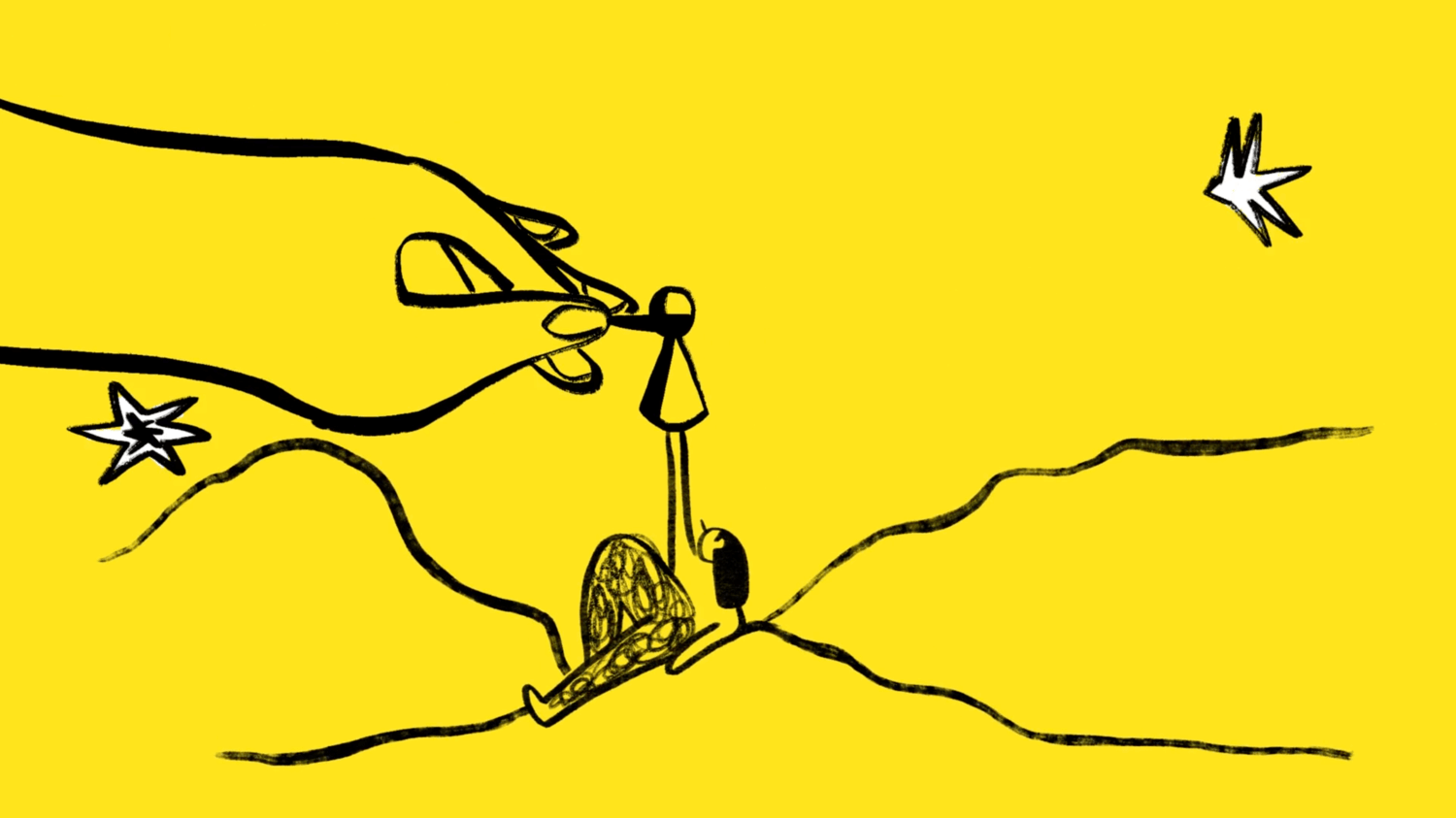
Jon Klassen
@Jon Klassen
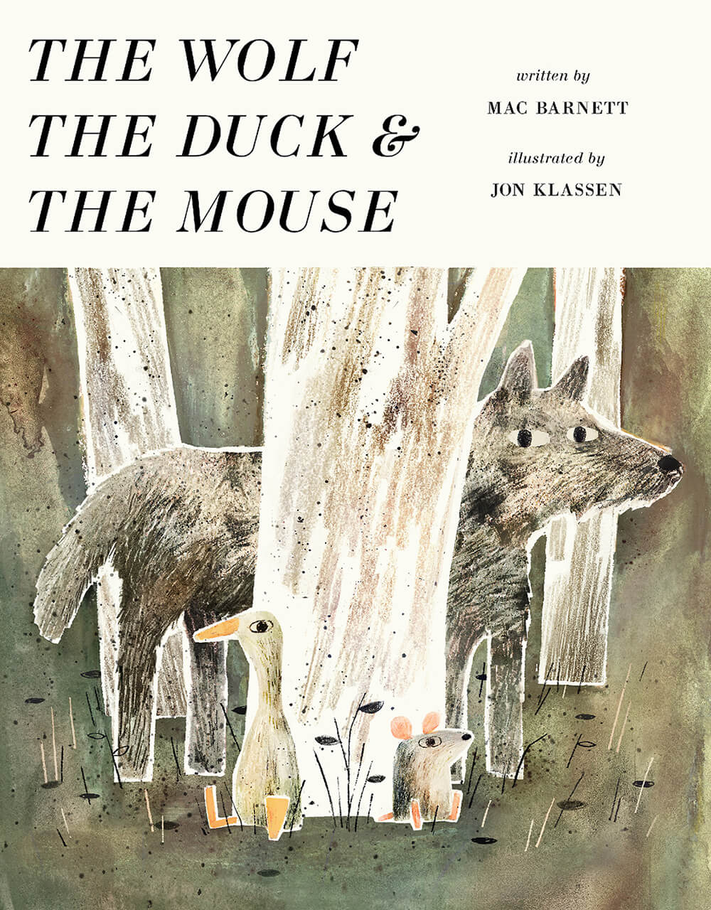
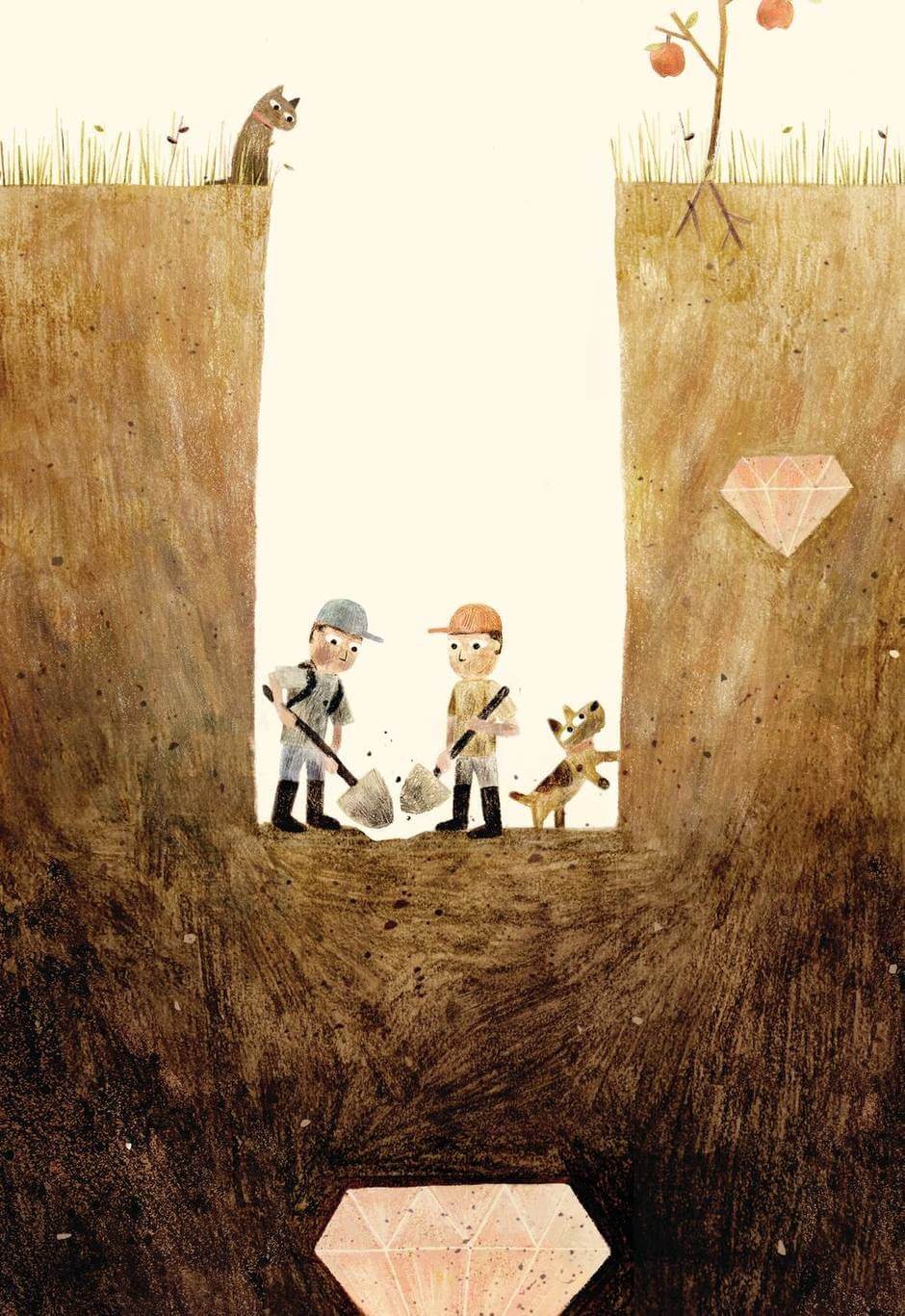
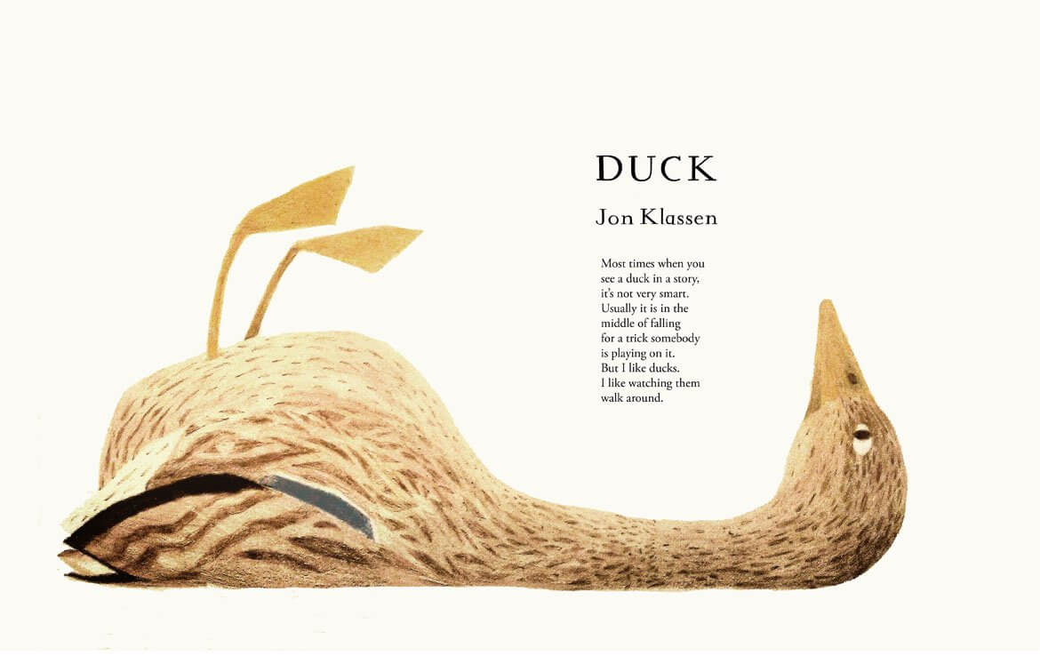
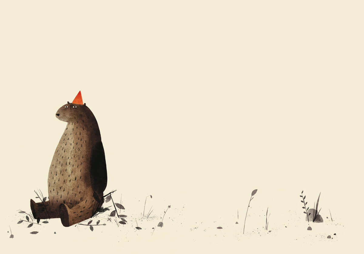
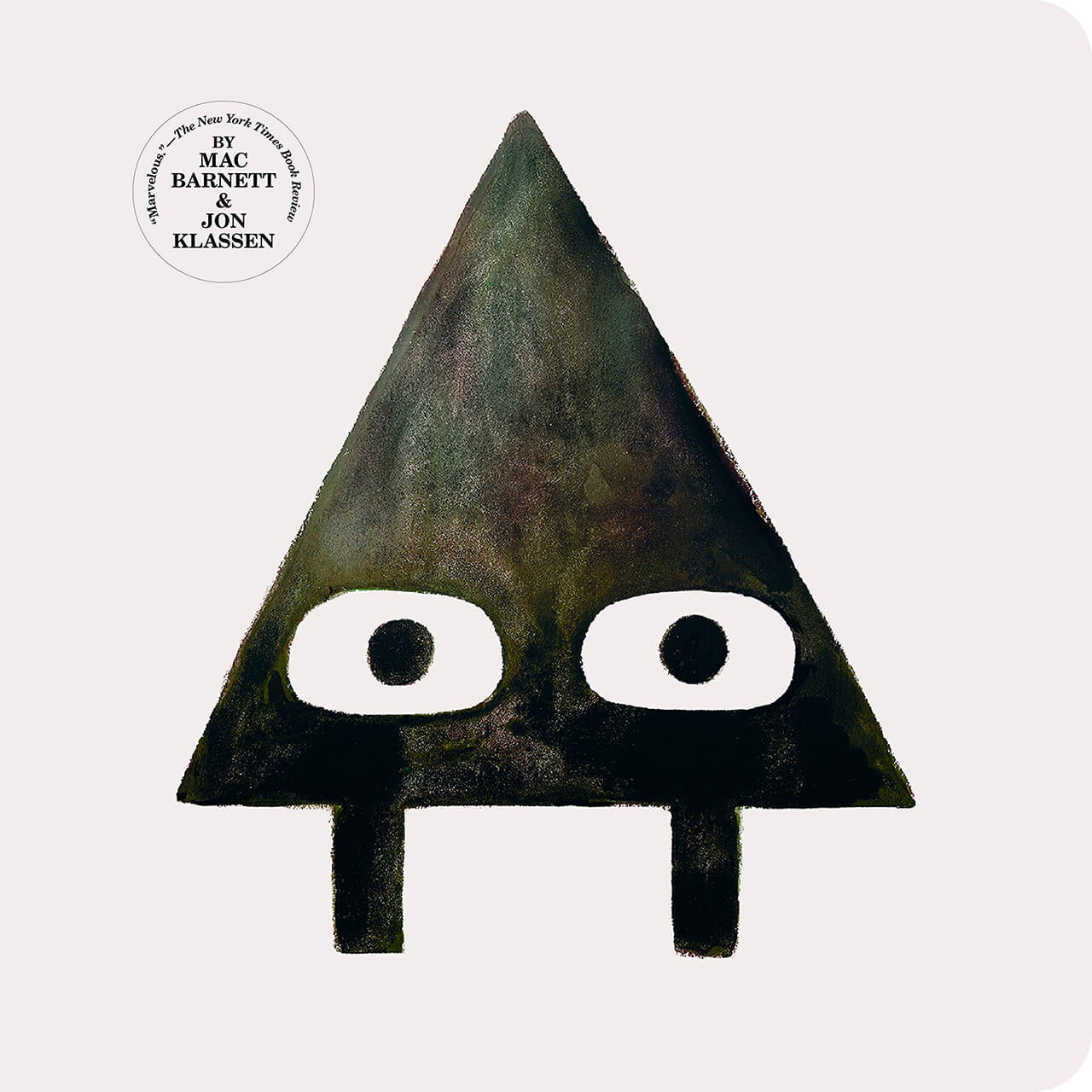
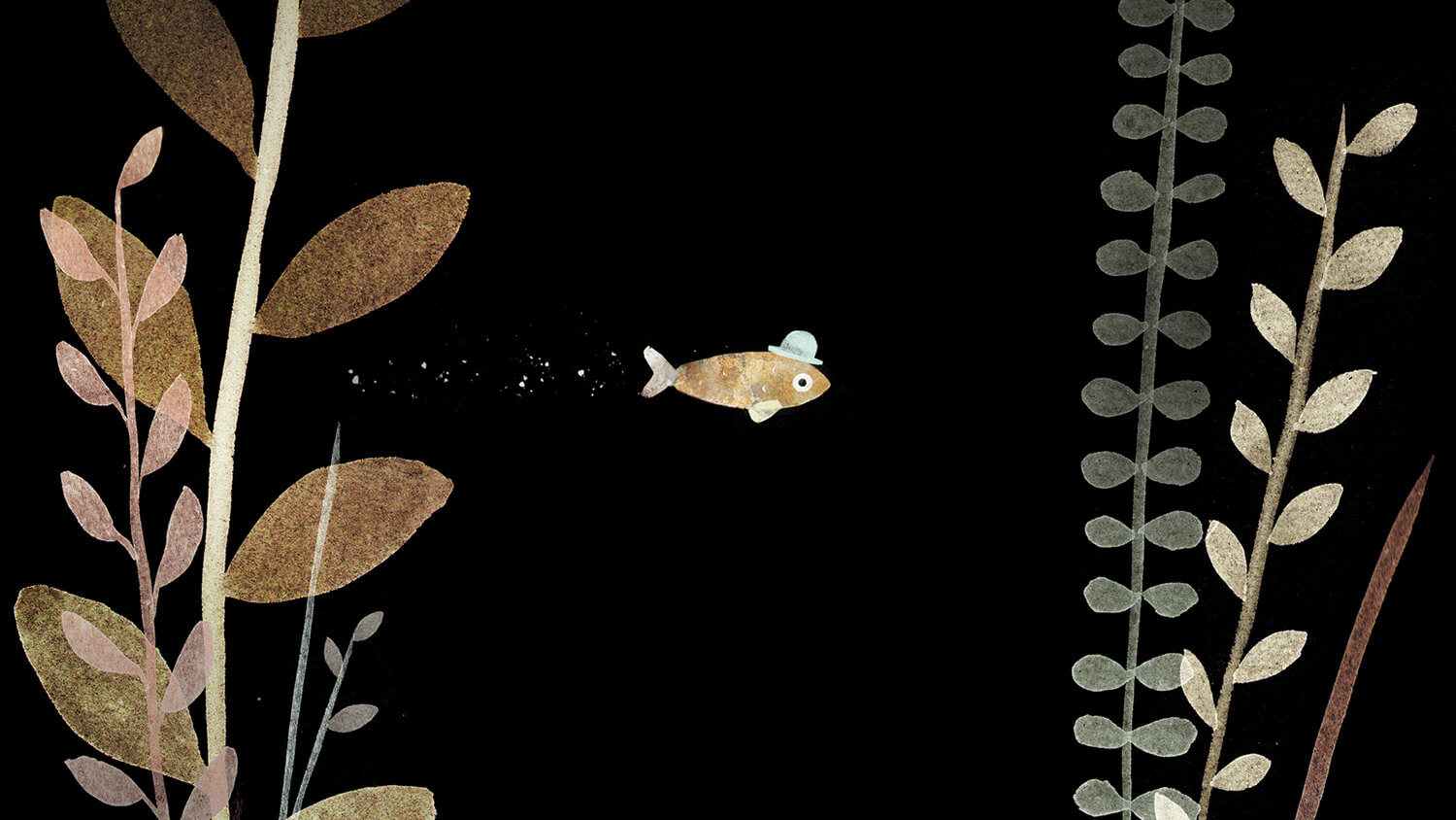
Jon Klassen CM is a Canadian writer and illustrator of children’s books and an animator. He won both the American Caldecott Medal and the British Kate Greenaway Medal for children’s book illustration, recognizing the 2012 picture book This Is Not My Hat, which he also wrote. He is the first person to win both awards for the same work. – Wikipedia
I found Jon Klassen when I was browsing picture books in Chapters. I picked up several picture books by front design. I realized that it always something similar. I checked illustrator. It was Jon Klassen.
He has own picture books and collaborates with story writer for some books. I noticed that both books show a strong structure. Commonly, the story has up and down, slow and fast, silent and surprising. He extremely emphasizes it. That’s why illustration makes the reader fun.
I can say it’s a great design.
Molly Fairhurst
@Molly Fairhurst
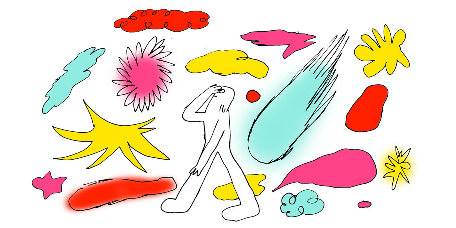
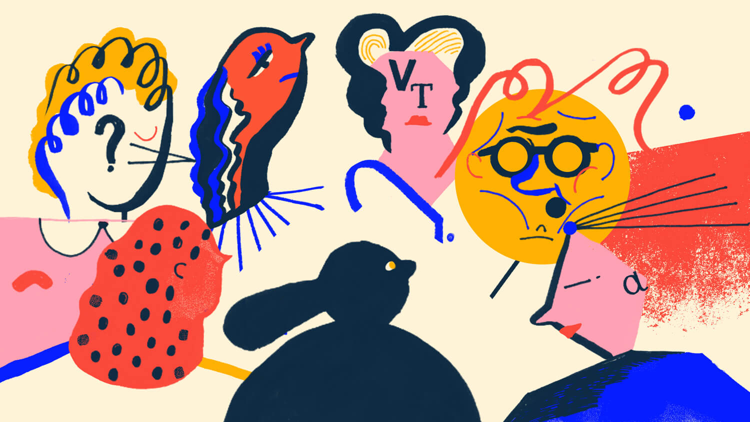
“Be playful,” says artist and illustrator Molly Fairhurst. “Always.” It’s a definitive statement from someone at the outset of their career, one that hints at a wise head on young shoulders. Molly’s work is concerned with “movement, figure and feeling” and her prolific output has developed a portfolio that shows a distinct and assured style. – It’s Nice That
The Creative Independent: A creative person’s guide to thoughtful promotion
Behance: Molly Fairhurst
Franz Lang
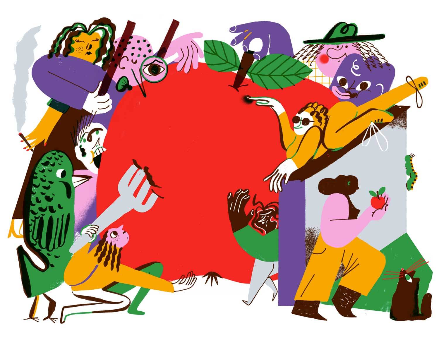
Franz Lang is an Italian illustrator currently working and living in London. “I always had a passion for drawing. My mother recalls from when I used to paint on the walls of our apartment and how I yelled ‘I want to be an artist!’,” Franz laughs. When studying at the Venice Academy of Fine Arts, Franz decided to attend an illustration course. “It was love at first sight.” – It’s Nice That
It’s Nice That: Franz Lang on understanding freelance illustration as a business
In 2018, Mailchimp launched new branding. Franz Lang’s illustration is used for it. It’s a very unusual style nowadays. First sight, people may feel awkward. It looks a child’s drawing. Throughout my career, I watched a lot of illustrations as well as pictures. It is a very high-level art direction of branding with the illustration.
I wrote a blog before, Rebranding Case Study: MailChimp. Respectable rebranding project. We should learn from it.
Olimpia Zagnoli
@Olimpia Zagnoli
Olimpia is a creative female-type person born into an artistic family in Milano. She drives a Vespa and has large round glasses, but the main thing is that she can, and does, draw like an ambidextrous octopus. One with prodigious skills, and a doppio espresso. – Official Website
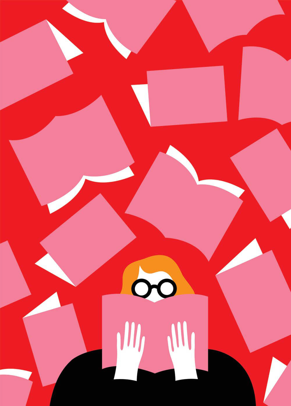
Very symbolistic, unique color combination. The background, Milano, may inspire her artwork. She doesn’t apply texture on the color, but I don’t feel bored. I’m wondering about it. I’m sure that beginner cannot emulate her style. Maybe fail.
Brian Edward Miller
©️Brian Edward Miller
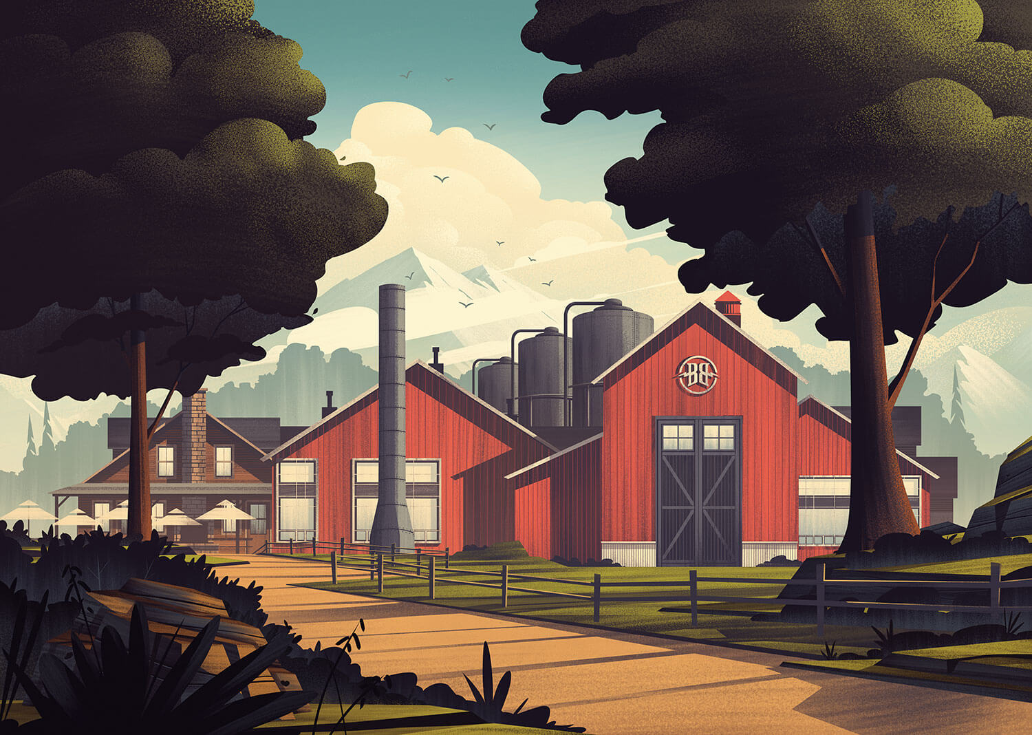
My name is Brian Edward Miller and I’m the owner, artist, and illustrator behind the Orlin Culture Shop (OCS for short) based in Erie, CO. The OCS represents an amalgamation of influences born out of an eighties driven childhood, a family legacy of artists and craftsman, and over a decade of experience as a creative professional. – Official Website
I like the depth of illustration. Audience focus on the main point, center of canvas. Then naturally feel depth on the background. Lastly, Brian Edward Miller draws something on the front on purpose. It enhances quality of illustration. Very well.
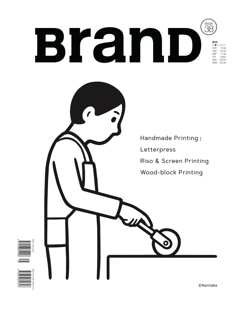
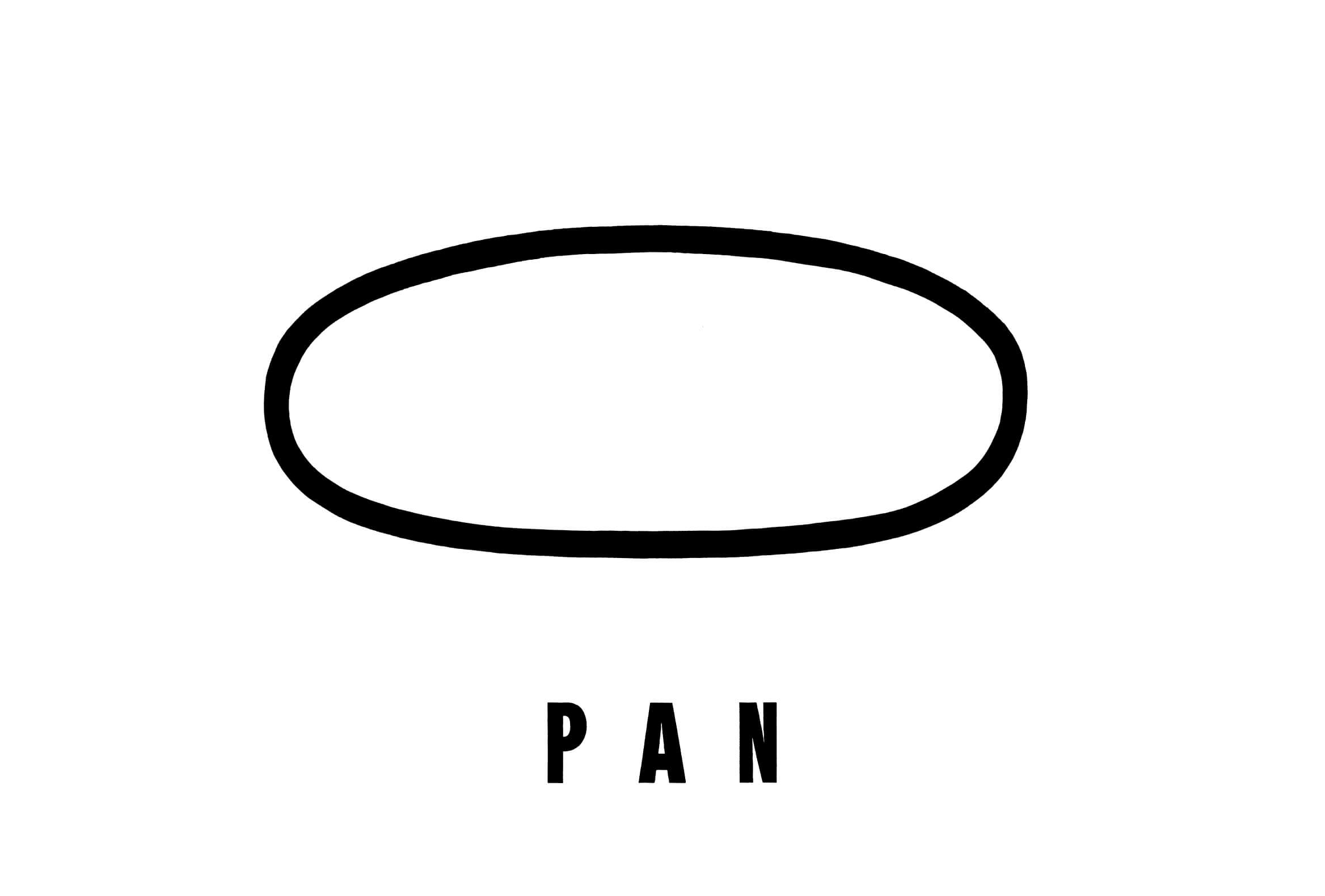
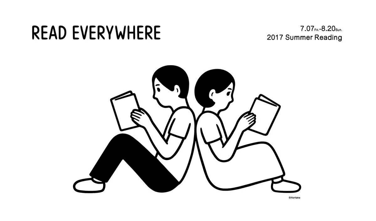
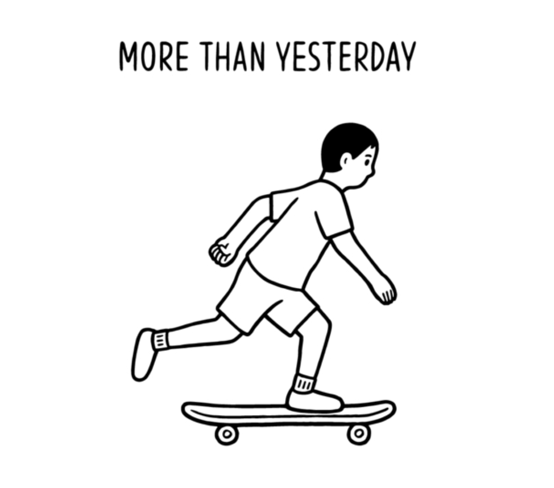
Noritake
©️Noritake
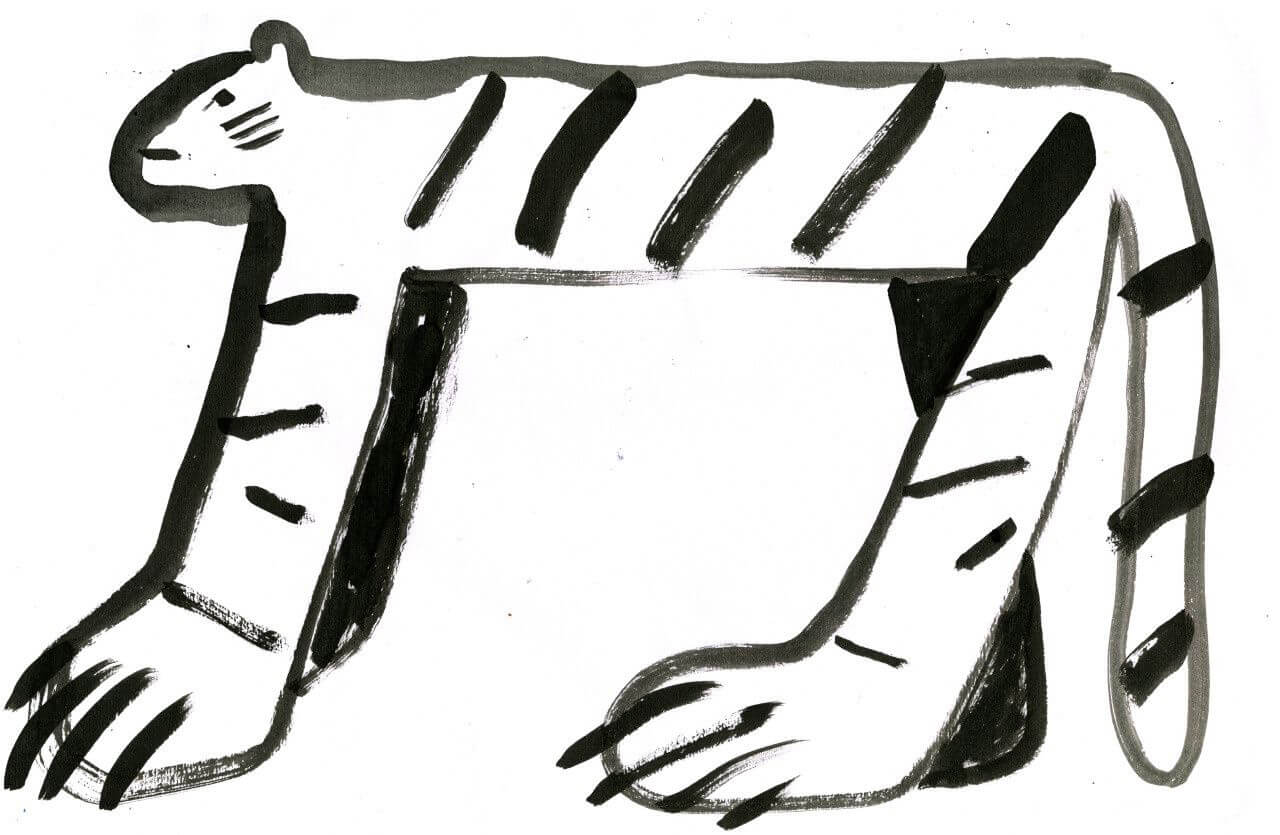
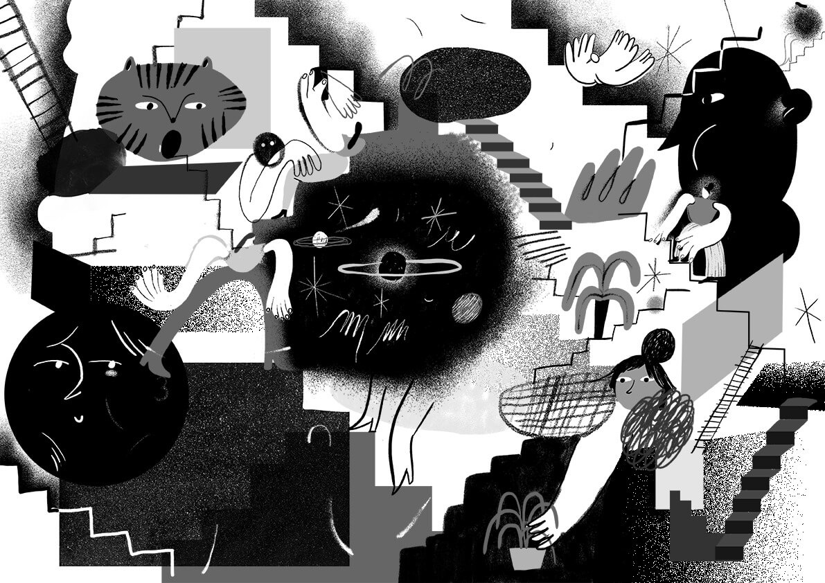
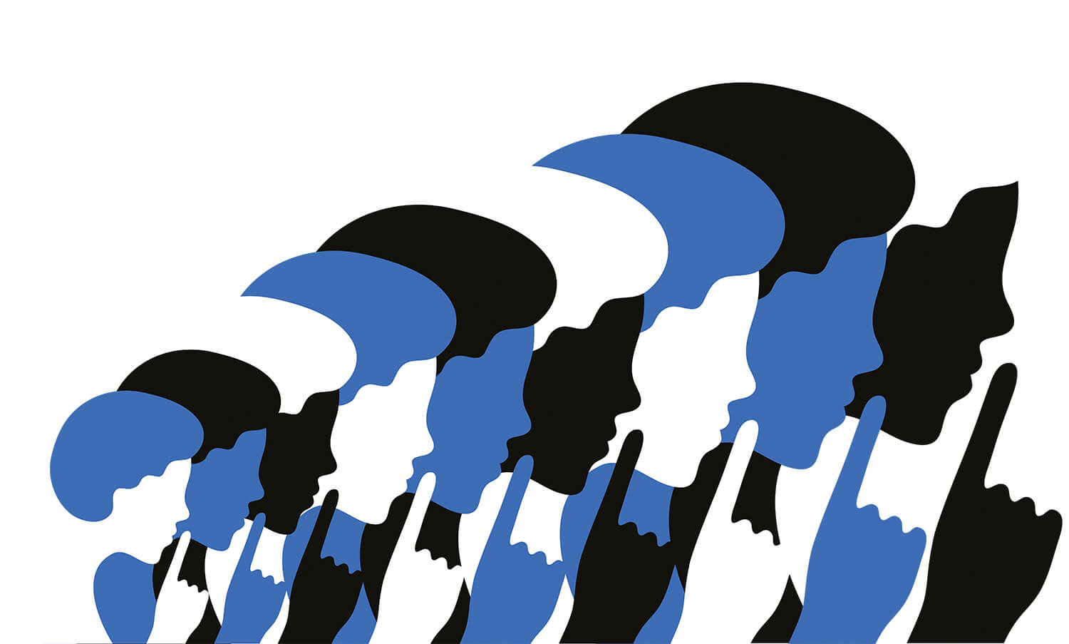
The strange faces and minimal scenes in Japanese illustrator Noritake’s work are utterly charming. Working mainly in monochrome with occasional flashes of blue or peach, the work manages to distil emotions and actions into beautifully crafted one-liners. Noritake has worked on designs for clothing as well as editorial illustration projects, but it’s the advertising work we love the most – quite something considering we have no idea what we’re even being sold. – It’s Nice That
Ultimate simplicity. Bold line. Non-emotional face. Not artistic style. Good for commercial illustration. Art director may want to use this illustration for parts of branding.
Conclusion: Purpose of discovery
Guy Kawasaki says, ‘B player hires A player. A player hires A+ player.’
I someday want to work with these proffesionals in client project. I would like to be a bridge between client and creators. If so, I have to keep in my mind these art work for synergizing with clinets requirement. I don’t feel this is prepaing job. Just fun to me.
Reference:
AOI: Association of Illustrators
Open Doodles: A Free Set of Sketchy Illustrations
