Story: Visualize what a client needs
When I create a logo/brand identity, I clarify a reason and a brand attribute. I always think about the words first. It is very helpful to decide a direction. The words form a design in the end.
A logo has many types. Sometimes, a client has a strong taste regardless of an industry standard. I basically follow it.
This blog is a support material for logo creation. I would like to share this link with the client and make sure of what they look for.
Logomark(Symbol)
Pictorial Mark
Apple is apple, Twitter is bird and Nike is the winged goddess of victory. I think every pictorial communicates with you. I mean you know which company it is. This is only a global company can do. I put Twitter here rather than a mascot. Because it’s very flat and doesn’t have an eye.
Example: Apple, Twitter, Nike, Target, Royal Dutch Shell, WWF?, Puma?…

Logomark + Letter
Adobe = A, McDonalds = M, Pinterest = P.
Example: Beats by Dre, Facebook, LinkedIn, Tesla, Skype, Behance, Meetup, inVision, DoorDash, UpWork, TD Bank…

Logomark + Business(service) Element
Instagram incorporates a camera, YouTube in play button and Slack in a speech bubble. Pinterest also in pin and P. It’s great!
Example: Instagram, YouTube, Slack, Bluetooth…

Monogram
This is a very common way and high fashion uses it often. I don’t think it’s coincidently. Obviously, industry-standard exists.
Example: Warner Bros., New York Yankees, Louis Vuitton, Chanel, Gucci, Fendi, Los Angeles Dodgers, San Francisco Giants…

Abstract Mark
I can see these style logos in the tech industry. It is also familiar to use gradient color, 2D to 3D by contrast. I am sure there is a meaning behind a logo, but a consumer may be not able to understand it instantly. Because abstract.
Example: Microsoft, Master Card, Chase Bank, BP, Adidas, Square…

Emblem
We can see emblem logo on auto maker, sports team, university and organization.
Example: NFL, BMW, Harvard University, NBA, Harley Davidson Motorcycle, NASA, UPS…

Mascot
Once business expands, mascot becomes a very strong identity of the company.
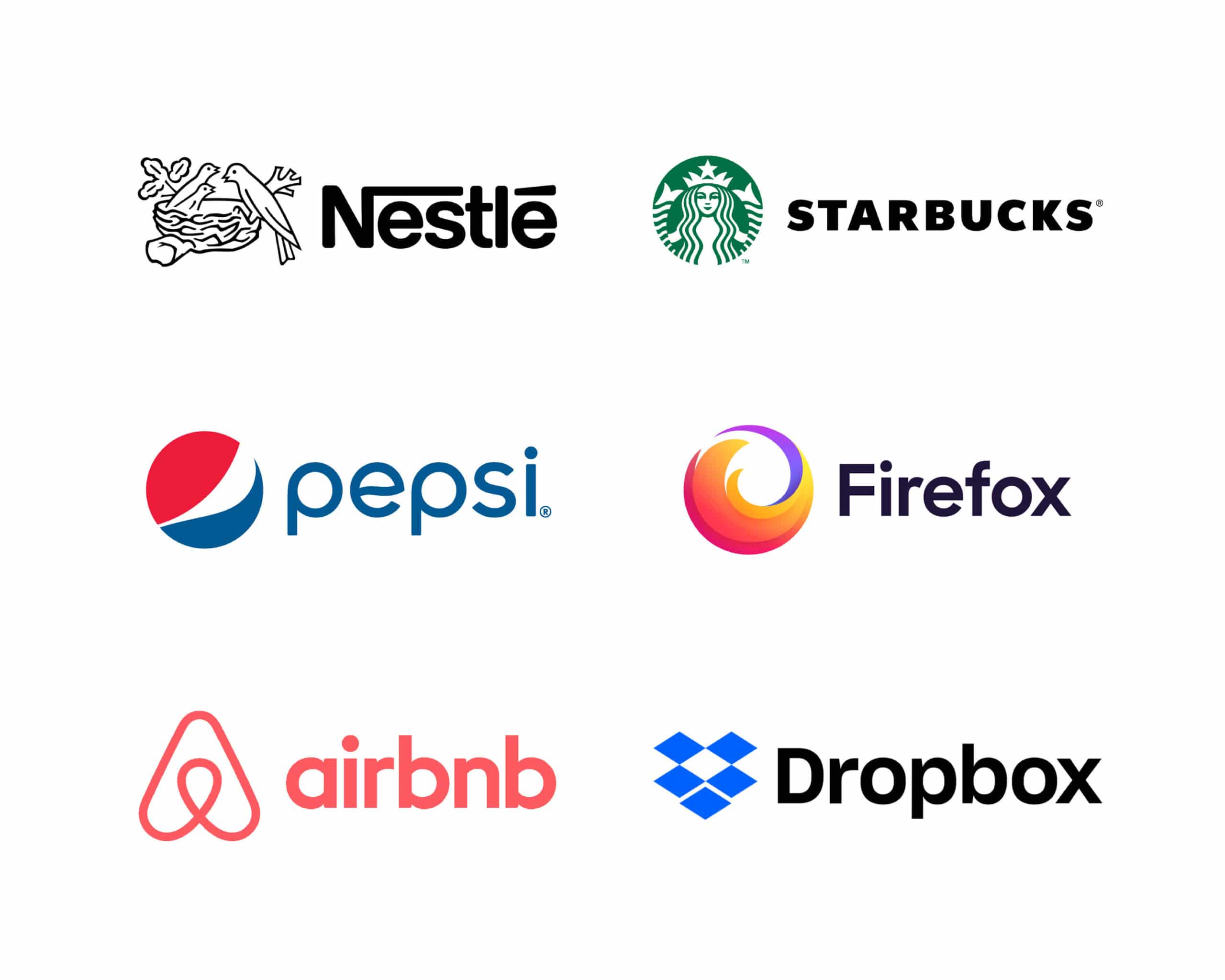
Example: Starbucks, KFC, Penguin Random House, Michelin, Mailchimp, Hootsuite, Duolingo, Lacoste, NBC?, Android?…

Logotype(Wordmark)
Wordmark
I could not recognize between word mark and letter mark. These make the client confused. I don’t use them separately. It the company name is short, it maybe not necessary to make a logomark.
Example: LEGO, HBO, eBay, CNN, Yahoo, Netflix, Subway, FedEx..
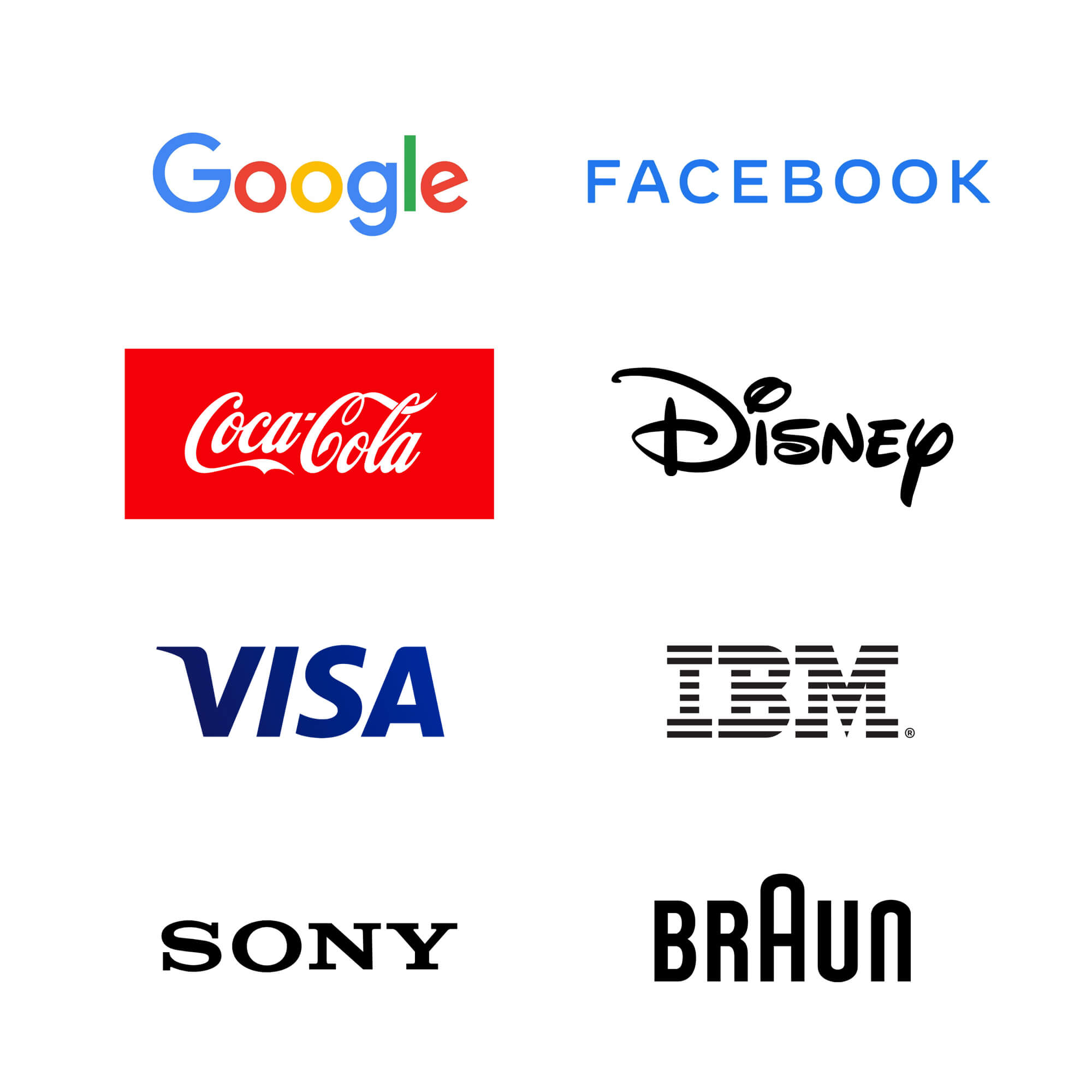
Logomark & Logotype
This combination is familiar to us, but I don’t see it on Google and Facebook. I make both when I work with the client. Logomark is useful for social media.
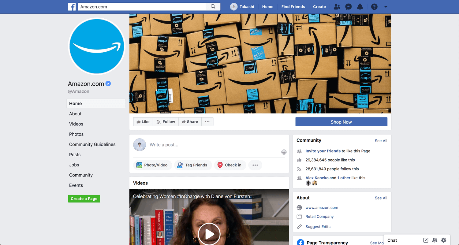
Amazon may little different type of logo. Because Amazon won’t display without a smile, but the smile can be an icon. X can be icon for Space X. I like custom font with business symbol.

By Industry
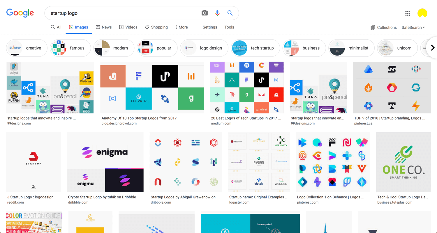
Startup
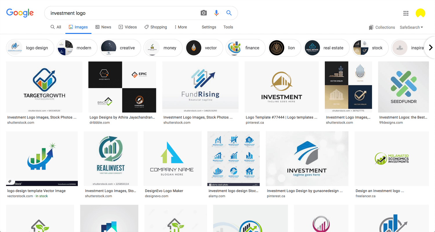
Investment
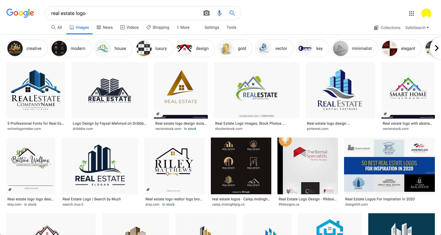
Real Estimate
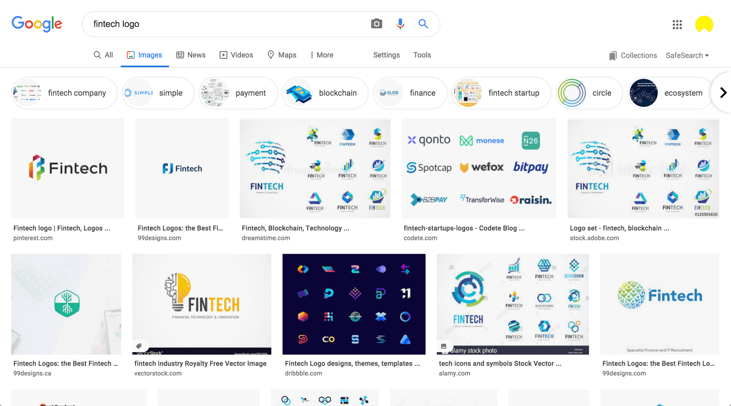
Fintech
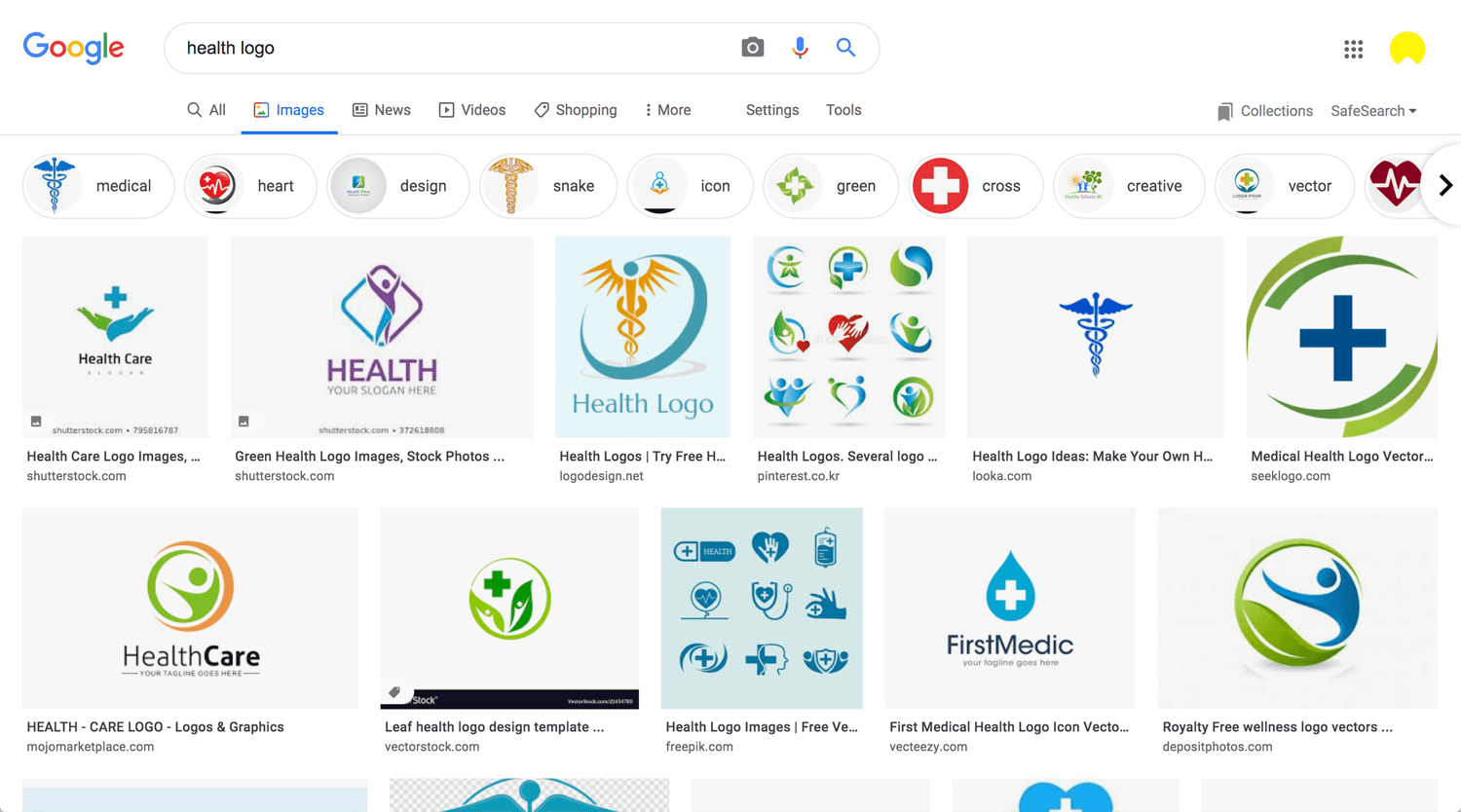
Health
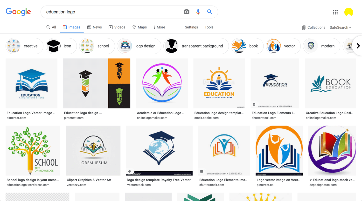
Education
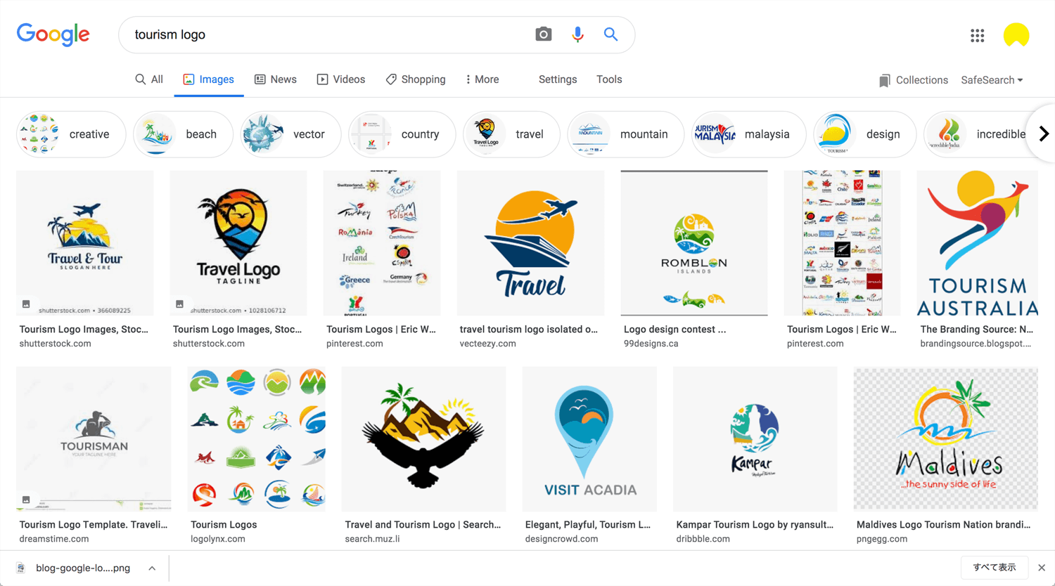
Tourism
Business Coach
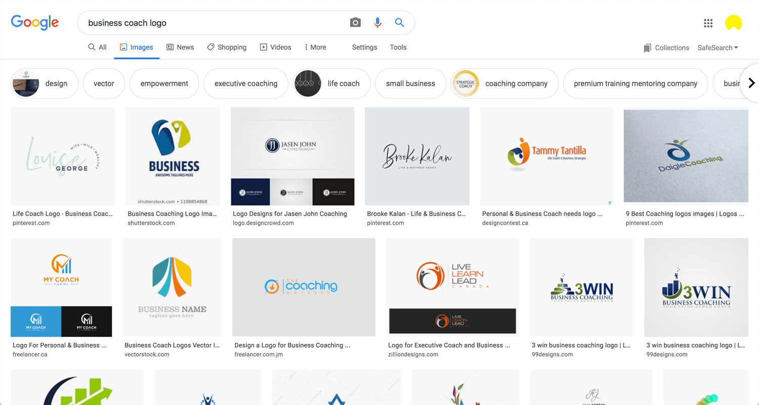
*I will update constantly.
Online logo maker
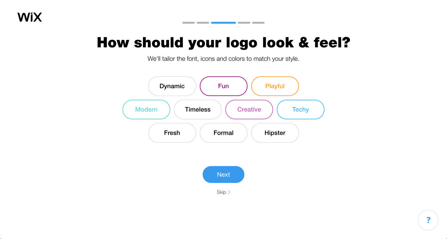
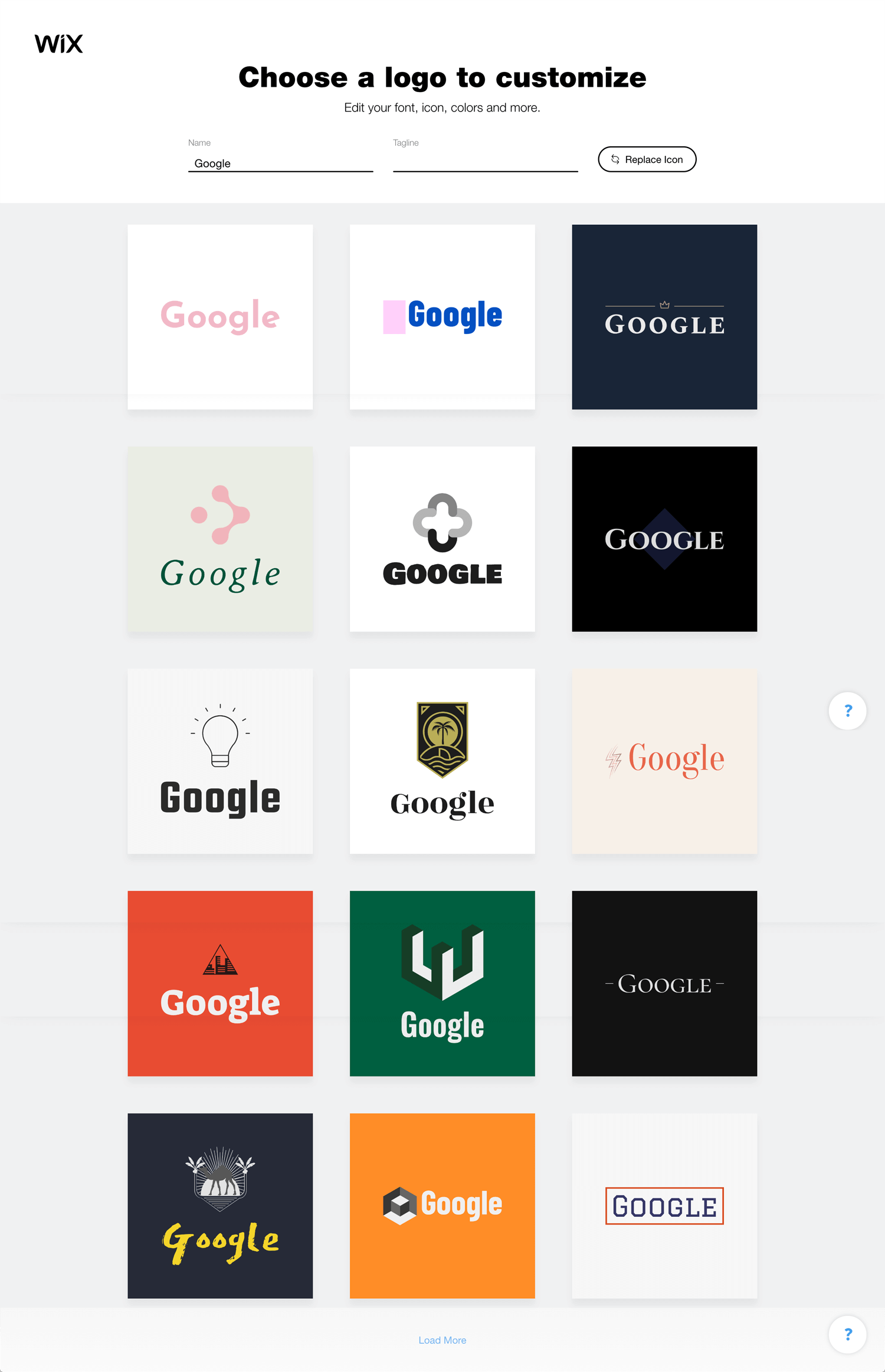
Maybe the first one is good even though it looks like not a logo. There are many online logo makers. Please try to create a logo yourself if you want to save the money. People spend money on clothes, food or cars instead of business. It does not make sense for me. I understand that small business needs marketing rather than brand, but marketing still needs a certain value of a brand.
Conclusion: Price = seriousness/importance
The world’s top agencies change creating the logo (with brand strategy) over $30K. On the other hand, people create a logo for $5. What’s the difference?
I, as a web/graphic designer, cannot change the client’s mind. If the client doesn’t need it, that is that. Just let the budget-conscious client go. I cannot work with all clients who need a logo, not a branding.
What only I can do is polish my expertise, improve brand discovery and provide value more than the price.
Reference:
Medium: There are 7 types of logo designs: but which type of logo is right for you?
99designs: The 7 types of logos (and how to use them)
