Story: Tendency of the website
I am working with a startup, APP. My task is to improve UX/UI on the website. As usual, I researched an industry and competitors. I am still observing the information, but I can see that tendencies, contents structure and visualization, what make lookalike SaaS.
I picked up some good examples as inspiration and write impressions.
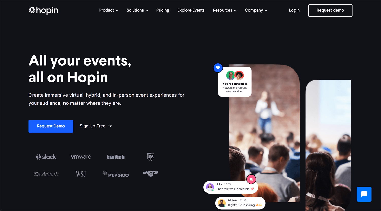
©Hopin
I start working with Toronto based startup. I heard a briefing last week. I researched a related business and competitors yesterday. Then, I found Hopin. It looks not so unique, but good website.
– Lotti animation is standard for SaaS startups rather than full bg images or video.
– The business adjusts under the COVID circumstances, online and in-person.
– Shors credibilities at hero section
– Color only one CTA button ✓
– Hero > Products(with video) > Features > Functions > Education > CTA > Testimonials > Forms
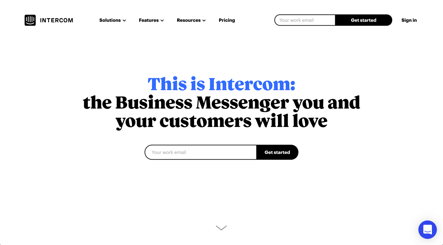
©Intercom
When I searched “SaaS, website, inspiration’ on Google, many blogs mention Intercom. It must be good something.
– Nice interaction and value proposition on hero section
– Black and RGB blue make me feel SaaS.
– Chatbots
– Nice mega menu interaction
– Nav menu, Solutions / Features / Resource / Pricing & Sign in
– Hero > What Intercom is> Credentials > Product segments > Reviews >CTA
– Overall, consistent tone and voice through a hero section to footer.
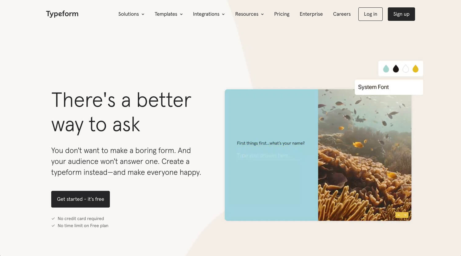
©Typeform
– The first impression is moderate, based on the typeface and color
– Remove the customer’s anxiety, no credit card & free plan.
– Very clear what Typeform do in the second section
– Hero > what we do > small demo > features > CTA > customer’s story > how it works > integration > video > testimonials > CTA
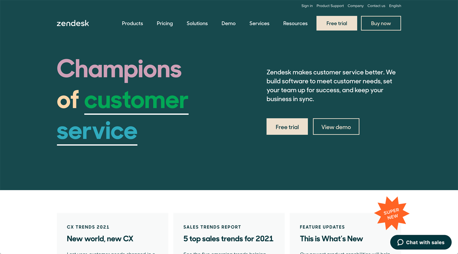
©Zendesk
The name is quite famous, but I still don’t know what Zendesk is. Champions of customer service. It’s a strong copy. So many nav menus, but interaction is sharp.
What action does this kind of customer, like me, take? I clicked view demo, but it requires inputting the form. I did not do it. I found the video in 3rd section. It can be emphasized more. I was confused whether it’s Squarespace’s story or Zendesk’s introduction. It was the latter.
Good usage of pale tone.
©SproutSocial
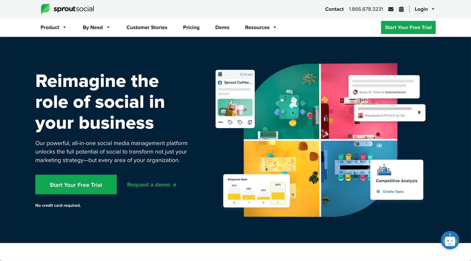
The illustration slowly moving. It’s weirdly slow. Nav menu does not react on hover, but the site implements accessibility. That’s great.
I can see 2 types of video, animation like Zendesk, or footage like SproutSocial. Both are easy to understand and it provides good user experience.
The radius of the image/illustration is linked to the logomark. It’s consistent. I feel the logomark does not need to be a comment bubble. Just abstract S and sprout leaf are good enough.
©Calendly
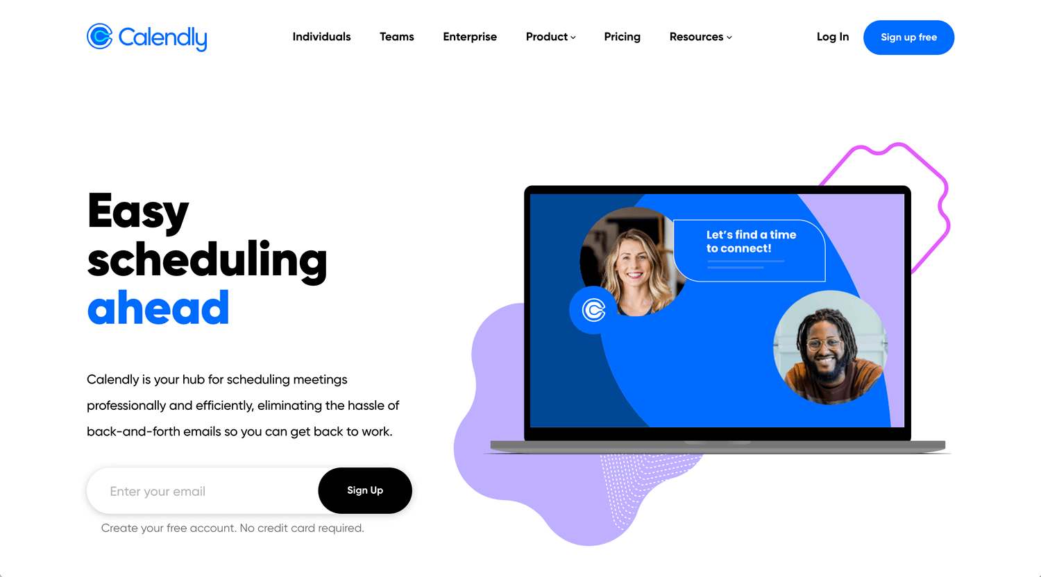
– Lotti animation, value proposition and CTA at hero section
– Credibility
– Video/feature
– Pain point and solution
– Additional feature
– Free trial (CTA)
I don’t know the story of the logomark, what’s symbolizing it, but the home page is very SaaS, modern with good contrast and interaction.
©Golinks.io
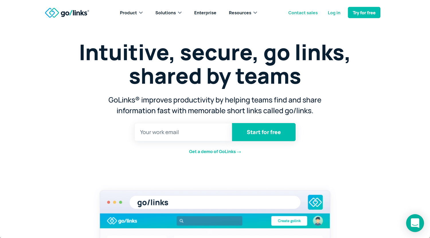
– Value proposition and CTA at hero section
– Animation
– Credibility
– Video
– Pain point and feature
– Additional feature
– Pitch
– Additional feature
– Free trial (CTA)
– Additional feature
– Free trial (CTA)
– Testimonial
This home page is also very SaaS, clear communication with faceless illustration and produced video. It looks modern with good contrast, font size, and enough white space. Very well.
©Lusha
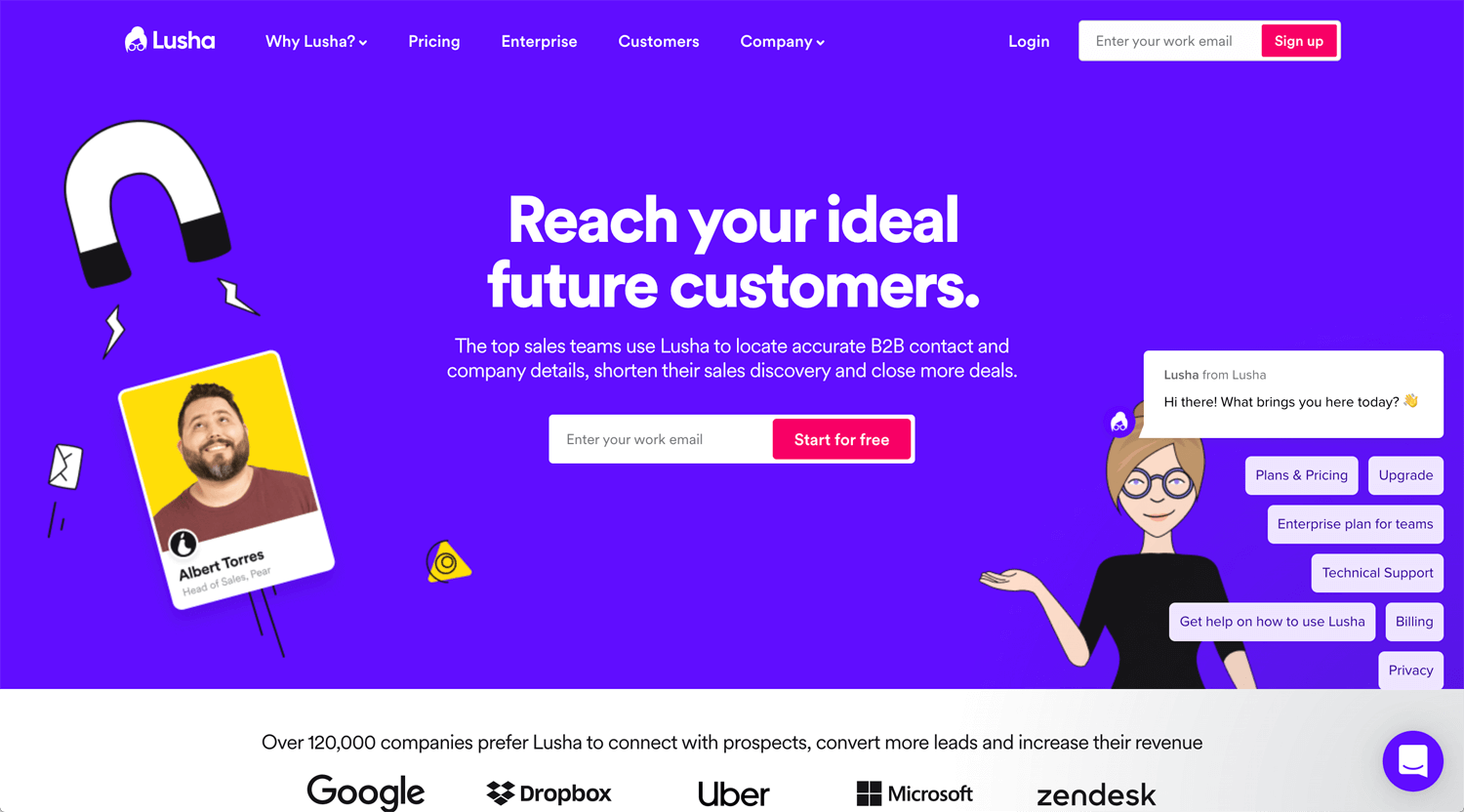
– Using character is unique. I don’t see it many.
– Hero > credentials > reasons > products > numbers > features 1 > integration > testimonial > reviews > CTA > Footer
©Notion
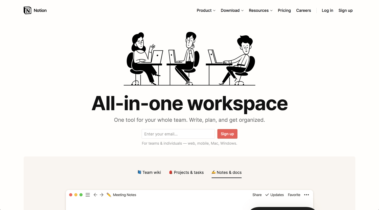
Many illustrations do not draw faces. Instead of it, emphasize skin tone, It expresses diversity. Notion takes a different direction and it has courage.
– Quite unique illustration
– Quite a cheap pricing, but they don’t mention it on the home page
– Auto slide on the second section, a good idea actually.
– Hero > product’s usage > credentials > audiences > CTA > product’s introductions > CTA > testimonials > CTA > features > CTA > pricing > usages > Reviews > Footer
– Enough length for persuade to use
©Robinhood
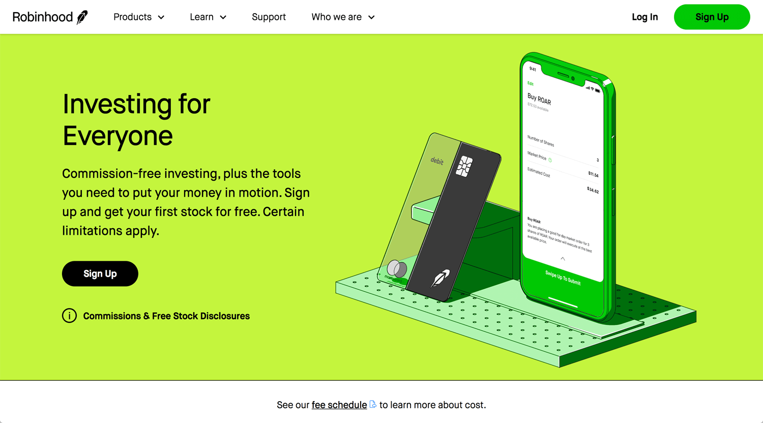
Gamestop controversy made Robinhood famous furthermore. I can see so many disclosures on the page. I don’t really know Robinhood installed disclosures before the issue or after. Anyway, It’s transparent even though I don’t think their target audience actually reads it. It’s better to reliable.
Nice color, it’s brilliant. The illustration keeps an outline and it’s unique. I am not curious about stock investment, but Robinhood opens the door of the stock market for the young generation. Providing new value to society, it’s a startup. The website still looks like MVP. It does not show any credentials, reviews, testimonials. Young people may adopt new things easily and quickly, but introduction video is helpful to understand Robinhood’s services.
©Fivetran
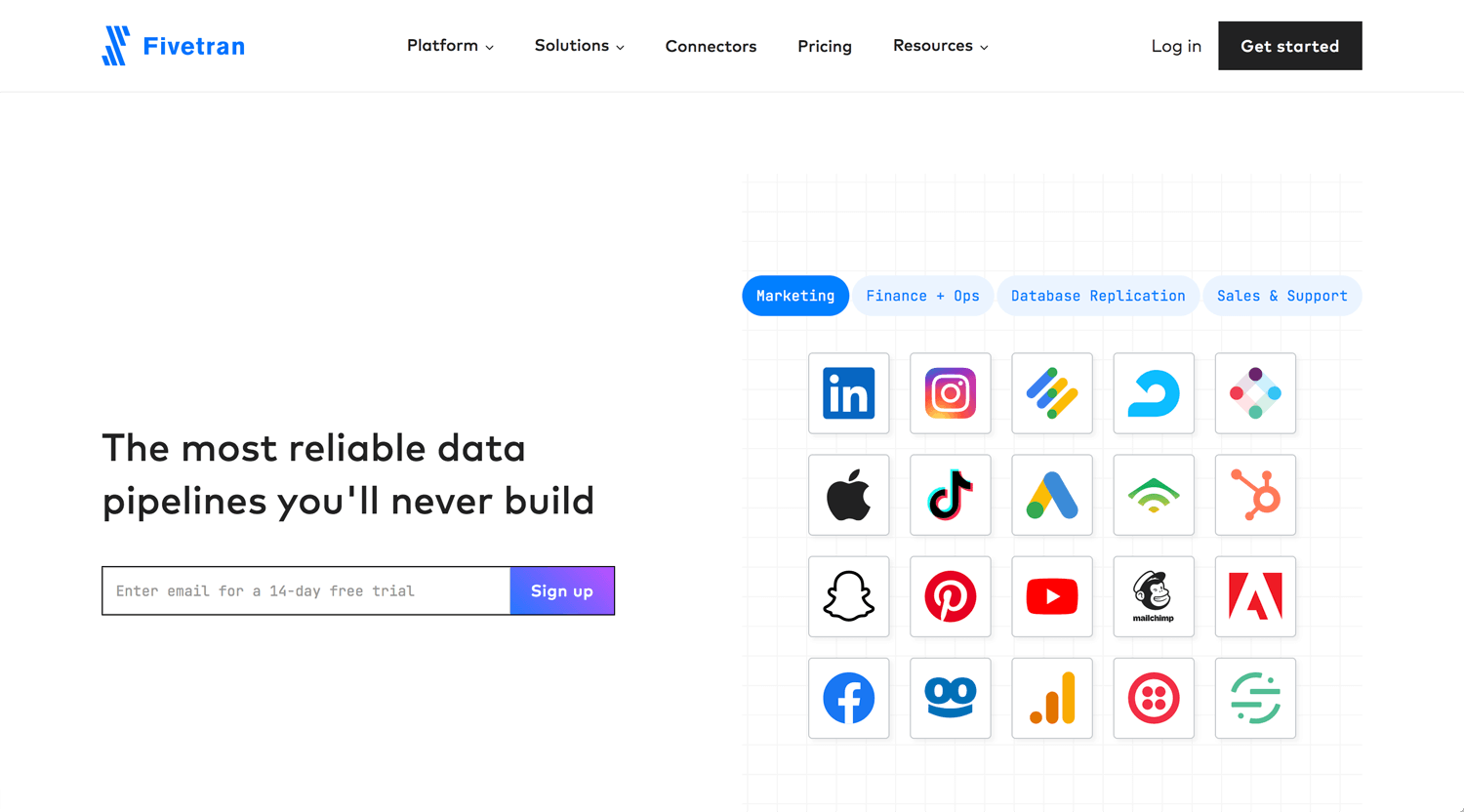
Using tabs for organizing much information. That’s good. UI on the global nav menu has consistency. Json files for interaction and video are good quality.
©Toggl
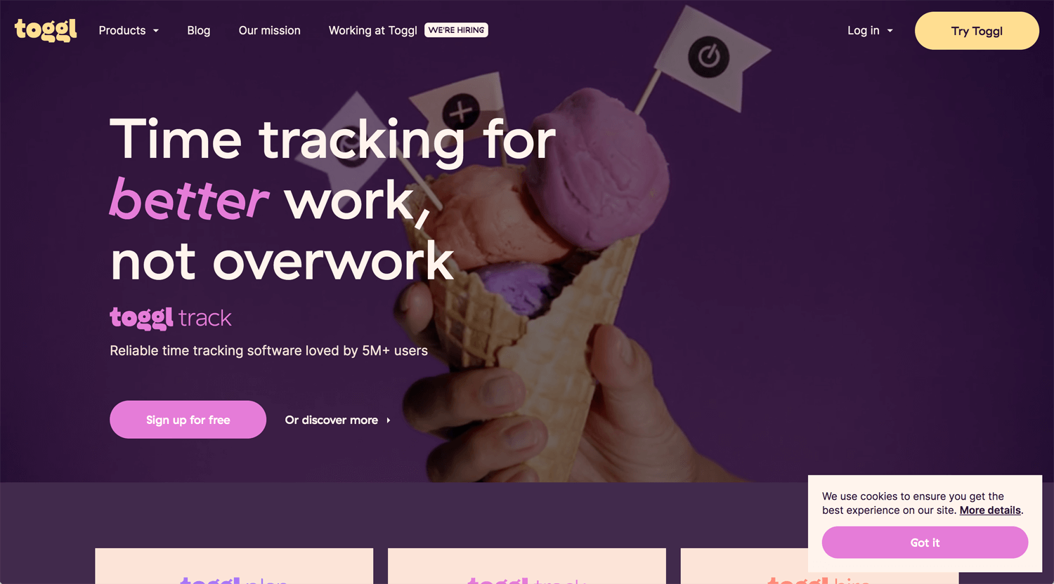
I can hear the voice through logo, typesetting, video and animation. I don’t see many contents strategies on it, still MVP. How can the target audience choose Toggl by this page, I thought at first. On the product page, for instance Toggl track is better contents and explanations. It follows a rule.
When you work with a startup, MVP is also okay. Be public is sometimes the first priority. You need to adjust to both situations.
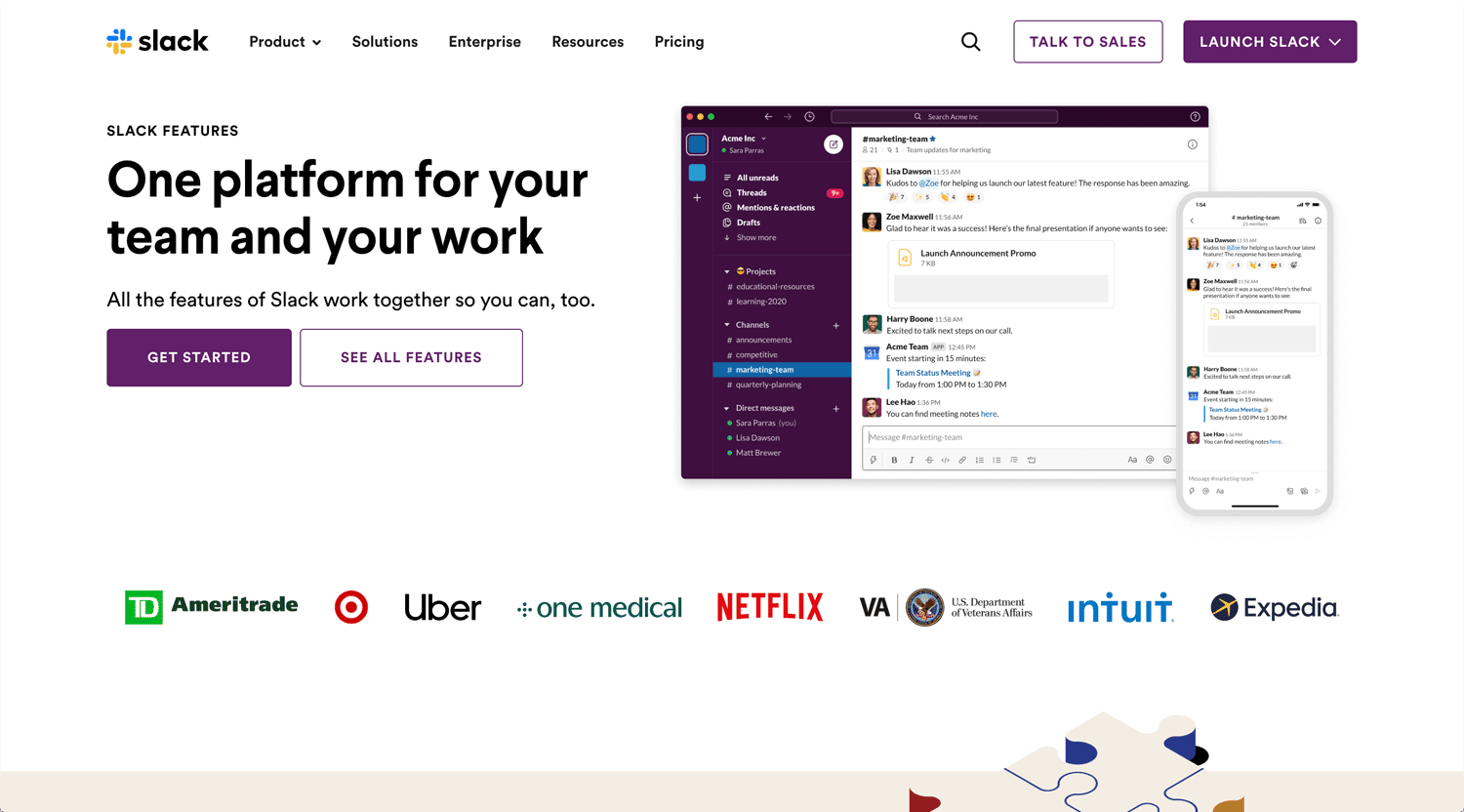
©Slack
Show products, credentials, feature x 3… Slack is already a global company. The website does not matter at this level. Focus on product improvement.
Conclusion: Contents and expression
The first priority which a web designer has to do is to organize content. Gathering information and categorize like who you are, what you do, how you do, why you do etc. Then, think about a target audience, why they have to choose your service or product? I checked the websites above. Branding and expression are quite different, but there are not many types of websites. Once you seize the core, you can make a format.
User takes steps to make a decision, attention > interest > compare > conversion. It’s all about UX design.
