Story: Measure of value
*Updated: May 10th, 2020
I am providing digital marketing service for a client. I’ve used Google Ads in 6 months, but I couldn’t leave good results. According to Google My Business, the result of each numbers are below.
Mid-April to End of September
View 592/mo → 1.2k/mo
Search 424/mo → 1.2k/mo
Activity 21/mo → 433/mo
The increasing these numbers is not a goal at all. Design(marketing) should lead new customer. This is the ultimate goal and why I provide a service. I could not lead to new clients for them. I have to reflect on it.
I suggested updating the website which was made by an employee. I do not say the cause is the website. Once I think how might I take action for 6 months’ results, a website might cause. I wanted to apply a value proposition and organic keywords on the website. I did not consider to buy a backlink. It’s over the budgets.
The current website was created by Wix.com. He asked me to create a website on the same platform. I knew it is the cheapest option for the client, but it will consume my time more than WordPress. In addition, I didn’t think I can what I want to do with Wix. After all, I persuade and rebuild a website by WordPress.
During build a website, I had to think about the primary font and secondary font on Google Fonts. This is notes for the future project.
Google fonts
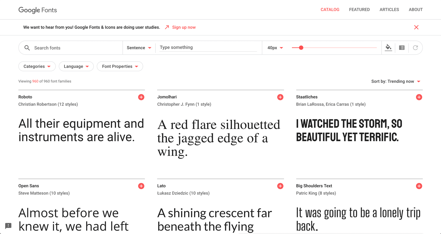
Google Fonts is a library of 960 free licensed fonts, an interactive web directory for browsing the library, and APIs for conveniently using the fonts via CSS and Android. – Wikipedia
I don’t guarantee you every fonts can apply to WordPress. You can upload fonts, but it may be not stable. I usually set Helvetica for the second priority font just in case.
In this project, I use Lexend Exa for primary font, and Source Sans Pro for a secondary font. The font is the voice of business. It is quite important, but designer cannot charge for it. Helvetica, Gotham or Universe, these fonts are the same meaning for the client viewpoint. They just don’t recognize many differences in it. We have to add other values. If it easy to recognize, that’s good. It often cannot see, loading speed, keyword research, and internal/external optimization.
Gothic(Sans-serif) for title
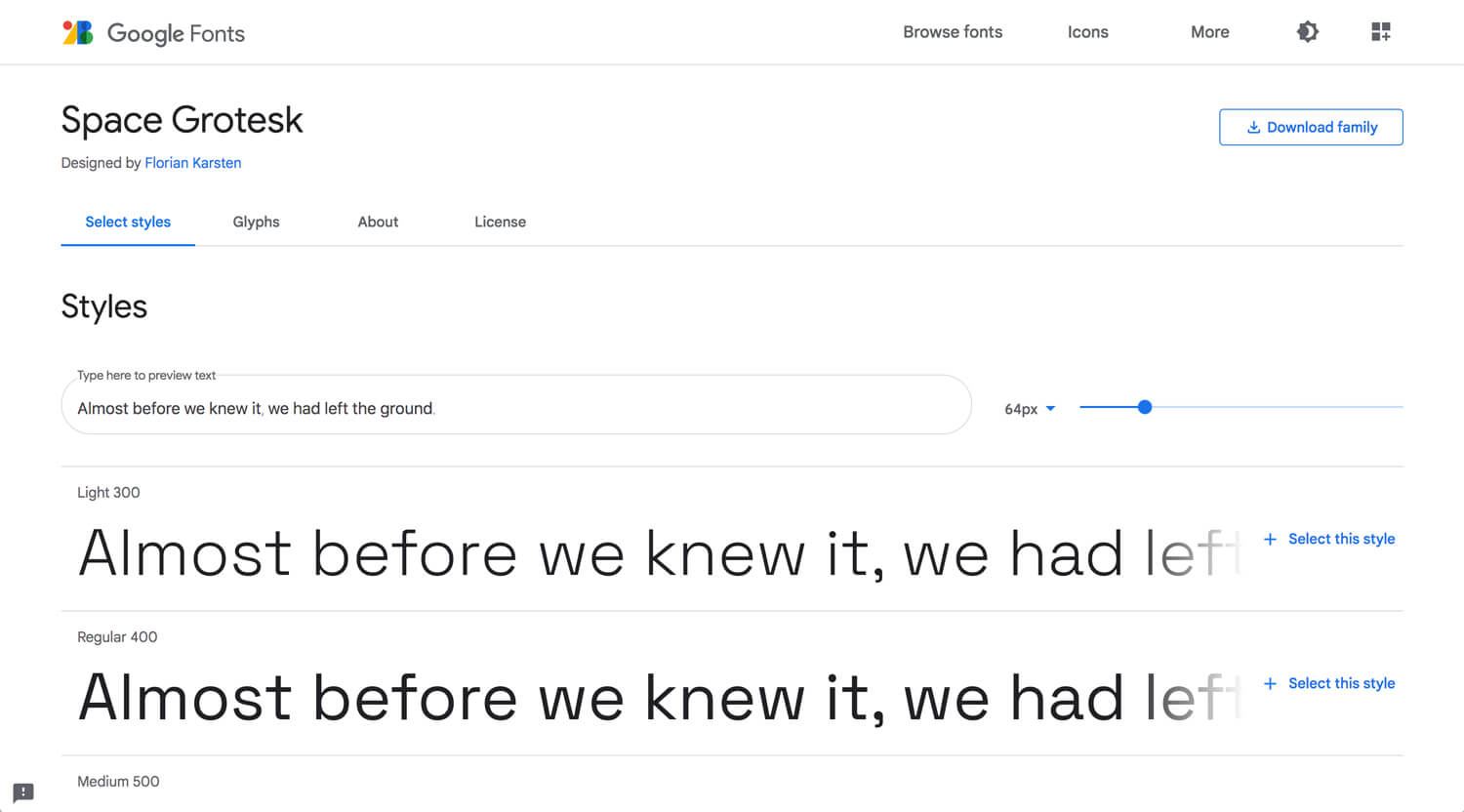
Space Grotesk
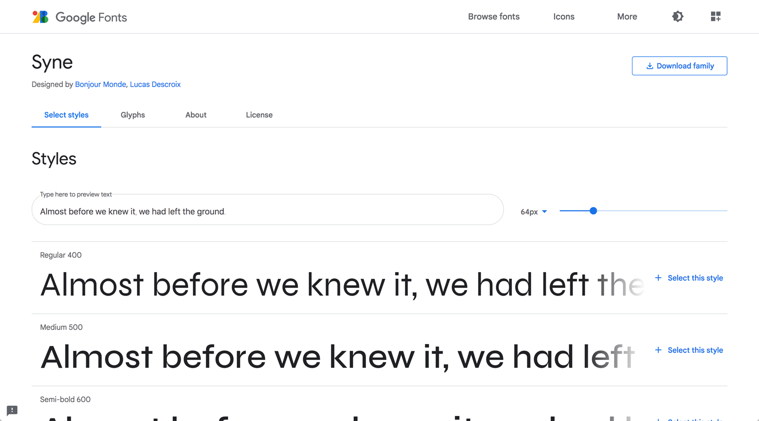
Syne
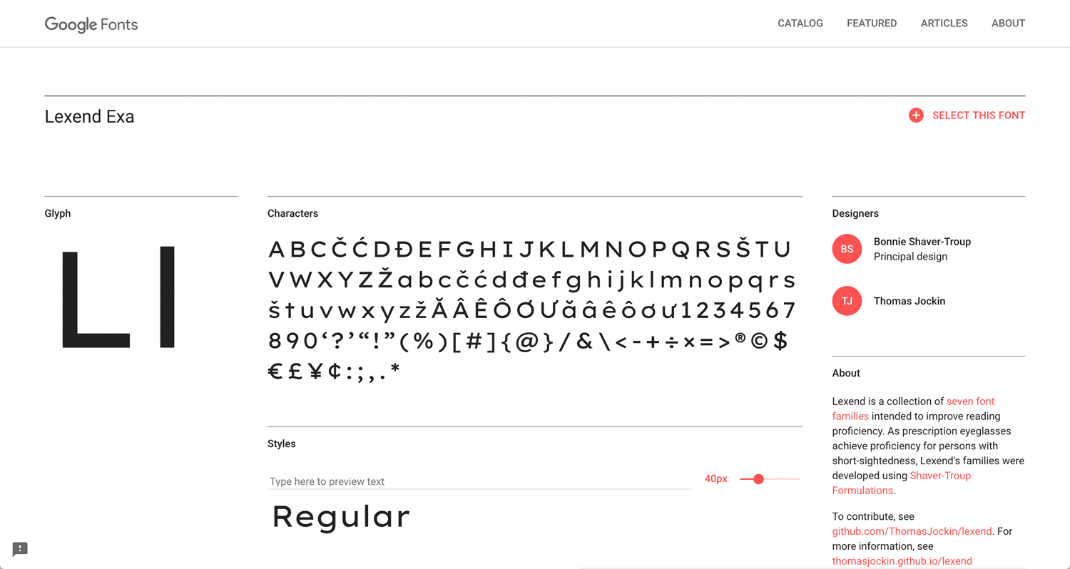
Lexend Exa(no family)
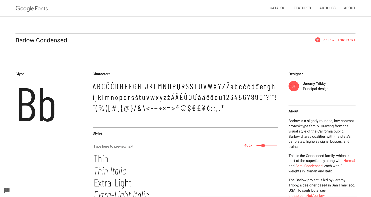
Barlow Condense
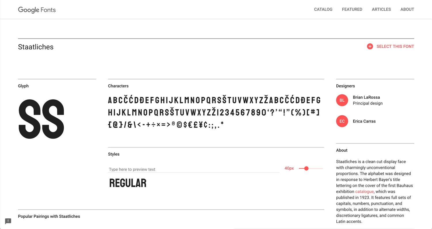
Staatliches(no family)
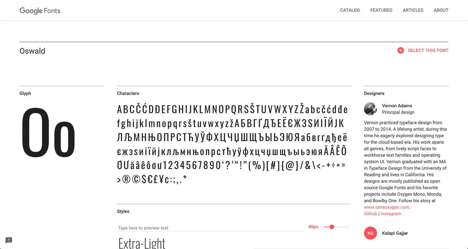
Oswald
Every element has a hierarchy. It’s not only big and small, thick and thin. There are many ways to apply it. A fun aspect of the design.
99designs: 6 principles of visual hierarchy for designers
I looked for a wide font like a Bt America. Lexend Exa is unique enough. I could use Lexend Exa on Fusion Slider, but I could not find it on Slider Revolution. I need research more.
Gothic(Sans-serif)
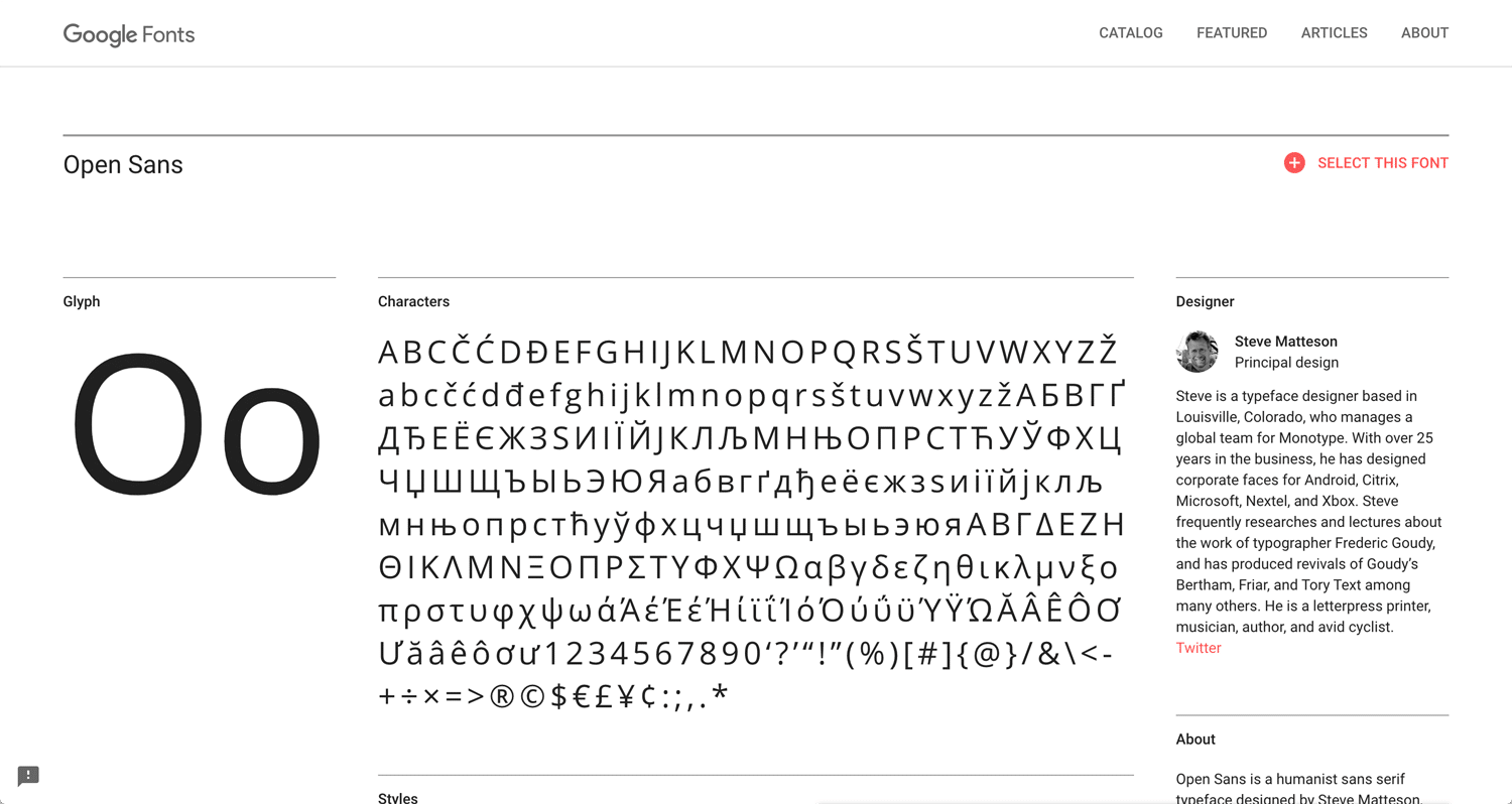
Open Sans
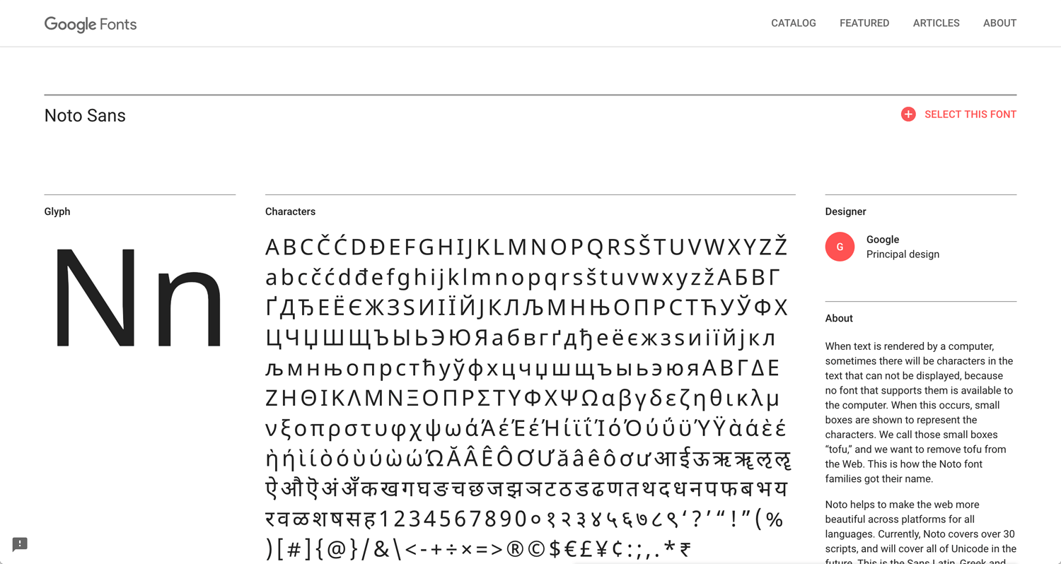
Noto Sans
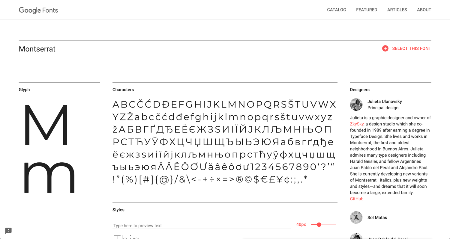
Montserrat
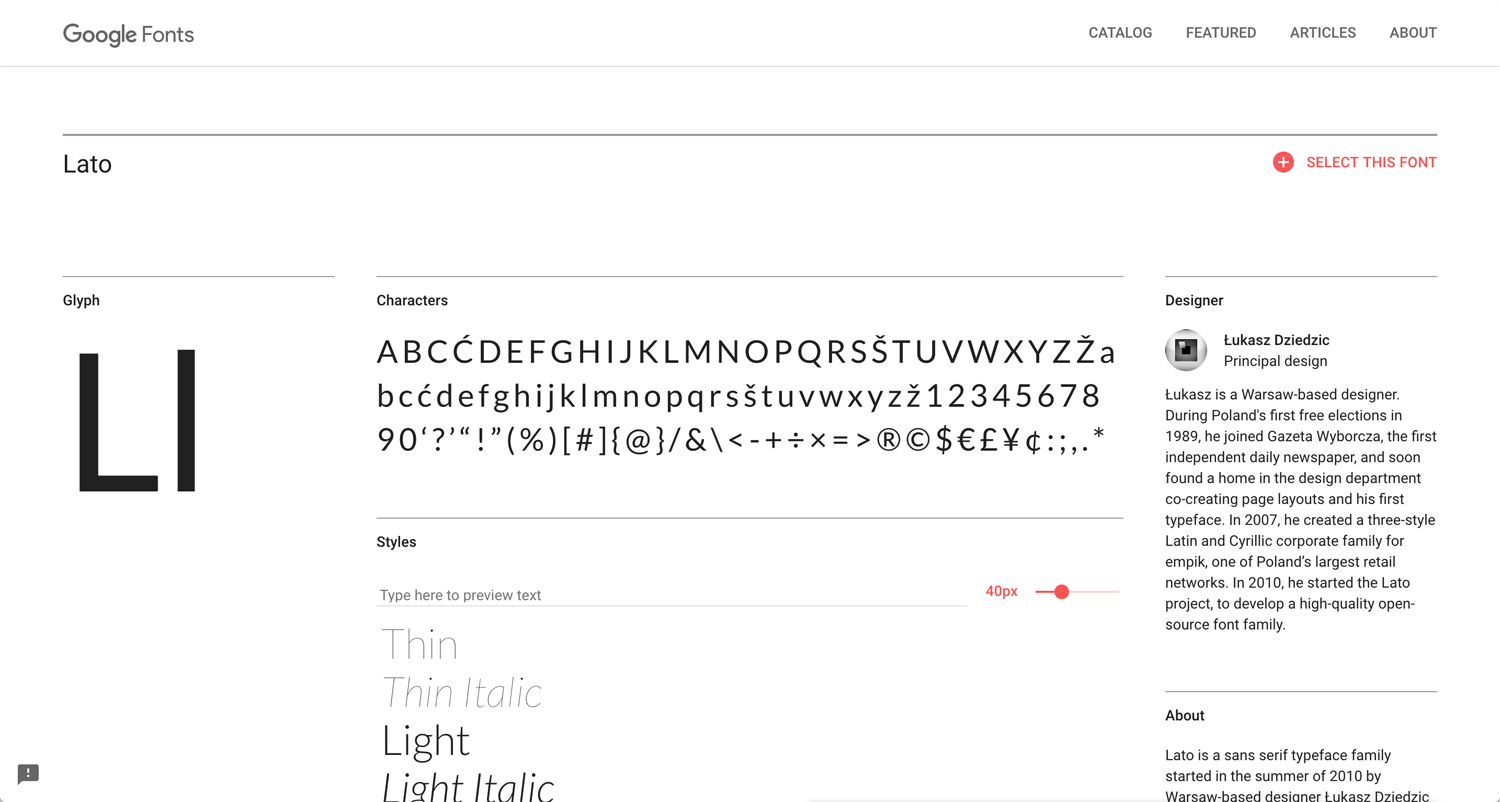
Lato
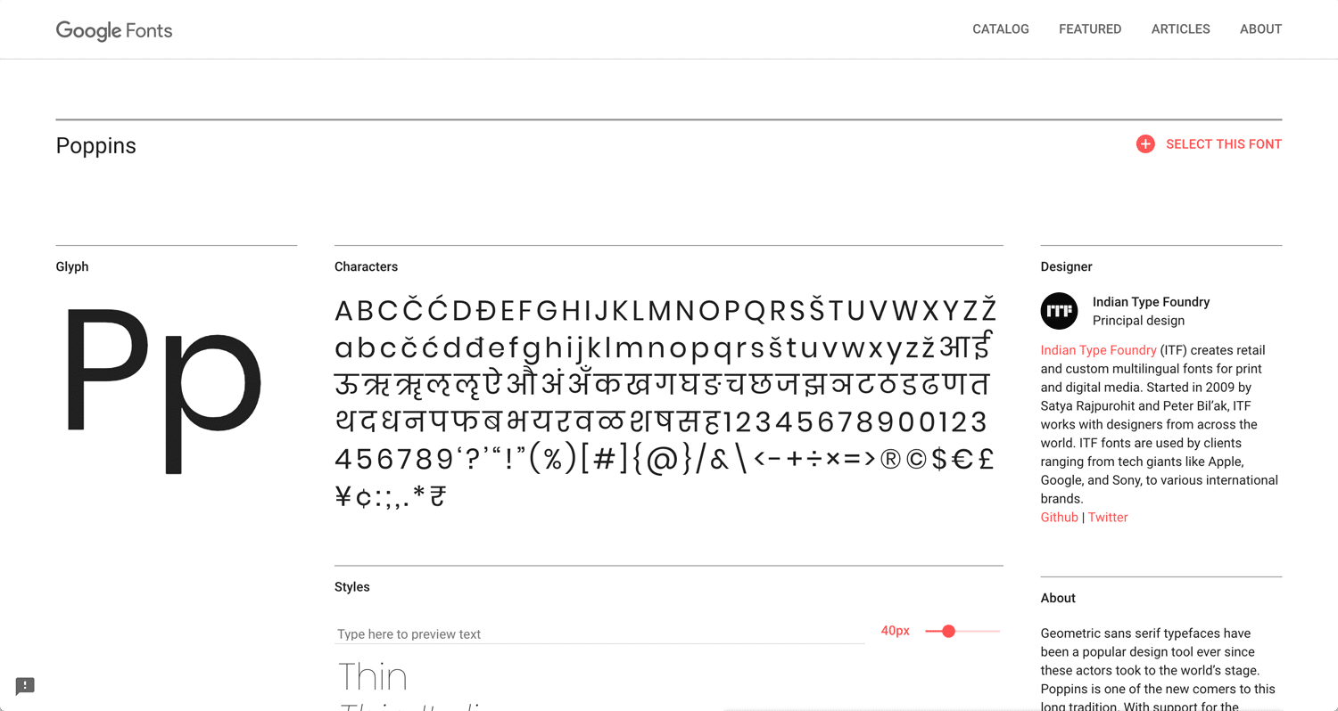
Poppins
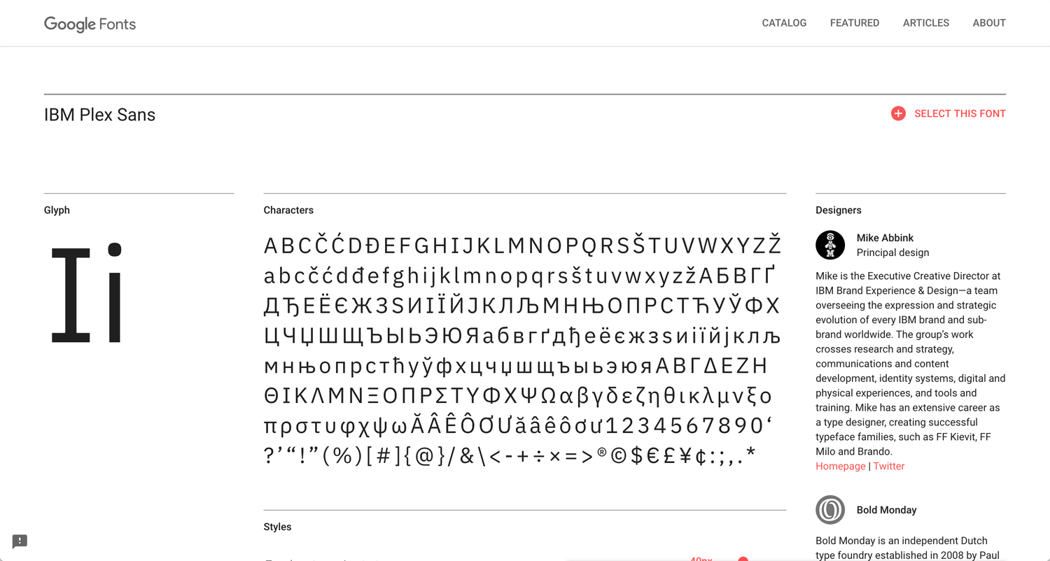
IBM Plex Sans
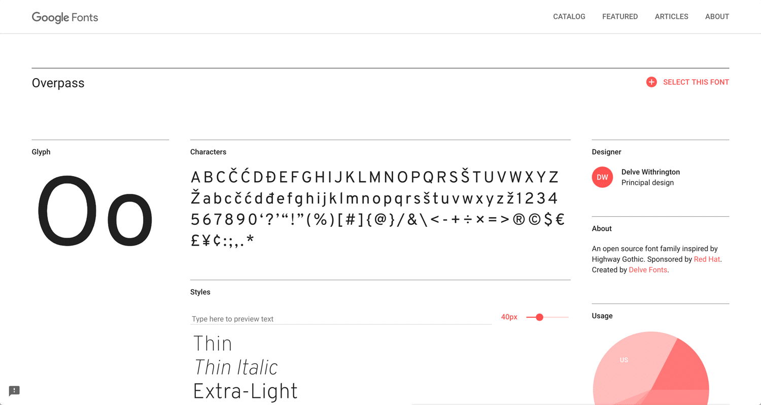
Overpass
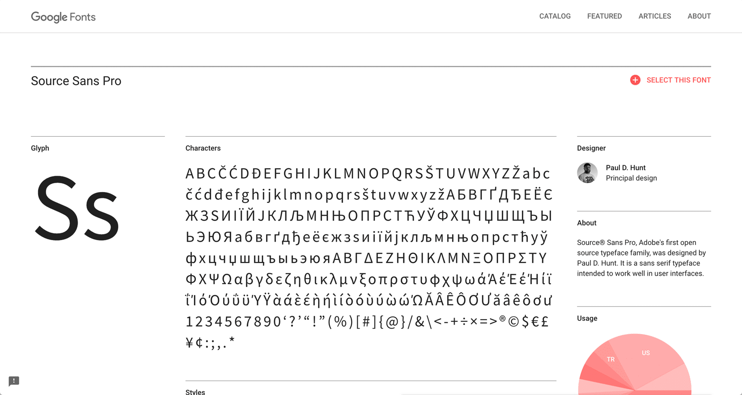
Source Sans Pro
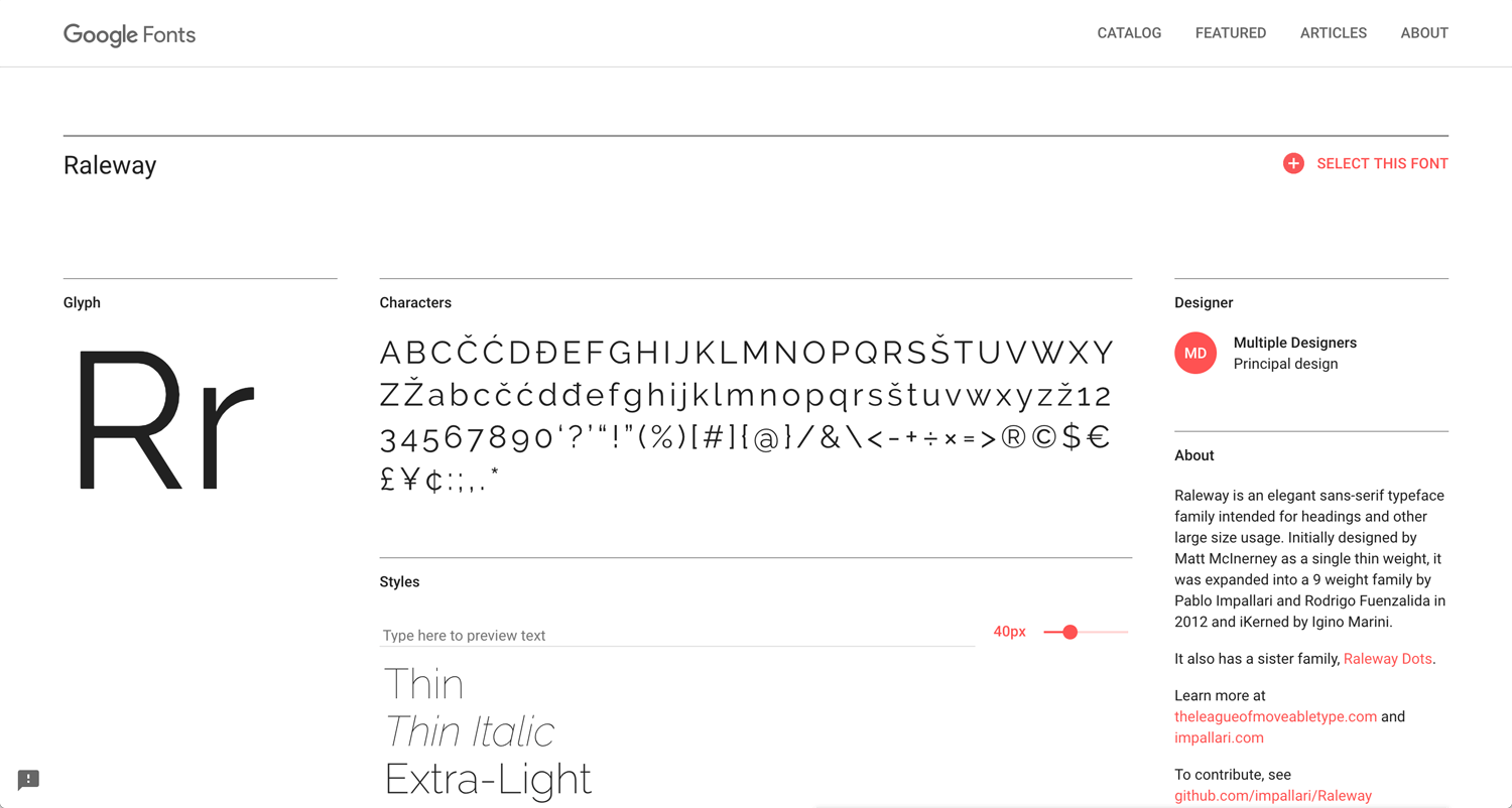
Raleway
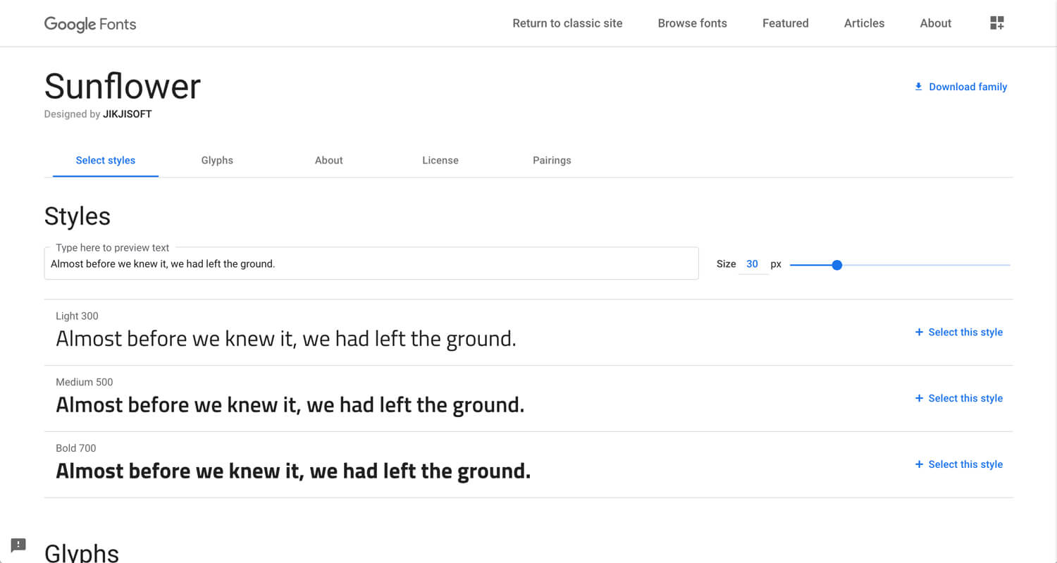
Sunflower
You may use just default fonts, but is it display the client’s voice? I picked up above and these fonts are quite common. Easy to use on any websites. I personally like IBM Plex. It bring a tech atmothphere.
Serif fonts for title
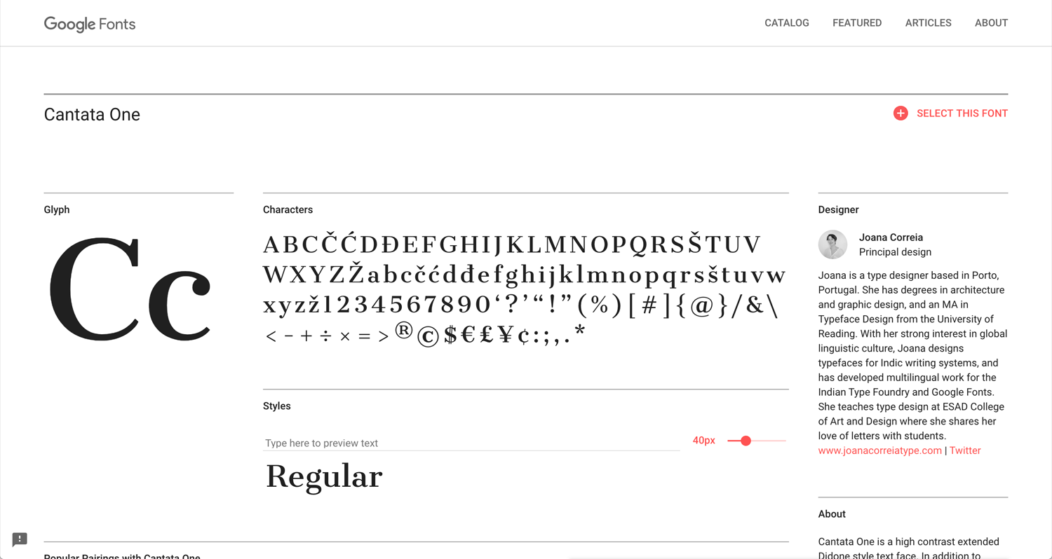
Cantata One(no family)
Self font makes a website more authentic. I feel gothic may more common than self, but I don’t feel any awkward about it. Cantata One looks thick even it has only regular. Therefore, I categorized for title font. Still on going.
Examples:
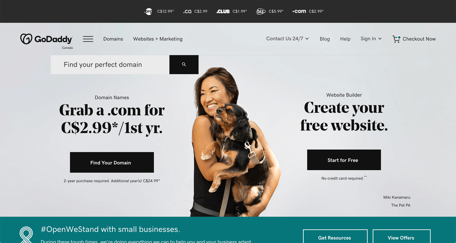
©Godaddy
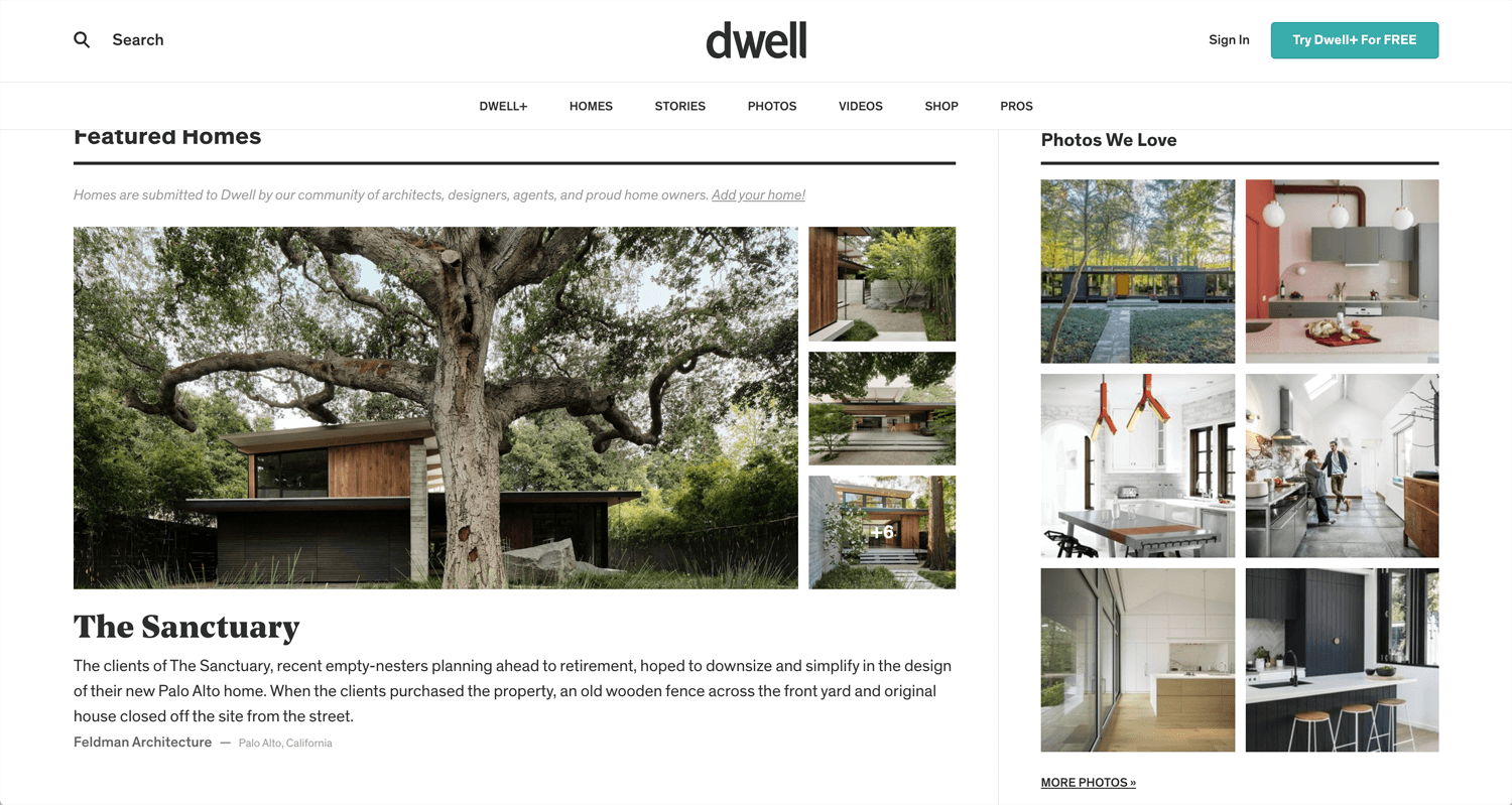
©dwell Magazine
Serif fonts
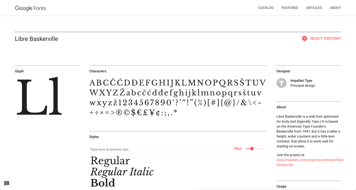
Libre Baskerville
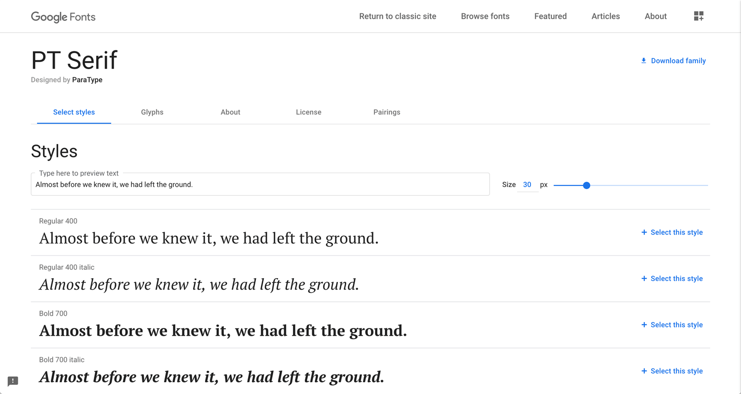
PT Serif
Very traditional and my primary font. The history relates to the book, the part of my name. Garamond, Georgia, Times New Roman are also classic and common.
Baskerville’s typeface was part of an ambitious project to create books of the greatest possible quality. – Wikipedia
Slab serif fonts for title
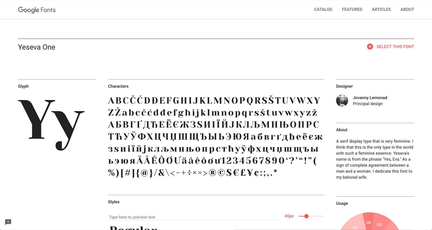
Yeseva One(no family)
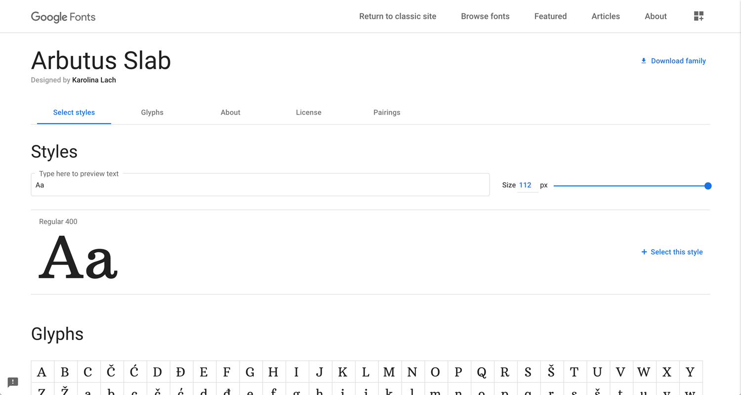
Arbutus Slab(no family)
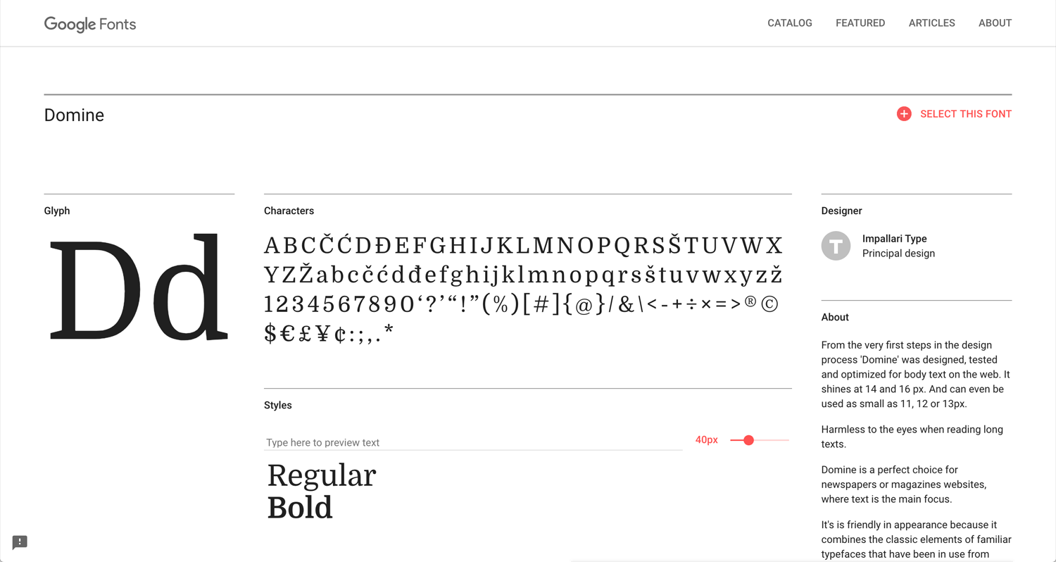
Domine
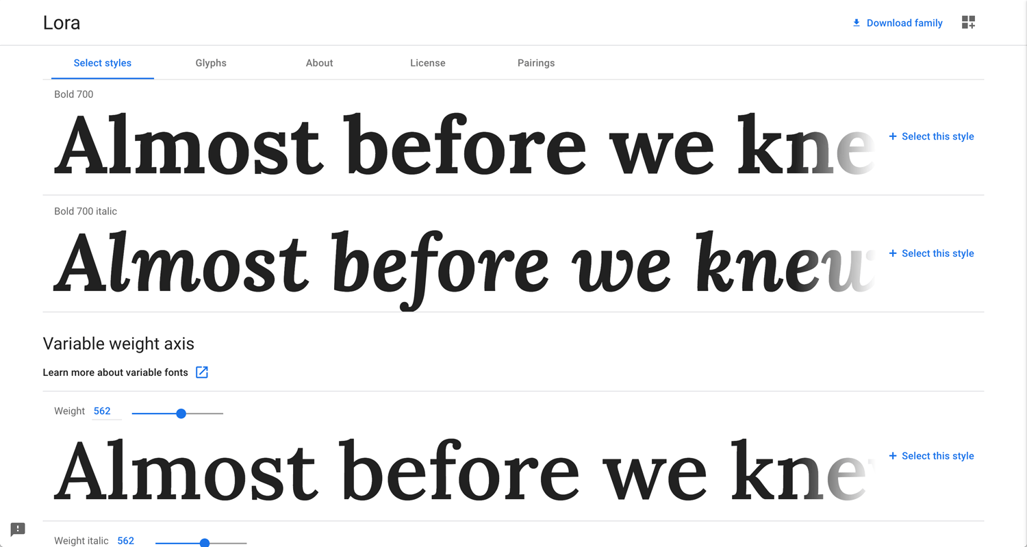
Lora Bold 700
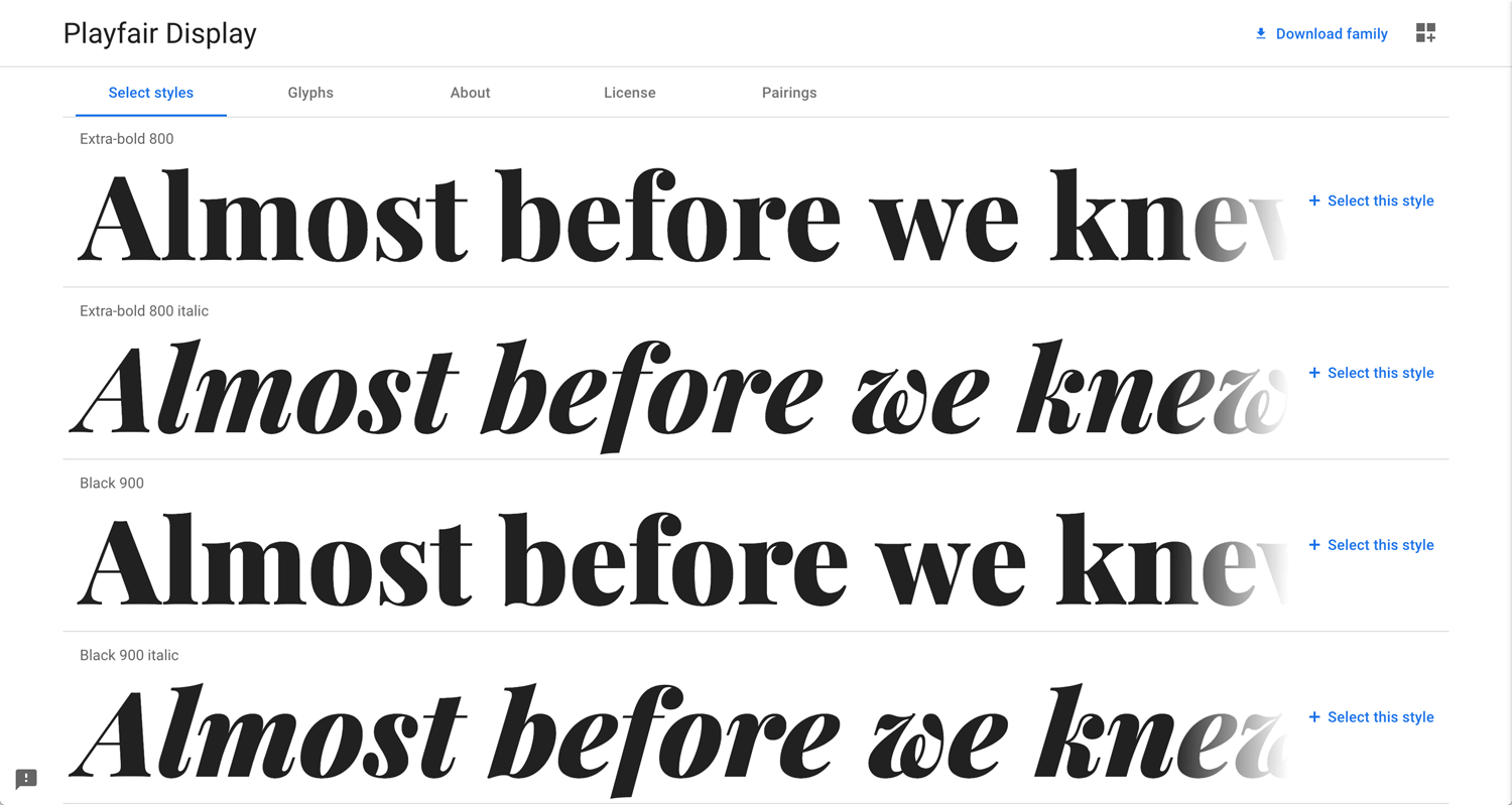
Playfair Display Bold 800
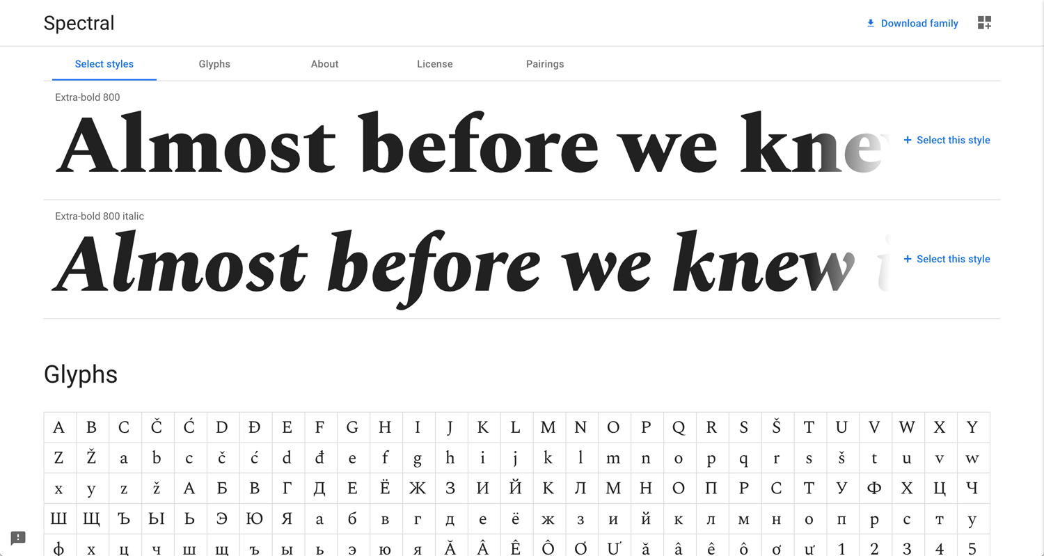
Spectral Extra-bold 800
Slab fonts give impact rather than a common gothic font. I come up with Monocle Magazine at first. I searched it looks Palatino. The combination of slab and gothic will work well. I like the combination rather than the gothic title and gothic body.
Round gothic(Sans-serif) fonts
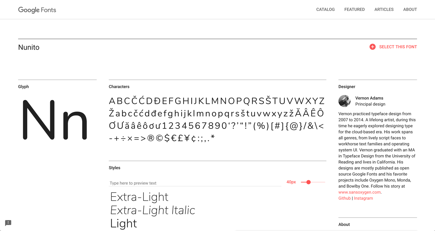
Nunito
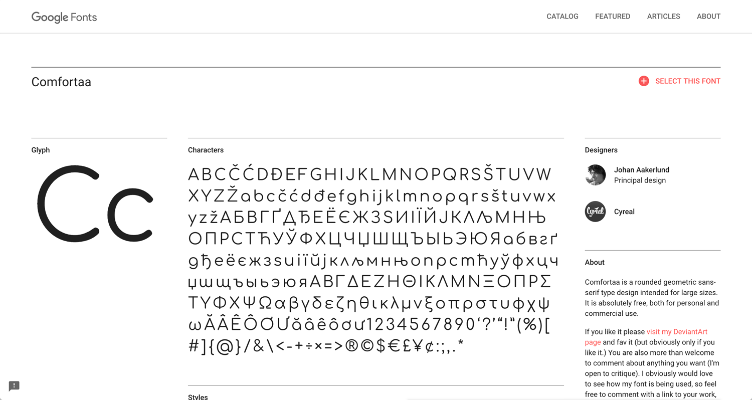
Comfortaa
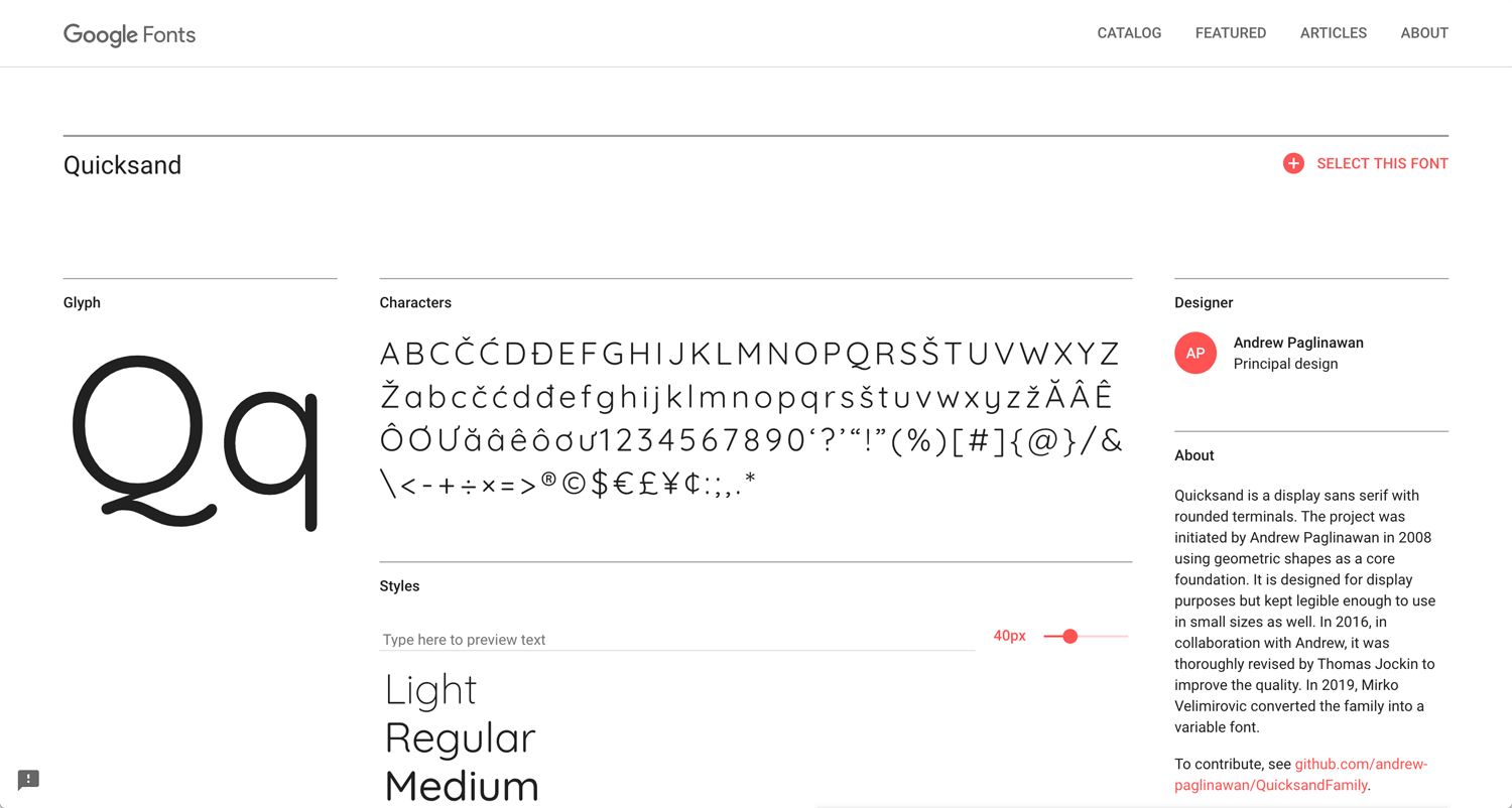
Quicksand
I don’t use these fonts often. It depends on client, business and industry.
Cursive fonts
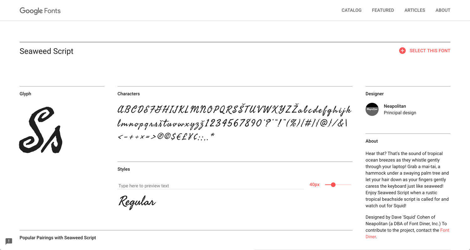
Seaweed Script(no family)
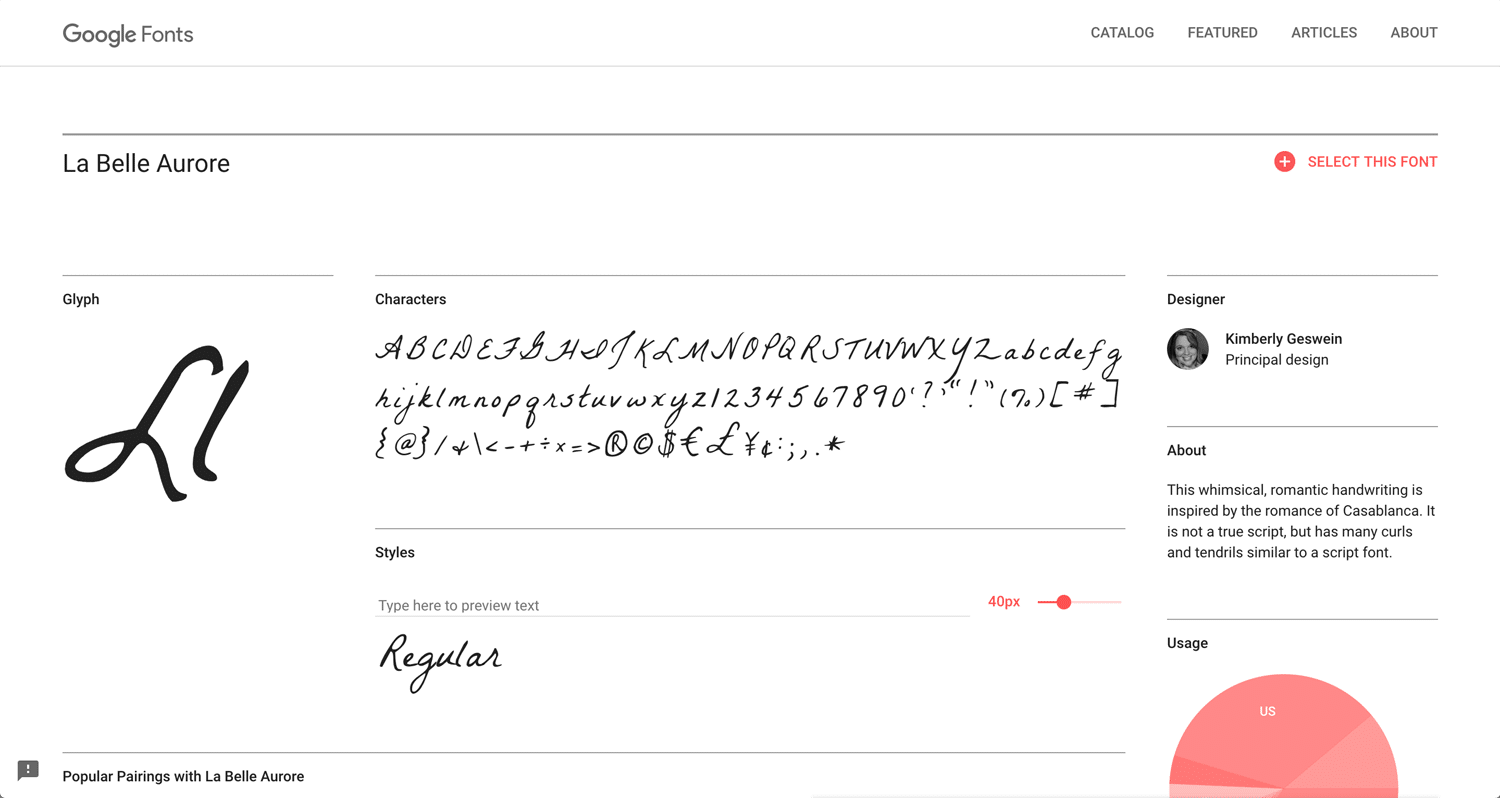
La Belle Aurore(no family)
I am thinking to try to use around the title or vertical letter for accent.
Aaccent fonts
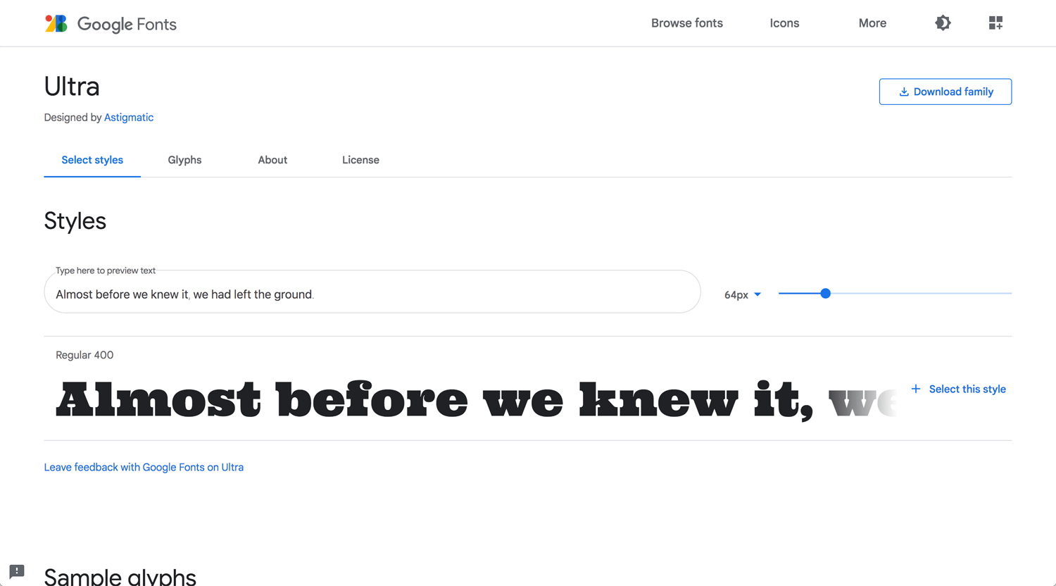
Ultra(no family)
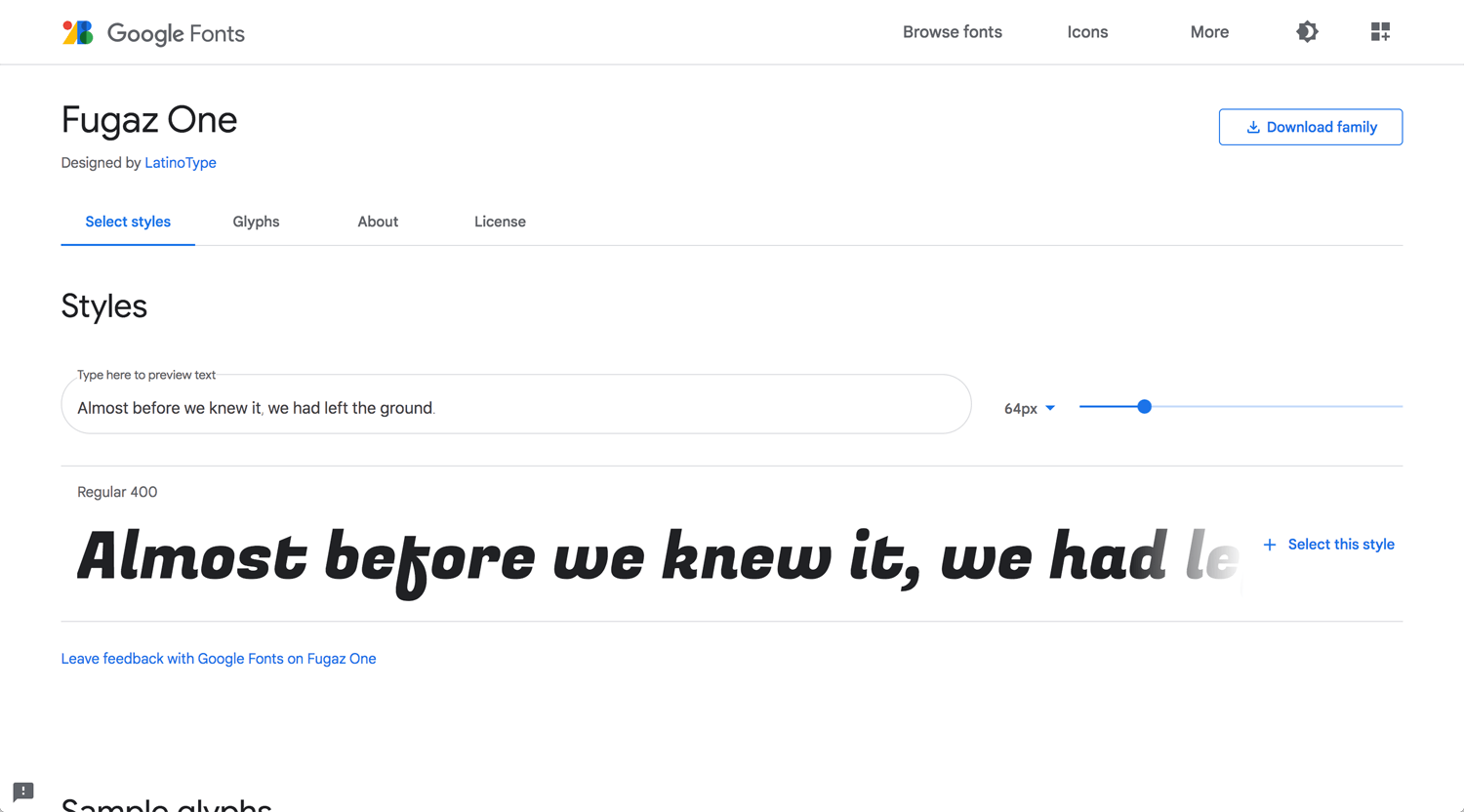
Fugaz One(no family)
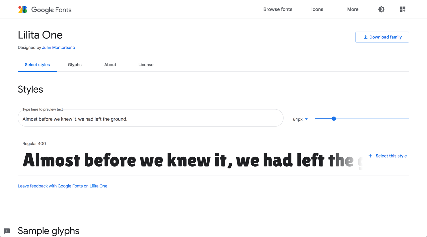
Lilita One(no family)
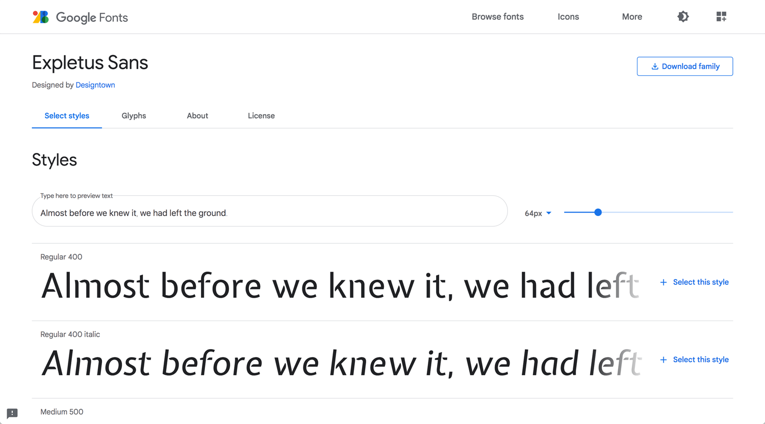
Expletus Sans
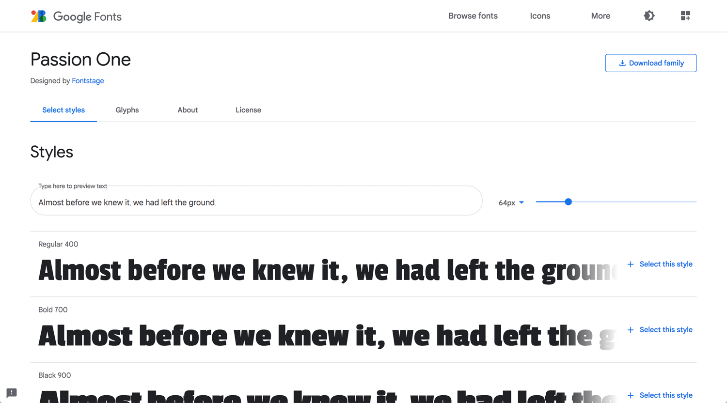
Passion One
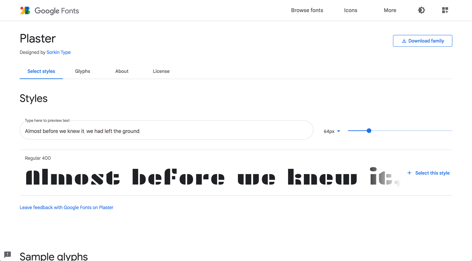
Plaster
Conclusion: Experiment on experience
I know how common font works. Everyone, even non-designer can manage it even though I am not sure they understand hierarchy properly. Therefore, I need to experiment. Trends always exist. Follow it. Then, create it for the next movement.
Reference:
Trend in 2019: Gt America
Traditional font: Copperplate Gothic
Palatino: Designed by Hermann Zapf and published by Linotype
awwwards: 20 Best Google Web Fonts
*I didn’t agree on many above, but I enjoy to look at many fonts.
