Story: Discomfort of design
If you are a graphic designer, you may notice discomfort on kerning, letter spacing or letter heights. However, many people included the client doesn’t know these jargons. Furthermore, they often don’t recognize it. In this situation, it’s difficult to increase estimate by design detail. We have to show more big vision to clients.
I am very enjoying to find the past master of graphic designers. A very beautiful typeface, bold enough and quite catchy. Knowledge and ability are different. However, better than nothing.
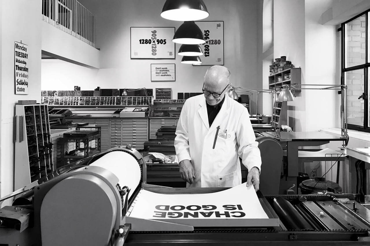
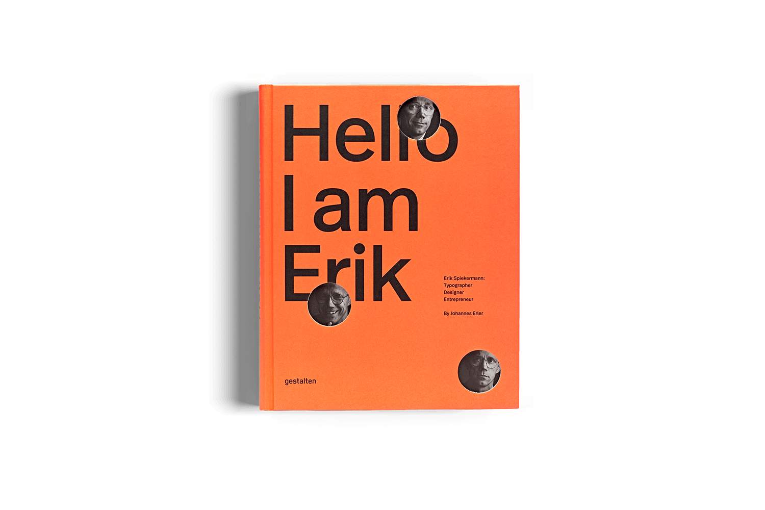
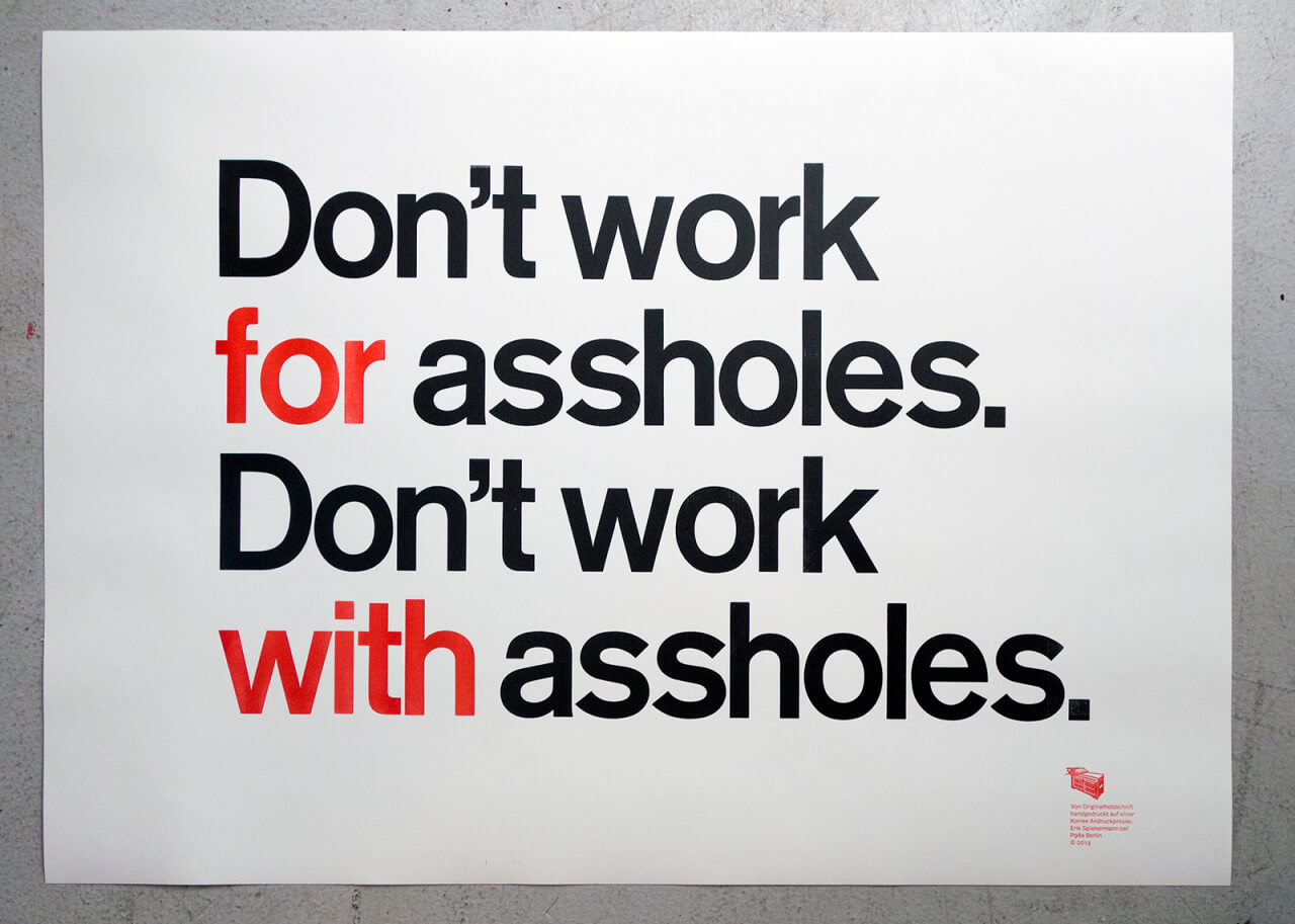
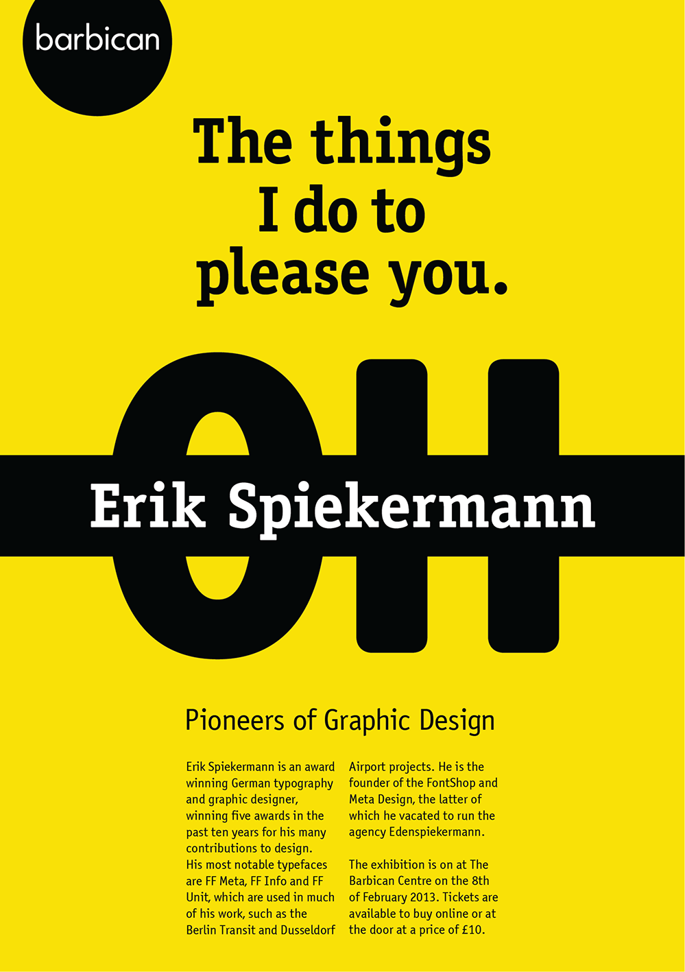
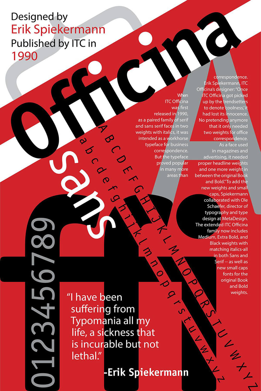
Erik Spiekermann
Rob Janoff is an American graphic designer of corporate logos and identities, printed advertisements and television commercials. He is known for his creation of the Apple logo. – Wikipedia
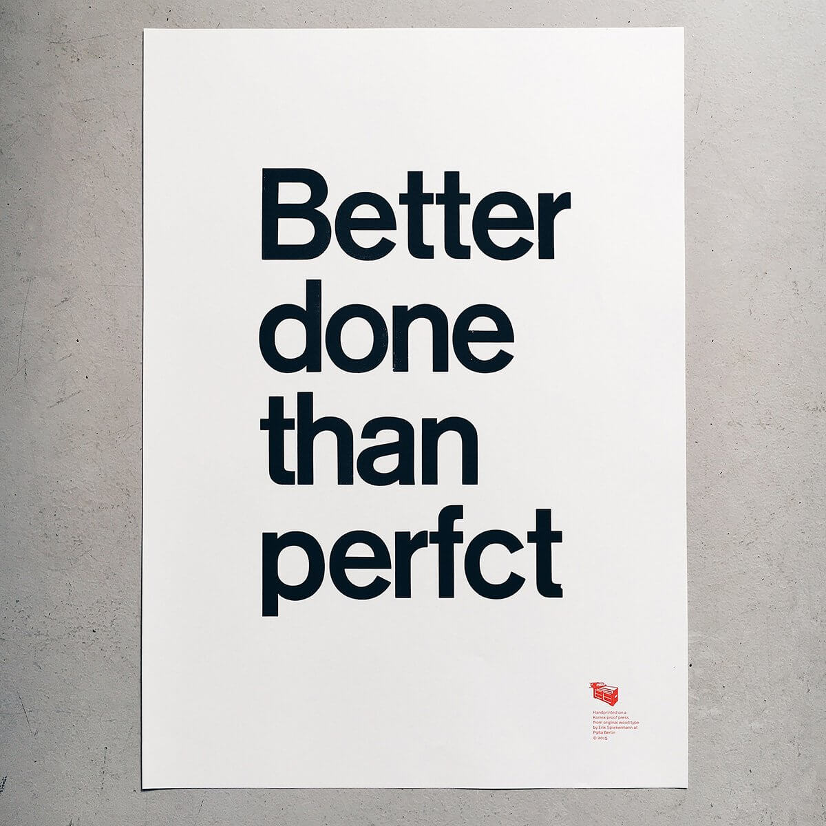
Better Done Than Perfect. This is totaly truth.
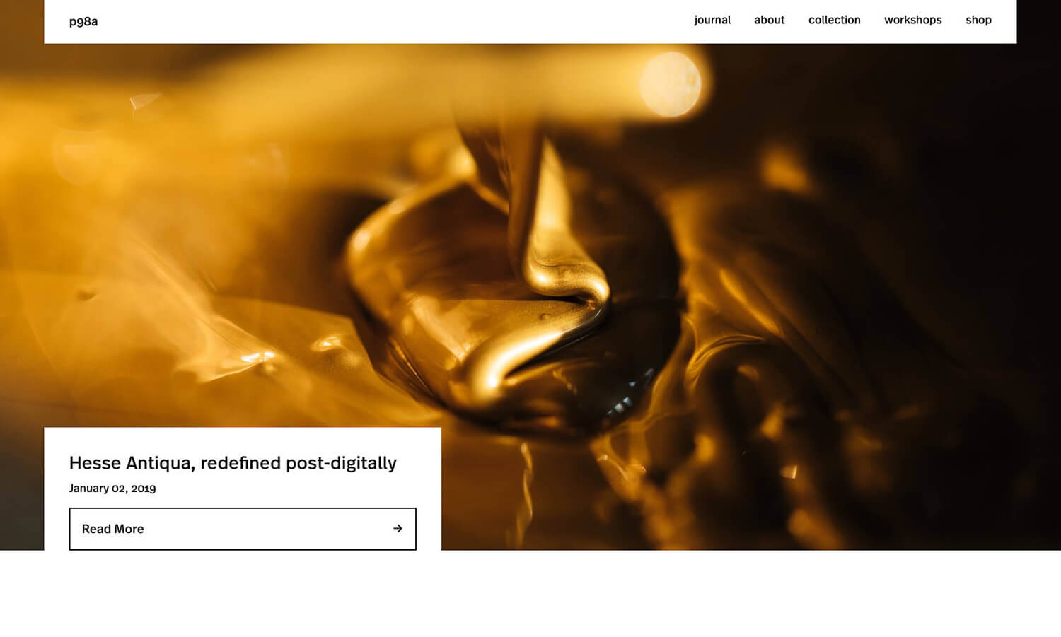
His studio, P98a, is an experimental letterpress workshop in Berlin dedicated to letters, printing and paper in Berlin, capital city of Germany. Strong decision for providing very authentic printing service in 2019. Current designer included me should know the history of printing. It had already started a digital printing when I started my carrer. Senior designer talked me about past design process, how unefficient at that era.
Instead of efficiency, we might loose a sense of detail. P98a website reminds me what important is for graphic designer.
Massimo Vignelli
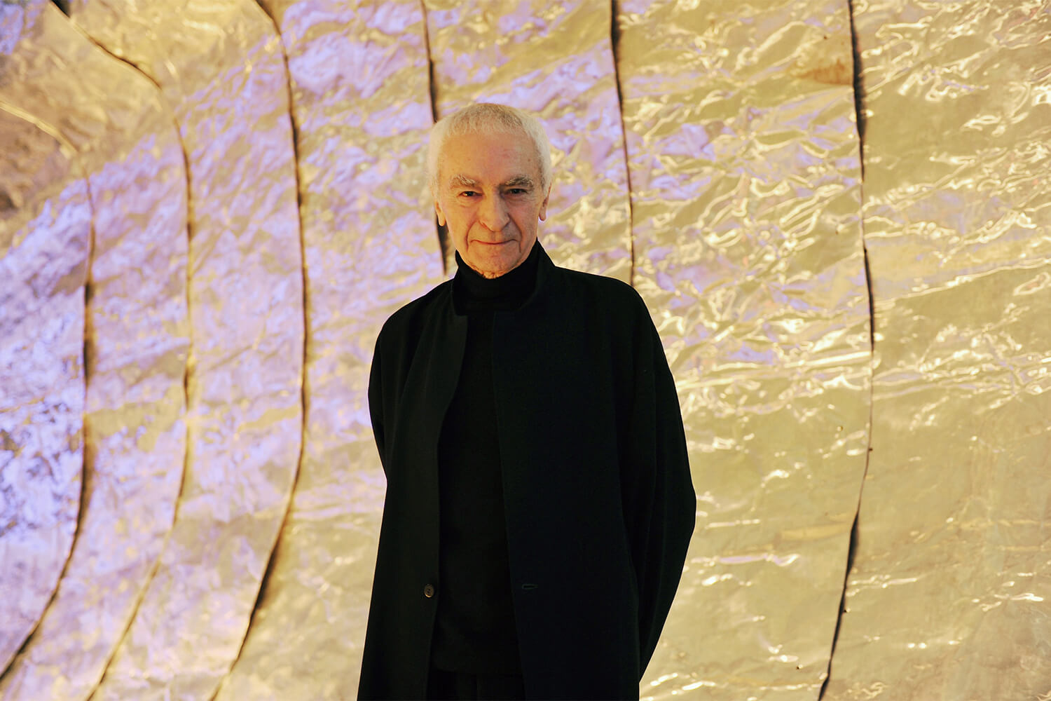
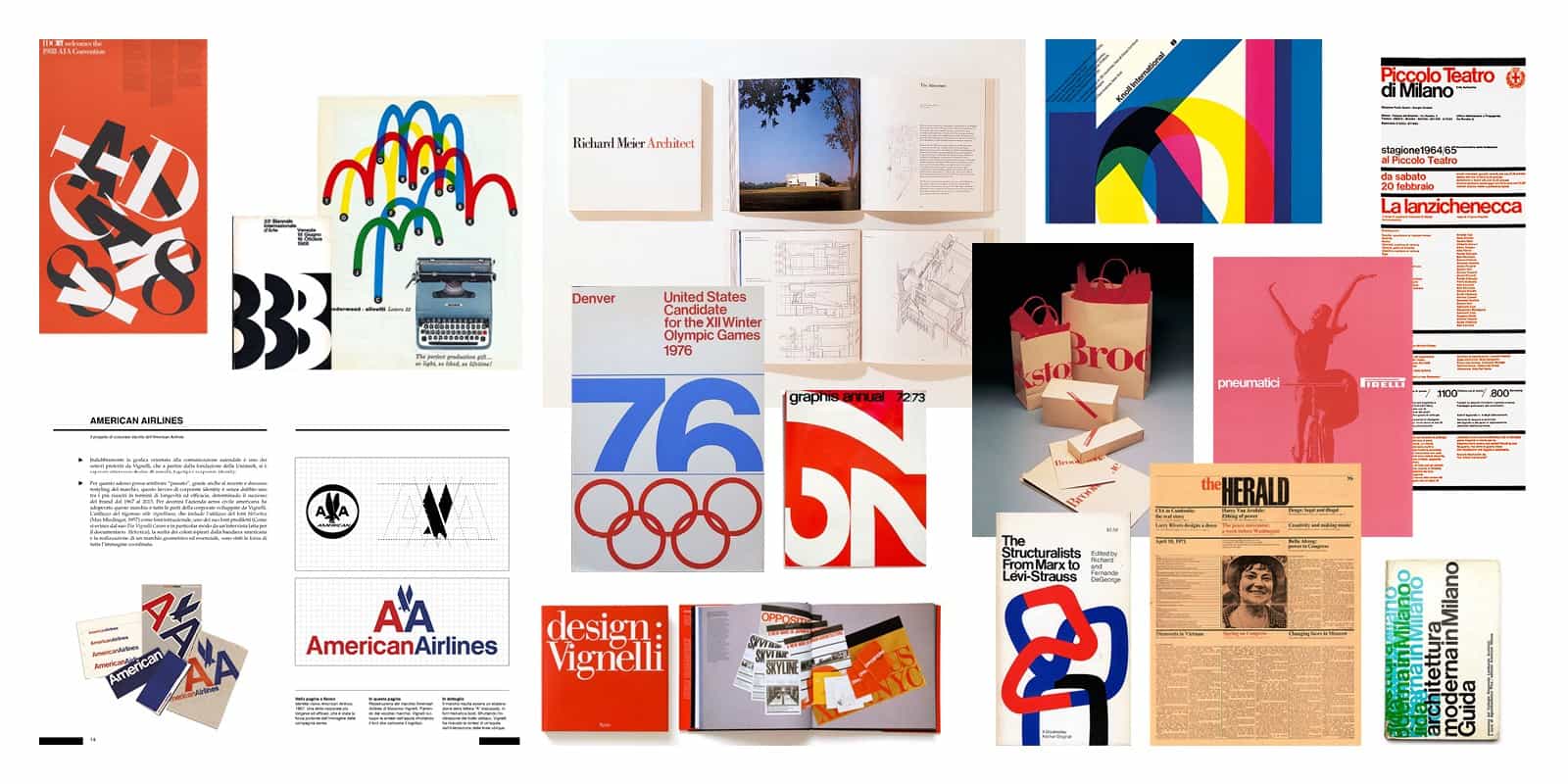

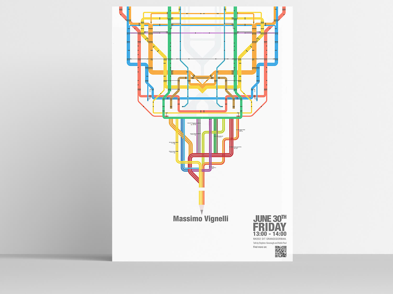
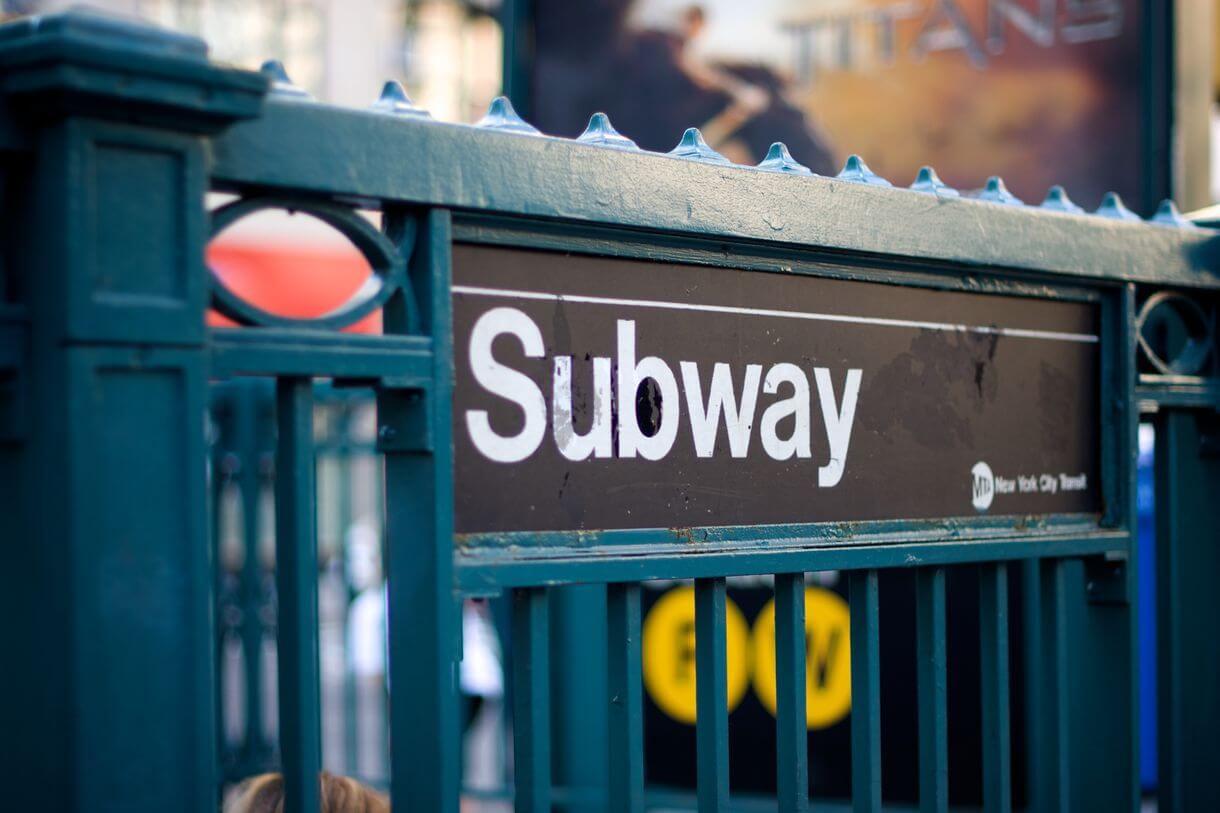
Massimo Vignelli was an Italian designer who worked in a number of areas ranging from package design through houseware design and furniture design to public signage and showroom design. He was the co-founder of Vignelli Associates, with his wife, Lella. – Wikipedia
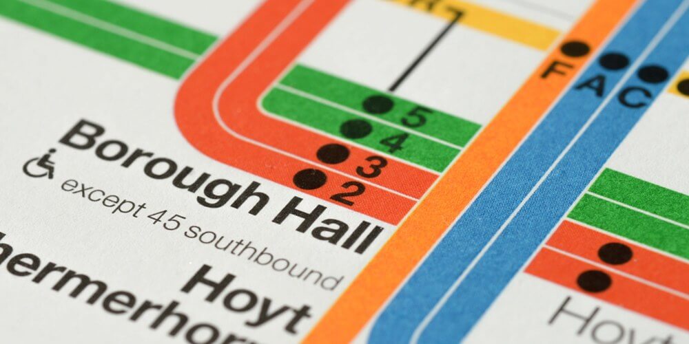
Infographics of new york subway. I personally like this type of design. It belongs to our daily life naturally. No need to stand out, make our life better in complicated sociaty. Don’t need to compete others. Designing for the people.
The Amerian Airline logo, it’s bold and sharp. Futhermore, it embraced history of past logo. On the social media, tiny cut lines of wing may not work, but it’s unevitable. Because no exist social media at that time. Great work!
Milton Glaser
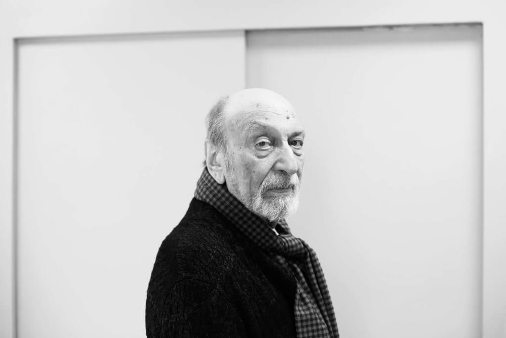
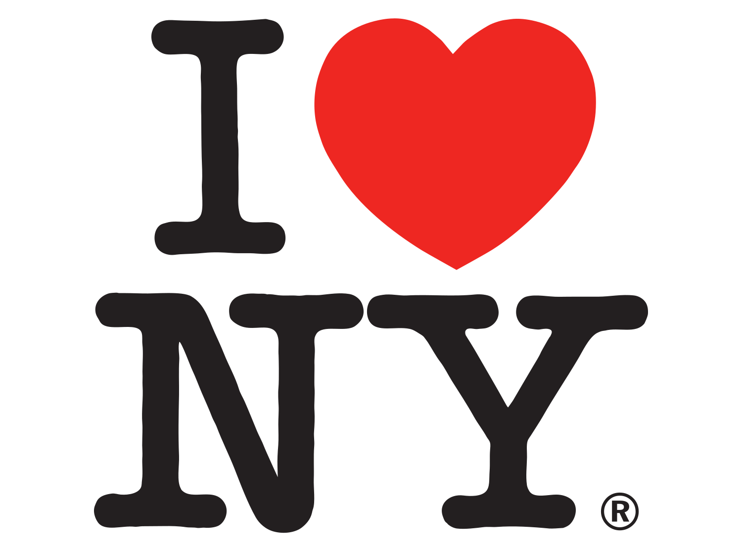
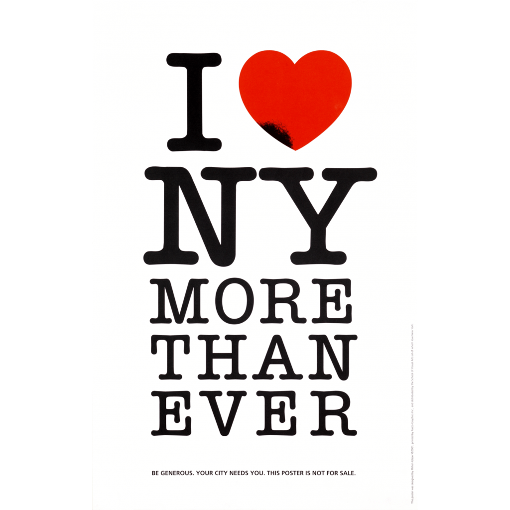
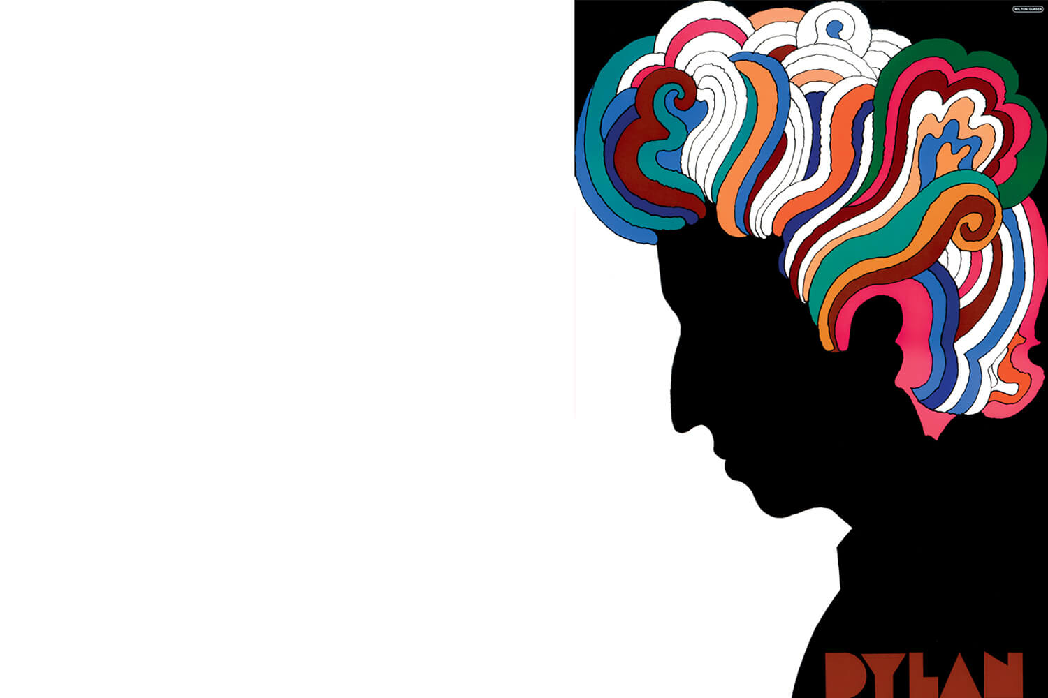
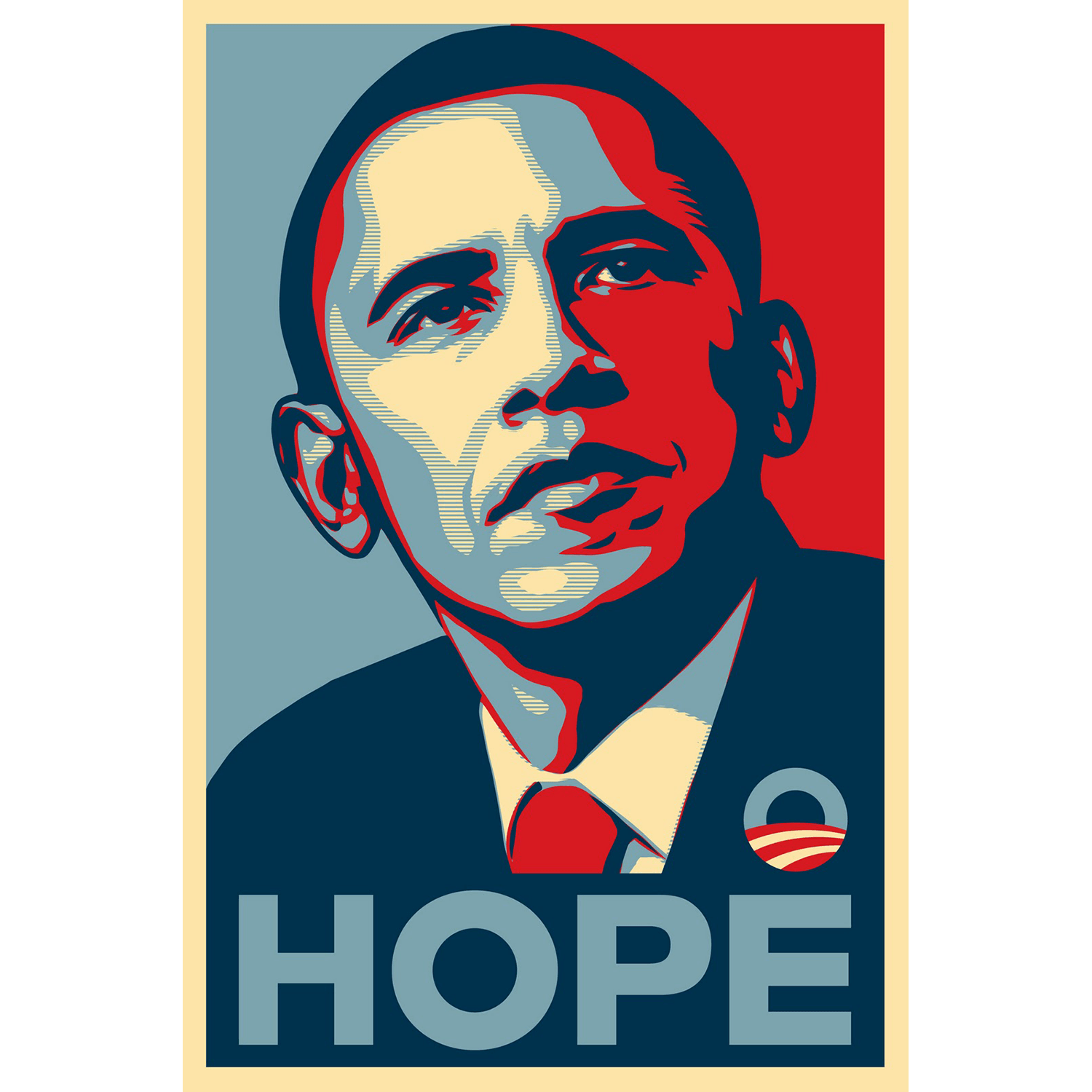
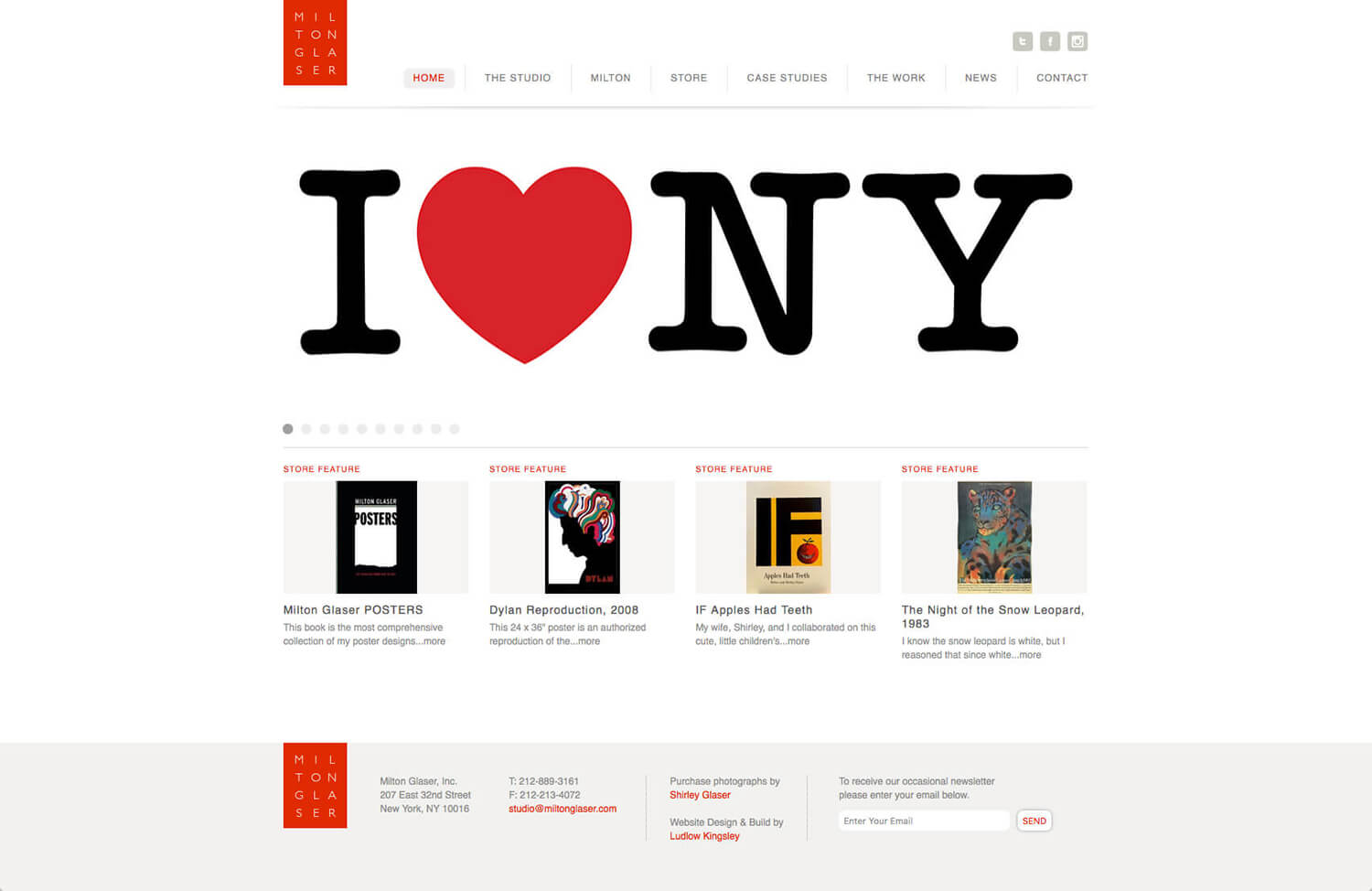
Milton Glaser is an American graphic designer. His designs include the I ❤ NY logo, the psychedelic Bob Dylan poster, and the logos for DC Comics and Brooklyn Brewery. – Wikipedia
Symbol mark of city branding, I Love(icon) NY. I have no doubt that New York is the largest city on the earth. Many people admire American culture. Since 21 century, United States has came back as the most infruence country in the world. It will be continued for a while. New York is the symbol of United States even though many technology companies gather to west coast, L.A., San Fransico and Seattle.
Alan Fletcher
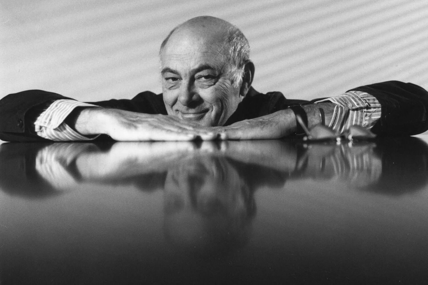
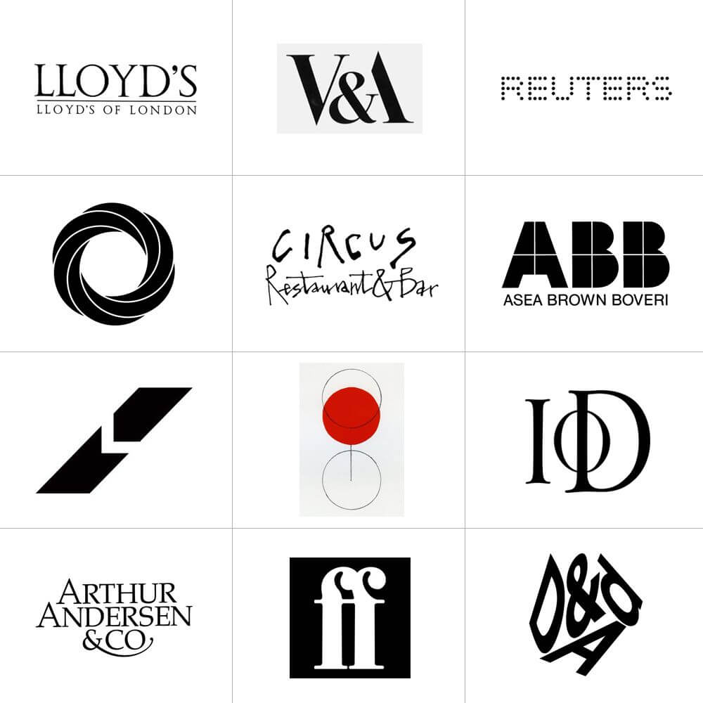
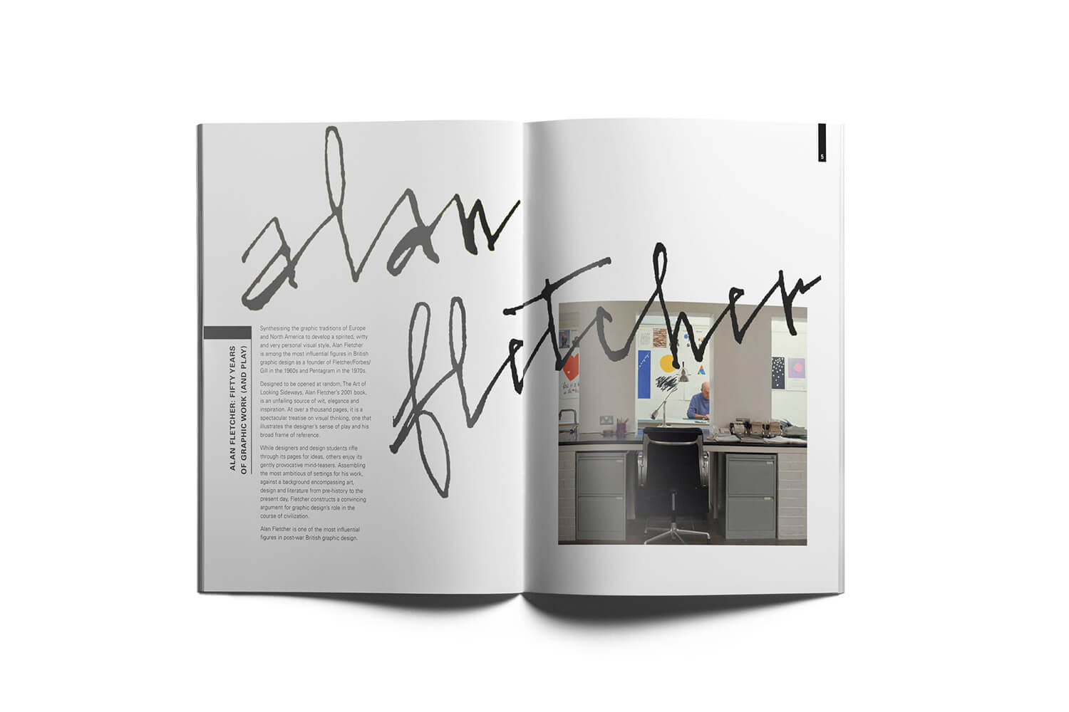
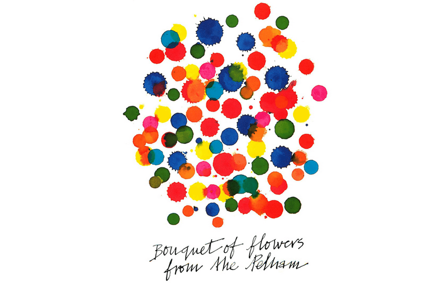
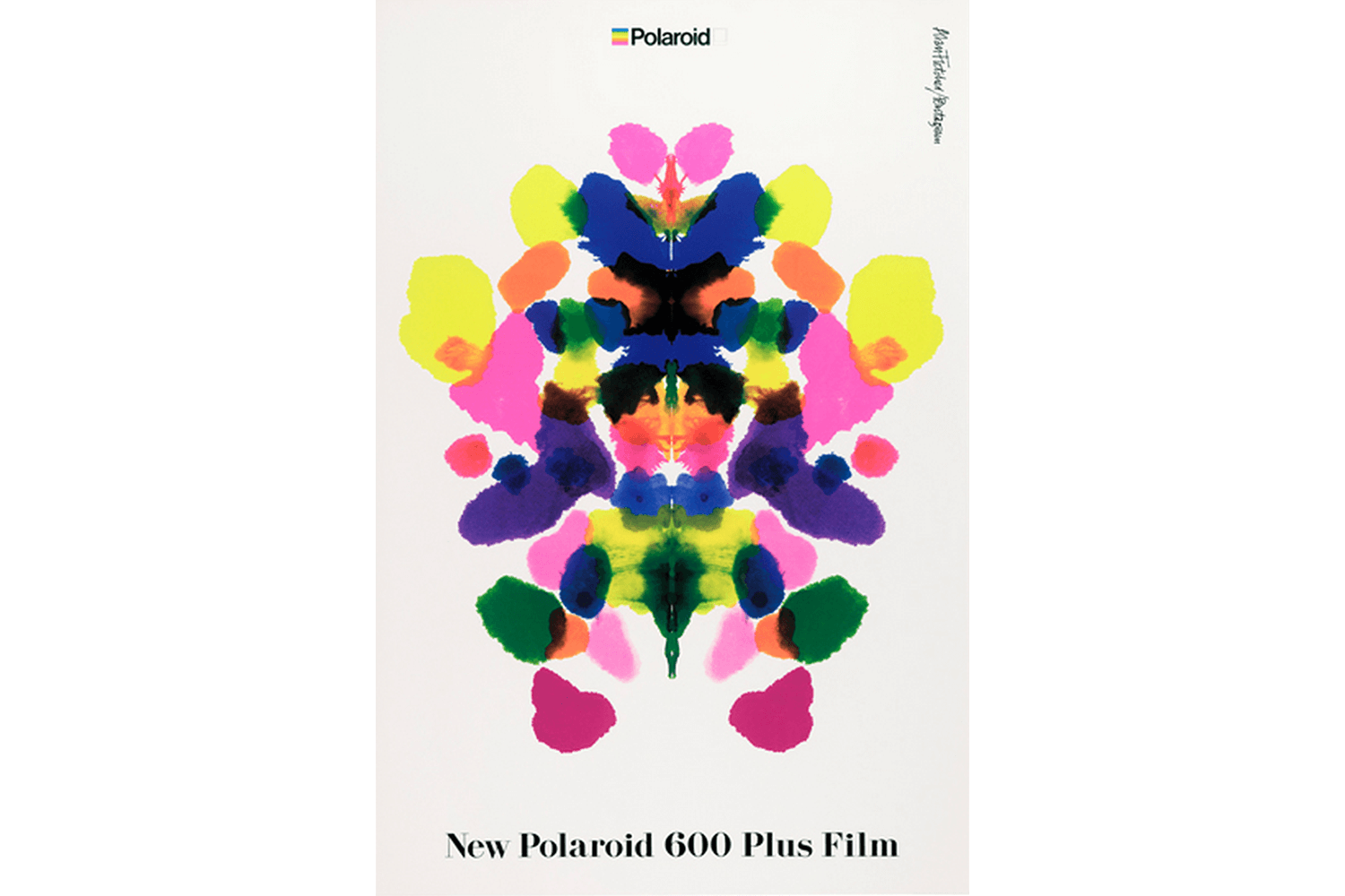
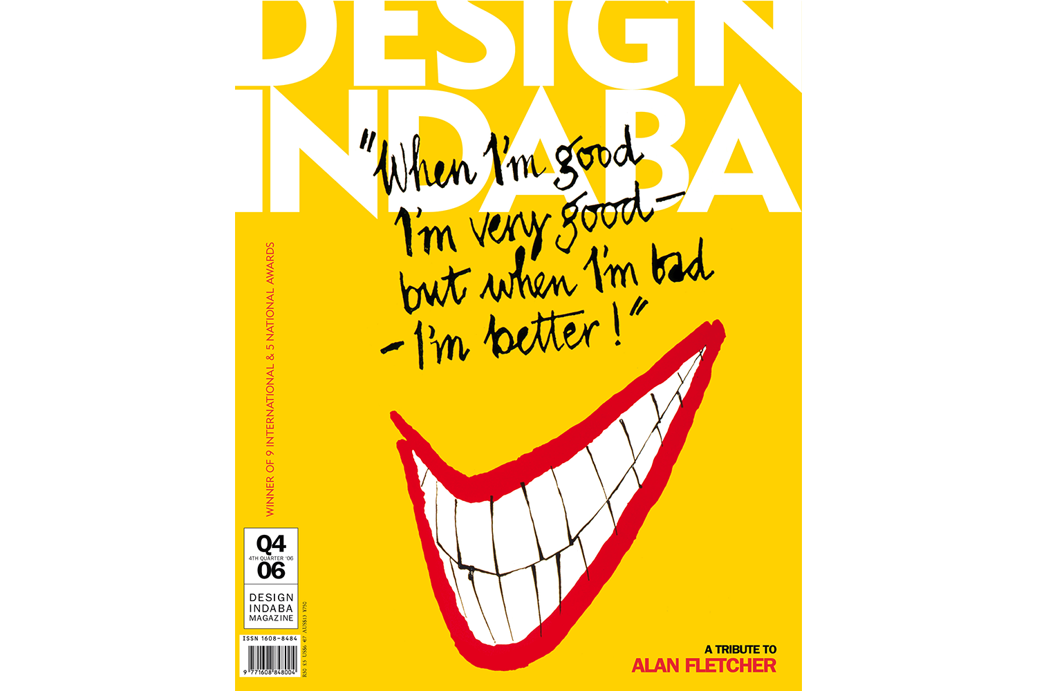
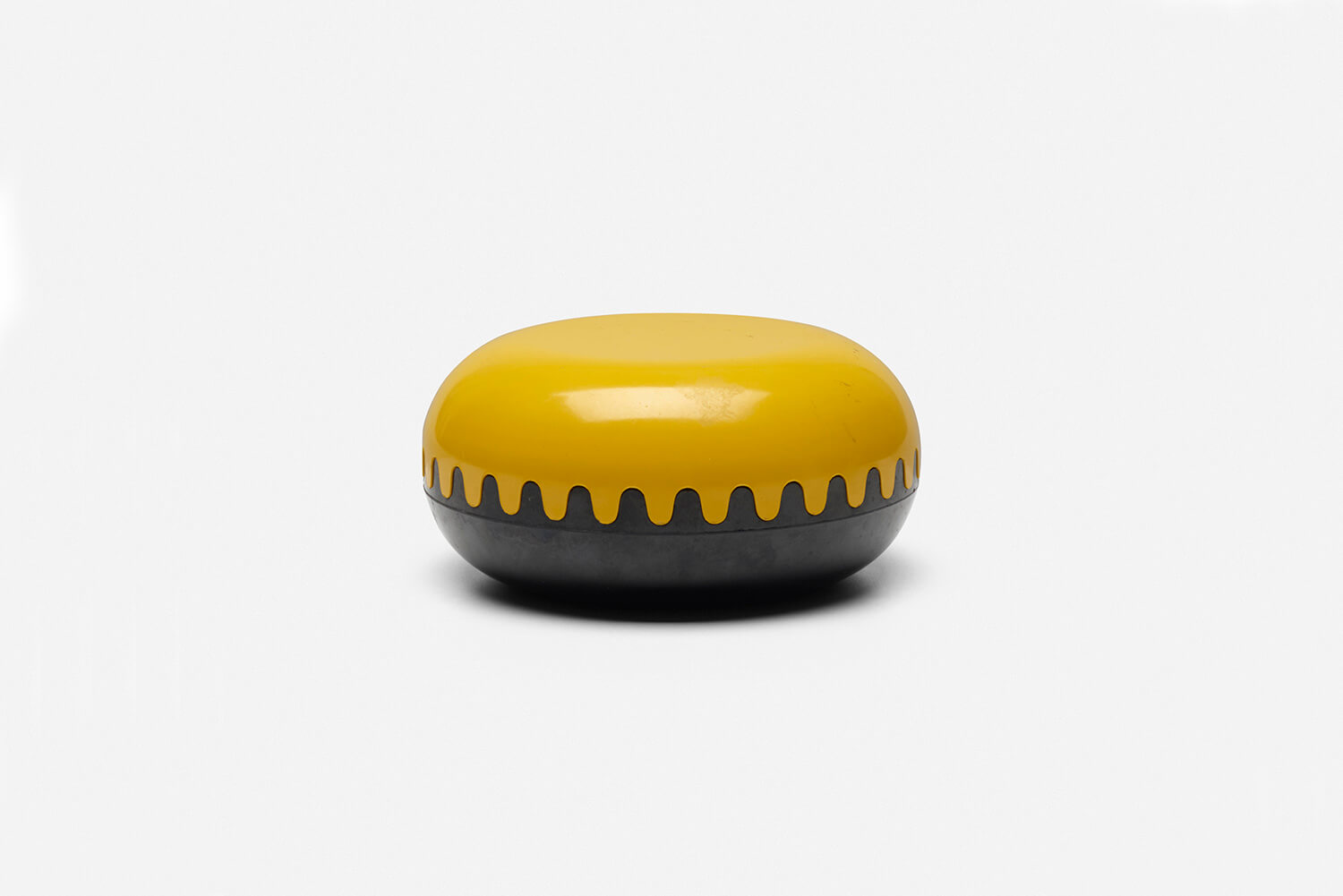
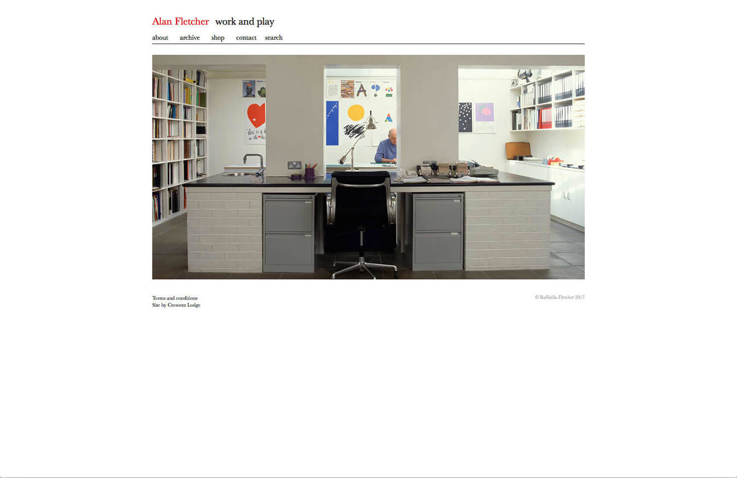
Synthesizing the graphic traditions of Europe and North America to develop a spirited, witty and very personal visual style, Alan Fletcher is among the most influential figures in British graphic design as a founder of Fletcher/Forbes/Gill in the 1960s and Pentagram in the 1970s. – ©Raffaella Fletcher 2017
I like Alan Fletcher’s drawing and handwriting more than logos. Playful. I took a look on website, Poster of London Transit caught my attention, eye catch visual and one word. Client normally wants to say a lot. The posters condence a strong message.
Armin Hofmann
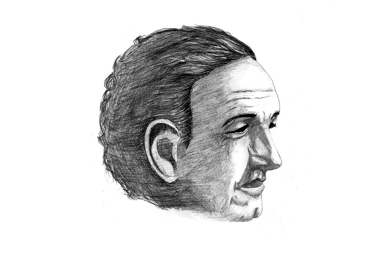
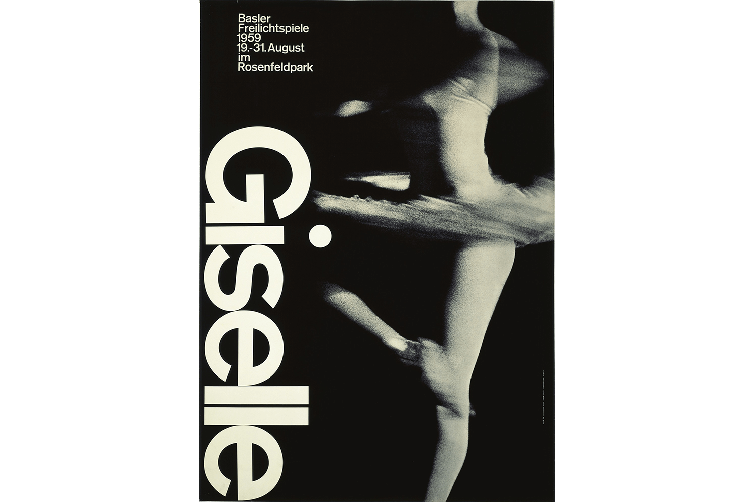
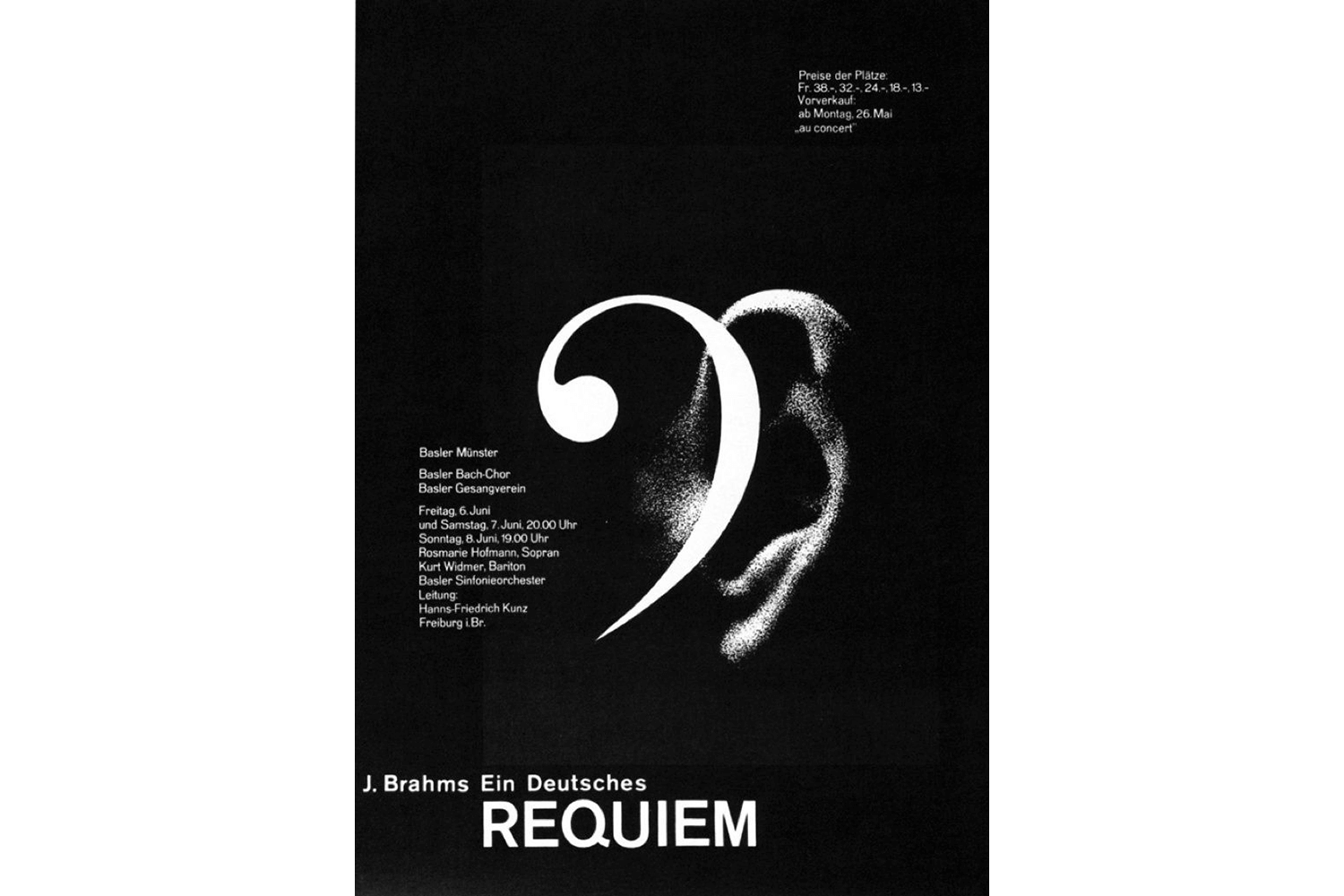
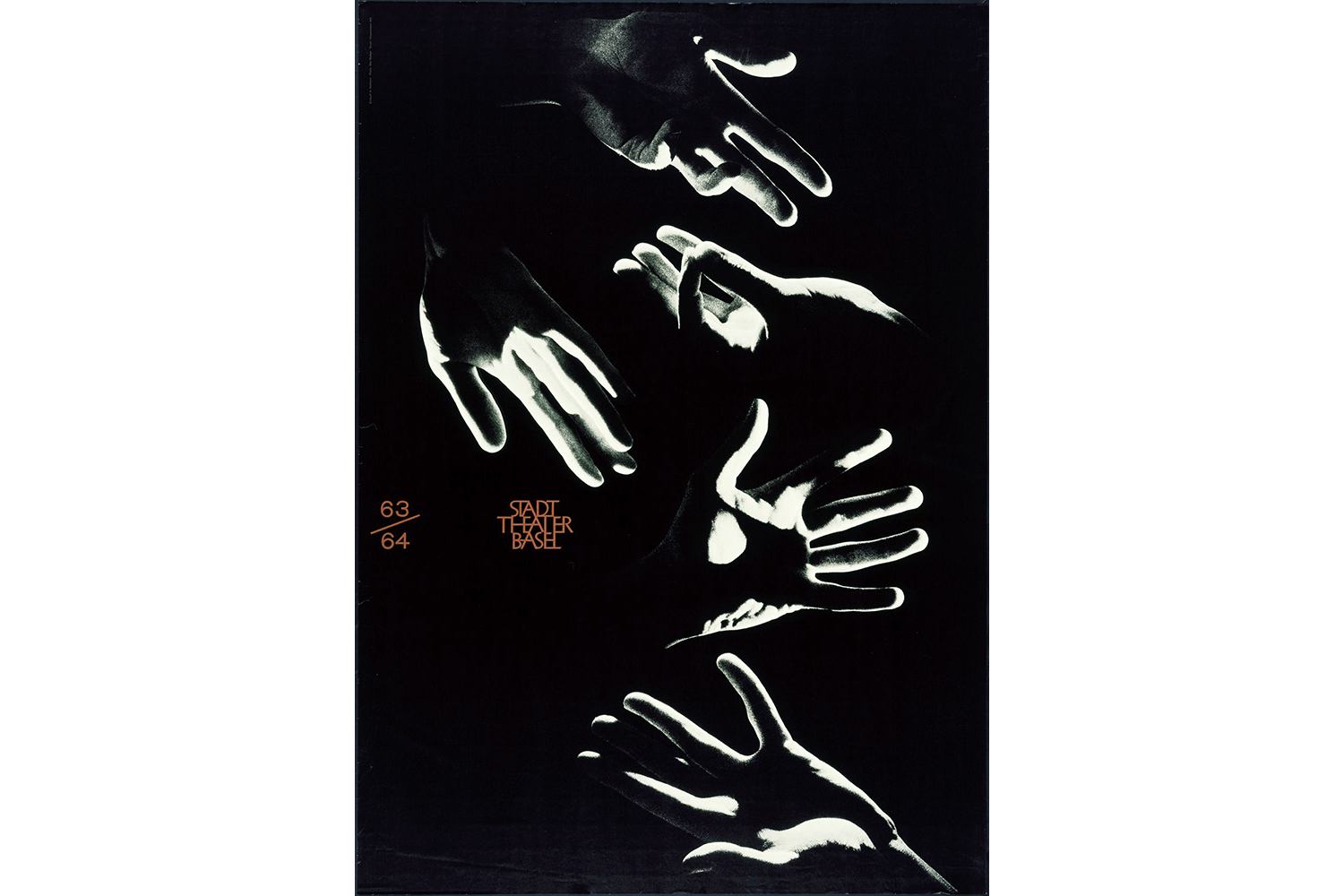
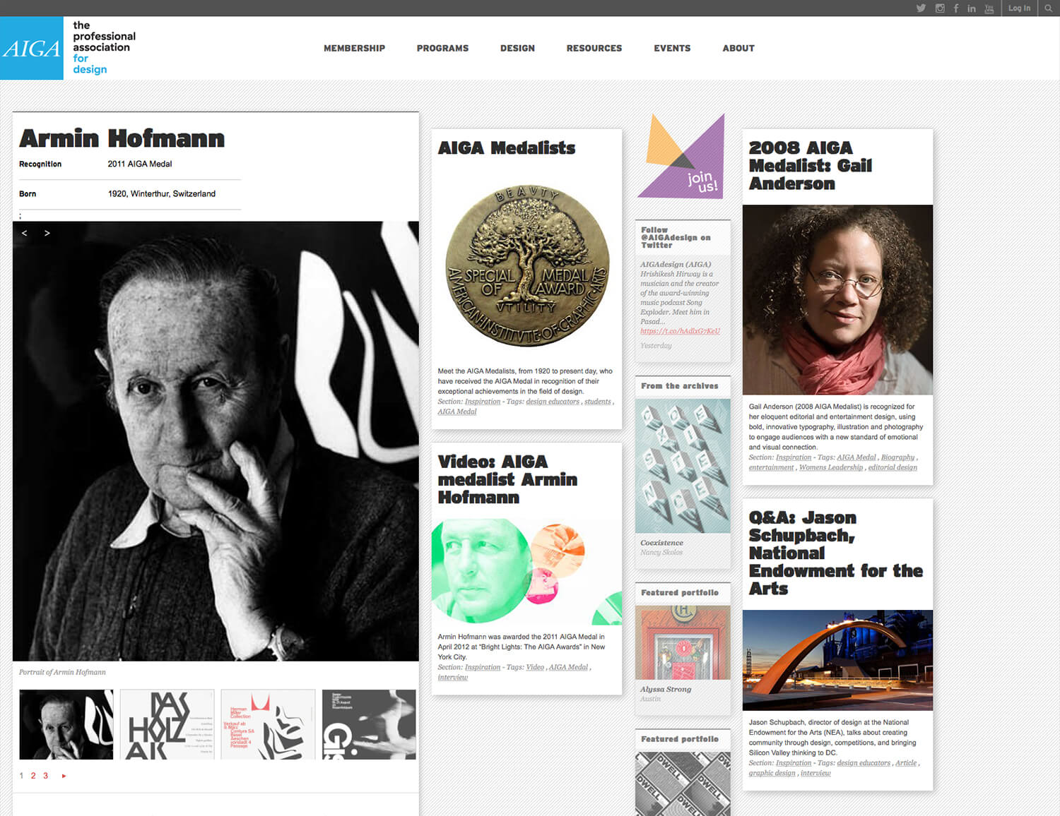
Armin Hofmann is a Swiss graphic designer. He began his career in 1947 as a teacher at the Allgemeine Gewerbeschule Basel School of Art and Crafts at the age of twenty-six. Hofmann followed Emil Ruder as head of the graphic design department at the Schule für Gestaltung Basel (Basel School of Design) and was instrumental in developing the graphic design style known as the Swiss Style. – Wikipedia
Classic, but Armin Hofmann poster will stand out even in 21 century. Currently, we have a lot of tools and information for designing, but our work cannot win his work. Silence, but boldness. I want to take a look these prints.
Conclusion: Relation to current
I saw a lot of graphic design when I was student, but I didn’t know these graphic designer. Now I feel how graphic designer in abroad influenced to Japanese graphic designer. Then, these graphic design which I saw will influence to my design inspiration near futue. Life is design, design is life!
