Overview: What is Google?
Google LLC is an American multinational technology company that specializes in Internet-related services and products, which include online advertising technologies, search engine, cloud computing, software, and hardware. Google was founded in 1998 by Larry Page and Sergey Brin while they were Ph.D. students at Stanford University in California. Together they own about 14 percent of its shares and control 56 percent of the stockholder voting power through supervoting stock. They incorporated Google as a privately held company on September 4, 1998.
An initial public offering (IPO) took place on August 19, 2004, and Google moved to its headquarters in Mountain View, California, nicknamed the Googleplex. In August 2015, Google announced plans to reorganize its various interests as a conglomerate called Alphabet Inc. Google is Alphabet’s leading subsidiary and will continue to be the umbrella company for Alphabet’s Internet interests. Sundar Pichai was appointed CEO of Google, replacing Larry Page who became the CEO of Alphabet.
Google: Evolving the Google Identity
Analyze: How transformed?
Challenge:
– A scalable mark that could convey the feeling of the full logotype in constrained spaces.
– The incorporation of dynamic, intelligent motion that responded to users at all stages of an interaction.
– A systematic approach to branding in our products to provide consistency in people’s daily encounters with Google.
– A refinement of what makes us Googley, combining the best of the brand our users know and love with thoughtful consideration for how their needs are changing.
Before

After

In 1998, Google was founded. Surprisingly, Google already used basic color combinations which current logo shows. The typeface was Baskerville Bold. The typeface changed to the Catull in 1999. The Catull was used until 2015. Then, Google switched to a modern, geometric sans-serif typeface called Product Sans (and also used for the Alphabet logo), created in-house at Google.
The rotating ‘e’ makes the feeling more human center. It similar image of smile logo of Amazon. Google installs Product Sans on the Google Pixel. It’s a good synergy of brand and service, convince hardware and software. Google also implies color to the icon of all service. There is a huge range of services, but it designed typing Product Sans after the wordmark. The icons have a Google color. A user can recognize them as Google easily.
Opinion: Color branding

What I’m impressed:
– People can recognize Google brand even only color
– Changed the dictionary (became a verb)
– Changed the world
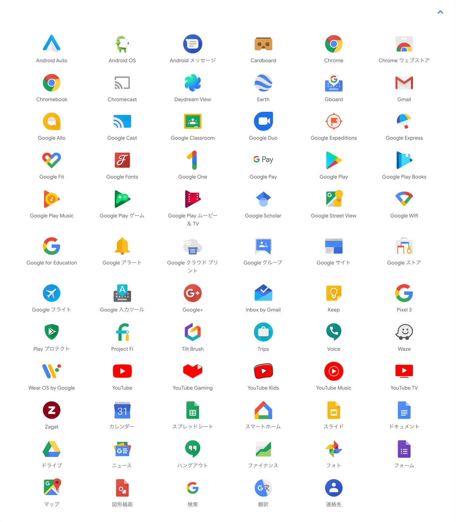
As you see, we can recognize Google brand. Some of them are mergers and acquisitions. That’s why looks different, but it’s okay. Consistency is important. but playful is also important. Especially Google culture. You can see it at Google Doodle.
I admire one-word logomark. G=Google, f=facebook and m=McDonald’s. I would like to try this for branding in the future.
Conclusion: Google mission
Google’s mission is to organize the world’s information and make it universally accessible and useful.
Recap: What did I learn?
1. Color (not shape) become brand
2. We can use 4 colors for logo (maximum?)
3. Brand become the word in the dictionary
Reference:
WIRED: How Google Got Its Colorful Logo
Cuora: Why did they choose two blue, two red, and only one green and yellow color?
