Takashi Hirakimoto 2.0 by Webflow
Keep Learning Webflow & Display What I Can Provide.
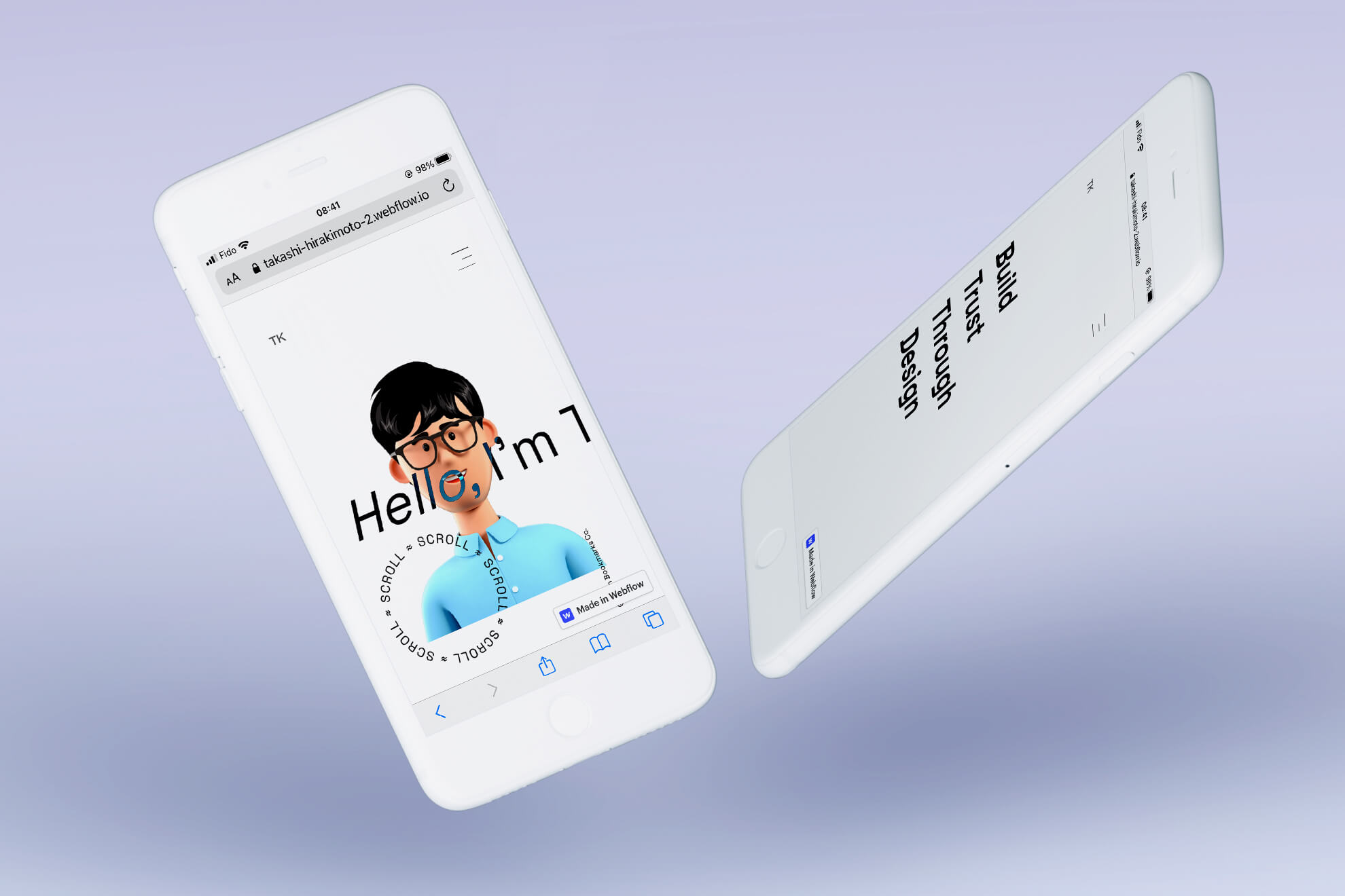
Website: Takashi Hirakimoto 2.0
Overview
I have started learning Webflow (no-code CMS) in the summer of 2019. I tried to meet a client’s request which need an interactive website rather than MVP(minimum valuable product) or standard WordPress website. Since then, Webflow is growing the business successfully as a startup. Webflow users steadily expand in the world. As a result, a good amount of clients require Webflow development experience in fall 2021 when I look for the project on Upwork.
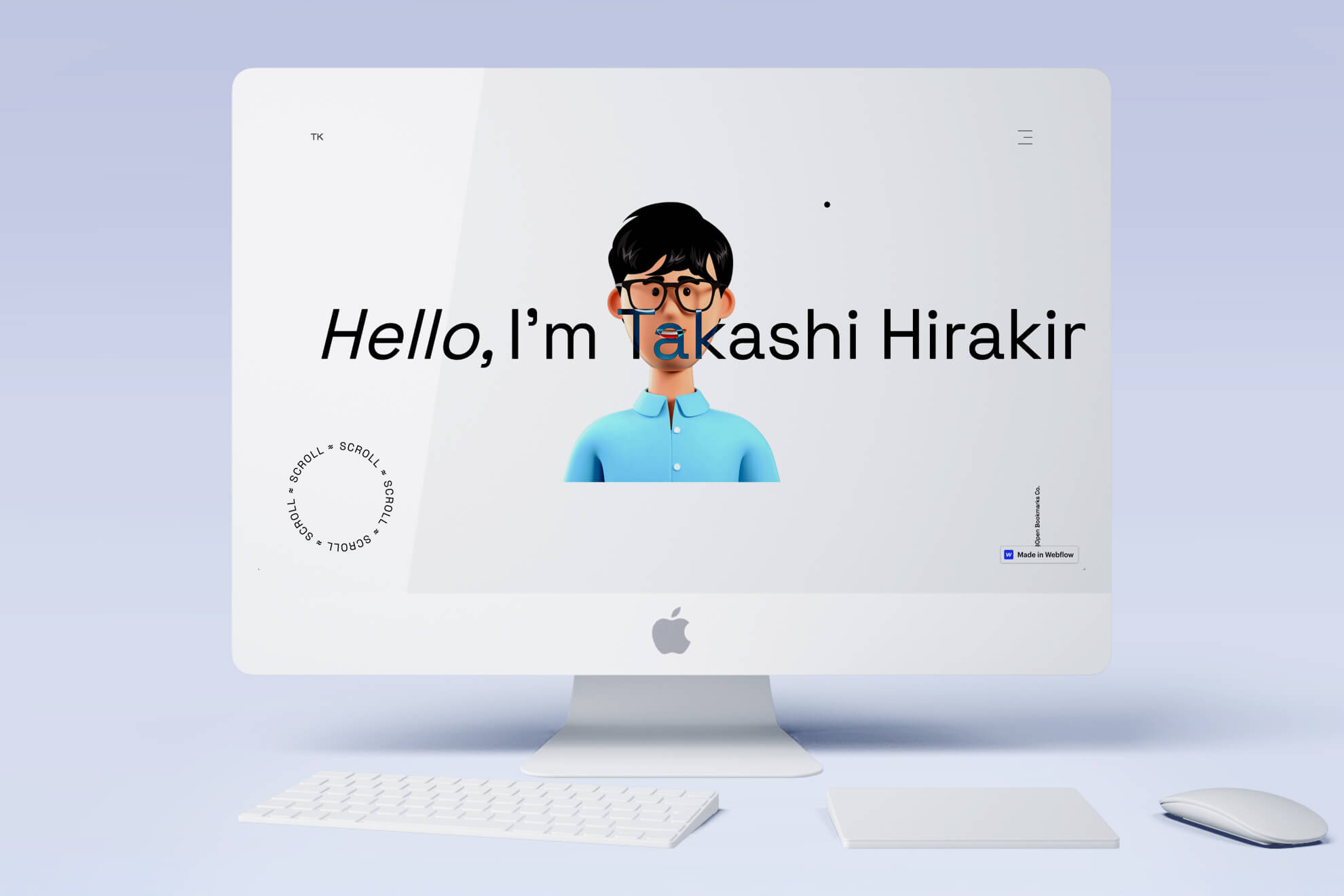
I have started WDC(Webflow Daily Challenge) in December 2020 through April 2021. As a finale, I developed a landing page by Webflow. Takashi Hirakimoto 2.0 displays what I learned through WDC. This achievement is only possible on the Webflow platform as a non-programming designer.
Typography
The purpose of this landing page is only one, I want a user to spend time on this page. Hopefully, access the portfolio even though I did not install many CTA.
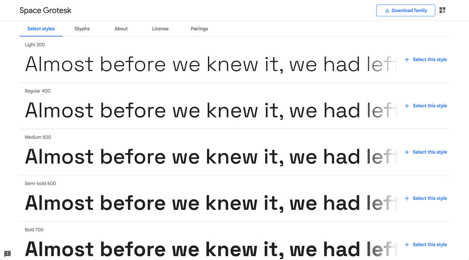
When I look at Dribble and Behance, I can see much unique typography. Among them, I found the trend in 2021, Grotesk typeface. I was willing to buy the fonts for this project. However, I could find an alternative on Google Fonts, Space Grotesk. It looks good enough. So, I pick it up.
3D Illustration
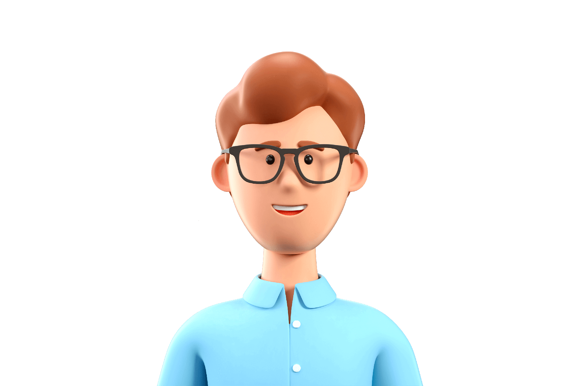
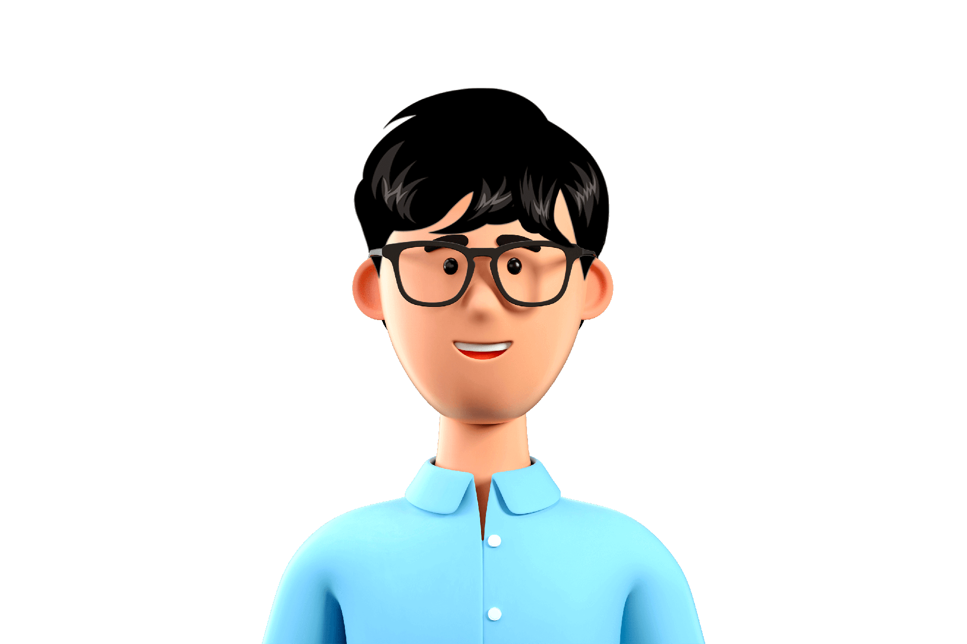
2D or 3D Illustration, GIF, video or Lottie animation, these visuals catch a user’s attention rather than just 1 image. It’s better if it interacts. Human chases moving objects unconsciously. This is natural human behavior. I don’t design by intuition. I design everything, element, typography, color, contents structure, etc, intentionally. There is no space for coincidence.
I did not make an animated avatar at this point. It’s a future plan.
Custom Cursor & Blend Mode
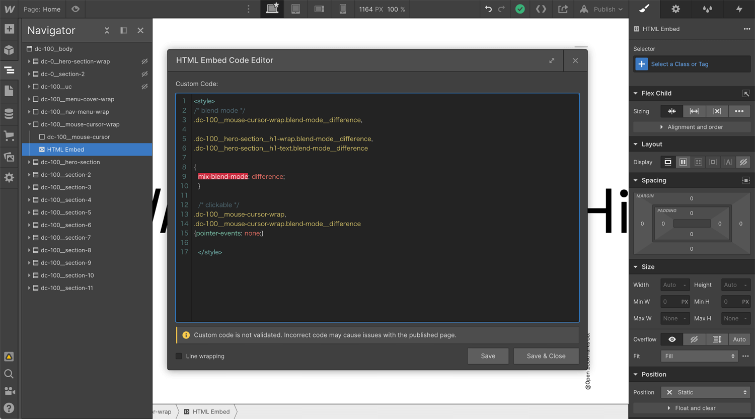
When I look at the latest website trend at Awwwards, a lot of websites use a custom cursor, often it’s circle/dot. It is only for a laptop user experience. I assume that my target audience mainly uses laptops rather than mobile. Because they are looking for a web designer/Webflow developer, or they are in a design-related position. These people won’t search for a potential candidate on mobile.
Structure
Body
– Div block 1
– – Div block 2
– – Embed
– Hero section
– – Div block 3
– – – Div block 4
– – – – Div block 5
Div block 1: width 100%, height 100%, position fixed, z-index 3, apply mouse move in viewpoint
Div block 2: custom mouse cursor
Div block 3: width 100%, height 100vh, position relative
Div block 4: Heading wrap
Div block 5: Heading
CSS
>style>
/* blend mode */
.dc-100__mouse-cursor-wrap.blend-mode__difference,
.dc-100__hero-section__h1-wrap.blend-mode__difference,
.dc-100__hero-section__h1-text.blend-mode__difference {
mix-blend-mode: difference;
}
/* clickable */
.dc-100__mouse-cursor-wrap,
.dc-100__mouse-cursor-wrap.blend-mode__difference {
pointer-events: none;
}
>/style>
Example:
*Div block 1: .dc-100__mouse-cursor-wrap.blend-mode__difference
*Div block 2: .dc-100__mouse-cursor.blend-mode__difference
*Div block 4: .dc-100__hero-section__h1-wrap.blend-mode__difference
*Div block 5: .dc-100__hero-section__h1-text.blend-mode__difference
Scroll Interaction
This is the value of Webflow. I can control the interaction vertically and horizontally. WordPress paid themes installed some interaction and easing, but it’s a template. If you don’t know writing a code, you cannot completely control it.
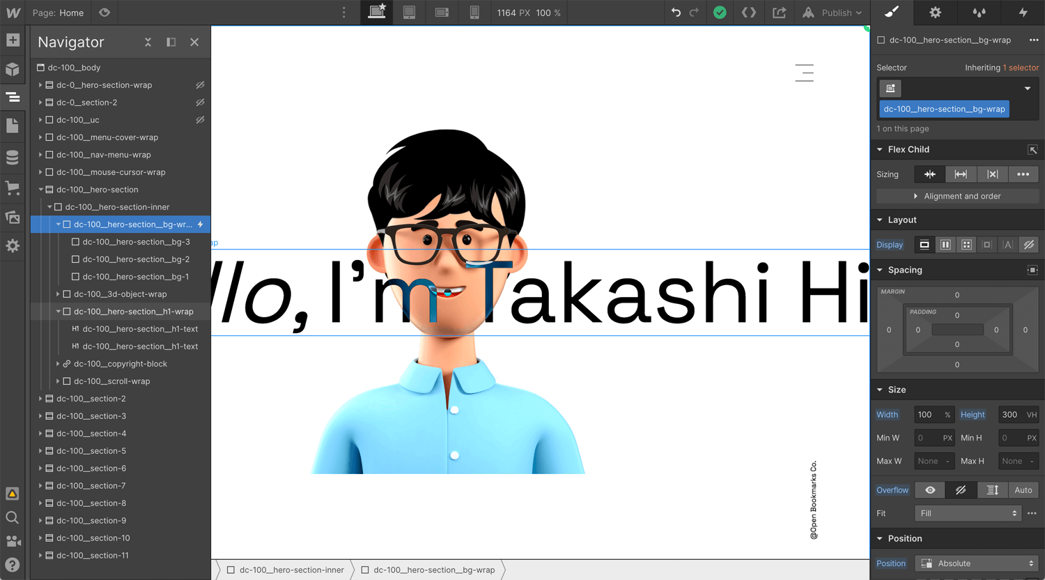
The heading moves right to left when a user does scroll. It urges a user to keep scroll for a while and protects a bounce. Background colors turn white, yellow and green. These div blocks are wrapped by a 300vh div block. It gives elements time to interact.
Structure
Body
– Section
– – Div block 1
– – – Div block 2
– – – – Div block 2.1 (Green)
– – – – Div block 2.2 (Yellow)
– – – – Div block 2.3 (white)
– – – Div block 3
– – – – Div block 3.1 (Heading 1)
– – – – Div block 3.2 (Heading 2)
Div block 1: width 100%, height 100%, position relative
Div block 2: width 100%, height 100%, position absolute, overflow hidden
Div block 2.1: width 100%, height 100%, position fixed
Div block 2.2: width 100%, height 100%, position fixed
Div block 2.3: width 100%, height 100%, position fixed
Div block 3: Max width 300vw, justify start, position fixed, children don’t wrap, background color black*
Div block 3.1: typography color white*
Div block 3.2: typography color white*
*This is the trick for embed blend mode.
Transparent Blur Background
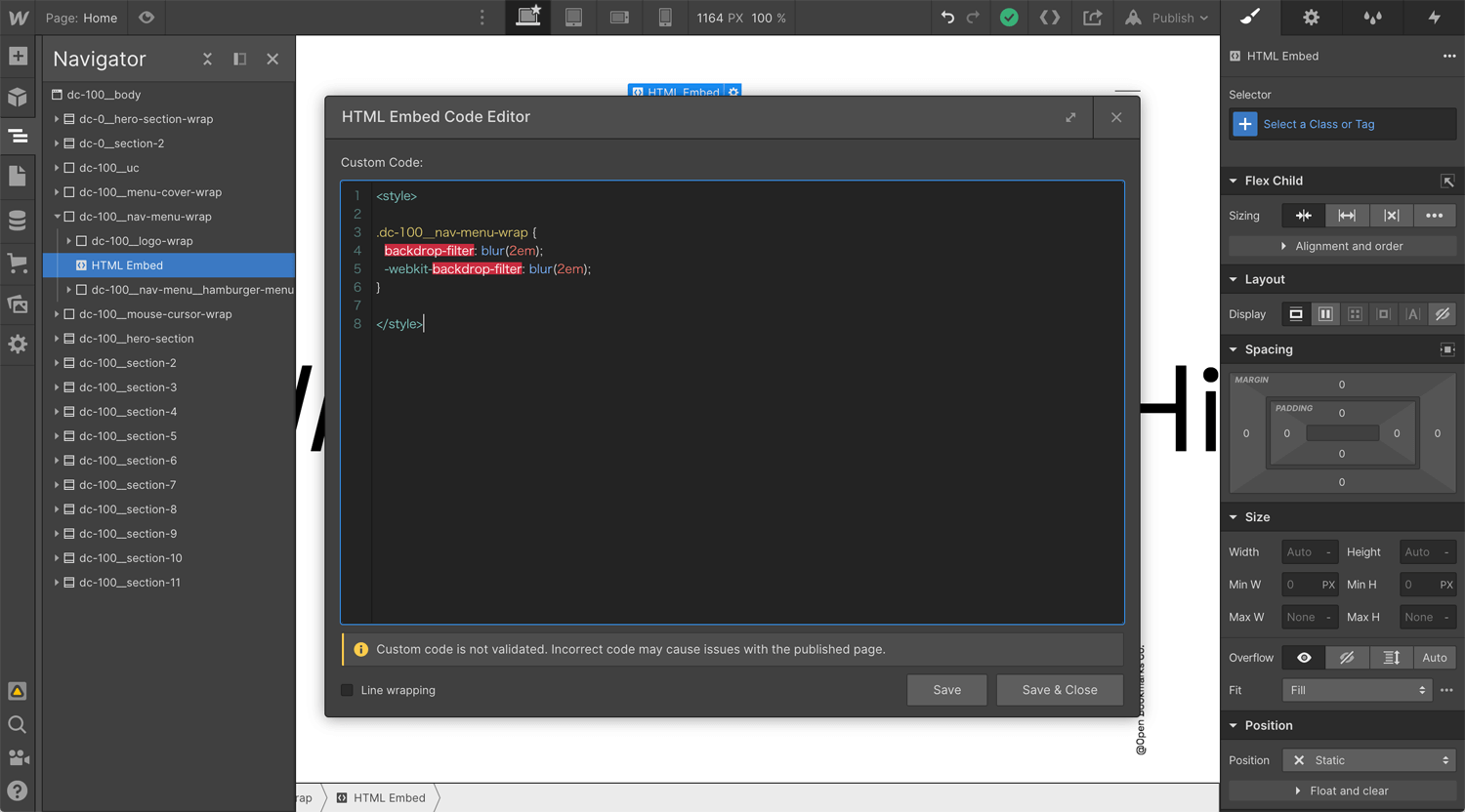
When I look at Dribbble, the transparent card with a blurred background was quite popular in early 2021. I saw it almost every time when I visited Dribbble. I don’t have a reason to use the credit card on this website, but I wanted to use this effect somehow for a small surprise. It does not display until the second section shows up. Not obvious, therefore, it works.
Structure
Body
– Div block 1
– – Div block 2
– – Embed
– – Div block 3
Div block 1: Nav menu
Div block 2: Logo
Div block 3: Hamburger menu
*You can embed the code everywhere. I embed here for organizing purpose.
>style>
.dc-100__nav-menu-wrap {
backdrop-filter: blur(2em);
-webkit-backdrop-filter: blur(2em);
}
>/style>
Horizontal Scroll
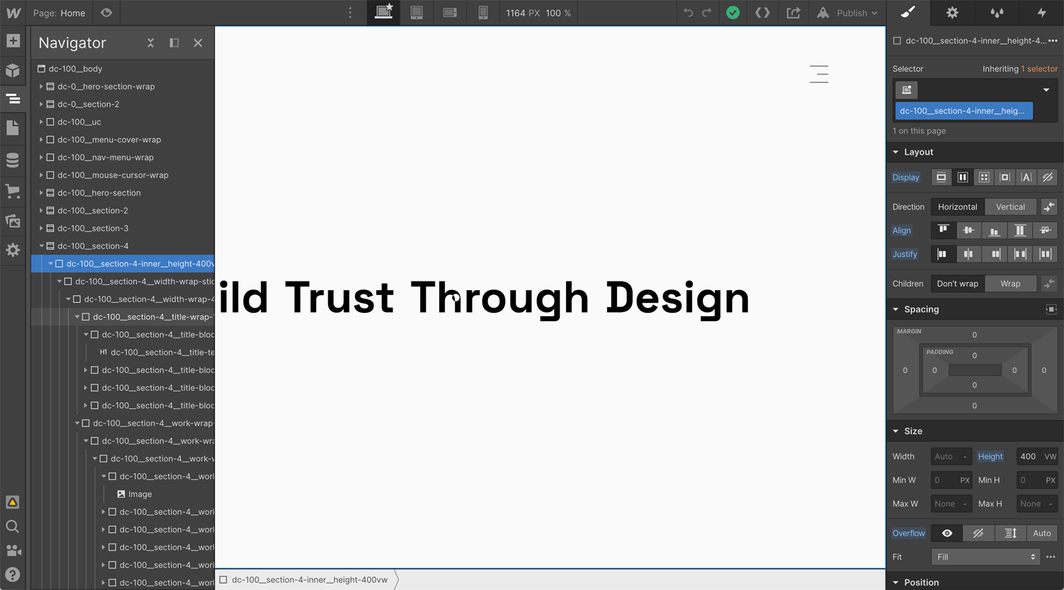
Horizontal scroll interaction is common for Webflow users. You can find how to implement it on YouTube. WordPress, Wix and Squarespace occupy the market. If you want to display differentiation from theme CMS, a horizontal scroll is a good idea.
Structure
Body
– Section
– – Div block 1
– – – Div block 2
– – – – Div block 3
– – – – – Div block 4.1
– – – – – Div block 4.2
Div block 1: Height 400vw
Div block 2: Width 100%, height 100%, position sticky
Div block 3: Width 400vw, height 100vh,
Div block 4.1: Width 100vw, height 100vh,
Div block 4.2: Width 300vw, height 100vh,
*Height 400vw on div block 1 is the key.
Clip Text
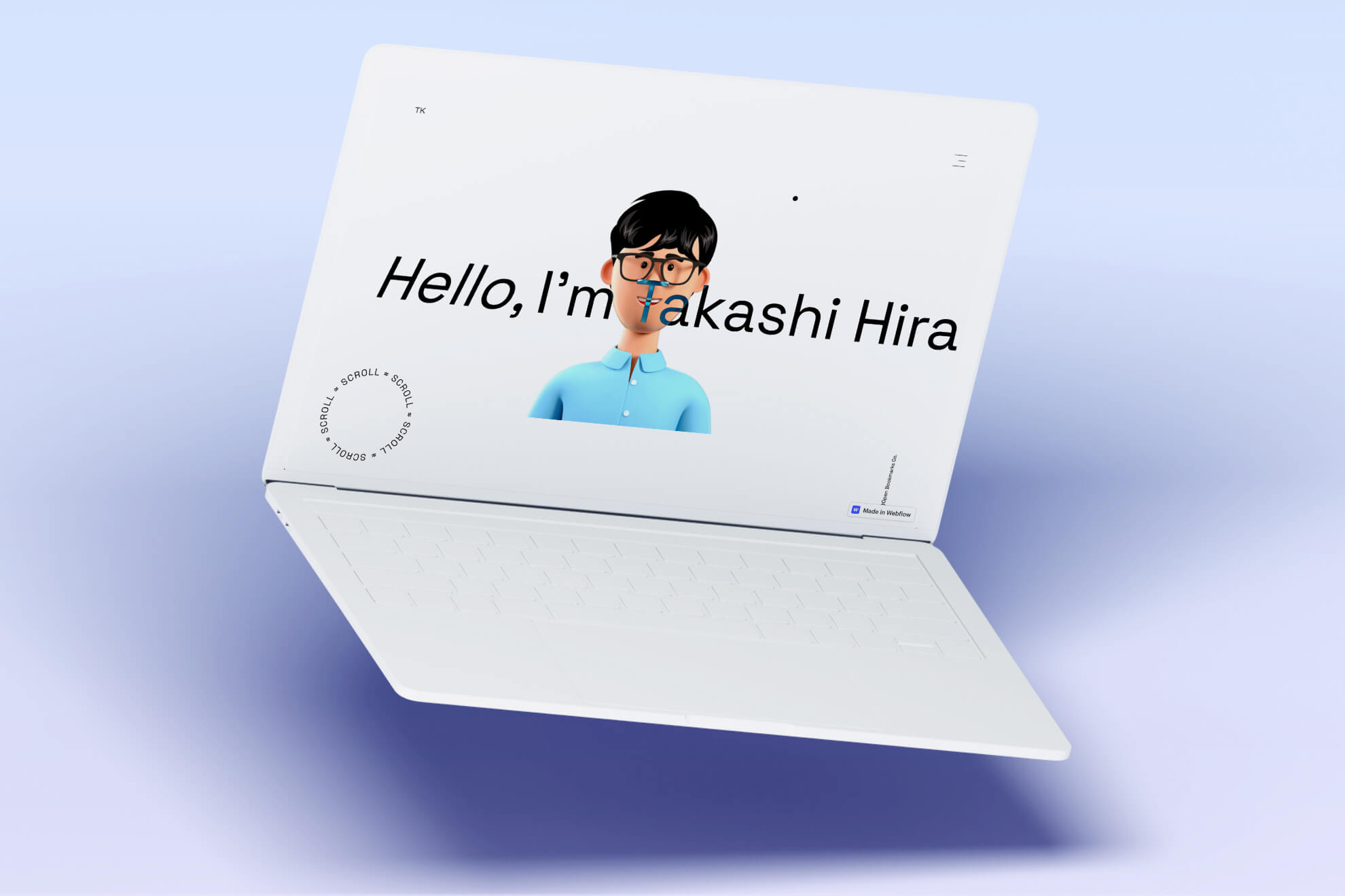
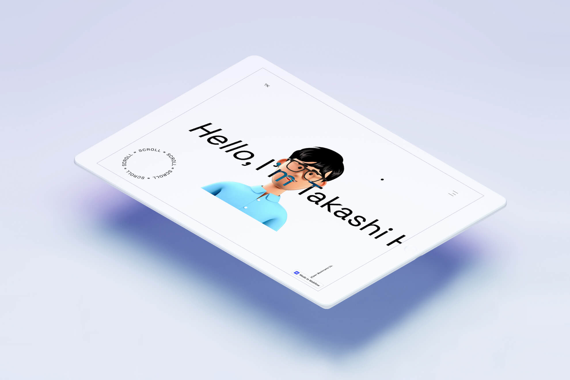
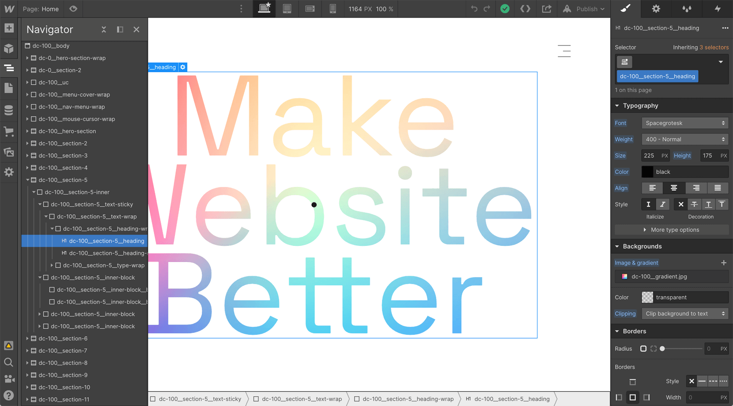
On Webflow, clip text is just one click. However, clip text does not work on iOS. Therefore, you can see many div blocks on the image. I needed to separate laptop and mobile, display and display none.
Structure
Body
– Div block 1
– – Div block 2
– – – Div block 3
– – – – Div block 4
– – – – – Heading 1.1
– – – – – Heading 1.2
– – – Div block 5
– – – – Div block 5.1
– – – – Div block 5.2
– – – Div block 6
– – – – Div block 6.1
– – – – Div block 6.2
– – – Div block 7
– – – – Div block 7.1
– – – – Div block 7.2
Div block 1: Width 100%, height 400vh
Div block 2: Width 100%, height 100%, position sticky
Div block 3: Width 60%
Div block 4: wrap for text
Heading 1.1: Clip background to text
Heading 1.2: Text for mobile
Div block 5, 6, 7: wrap fro background image
Div block 5.1, 6.1, 7.1: Width 100%, height 100vh, position absolute, background image fixed
Div block 5.2, 6.2, 7.2: Background image for mobile
*Height 400vh for div block 1 is for fixed background x 3
Infinite Marquee
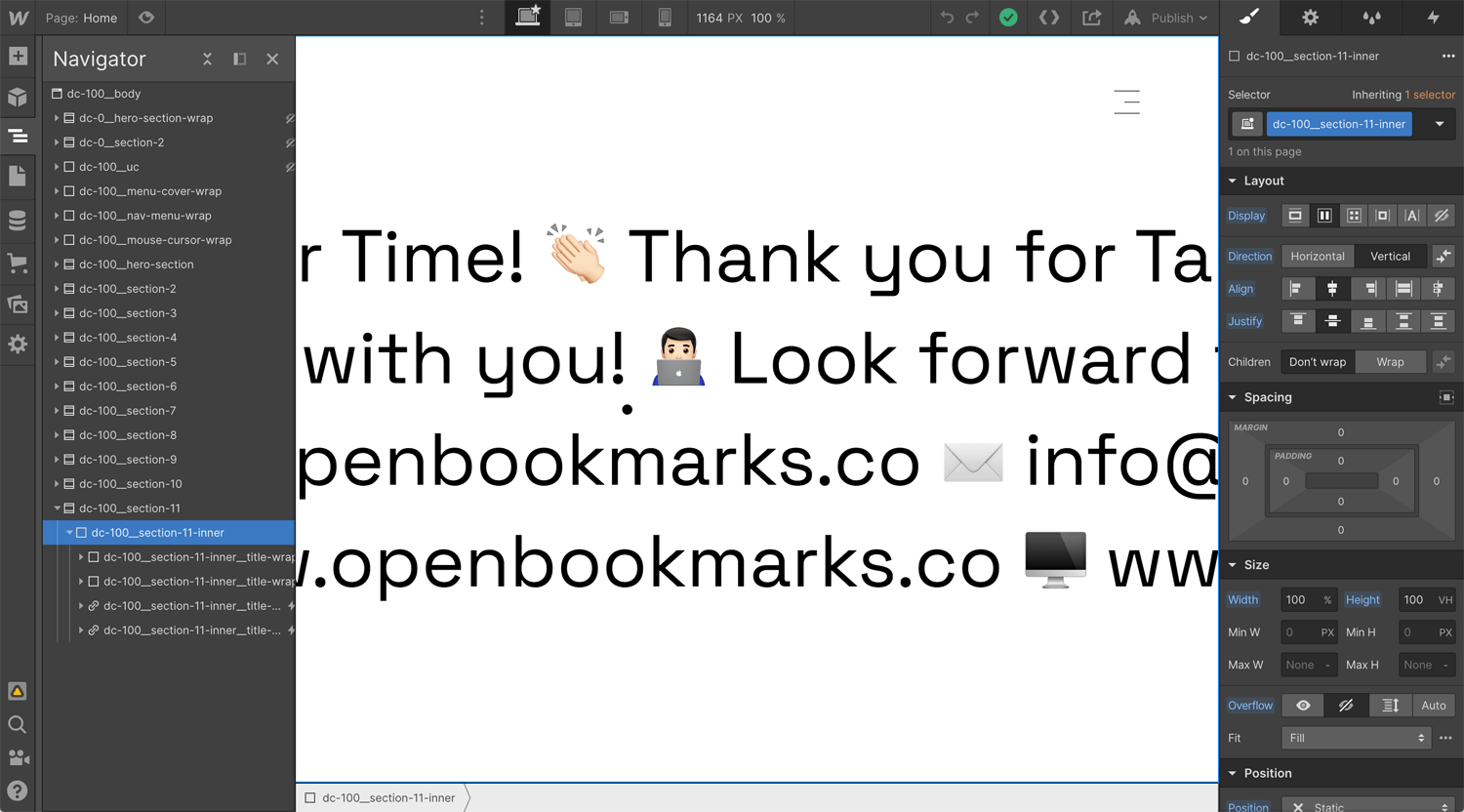
In the finale, I implement an infinite marquee (infinite loop animation). I am still thinking about how it seamlessly works on laptops and mobile.
Structure
Body
– Section
– – Div block 1
– – – Div block 2
– – – – Heading 1.1
– – – – Heading 1.2
– – – – Heading 1.3
– – – – Heading 1.4
Div block 1: Width 100%, height 100%, flex
Div block 2: Flex horizontal
Heading 1.1: –
*Apply page loading interaction to div block 2. When the text moves right to left, move-x -0000px, and the text hits the same position, apply duration 0 and move-x 0. The text moves infinitely.
Result
I pushed my boundary between December 2020 to May 2021. I learned the latest Webflow practice intensely. I checked the latest web design trend on Awwwards. I searched for attractive Webflow technics on YouTube. I often faced an issue and I was thinking day and night about why the interaction does not work. Struggled, but enjoyed it.
I am using this landing page for the Upwork proposal. This Webflow website works well so far. I reached +20K on Upwork within 2 years. The success rate is 100%. Therefore, I have no worry to find a new project.
Learning Webflow is not the end. I will create the next level website, Takashi Hirakimoto 3.0, in 2022/2023.
Case Study
Align with Client and Achieve a Goal
Let’s Work Together
Tell Me More About Your Project
Please feel free to get in touch anytime, whether for work inquiries or to just say hi, to info@openbookmarks.co. I am currently accepting a new project, and always excited to hear interesting proposals. Request a free estimate for your project. I’m ready!
