neipo – neighbour post
Product Design Process Through User Experience Design
Overview
‘neipo’ is the abridgment of a neighbor post. Recently, online shopping is huge expanding as part of a retail business. I guess the perspective is quite bright in the future. On the other hand, wealth inequality is expanding in society. People have to work as full time. This means that a majority of people who enjoy online shopping cannot receive a parcel at home. People have to choose the closest post office for a shipping, but it has some problems, such as a business hour, distance and weather and so on. That’s why I came up with this APP for solving these problems.
Problem
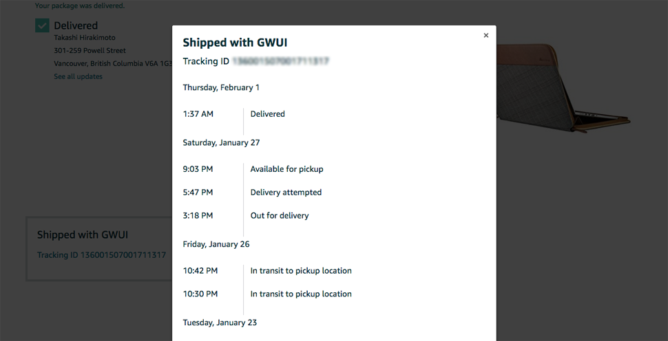
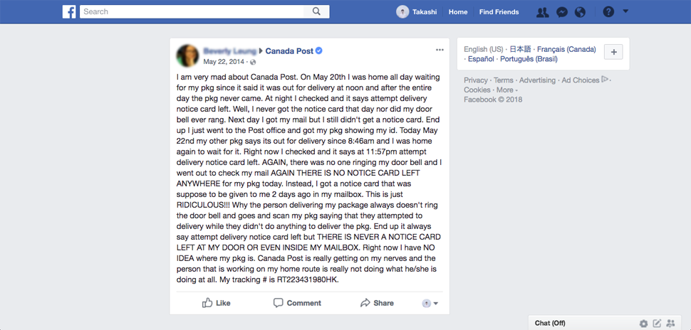
I saw an ordinary scene at Gastown. Postman was delivering a parcel. He pushed buzz, but no one responded. He left a delivery notice and backed to a car. It was occupied by a lot of Amazon boxes.
I set up a hypothesis about some problems.
– These days, people buy products online, but many people cannot receive a parcel at home.
– Amazon ships parcel fast, but it stops at post office(at least 1 night after people receive delivery notice).
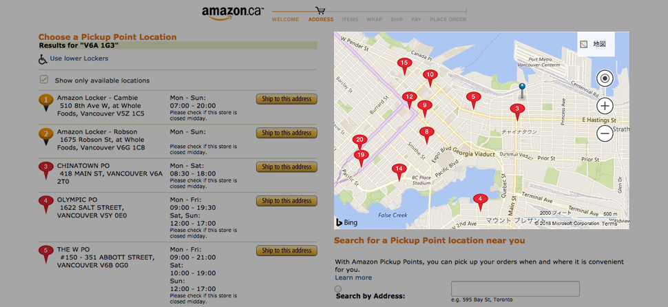
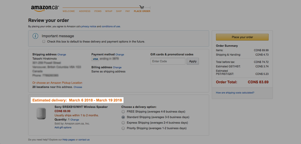
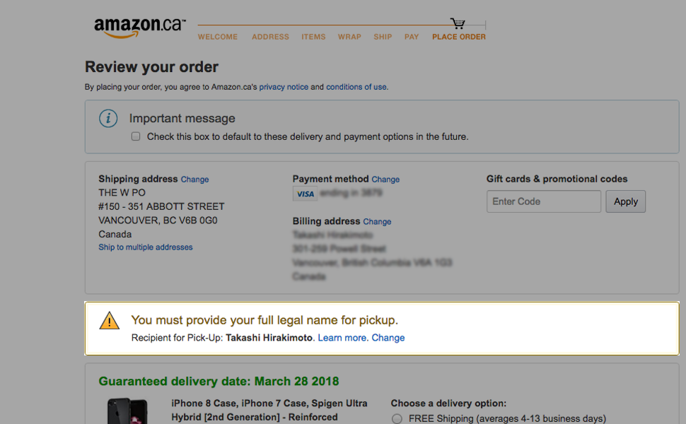
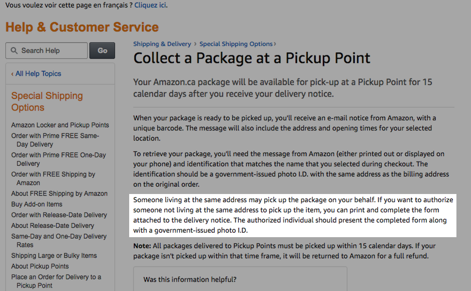
– Amazon user can choose the shipping address to the closest post office, but it is not always so close to them.
– Some of post office close at 6 pm. A full-time worker at suburb cannot pick up until the weekend.
– Recently, social isolation has increased in spite of expanding social media service. Generally speaking, Canada(Canadian) is friendly. Neighbor(community) should have a general common sense.
Goal
“Receive parcel at neighbor”. This is the elevator pitch. I need a strong cause when I start a new project. “Make a small story in trivial daily life”. The vision would align a member’s vector if this is a team project.
Some more reasons are below.
– Decreasing frustration of online shopper.
– Increasing a neighborhood interaction.
– Fill in the receiving time gap.
– Making a good community and society.
– Solving the social isolation.
Objection
There is an business opportunity wherever people complain, Jack Ma who is CEO of Alibaba says. However, people usually challenge you when you come up with an idea which there is not exist. This project is not an exception. Through the interview, people challenged me a lot. Hit the wall, but this is the meaningful process to thinking user experience.
Some objections are below.
– People does not know specific day when the parcel arrives.
– Many people suppose to receive delivery notification.
– People does not want to share too much personal information.
Refine
I have no doubt the concept, “Receive parcel at neighbor”. Because the idea came from my experience. People should have same complain. At first, I intended that people ships parcel to a neighbor directory. However, let a neighbor know people’s information is not easy. I refined that this APP makes possible to let a neighbor pick up your parcel instead of you.
Business of Design
I considered business aspect. User will receives benefit on the service. Should I charge to end user? Maybe or maybe not.
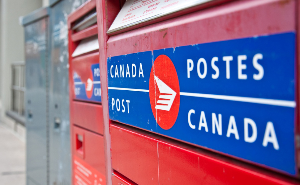
Come to think of it, City of Vancouver or Canada Post are potential clients for me. The city wanted to invite Amazon 2nd headquarter(failed). Vancouver is strengthening tech industry as city’s vision. There is an impact in the world if this service comes true. Evaluation of Canada Post would be improved. I assume ‘neipo’ as B to B.
User Research
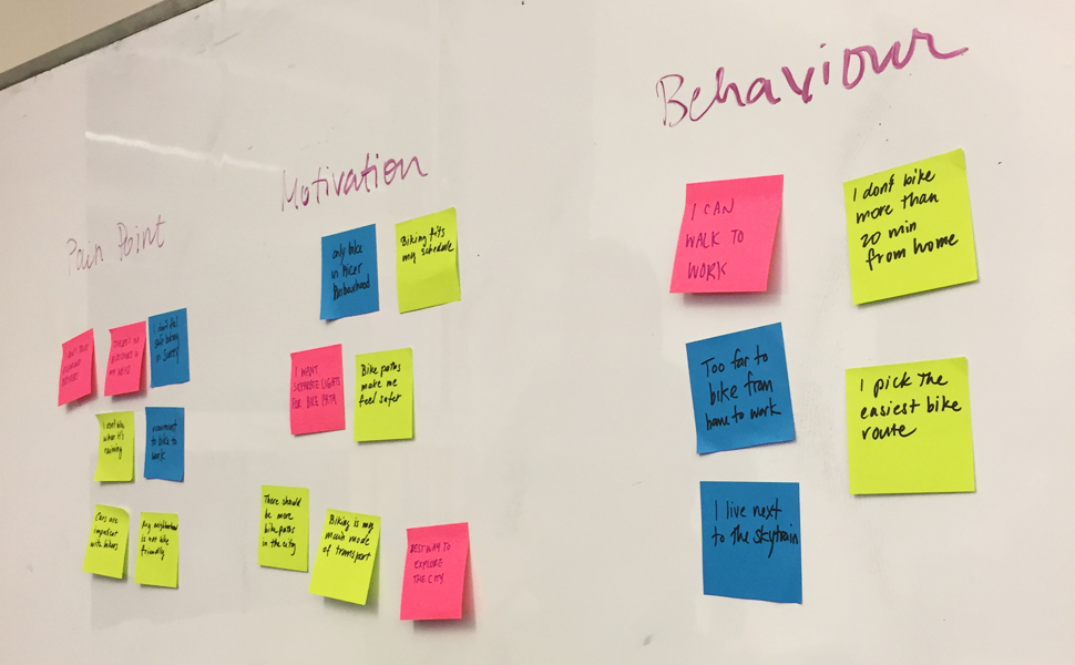
I assumed targets. This is the first step before designing. I, designer, cannot create without it.
– Who are the users?
– What are their behaviors, goals, motivations, and needs?
– Where do they have problems with their workflow?
Through this research, I thoroughly consider about potential users below.
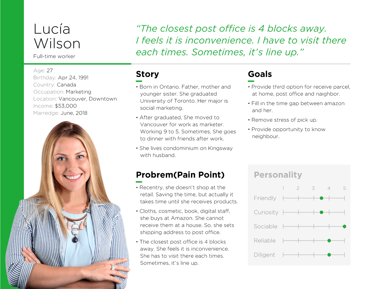
– A: Full-time at downtown, Amazon user, Pick up a parcel at a post office, but it’s 4 blocks away from home.
– B: Full-time at Olympic village, Pick up parcel near the workplace but feel irritated about a lineup.
– C: Housewife, 2 years boy and welcome daughter this year, stay home long.
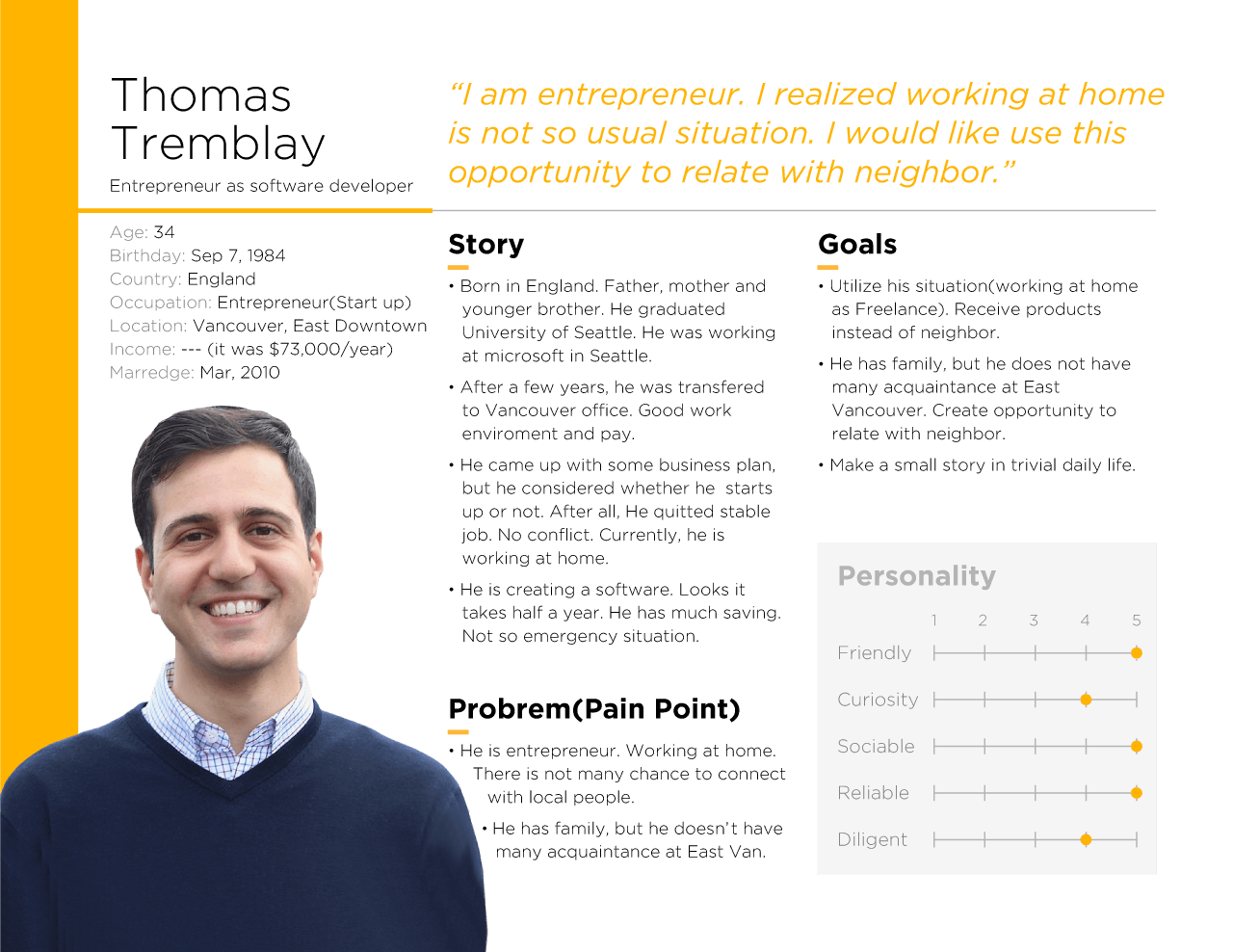
– D: Freelance, Work at home during a daytime, Flexible.
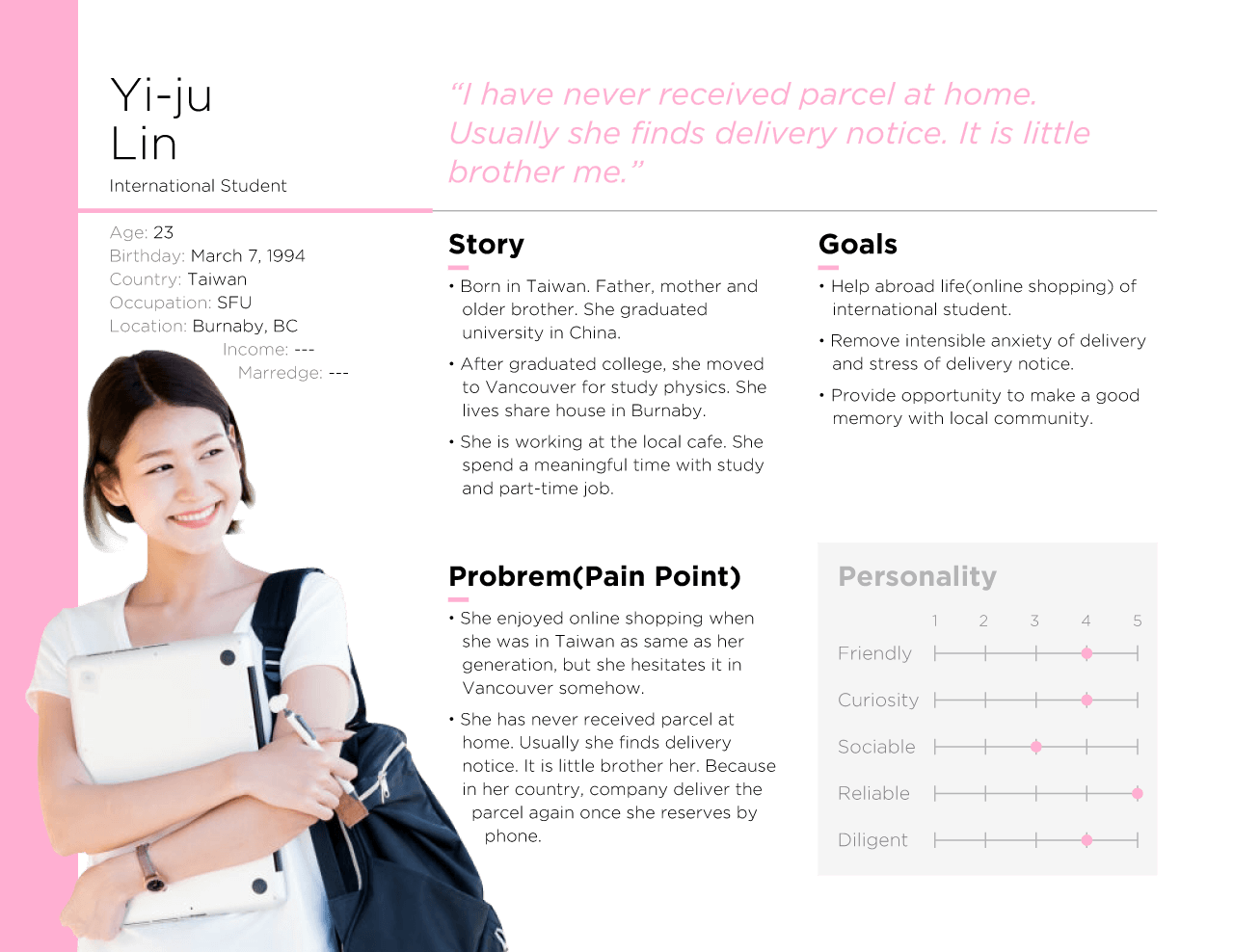
– E: International student, It was a heavy online shopper in her country, but she little hesitates it in Canada.
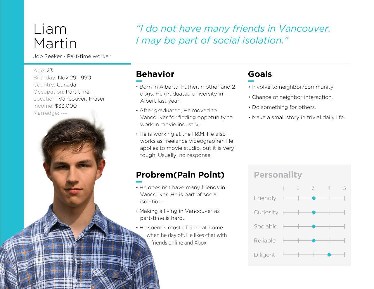
– F: Part-time, Jobseeker, Play video game, Xbox, when the days off.
– G: Retired, Moved to condominium recently, Taking a time with wife, Not many acquaintances there.
Interview
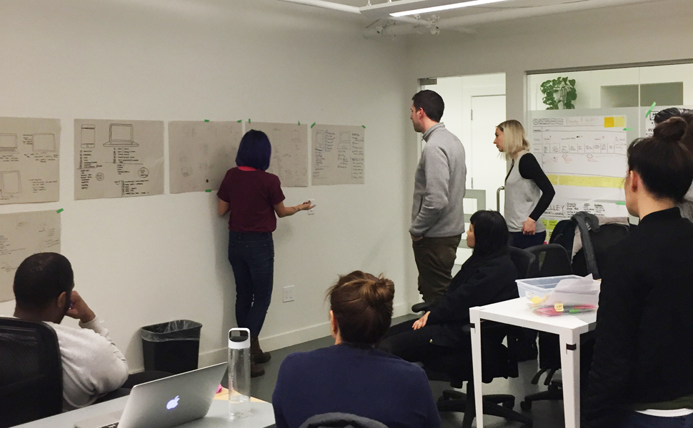
The interview script would be like that.
① How many time do you shop online a month?
② When did you use online shop most recently?
③ What did you buy?
④ What shopping site do you often use, Amazon, ebay?
⑤ How much did you pay for shipping?
⑥ How did you receive?
⑦ How long does visiting take to closest post office?
⑧ Do you have any bad story of online shopping?
⑨ Do you know your neighbour?
Persona
I extracted a user by research. I did visualize some of them to showing stakeholder. These personas are a representation of a few types of customer. “Who are we designing for?” A designer should keep it in their mind. Personas help to align strategy and goals to specific user groups.
User Flow(iA)
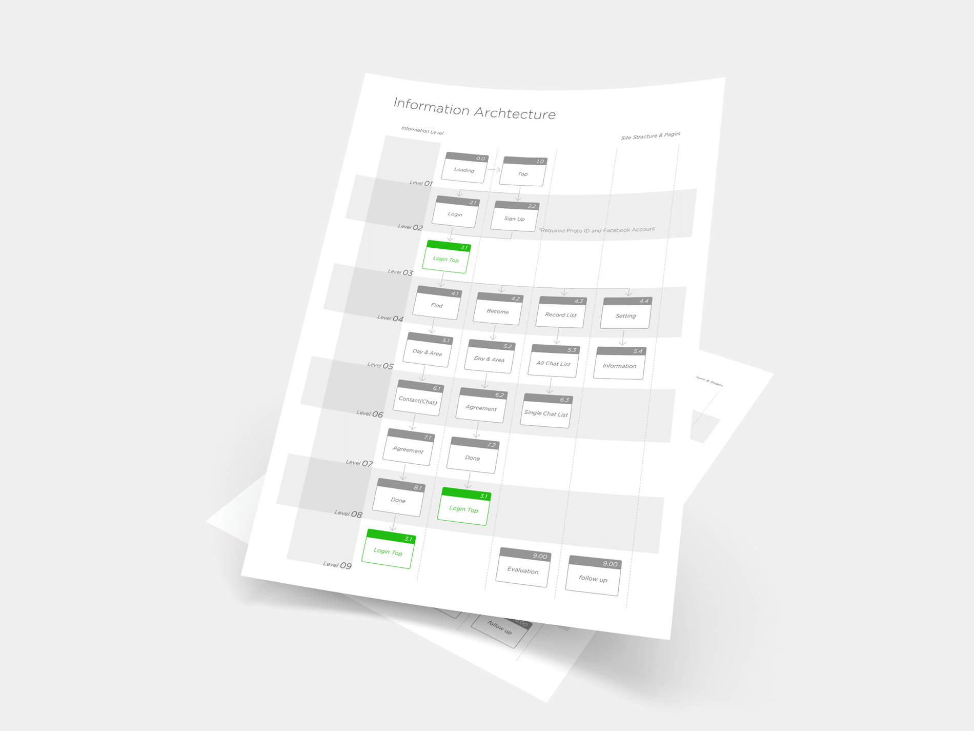
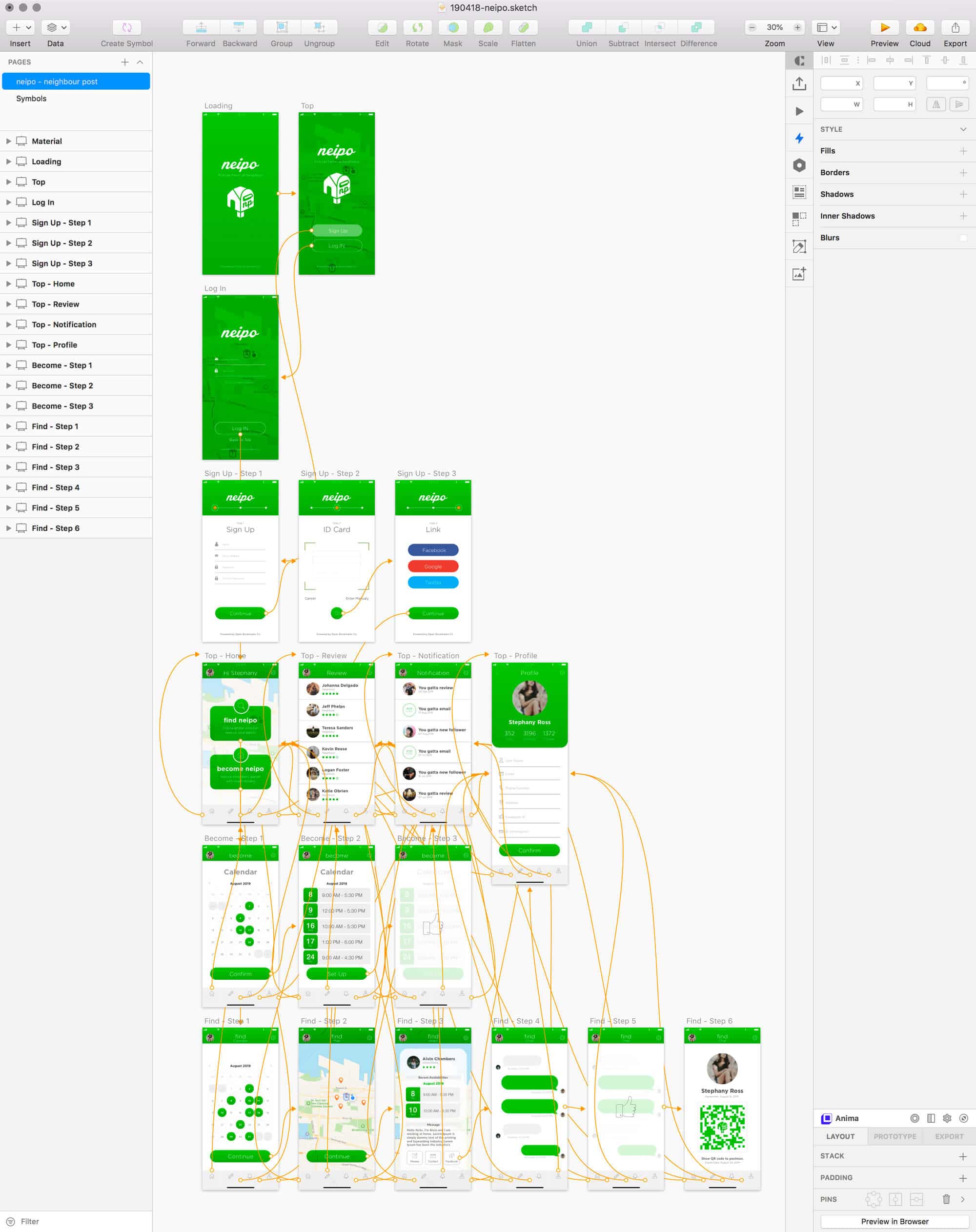
iA(Information architecture) aims at organizing content so that users would easily adjust to the functionality of the product and could find everything they need without big effort. iA puts user satisfaction as a priority.
A user has 2 options, find neipo who can pick a parcel instead of a user or become neipo who want to commit to a community. I would like to keep resister process simple. It would similar Canada Post service, FlexDerivery. The information should be verified with authority information.
A user can evaluation(give star) their neipo. It shows up when neipo send a text to a neighbor. I am going to imply function somehow user experience and story on the website.
Wireframing
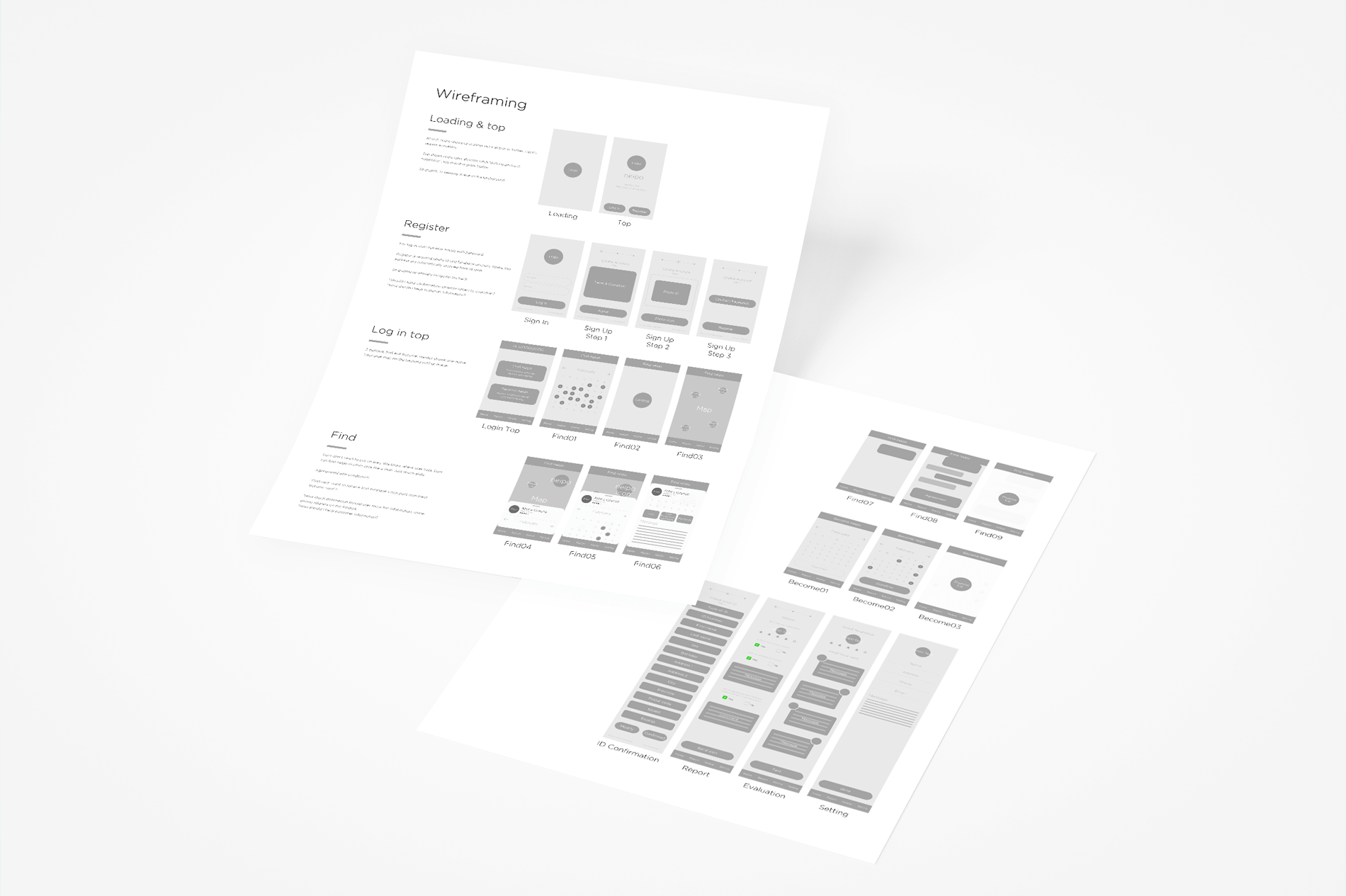
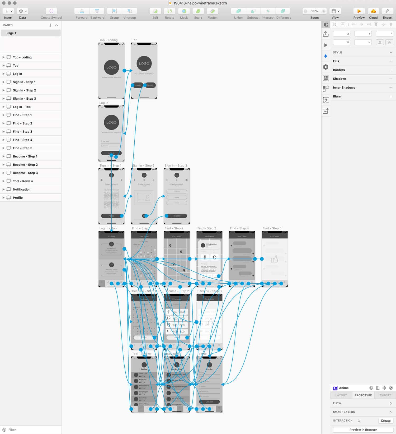
iA and wireframing are blueprints of a product. I installed wireframe to invision. Many problems and contradicts are appeared through this process. I should be experienced appreciation, Sketch and XD(experience design).
User Interface
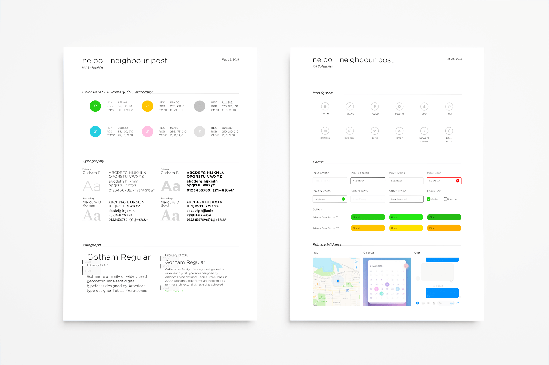
Before creating an interface, I searched the standard. Then, I add originality for the service. Creativity is not always 0 to 1. Combining A and B often creates a new value. this is common in business.
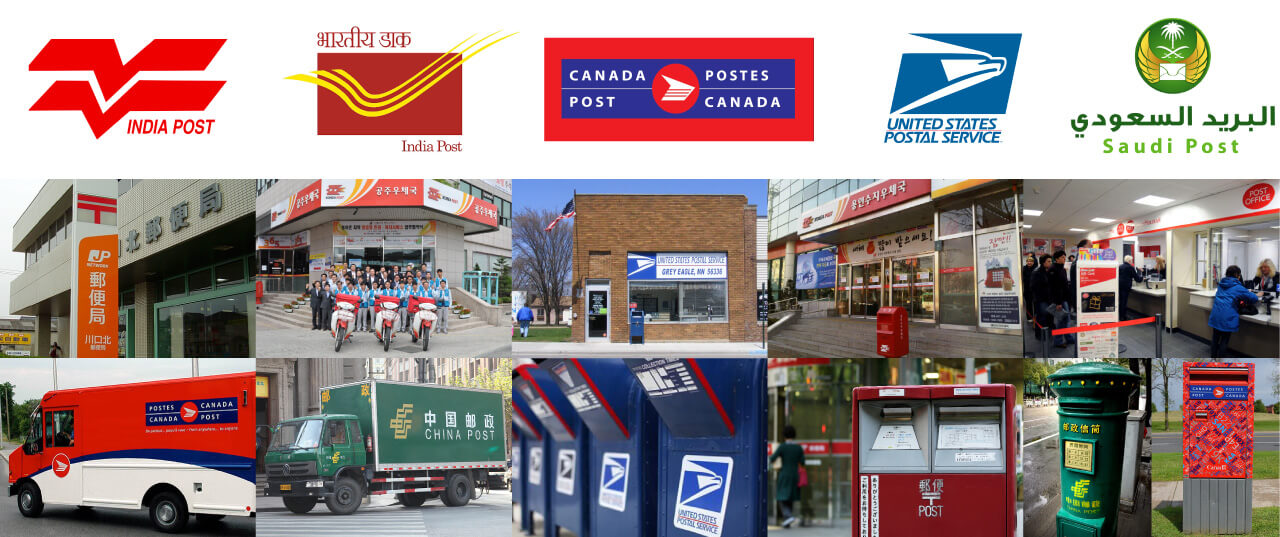
I have an image of red to post office. I realized that it is a truth. Red is a majority. However, I could find blue and green as well. The tone of color implies authority to me. Post service may public service in many countries. Interestingly, the motif are a bird, wing, and wind.
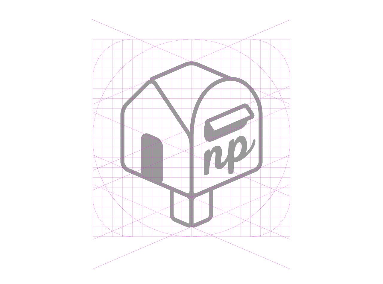
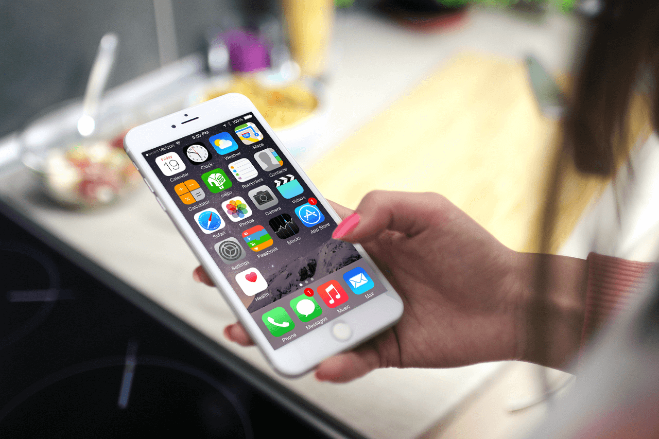
After a comprehensive search, I set up an interface, font, primary color, secondary color, gadget and so on. The primary color is friendly green. It is my hope to be a service which local people like it and use it naturally at trivial daily life.
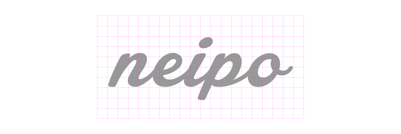
“naipo – neighbour post” may not be the best name. Brand attribute is “Friendly and Harmony”. Round shape of Gotham is suiting to it.



Result
I make ‘neipo‘ happen in 2018. I have to make a business plan and present the idea to an investor. I have to make a development team. I may have to sales to Canada Post and amazon. The biggest challenge since I came to Vancouver. I would like to embody of the study, ‘Success is determined by willpower’.
Case Study
Align with Client and Achieve a Goal
Let’s Work Together
Tell Me More About Your Project
Please feel free to get in touch anytime, whether for work inquiries or to just say hi, to info@openbookmarks.co. I am currently accepting a new project, and always excited to hear interesting proposals. Request a free estimate for your project. I’m ready!
