Overview
Breakaway addiction services is a multi-function substance use support and treatment agency that provides a range of community-based and outreach programs. We are strongly committed to providing innovative services from a harm reduction trauma-informed approach. We develop programs that are accessible, barrier-free and open to all community members.
Brand Identity
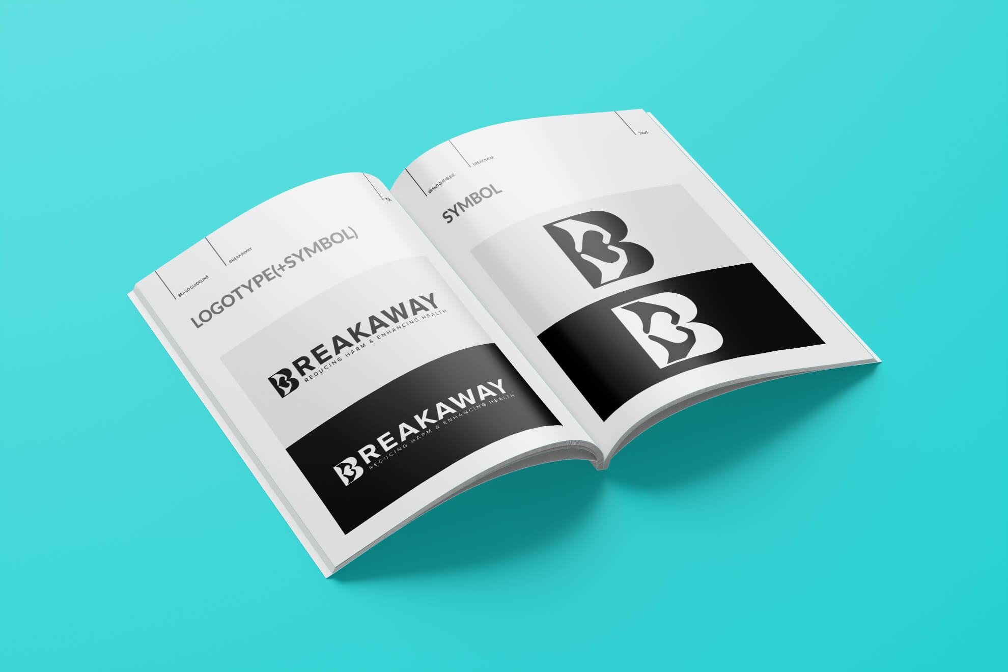
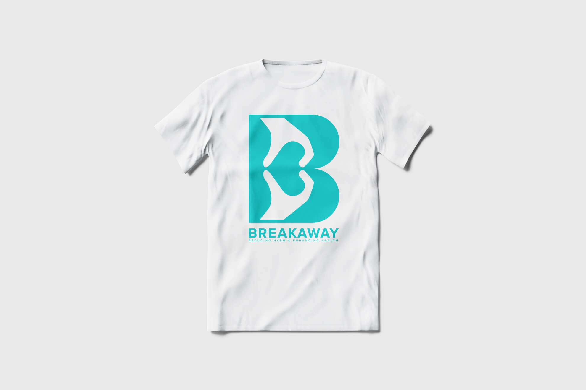
Breakaway provides comprehensive services. The word, Breakaway, itself inspired my imagination and I created the possibility of brand identity. I could propose a very suitable brand identity for a non-profit organization. Wordmark, “B” & “♥️” incorporated by the illustration, hand. This combination makes the brand uniqueness and characterizes who BREAKAWAY is.
Visual Component
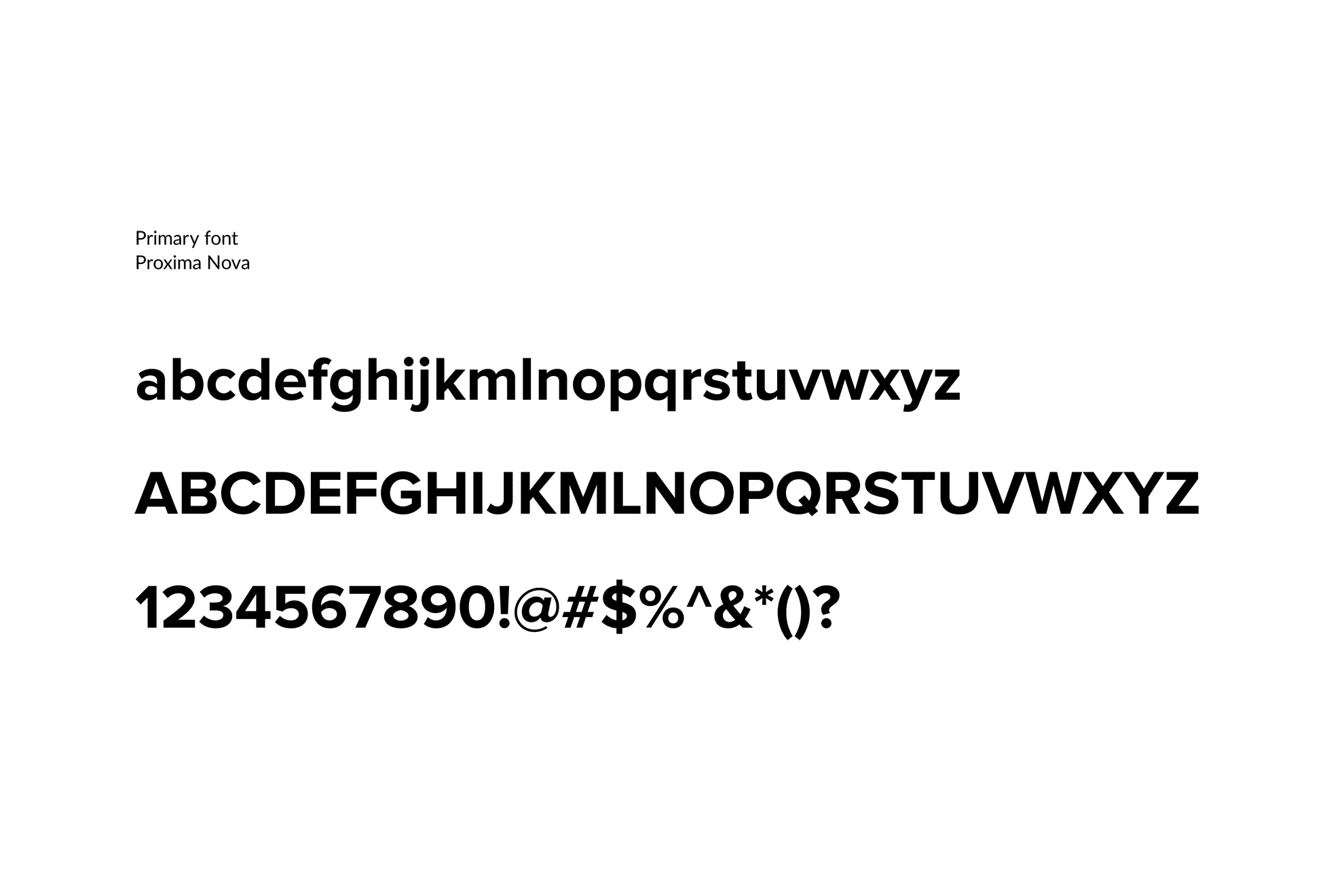
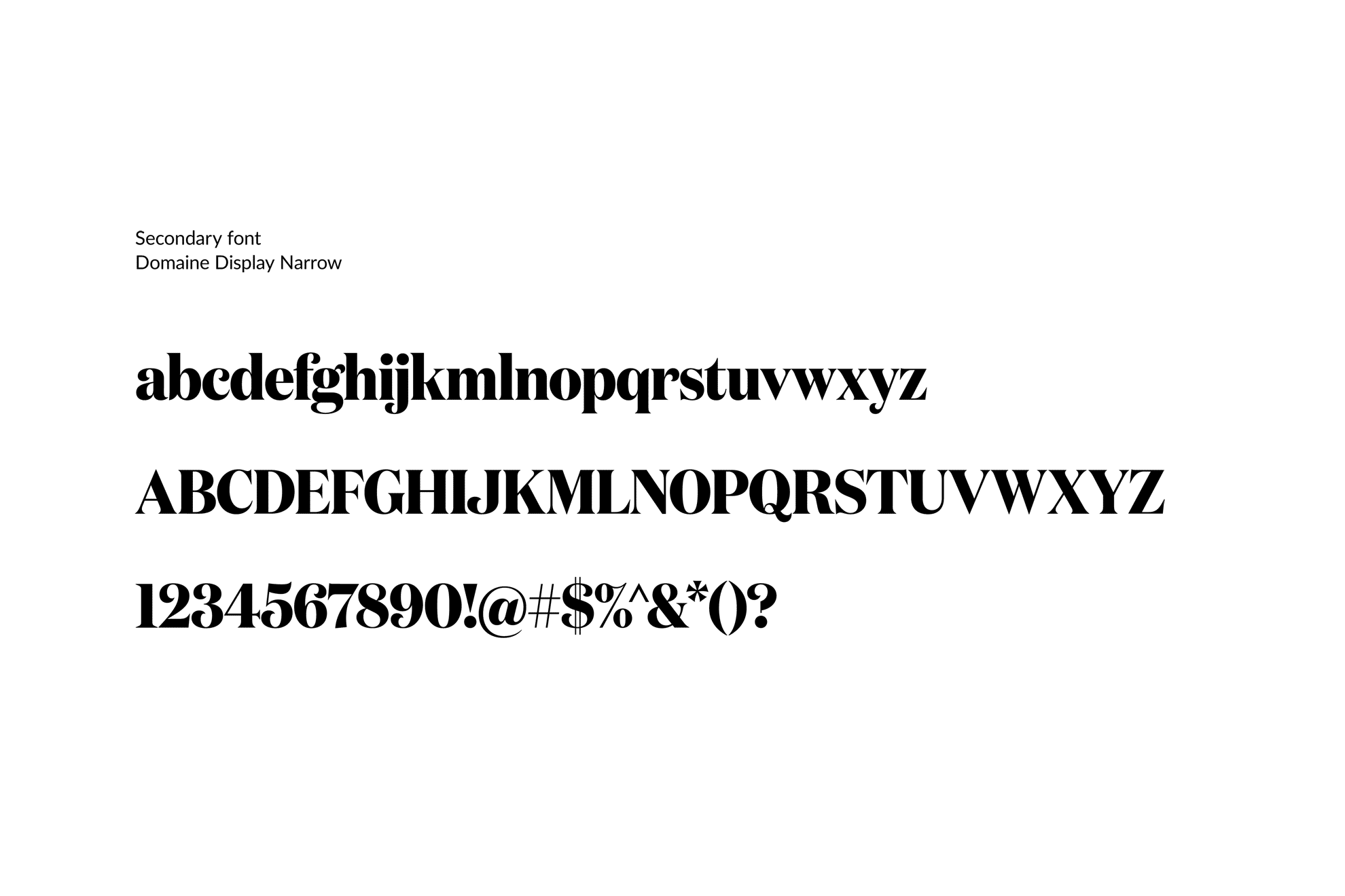
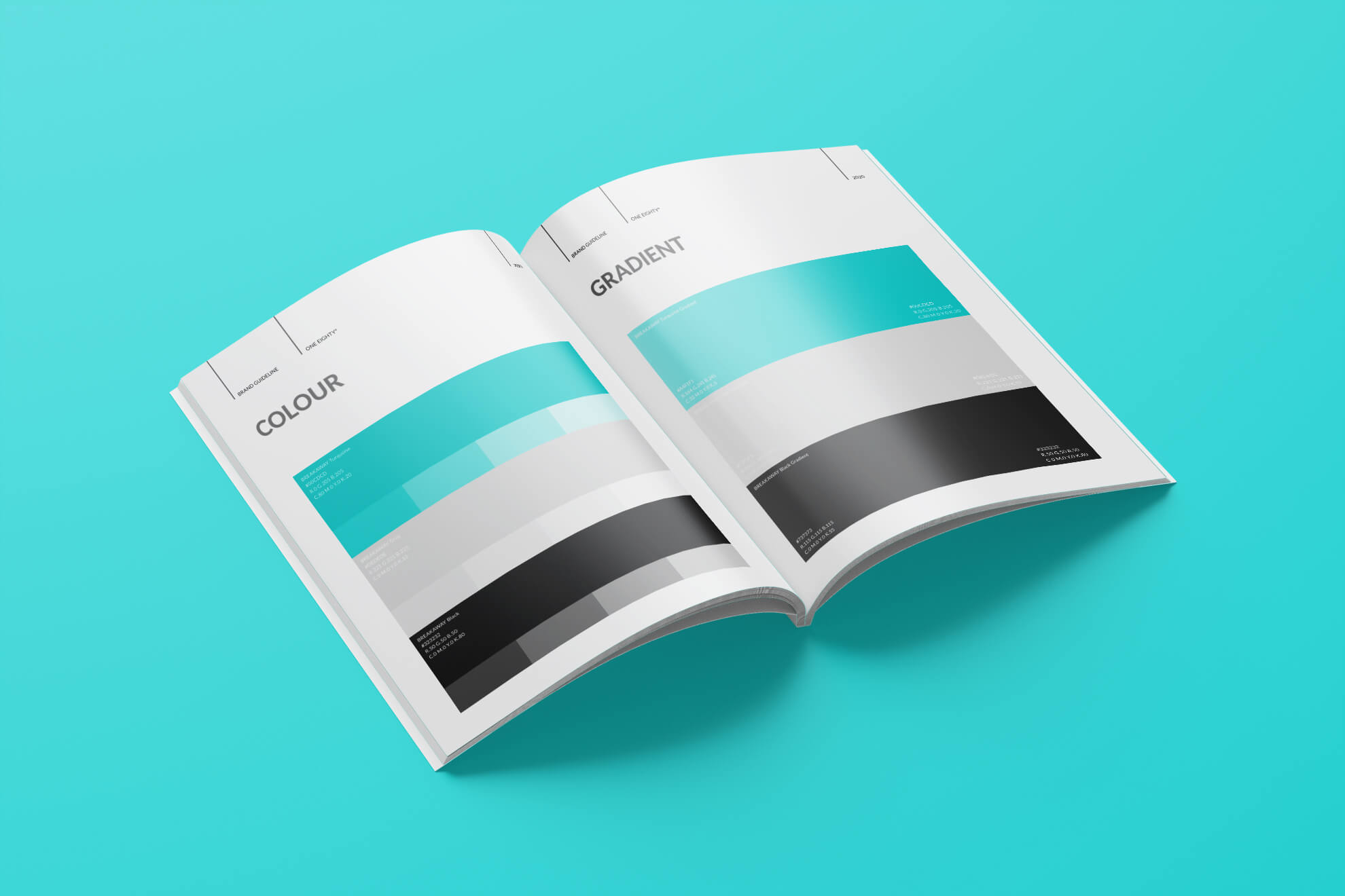
The consolidated visual identity defines the outward look and feel of the brand.
The outcomes of strong design consistency include the elevation of brand recognition, increased perception of value and the refinement of an aesthetic that affects the nature of communication with our intended audience.
Style Guide
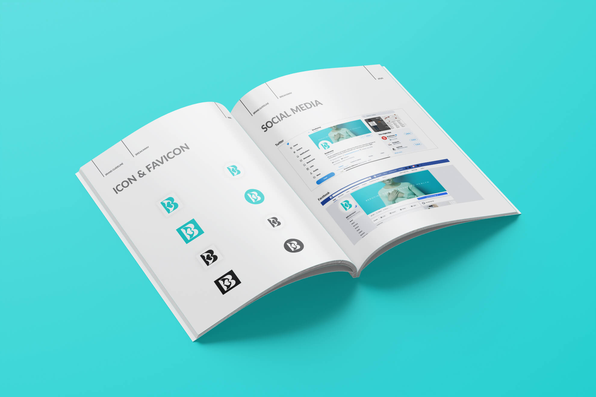
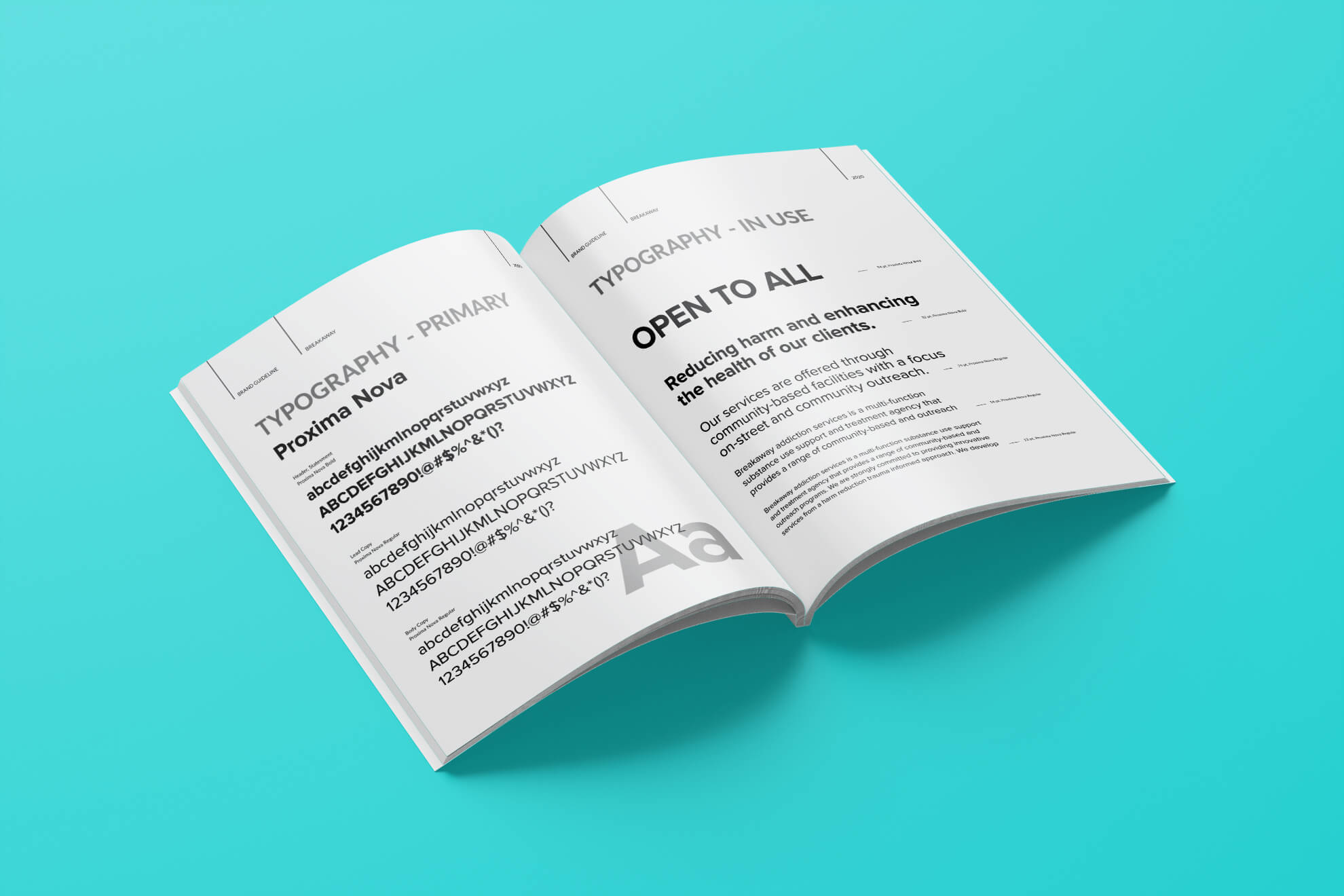
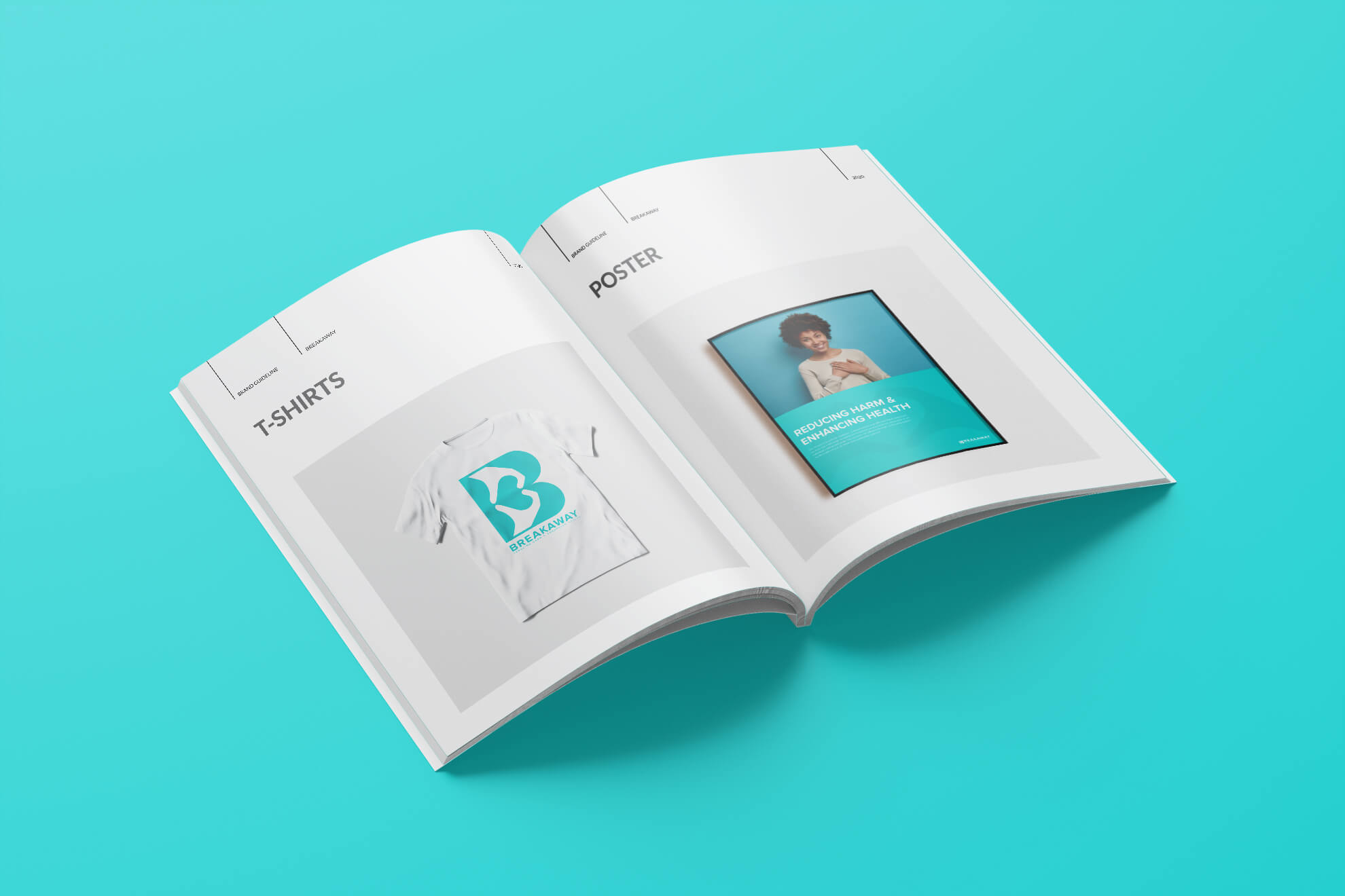
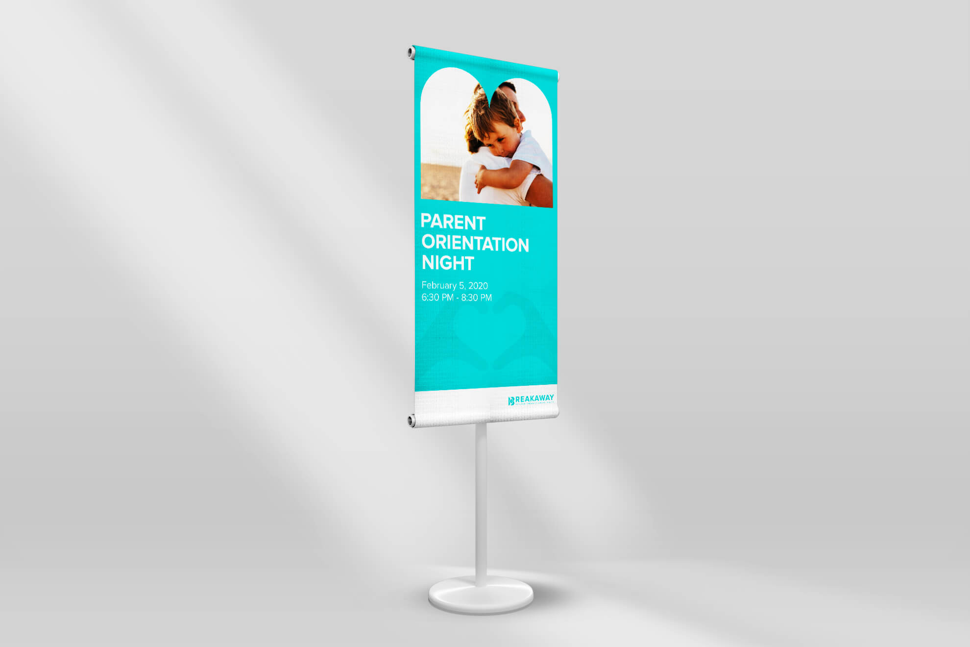
A visual identity holds substantially more value when the meticulous details of its application are thoughtfully considered. Examples within this section demonstrate creative approaches in our implementation across print and digital communications.
These examples were selected for their ability to showcase the degree of variance possible in our designs and their relevance in context to our broader brand objectives.
Review
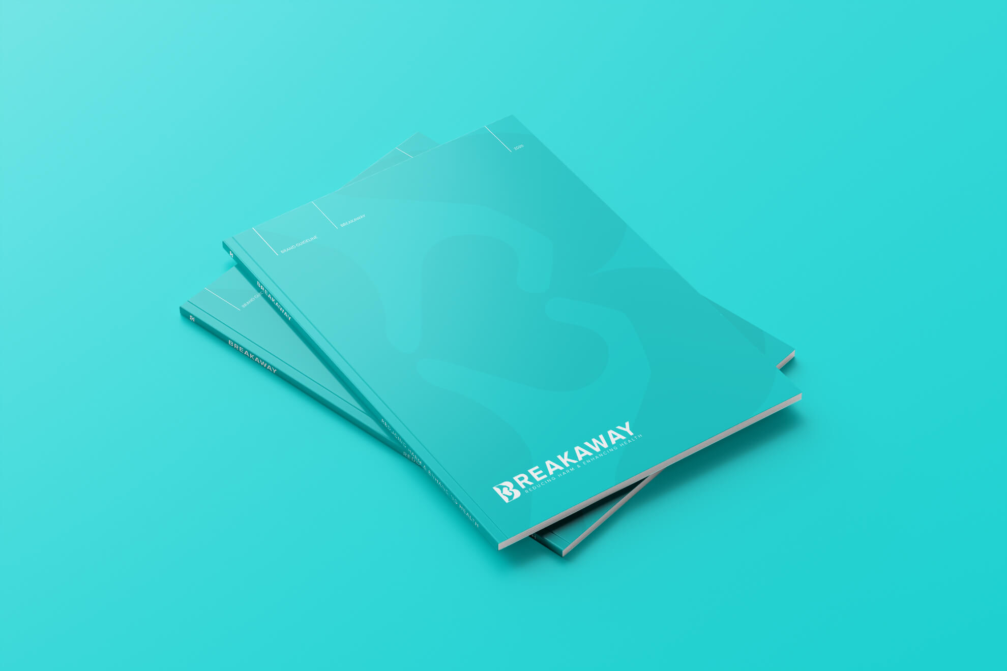
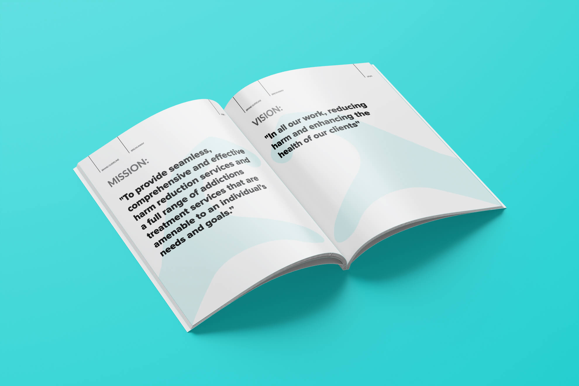
This brand strategy articulates the elements that make up the core of the BREAKAWAY movement. It defines the personality of the company and aligns design team, stakeholders, and audience around a comprehensive and absolute understanding of who we are.
This guide is designed to establish the foundation of the brand, so that BREAKAWAY shows up in the world with clarity, consistency and strength.
