Story: Responsive adjustment
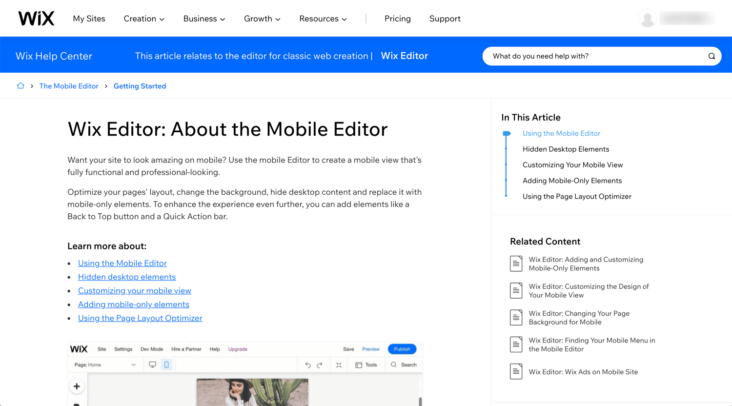
Whatever CMS I use, Webflow, WordPress or Wix, I need to work for responsive. Half of the design elements are adjusted, but it still breaks the elements somehow. Currently, I am working on Wix CMS and I am hoping it’s going to be smooth.
We, as freelance web/graphic designers, know that mobile-first these days, but I don’t feel it’s convenient developing mobile-first, then laptop. It is possible to increase the contents and elements for a laptop version. However, there is no reverse situation, decrease contents, I think. Actually, I hide some elements when I develop a website, laptop to mobile. I will figure it out.
Wix Mobile Web Design | Wix Fix
©Wix Fix
Optimizing Your Wix Website for Mobile Devices: Mobile Optimization Tutorial
©Parrot Digital
This is a very typical situation to adjust to mobile.
Conclusion: 2 days+ work
I worked for mobile adjustment this week. In 1 day, I touched all pages in the first round. Then, I adjusted the space and size as a second round. In 2 day, I confirmed the space and size once again with fresh eyes. It was the first time and I needed to learn the above quickly. So, it takes around 5 hours, I feel.
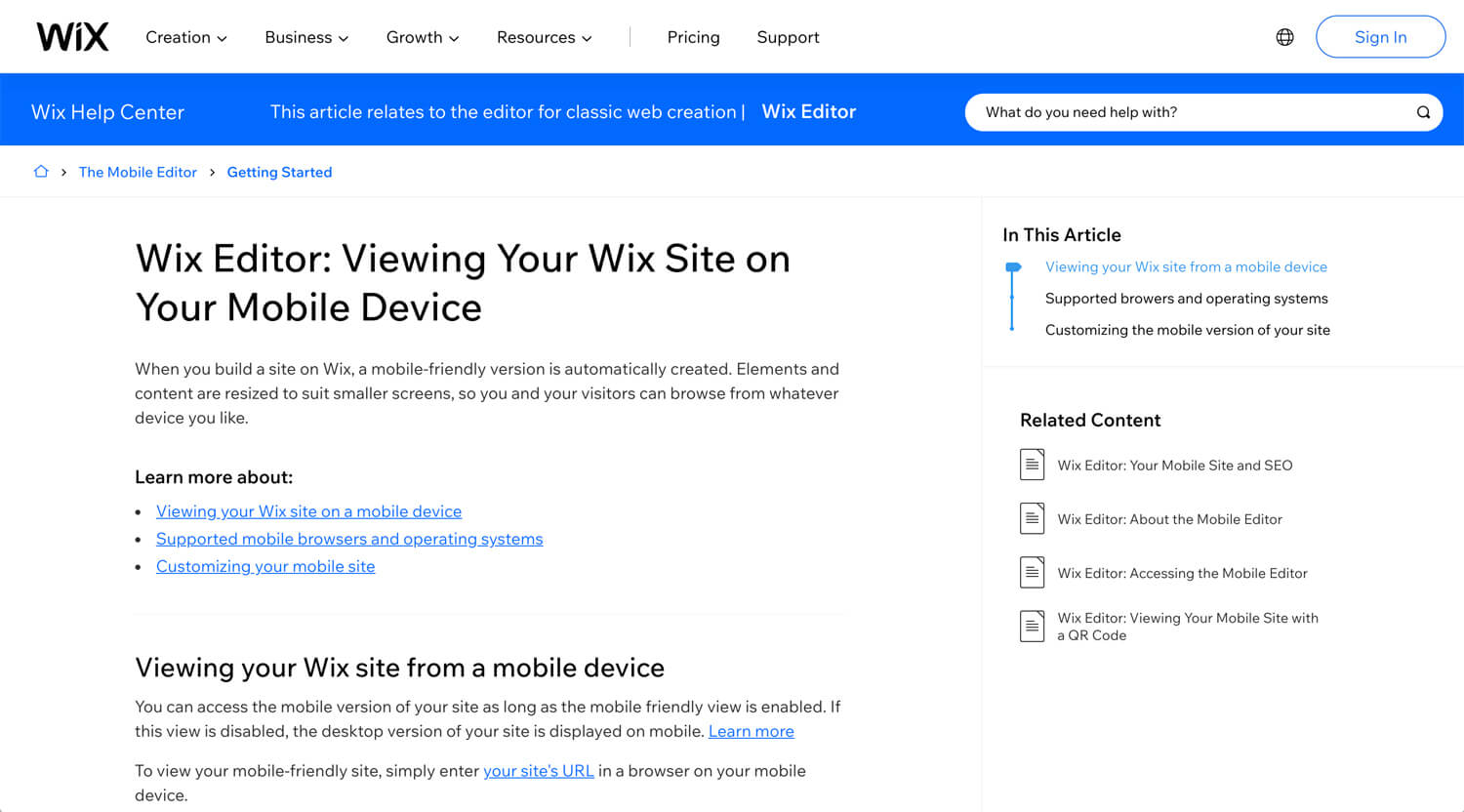
I did a mobile adjustment on a laptop. I am sure that I need to adjust the layout and size once I check it on my iPhone. I don’t know how to check the Wix website on mobile before publishing.
It was client work. Therefore, it was not much playful. So, the mobile adjustment did not take much time. If I play the layout on a laptop, it takes time. This process will be improved in the future. I don’t know when it happens yet.


