Story: Curiosity
Curiosity pushes us forward every day. I cannot die until I look at the Space X launch. Many people told us to stay focus. It’s not an easy a current circumstance, especially in our current era. We can reach information everywhere. The algorithm recommends what we may like.
When YouTube recommends JS topic videos, I found interesting websites. The benefit of Webflow is that we can emulate it without the JS. Some of them are still not able to do it, but it’s okay.
If I don’t know these interactions, I cannot use them. For the design, knowing is better than nothing.
What is Webflow?
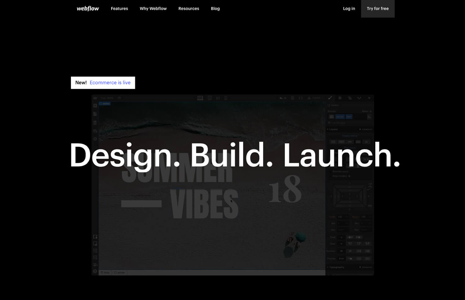
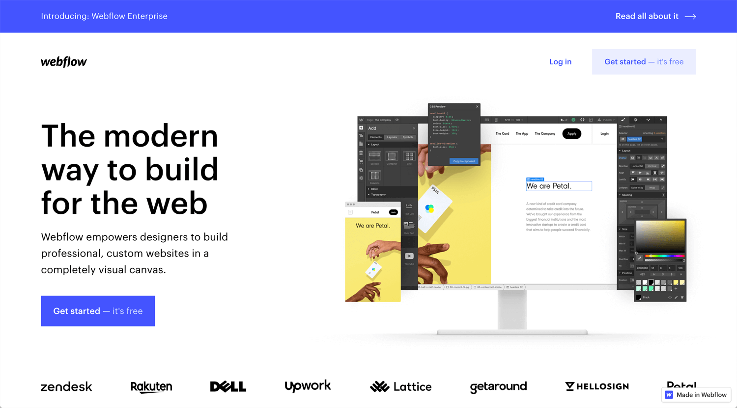
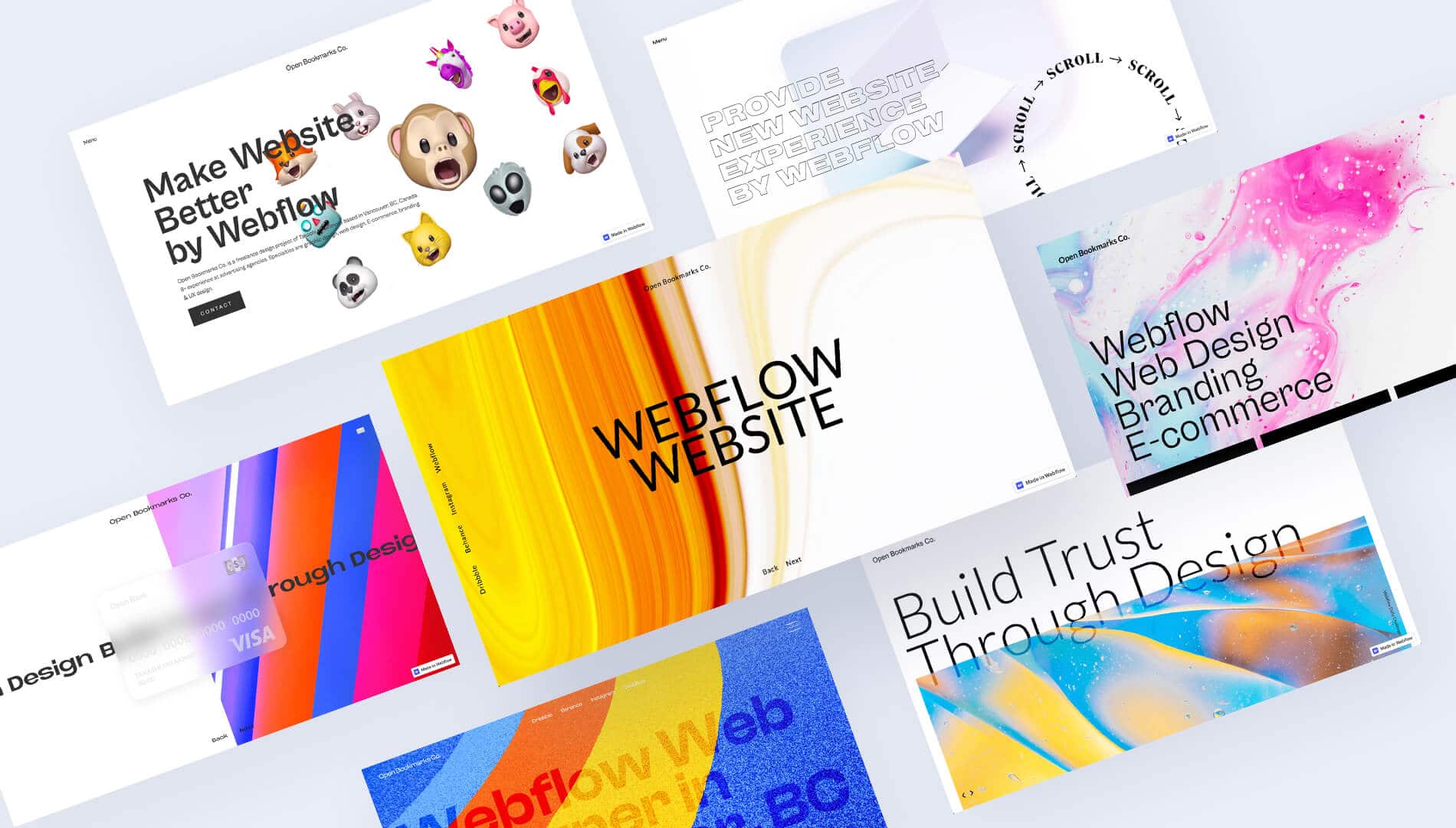
🌎 Webflow: The Web Development Platform Of The Future
Webflow is created for a designer who is not good at programming. Once you master Webflow, you can develop an interactive website yourself.
Advansed Website
©Bridge
– Very engaged text interactions
– Vertical parallax interaction > horizontal scrolling, very smooth
– Full Screen > zoom out > horizontal scrolling > gravity text interaction (i have no idea)
– A lot of window illustrations(some of them are gif) > Hero design with background color transformation
Each interaction can be emulated separately, but I am not sure I can combine all. New experience.
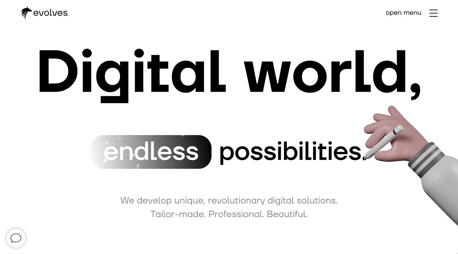
©evolves
– Glass effect on navbar background
– Hamburger menu interaction
Each design components, logo, interaction, digital font and 3D illustration are great, but I feel something misalignment in 1 brand.
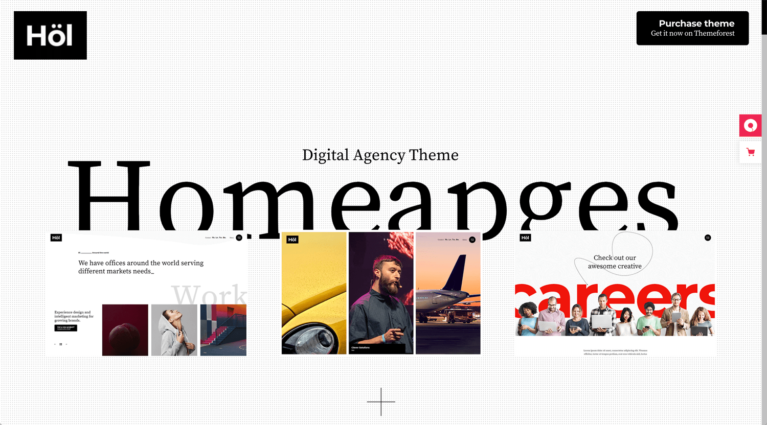
©Hölmes
– Typing interaction
– Typography
Not many interactions, but Hölmes shows a good design sense(layout) by a website. We may be able to learn a layout from a design-driven WordPress theme. Then apply interaction by Webflow.
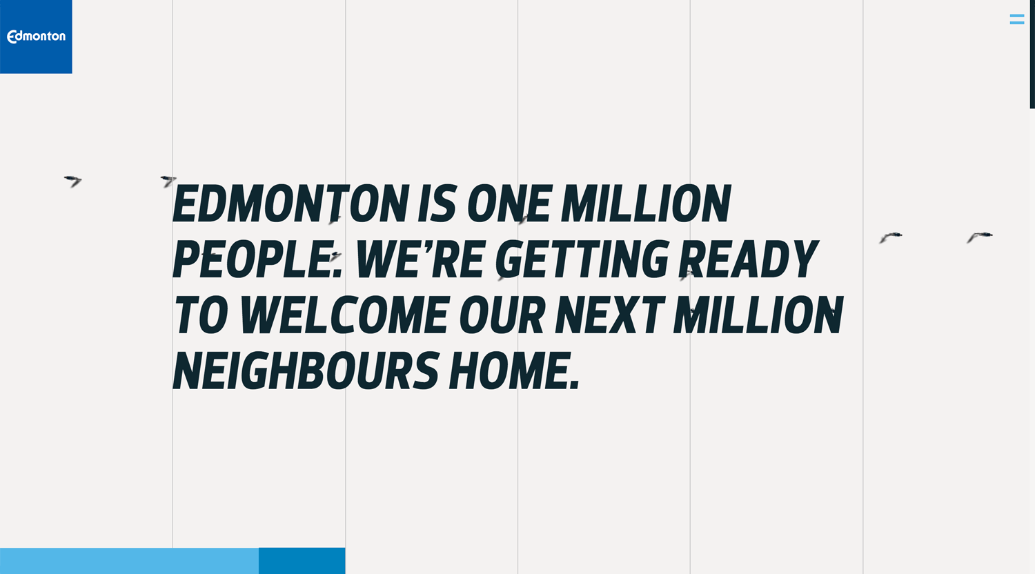
©Edmonton
UI elements and web development are very well together. Seamless, storytelling website. I am sure that it’s a high engagement.
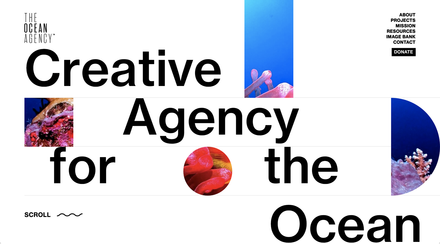
©The Ocean Agency
– Eye-catchy loading animation
– Beautiful color of photos
– Text revealing interaction
– Button hover
Impactful hierarchy, the geometry shape, overall, it’s a beautiful design.
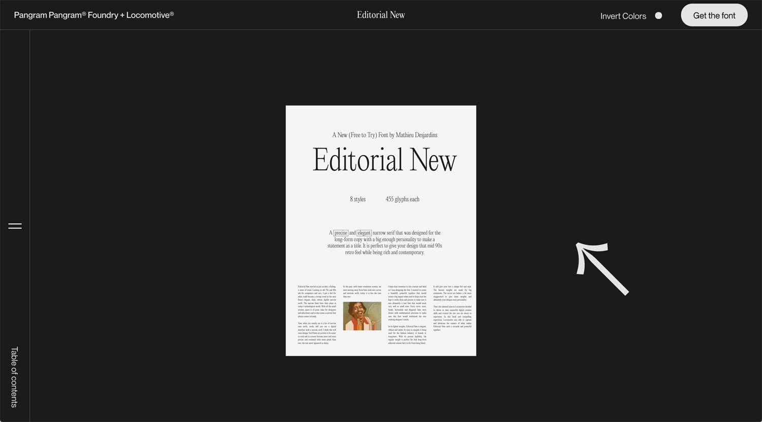
©Editorial Now
– Blend mode mouse cursor ✓✓✓
The website for a font usage example. The editorial layout relatively trends in 2021. Blend mode mouse cursor is eye-catchy. The sticky positioning, horizontal element slides are effective. How to use these interactions shows the sense of the designer. Nice.
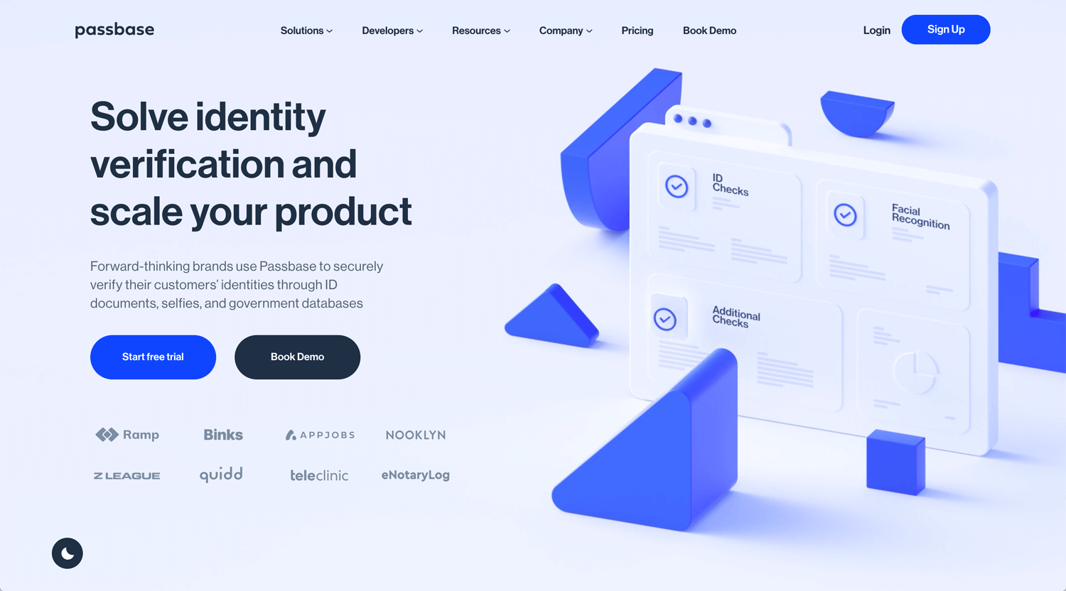
©Wisr Finance Pty Ltd
– Value proposition, CTA and evidence(customer’s logo) at a hero section
*2 lines of H1 is better?
– Nice 3D objects and color ✓✓✓
– Nice mouse hover interaction
– Megamenu
3D object, the animation is very SaaS website feeling. I do not like an illustration.
©Obys.agency
– Nice color pallet & photos
– Nice scroll interaction set
Camera-related elements(included digital font) make the website consistent. I little confused about the initial action, it’s clickable or not.
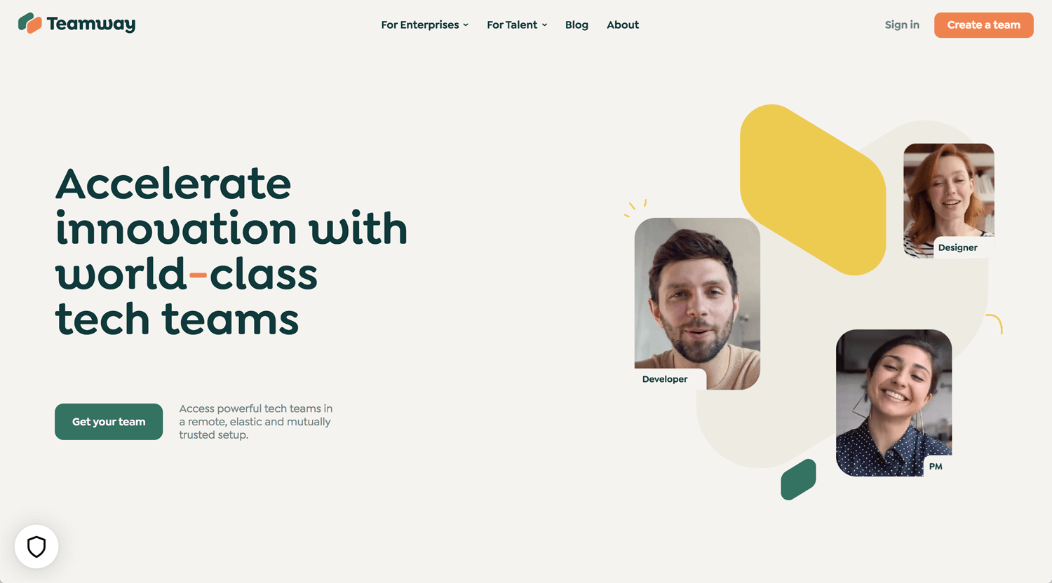
©Teamway
– Fonts, color(background as well), and illustration
*I don’t get about logo elements
Some interaction has some error. Some scroll into views are not opacity 0%. About the hover interaction of nav-menu, when I hover out, For Enterprises, the menu panel is still showing.
It looks startup and no need to be perfect. Just improve when found the issue. Release the service quickly is good.
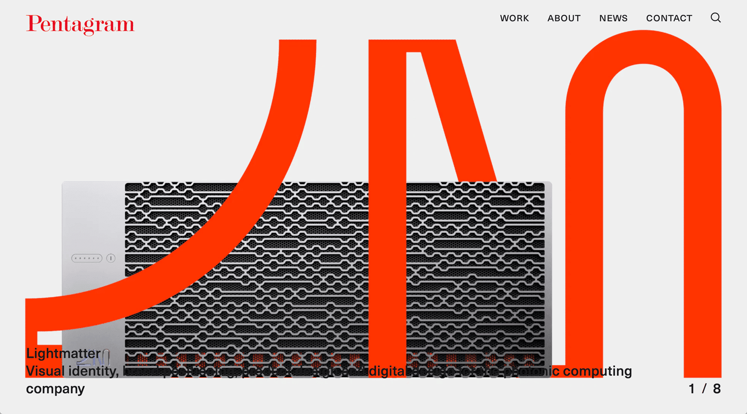
©Pentagram
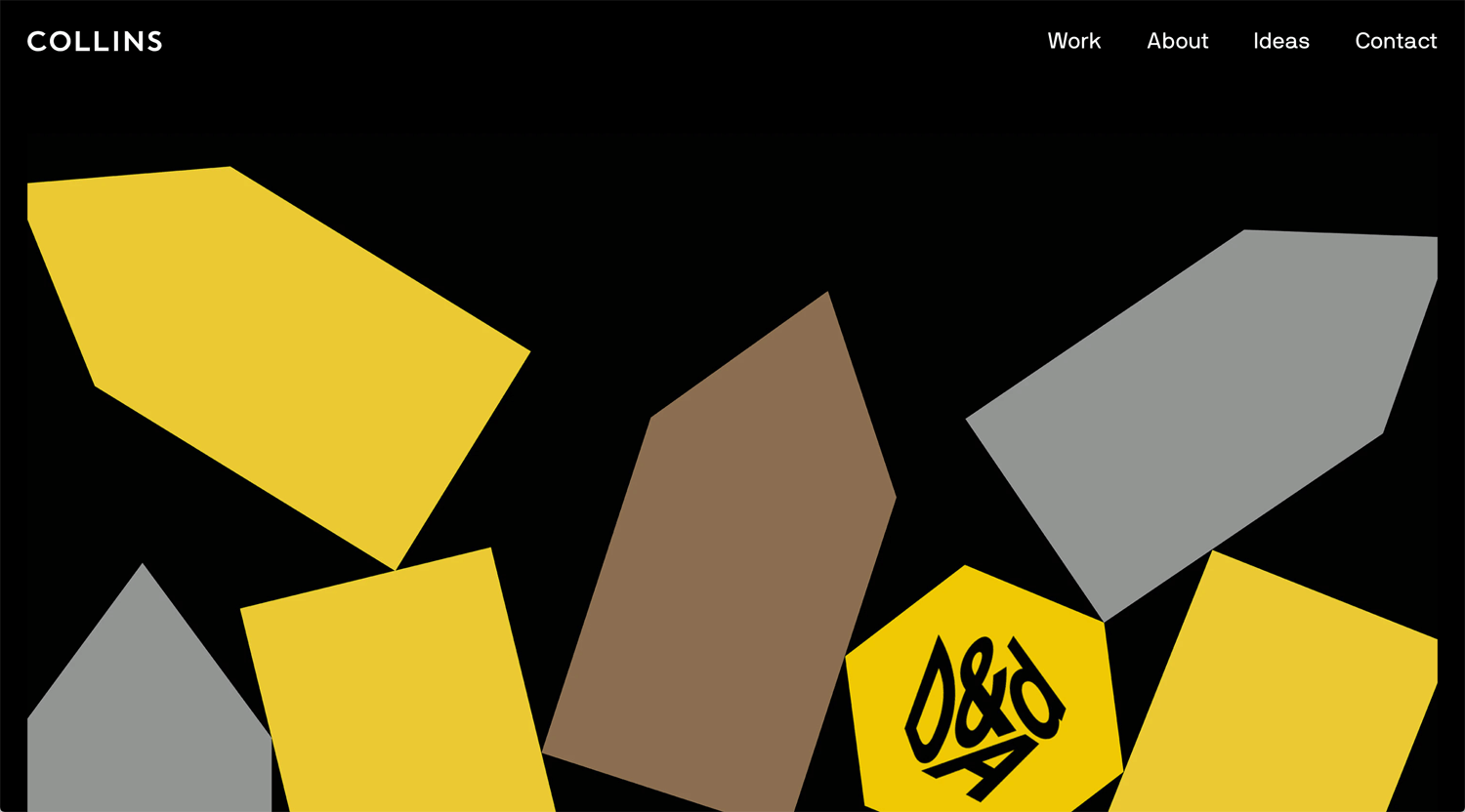
©Collins
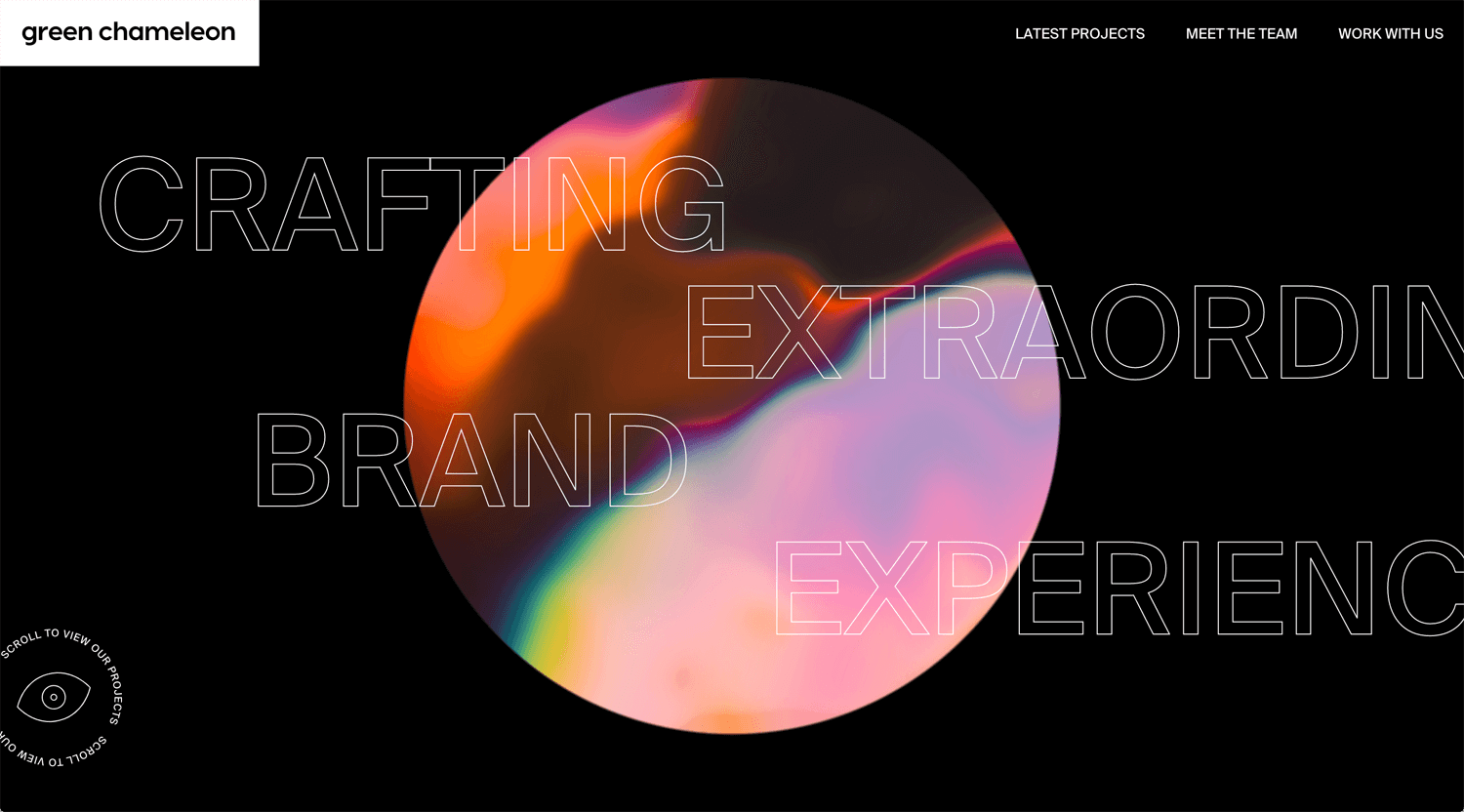
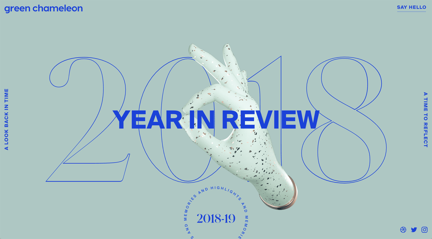
©Green Chameleon
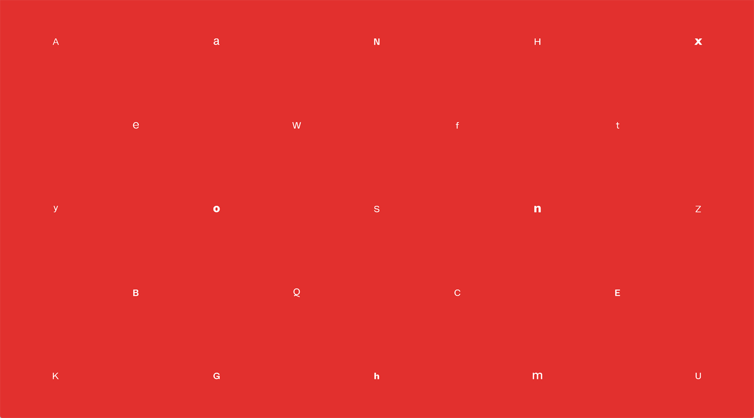
©Stelvio Grotesk
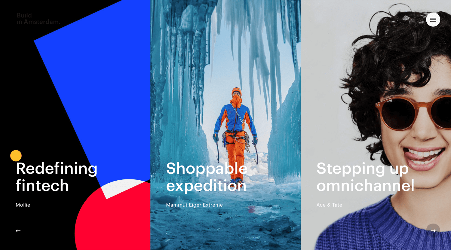
©Build In Amsterdam
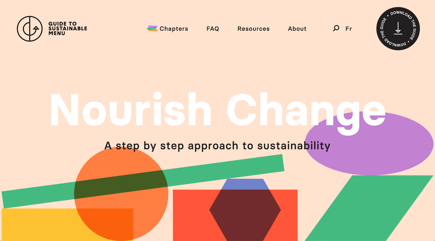
©menudurable.ca
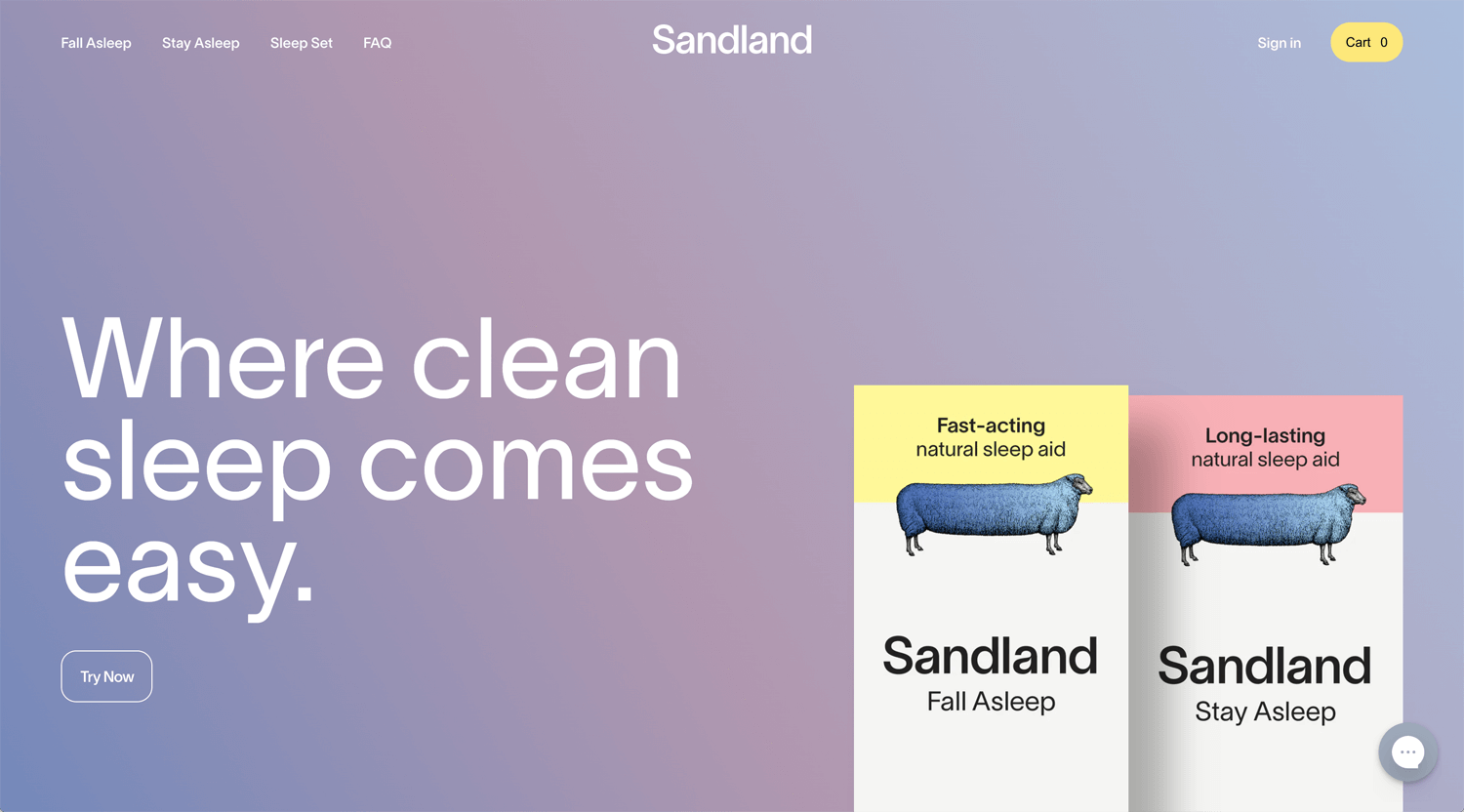
©Sandland
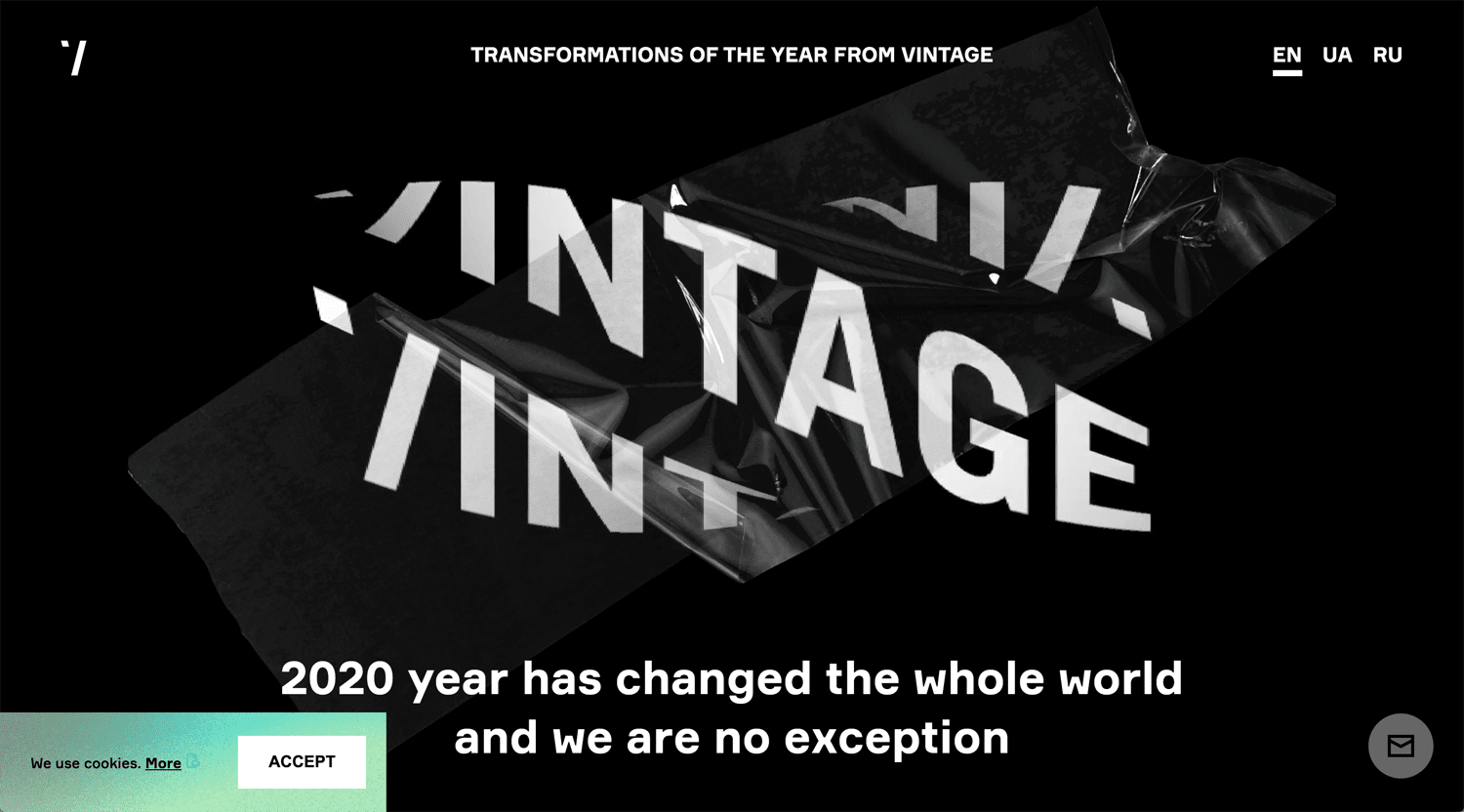
©Vintage
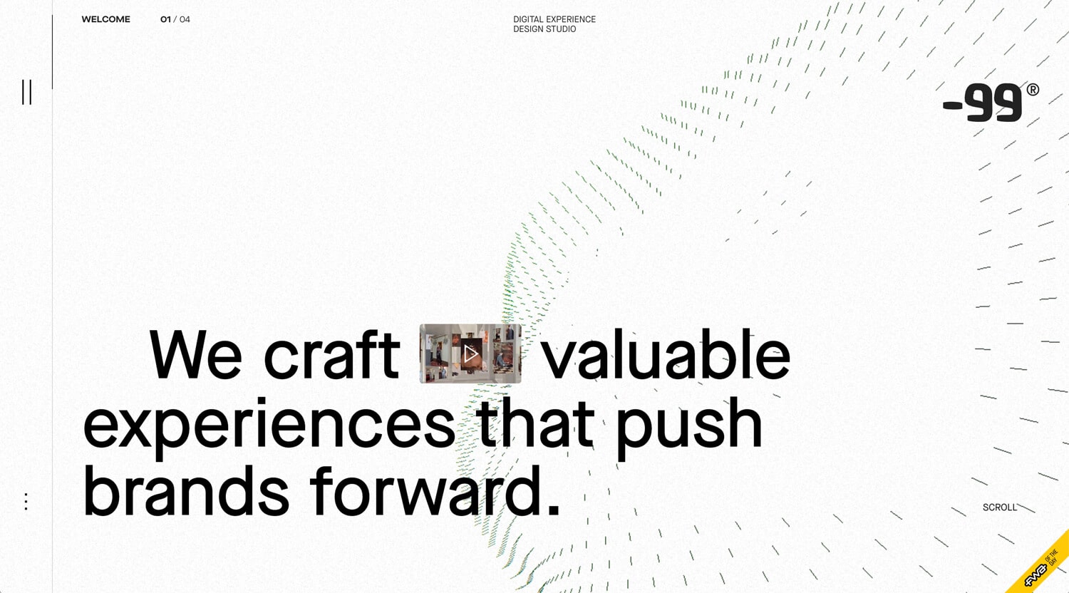
©-99
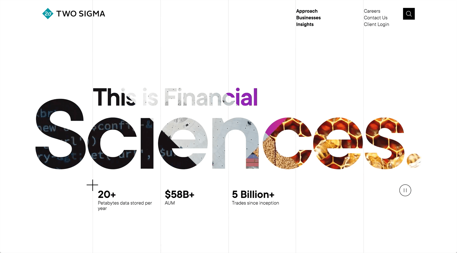
©Two Sigma
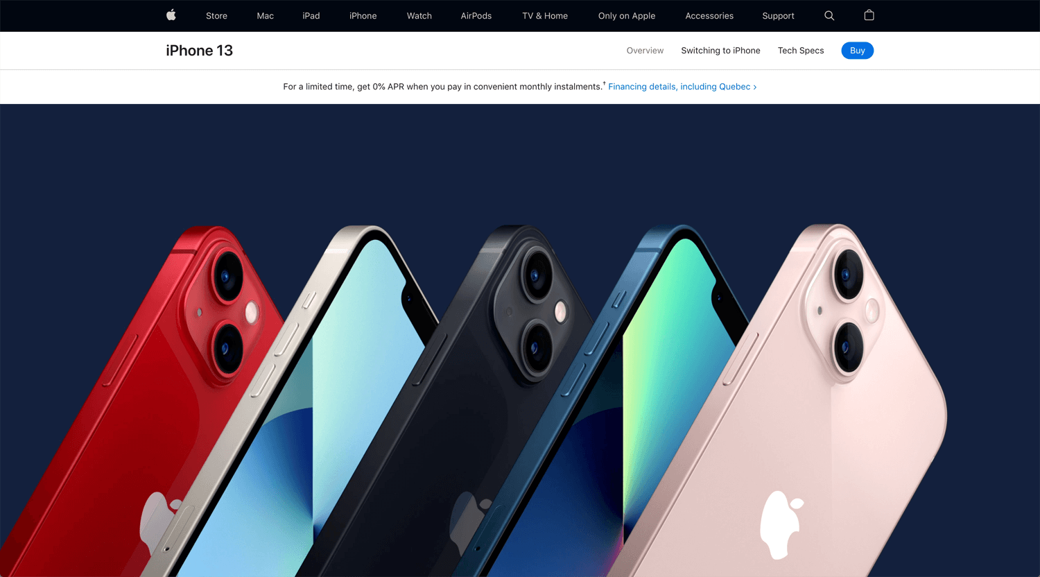
©iPhone 13 by Apple
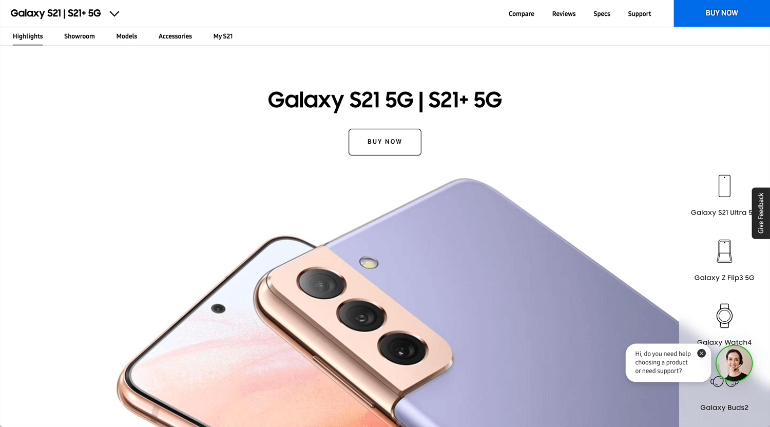
©Galaxy S21 5G by Samsung
Conclusion: Less or more
Great websites are developing by creators in the world every day. We cannot follow all of them during we are working on projects. We may not be able to emulate because of too advanced. We may not be able to apply what we learn to the real project.
Even so, learning is the best rather than indulge. Let’s keep study!
