Story: Structure and interface
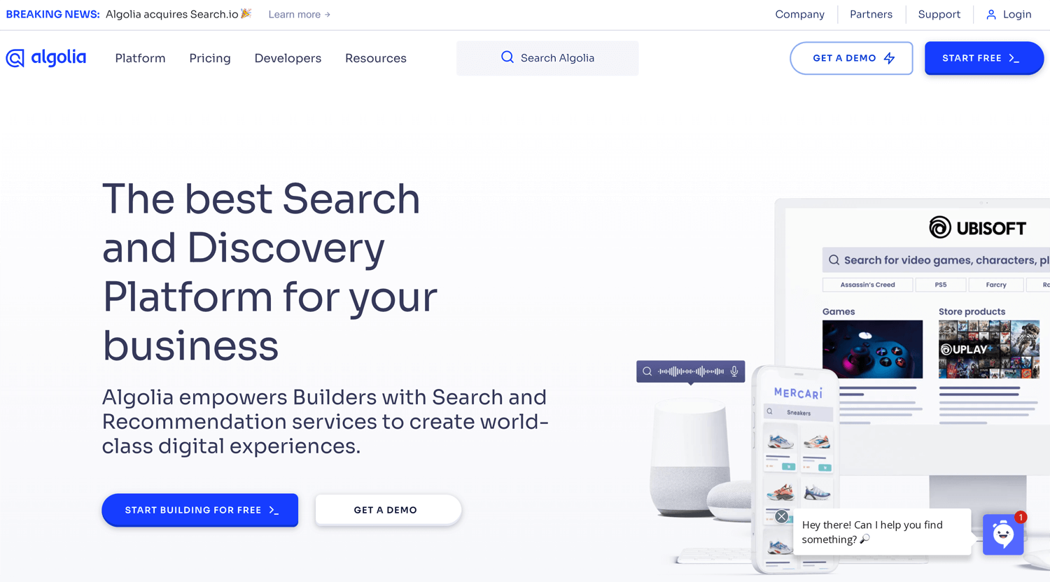
When browsing projects on Upwork, it’s common to see clients refer to a landing page as their website home page. However, the landing page and the home page are different and serve distinct purposes, even though they’re often confused.
Home Page
- Purpose: The home page is the main entry point to a website, designed to give visitors a comprehensive overview of what the site offers. It typically provides links to different sections of the site, such as products, services, about us, contact information, and more.
- Audience: It targets a broad audience, including new visitors, returning users, and those exploring multiple aspects of the business.
- Content: The content is usually varied, including a mix of headlines, images, navigation menus, and calls to action (CTAs). It aims to engage visitors and guide them to explore further into the site.
- Navigation: The home page often features a navigation menu to help users easily access other parts of the website.
Landing Page
- Purpose: A landing page is specifically designed for a marketing or advertising campaign. Its main goal is to convert visitors into leads or customers by focusing on a single call to action (CTA), such as signing up for a newsletter, downloading a resource, or making a purchase.
- Audience: It targets a specific audience that arrives on the page through a particular channel, like a social media ad, email campaign, or search engine result.
- Content: The content is highly focused and tailored to the specific campaign or offer. It typically includes persuasive headlines, minimal navigation, and a strong CTA to encourage immediate action.
- Navigation: Unlike the home page, a landing page usually has limited or no navigation options to keep the visitor focused on the desired action.
Key Differences
- Goal: The home page aims to engage and inform a broad audience, while the landing page is designed to convert a specific audience.
- Audience: The home page serves all visitors; the landing page is tailored to a targeted audience or campaign.
- Content and Navigation: The home page is comprehensive with diverse content and navigation, whereas the landing page is focused with minimal distractions.
A landing page is often created for a specific product or service with a marketing purpose in mind. When you click on a Google Ad, you’ll typically land on a dedicated landing page if the advertiser is using it strategically. However, some advertisers may direct you to a regular website page instead, which is not considered the best practice for advertising or marketing. For example, Unbounce provides the service for it.
A landing page typically follows some basic formulas. I follow Donald Miller and have read a couple of his books, where he discusses what a website should be. I find his approach persuasive, both in terms of its radical ideas and psychological insights. These principles can be applied to landing pages as well.
I’d like to explain the content strategies.
Contents structures for the landing page
The section can be up and down. It depends on your product or service.
01. Hero section
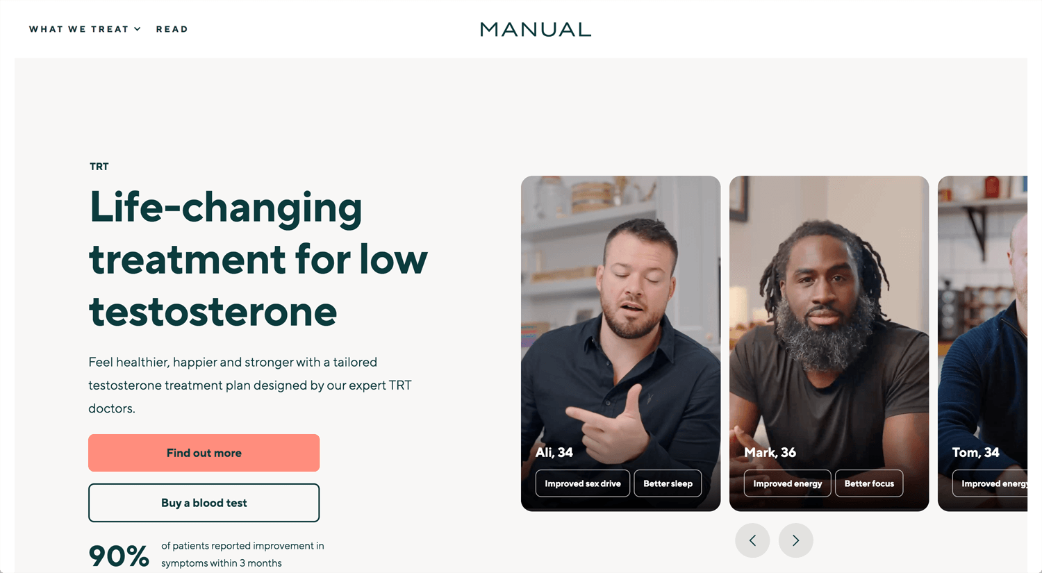
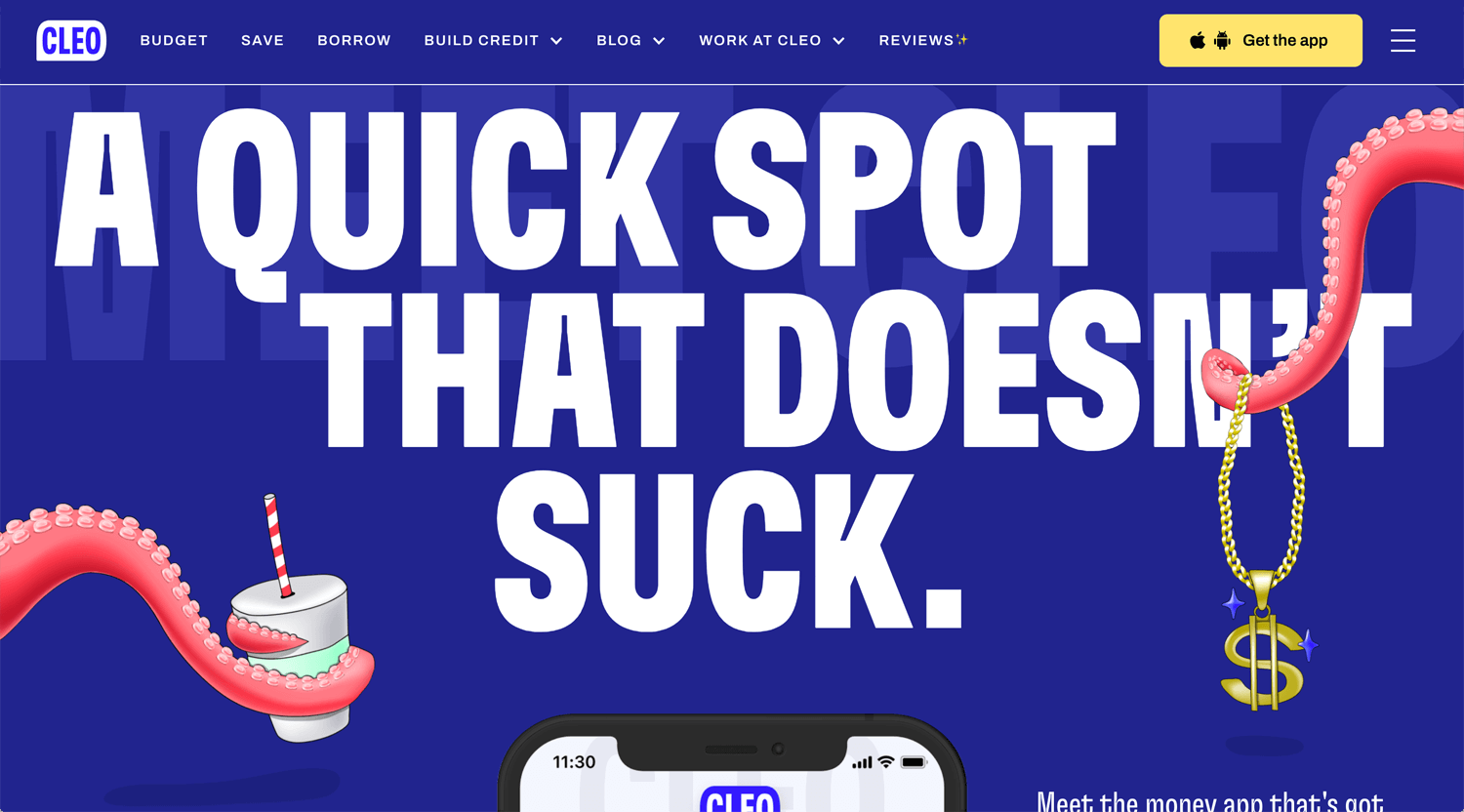
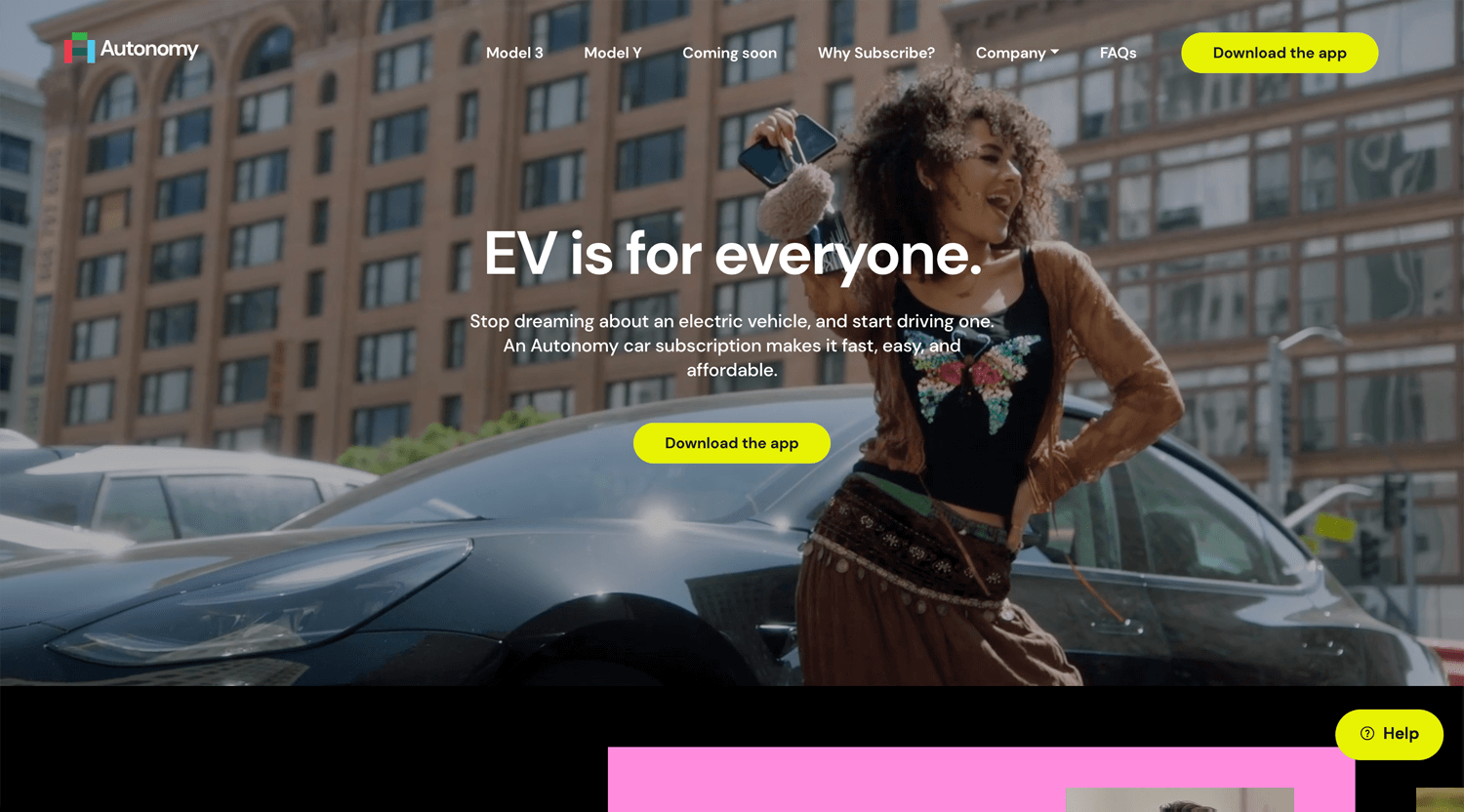
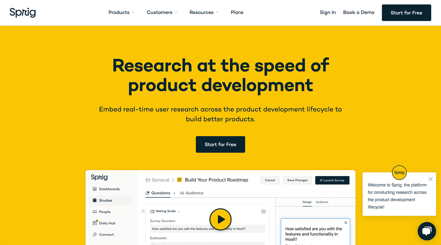
- Headline: This is the first thing visitors will see, so it must be powerful and direct. A strong headline instantly communicates the core value of your product or service, capturing attention and compelling visitors to stay. It should address a key pain point or desire, making it clear why they need to keep reading.
- Subheadline: The subheadline builds on the headline by offering a concise explanation that supports and enhances the main message. It provides context and clarity, helping visitors quickly understand how your product or service can solve their problem or fulfill their need.
- Call to Action (CTA): A prominent, action-oriented button that clearly tells visitors what to do next. The CTA should be irresistible, using persuasive language that creates a sense of urgency or exclusivity, driving users to take immediate action.
*You can show the client’s logo or review rate in the hero section.
02. Problem statement
- Pain Point: Here, you articulate the specific problem your target audience is facing. By clearly identifying their pain points, you create an emotional connection, showing that you understand their struggles and are equipped to help. This section should evoke empathy and resonate with the audience’s experience, setting the stage for your solution.
- Emotional Trigger: This amplifies the problem by touching on the emotional impact it has on the user. Whether it’s frustration, stress, or missed opportunities, highlighting these emotions makes the problem more tangible and pressing, increasing the desire for a solution.
*Display that you understand the client’s problem as a service provider.
03. Solution Overview
- Product/Service Introduction: Introduce your product or service as the clear solution to the problem you’ve just outlined. This section should be concise yet powerful, positioning your offering as the best and most effective answer. It’s important to emphasize how your solution stands out from others, whether through innovation, efficiency, or unique features.
- Key Benefits: Highlight the top 3-5 benefits that make your product or service indispensable. Each benefit should be directly tied to solving the pain points mentioned earlier. This section is not just about listing features; it’s about communicating the value and positive impact your solution will have on their life or business.
*You mentioned the client’s problem in the previous section. Right after presenting the problem, you provide a solution. This is the standard structure, but it’s also highly rational.
04. Social Proof
- Testimonials: Showcase real quotes from satisfied customers to build trust and credibility. Testimonials are powerful because they provide third-party validation, showing potential customers that others have had a positive experience with your product or service. Select testimonials that specifically highlight the benefits and outcomes your target audience is looking for.
- Logos or Case Studies: Displaying logos of well-known companies you’ve worked with or brief case studies that detail success stories can further enhance your credibility. This section reinforces the reliability and effectiveness of your solution by associating it with recognized names or proven results.
*Many similar services exist online, so why should a potential client choose you? You need to show social proof and build trust as quickly as possible. Clients don’t necessarily choose the cheapest option; they choose the right one.
05. Features/Benefits
- Detailed Features: Dive deeper into the specific features of your product or service, but always frame them in terms of the benefits they provide. This section is about showing the functionality and practicality of your offering, helping visitors understand exactly how it works and why it’s superior.
- Visuals: Incorporate images, icons, or videos to make the features more engaging and easier to understand. Visuals can help break down complex information, making it more accessible and appealing, and can also evoke a stronger emotional response.
*A feature refers to what you can do for the client, while a benefit refers to the value you provide to the client. These terms are often mixed up, so it’s important to understand the differences.
06. Call to Action (Reinforced)
- Secondary CTA: Reintroduce your main call to action in a different way, giving visitors another chance to take the desired action. This section often appears after you’ve provided more information, ensuring that those who needed additional persuasion are now ready to convert. The language should remain compelling, with an emphasis on the benefits of taking action now.
- Urgency/Scarcity: Adding elements of urgency or scarcity can significantly boost conversions. Phrases like “Limited time offer” or “Only a few spots left” create a sense of urgency, encouraging visitors to act quickly to avoid missing out.
*The landing page does request to the audience only 1 action. You can repeat CTA a couple of times.
07. FAQs
- Common Questions: Address any lingering doubts or concerns by answering frequently asked questions. This section helps to overcome objections by providing clear, reassuring information that makes it easier for visitors to make a confident decision.
- Clarification: Use this section to clarify any complex aspects of your product or service, ensuring that there are no barriers to conversion. The goal is to eliminate uncertainty and provide all the information needed for visitors to feel secure in taking the next step.
*An FAQ section is also used to showcase your expertise in the client’s field. By understanding the target audience, you can address the questions they are likely to ask.
08. Final Call to Action
- Reiteration of the CTA: End the page with a final, strong call to action. By this point, visitors should be fully informed and ready to convert, so the CTA should be clear, bold, and action-oriented, leaving no doubt about what they should do next.
- Supportive Text: Offer reassurance with a risk-free statement, such as “Money-back guarantee” or “No credit card required.” This can reduce any remaining hesitation and provide the final push needed to convert.
*Each CTA should be crafted to persuade the target audience to take action immediately.
09. Footer (Optional)
- Contact Information: Provide easy access to your contact details, offering visitors a way to get in touch if they have further questions or need support. This demonstrates that you’re approachable and available to help, which can further build trust.
- Legal Links: Include links to your privacy policy, terms of service, or any other relevant legal documents to ensure transparency and compliance with legal requirements. This adds a layer of professionalism and trustworthiness to your landing page,
If the target audience reviews the entire landing page, the final decision is in their hands. It’s up to them whether they choose to contact you or not.
Contents structures for the landing page, Option
The structure above is the basic formula. We can arrange it based on the client’s business and offer.
10. Process
- Content: This section provides a clear, step-by-step outline of how your product or service works. It can include visual aids such as flowcharts, diagrams, or icons to illustrate each step. Each step should be accompanied by a brief, easy-to-understand description that highlights the key actions and outcomes involved.
- Purpose: To demystify your offering by breaking down the process into manageable and comprehensible parts. This section helps visitors understand exactly what to expect, reduces any potential confusion, and builds confidence in the effectiveness and ease of your solution. By presenting the process transparently, you address potential concerns and demonstrate the practical value of your product or service, encouraging visitors to take the next step with greater assurance.
11. How It Works
- Content: This section details the process of how your product or service functions. It typically includes:
- Step-by-Step Breakdown: A clear and concise outline of each stage in the process, with a brief description explaining what happens at each step and its benefits.
- Visual Aids: Diagrams, flowcharts, or icons that visually represent the process, making it easier for visitors to grasp the flow and sequence of actions.
- Practical Examples: Illustrative scenarios or case studies that show how the process applies in real-life situations, helping visitors relate to and understand the practical application.
- Purpose: To demystify your product or service by clearly outlining each stage of the process. This section helps visitors comprehend what to expect, addresses any potential concerns, and showcases the efficiency and effectiveness of your offering. By presenting a straightforward, visual explanation of how it works, you build trust and confidence, encouraging visitors to take the next step with a clearer understanding of what’s involved.
12. Pricing table
- Content: The Pricing Table section presents a clear overview of your product or service’s pricing options. It features distinct pricing tiers with detailed costs and included features, enabling easy comparison. Visual elements like tables or grids enhance readability, while prominent calls to action, such as “Sign Up Now” or “Request a Quote,” encourage immediate engagement.
- Purpose: The Pricing Table provides transparency about costs, helping visitors quickly understand their options and make informed decisions. This organized format simplifies the decision-making process and promotes conversions by clearly displaying the value and benefits of each pricing tier.
13. Case study/Success Story
- Content: The Case Study/Success Story section showcases detailed accounts of how your product or service has positively impacted clients. It typically includes a narrative describing the client’s initial challenges, the solutions you provided, and the measurable results achieved. This section often features quotes or testimonials from clients, along with supporting data or visuals that illustrate the success.
- Purpose: The Case Study/Success Story section builds credibility by demonstrating real-world applications and outcomes of your product or service. It provides potential clients with concrete examples of your success and the tangible benefits of your offering, helping to establish trust and persuade visitors of your value.
14. Interactive Quiz or Calculator
- Content: The Interactive Quiz or Calculator section engages visitors with a tool designed to assess their needs or provide personalized recommendations. It typically includes a series of questions or inputs that guide users through a decision-making process, resulting in tailored results or insights. This section often features user-friendly interfaces and dynamic responses based on the inputs provided.
- Purpose: The Interactive Quiz or Calculator enhances visitor engagement by offering a personalized experience that addresses specific needs or preferences. It helps capture valuable lead information, provides relevant recommendations or estimates, and encourages visitors to take the next step by demonstrating the immediate value of your product or service.
References
*Not all references are present as the landing page, and not all the content we discussed may be included on the page.
Resources
I am constantly researching design-related topics. I previously collected information about landing pages. Please check if you are looking for it.
Conclusion: Formula and answer
Now that you know the formula, can you solve the issue? Maybe not.
What you need to do:
- Collect Information: Gather all relevant data and insights needed for the landing page.
- Copywriting: Craft compelling and persuasive text tailored to your target audience.
- Graphic Design: Create visually appealing elements that enhance the overall design.
- Landing Page Design: Design the layout and structure of the landing page.
Additional tasks may include:
- Customization: Modify templates using CSS/JS if necessary.
- Follow Brand Guidelines: Ensure the design and content align with the brand’s identity.
Creating a landing page requires:
- Psychology (part of UX): Understand the target audience
- Content Editing Skills: Refine and polish the content for clarity and impact.
- Copywriting: Develop engaging and effective text.
- Graphic Design: Design graphics and visual elements.
- Web Design: Structure the page layout and user experience.
- Programming: Implement any required coding for functionality.
- Video Editing Skills: If using video, edit it to fit the landing page.
While creating a landing page is not overly difficult, it does require practice. For client projects, delivering high-quality work is essential. Evaluate the landing page based not only on its appearance but also on how well it engages the target audience. Although we cannot guarantee specific results, it is crucial to explain the outcomes, whether they are better or worse than expected.
Reference:
Unbounce: What is a landing page?
Leadpages: Landing Page Builder for Lead Generation
