Story: Useful or spam
I receive some newsletters every day. Most of them are no value to see. I can unsubscribe it anytime, but sometimes it informs useful information.
I believe that most email newsletters are using Mailchimp. Mailchimp provides a template, but it is also customizable. So, how much a sender can engage with an audience depends on them, content’s creator and marketer(and designer?). If a marketer works at a small company, s/he would be in charge of all of them. Ideally, each task separates with each expert, but it’s rare in my guess.
I searched what newsletter makes good or bad.
UberEats
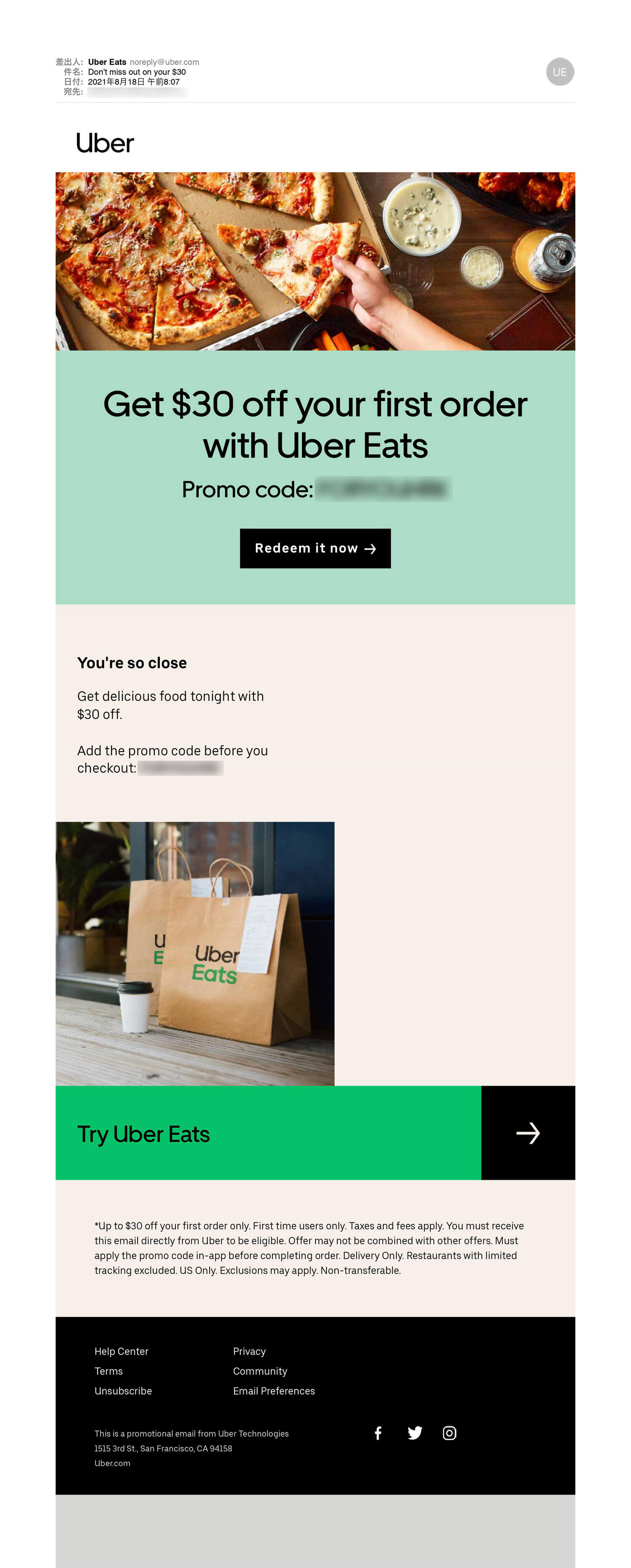
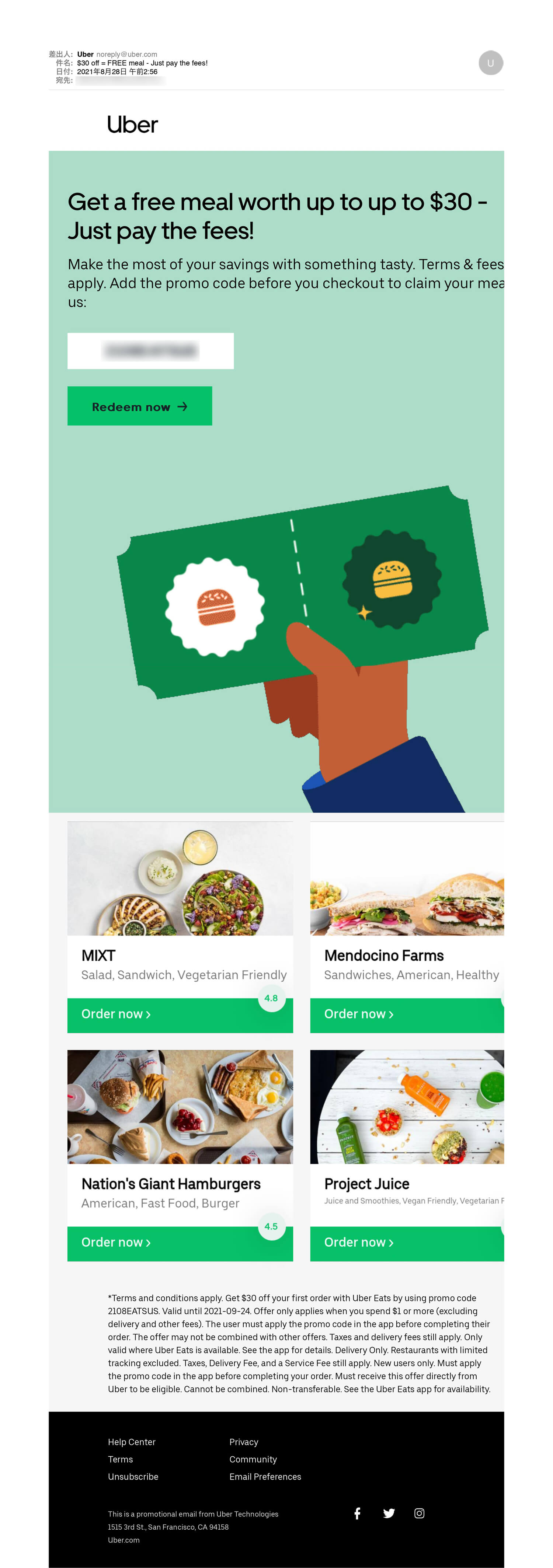
I used Uber in L.A. before. Therefore, I receive the newsletter of UberEats. I usually delete it. I don’t think I can use food delivery services in daily life. I am not rich. This morning I received the UberEats newsletter again, but it looks different. I could recognize it better than usual. Therefore, I would like to compare it.
Before
After
About before, I saw this newsletter over 20 times. I have no interest and no attract the pizza as well. I may use UberEats on some occasions in the future, but not in daily life.
About after, the illustration makes me feel I got something. The illustration uses gif, it’s a trend and catches a user’s attention. Below the illustration, it shows local restaurants which I have never heard of. It cultivates the curiosity of local restaurants. UberEats may be able to offer(charge) for the ads service, 4 blocks, to local restaurants. Only 1 offer, coupon. It’s easy to understand.
Just 1 fundamental issue is that I am not a target audience, but good job!
12 Email Newsletter Design Tips to Boost Your Email Marketing Results
©Visme
– Mobile-first
I don’t know which is comfortable for a user
– Single column
– Keep the text short and sweet
– Visual hierarchy
– White space
– Stunning image
I feel gif animation works better on a newsletter
– CTA
I did not learn anything new. I think an email newsletter is not so much a quality matter, try and error these theories.
Newsletter Design Trends 2021
©Liana Technologies
– Big font and bright color
Starbucks newsletter is a good example.
– illustration
As you see the UberEats above, it works.
– Less is more
– Break layout grid
It depend on the template? I don’t think we should take much time for a newsletter
-Dark mode
I don’t see this often on my newsletter.


6 Tips for a Great Newsletter Design
©Liana Technologies
– Mobile-first
– Understand the target group
– At most 2 fonts
– Fewer colors
– Catchy image or illustration, some interaction
– Easy to scan
Email Design: How to Create Newsletters for Best Marketing Results?
©designmodo
– Interaction
I think interaction increases engagement, in my experience(and human nature).
– Pattern, Emoji
– Gif
– Accessibility
Example
DIJ
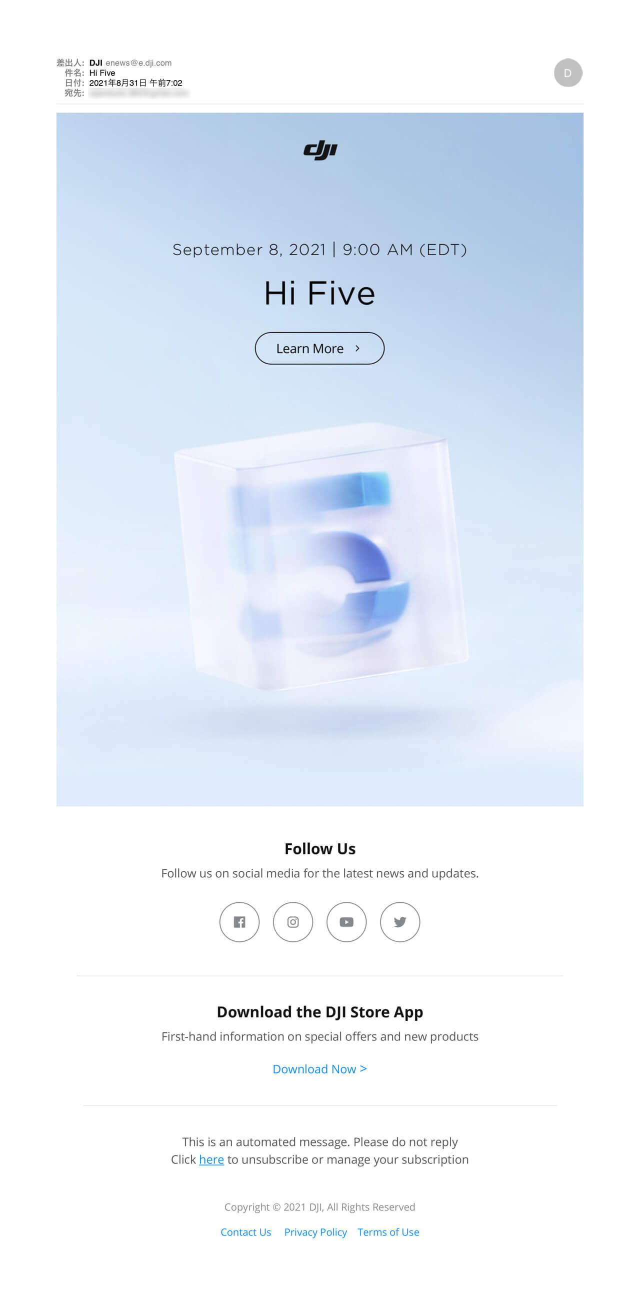
The example of less is more. I did not click the link though it’s okay.
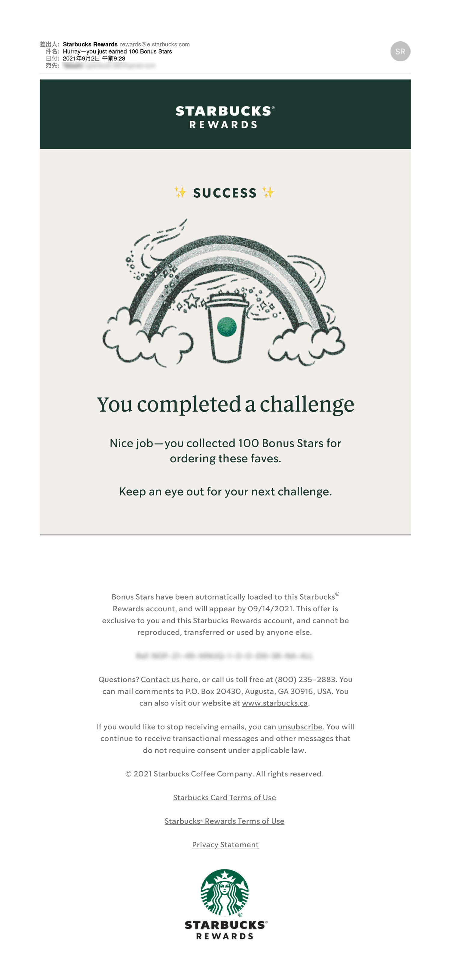
The illustration is a gif. Some people say Starbuck looks like a bank. They collect money, charge on the rewards card, before physically selling anything. Good for business. The promotion often affects my purchase. Starbucks knows my behaviour.
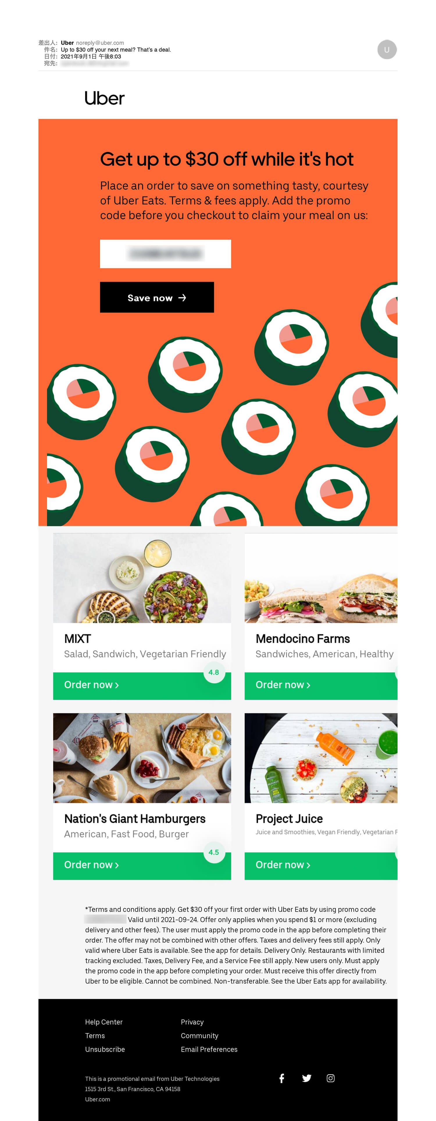
Getting better. I am sure that this newsletter works and UberEats will keep this direction for a while.
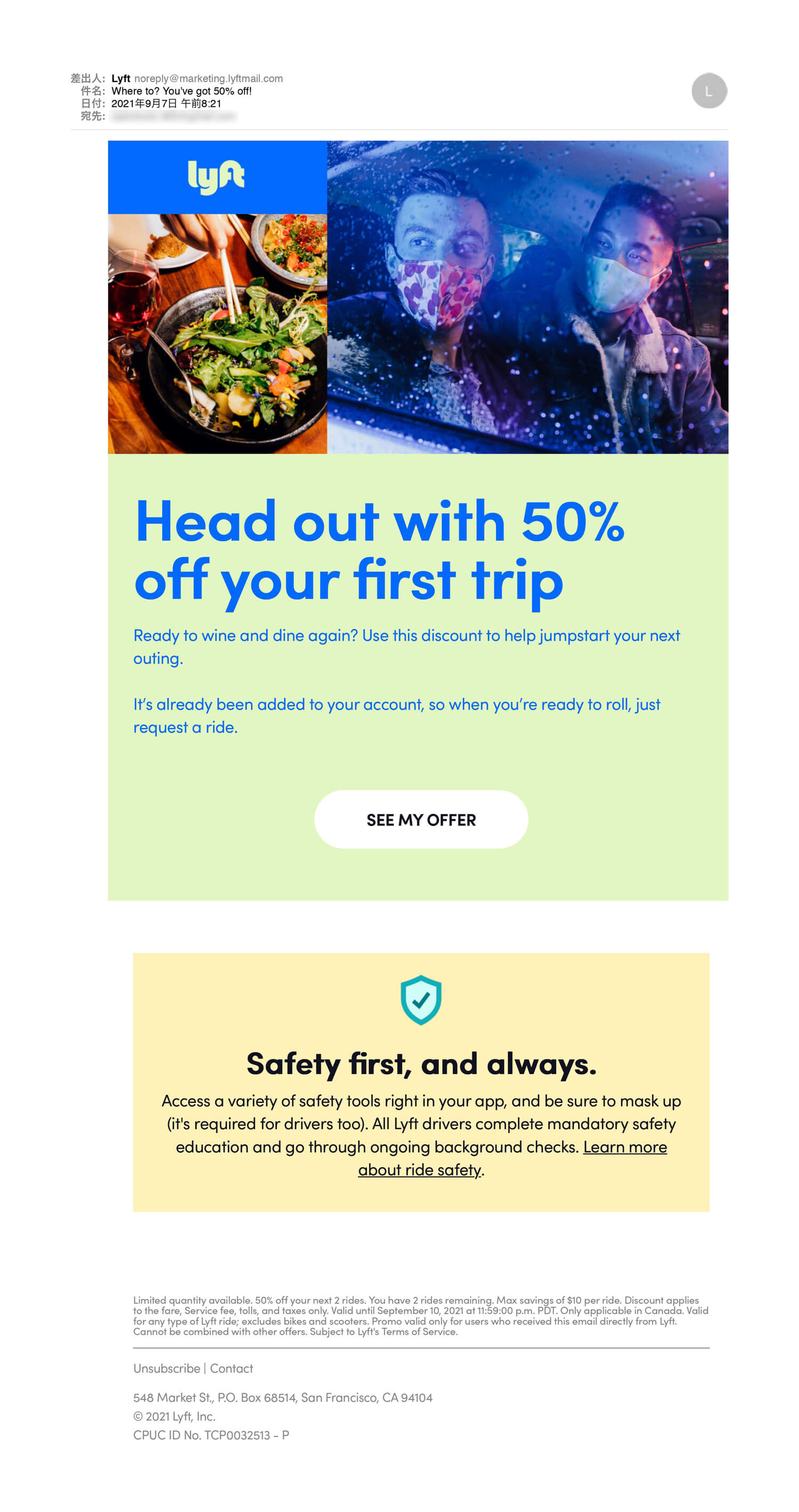
Lyft offers 50% for 2 rides. The newsletter is not so impressive, but it may work. Because I need to go to the airport next week. Targeting and demand are matched.
Conclusion: Not much something new
If you are a designer, you may not so much learn from the video. I don’t have many chances to make a newsletter, but I naturally knew most of the tips. Overall, we can learn from newsletters that we receive in daily life. We should distinguish between good newsletters and bad ones. Then, we need to be able to explain the reason, like an UberEats newsletter above. It’s part of the design job.
The learning opportunity is everywhere. Life is design!
9 of the Biggest Email Design Trends From the Past Year with Cristina Gomez | UNSPAM 2020
©Really Good Emails
*Updated: 2022.4.3
Tips:
– Beige
– Bigger Bolder Type
– Overlapping Blocks
– Transparent Illustrations
– 3D Imagery
– Circle Bullet
– Night Mode
– Plant Accents
– Gradients
– Diagonals
– Neon Green
I had a rush work, only 1 day for email newsletter design. I returned to this blog and I used elements as much as I can, but it was not enough. I checked YouTube and I found a good resource. I sometimes see a job post, Email Designer on LinkedIn. Subscribing a newsletter for learning design is a nice idea. I recently subscribed to the Lululemon newsletter for some reason. Their newsletter displays their brand.
Omnisend: Order confirmation emails: best practices and examples
