Story: Symbol the company’s history
Generally speaking, most of the company bankrupt in 30 years. It means a company has to innovate new services. In each era, brand and message also transform. You may think the old logo looks really old-fashion, but it was a symbol at that time. The current logo, even you think it’s a masterpiece, will be getting old in the future. Please keep in mind.
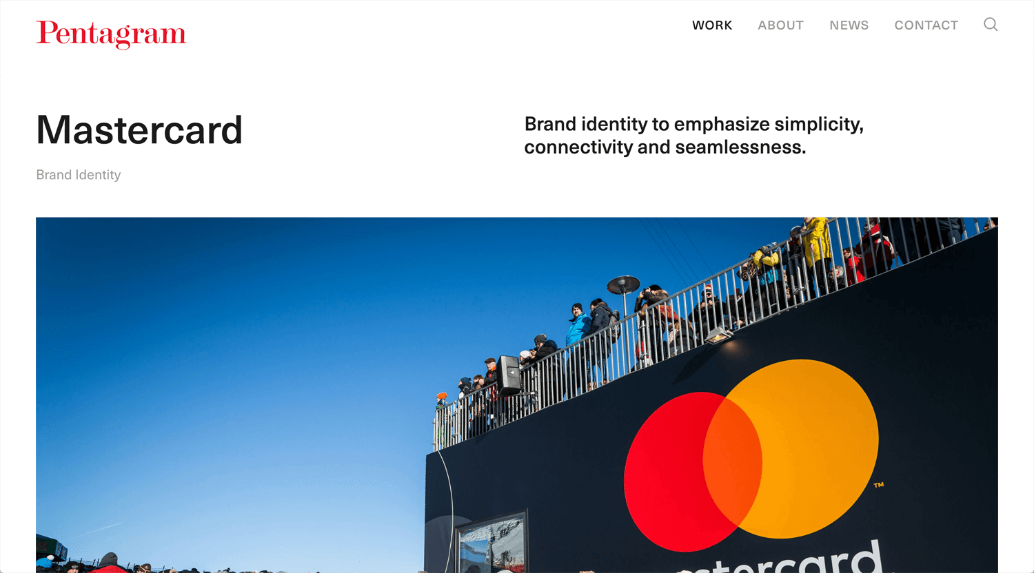
Mastercard
©Pentagram
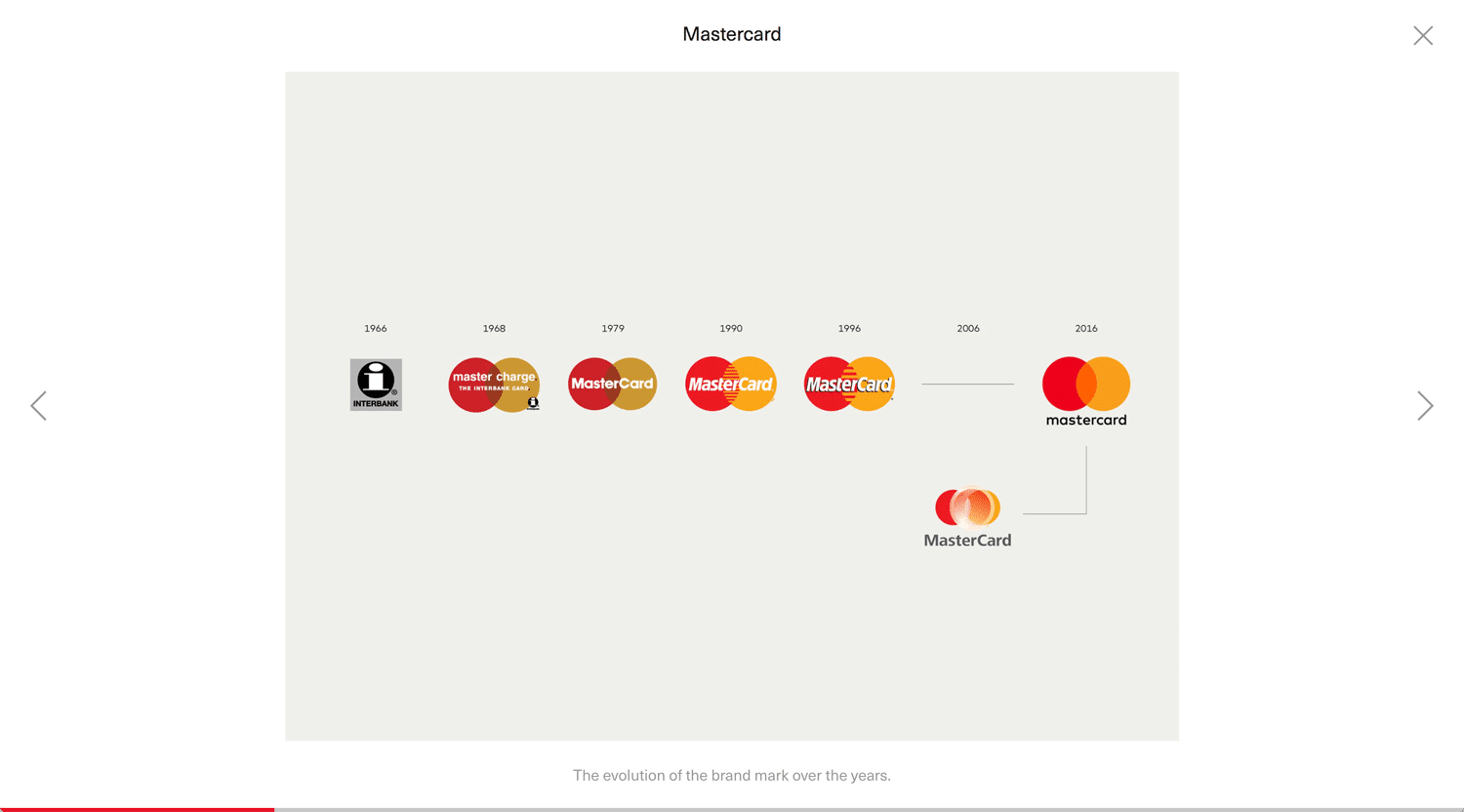
Surprisingly, Mastercard already designed basic form in the year 1968. Since then, all designer has respected it.
The two circles represent the overlap of commerce between international powers, in particular, the East and West. Associations that could be made with this symbolism are the Japanese flag carrying the red circle, and the golden circle as the power of the “sun” of the “golden” West—the land of opportunity and highest attainment in current history.
Mastercard provides global service and the consumer has an image, double circle, of the company. I don’t think it will change in my life, but no one knows in the future. Will see.
Wikipedia: Mastercard
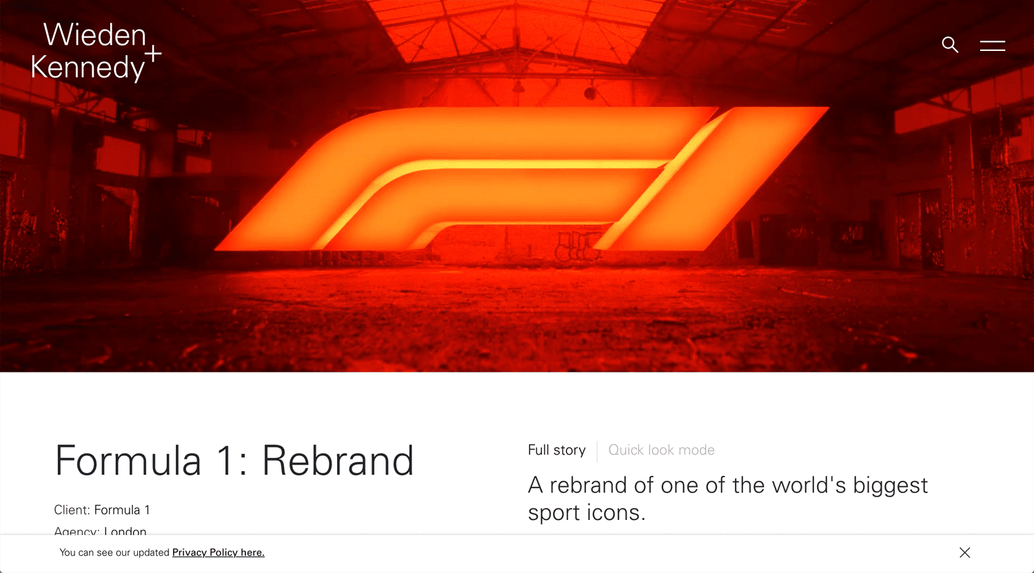
Formula One (F1)
©W+K
I really like the current F1 logo, very bold, dynamic and symbolic. The logomark displays the racing course. It is naturally able to install the racing car, narrow space. However, when it released in 2017, there were controversial. I understand that people got used to the previous one. I had no doubt that the new brand identity could beyond the previous one as a symbol and application.
It’s 2021. I want to hear the current reputation.
Medium
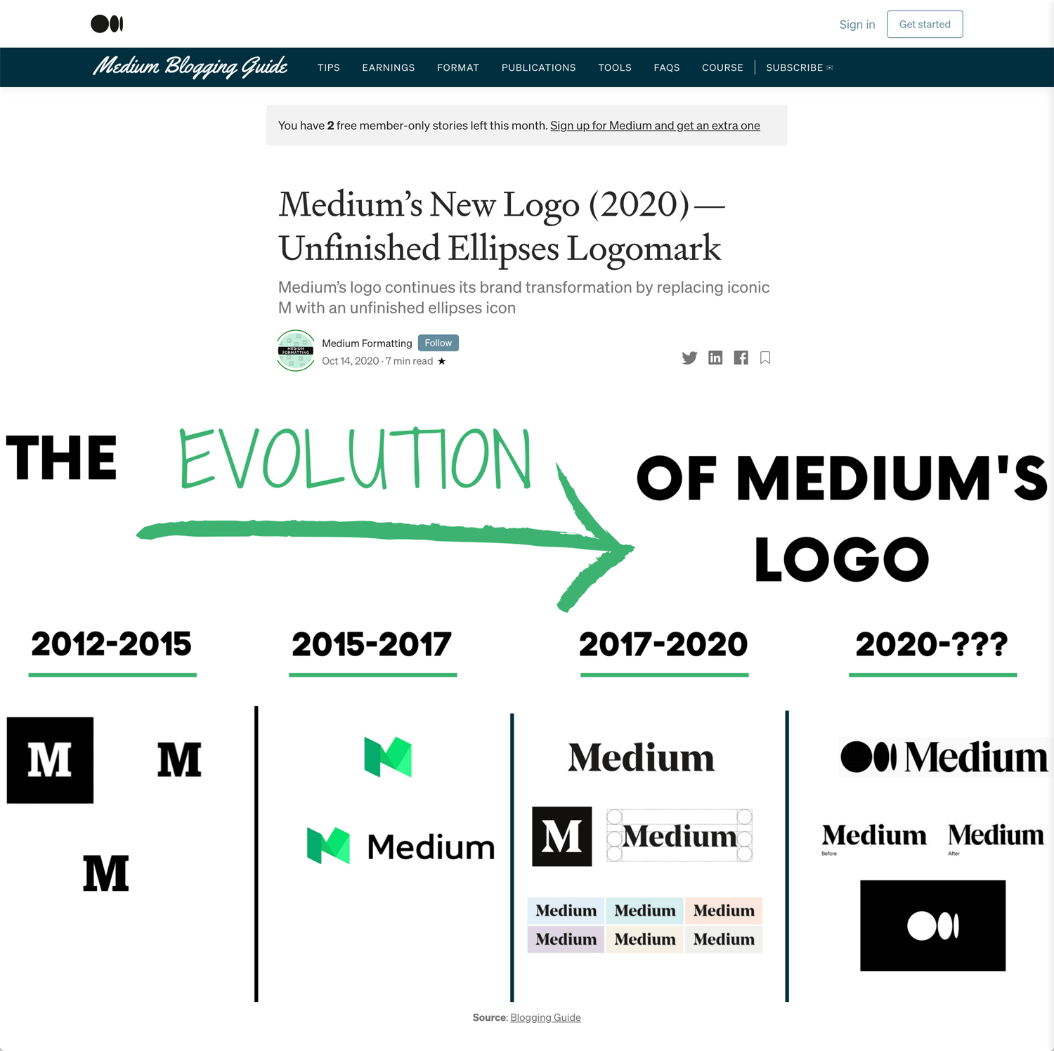
Medium logo also shows that the designer can find the core/idea in the company’s history. If it was appropriate, a designer can reuse it. A designer does not always need to change it. Try to embrace it and enhance it.
Medium: Where good ideas find you
Microsoft
©Free Logo Design
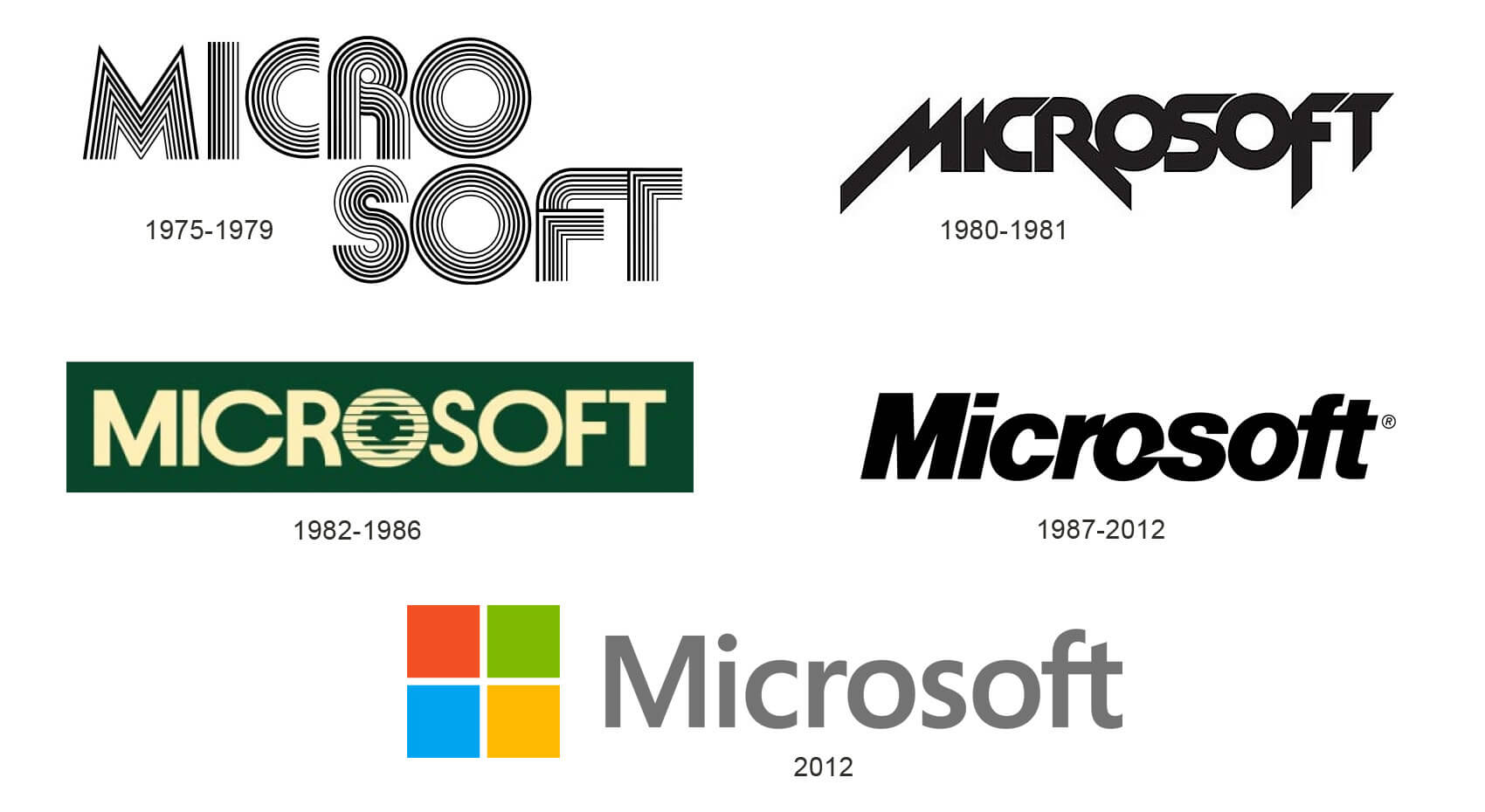
Microsoft, one of a well-known global company, was founded by Bill Gates & Paul Allen in 1075, 45 years ago. 143 billion USD revenue in 2020.
The first logo looks sci-fi. The second logo looks future chic or Metallica. The current one is just modern. What we can learn is branding is not difficult than sales marketing. If the company creates a cashflow, stable business, they can restore the brand, like Microsoft. There is no consequence for each logo. The company can change the impression, voice & communication. The consumer will forget the past brand identity soon.
Walmart
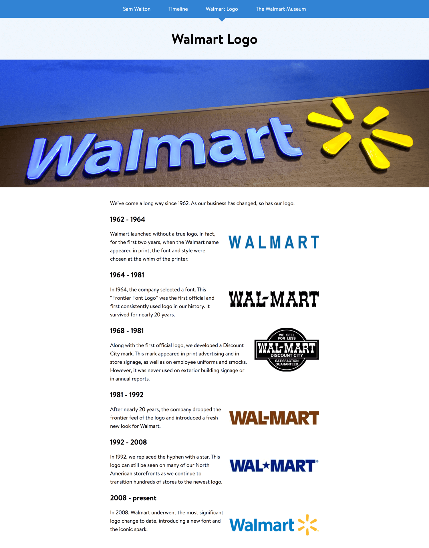
The first logo looks quite simple. It needs to adjust for kerning. The second & third ones look like the western reclamation era. 5th logo looks like the grocery shop in the United States. The current logo uses light blue. The blue, a little darker, was used for the first logo. It can be a symbol color for the brand.
Pepsi
©99designs
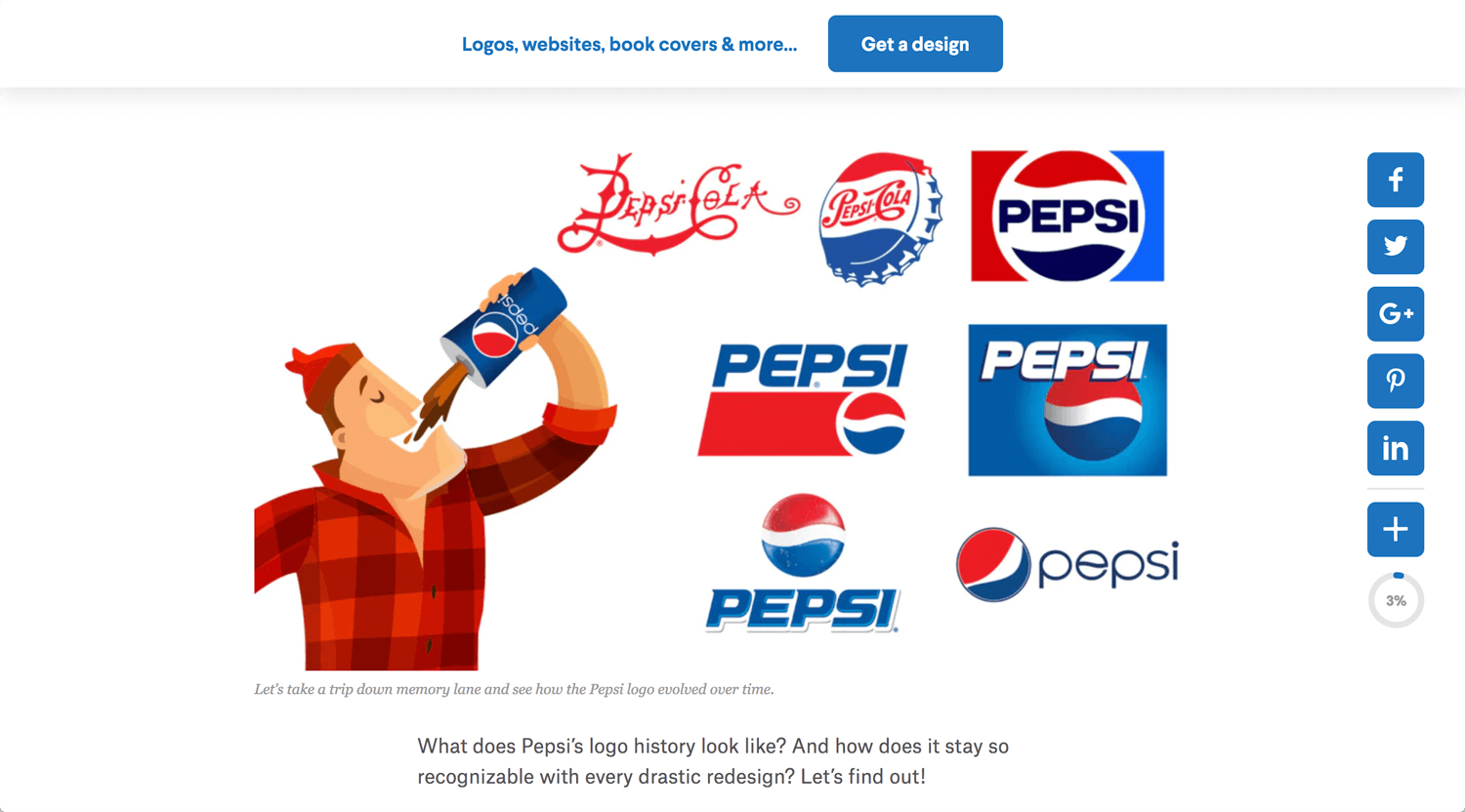
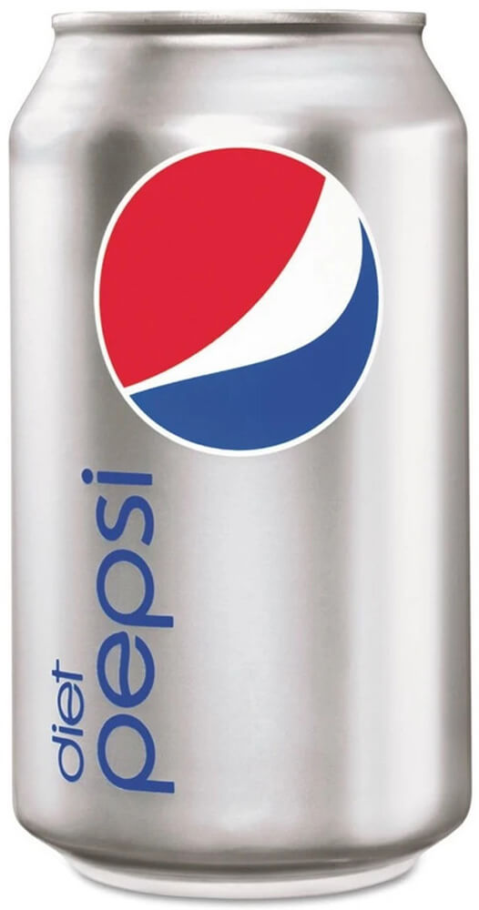
The top half is red, the bottom half is blue, and a wavy white line runs through the center. Which looks like a globe, but there is more to it. It is claimed that the new logo represents Earth’s magnetic field, feng shui, Pythagoras, geodynamics, renaissance and more. In short, it is some kind of Da Vinci Code. – The Economic Times
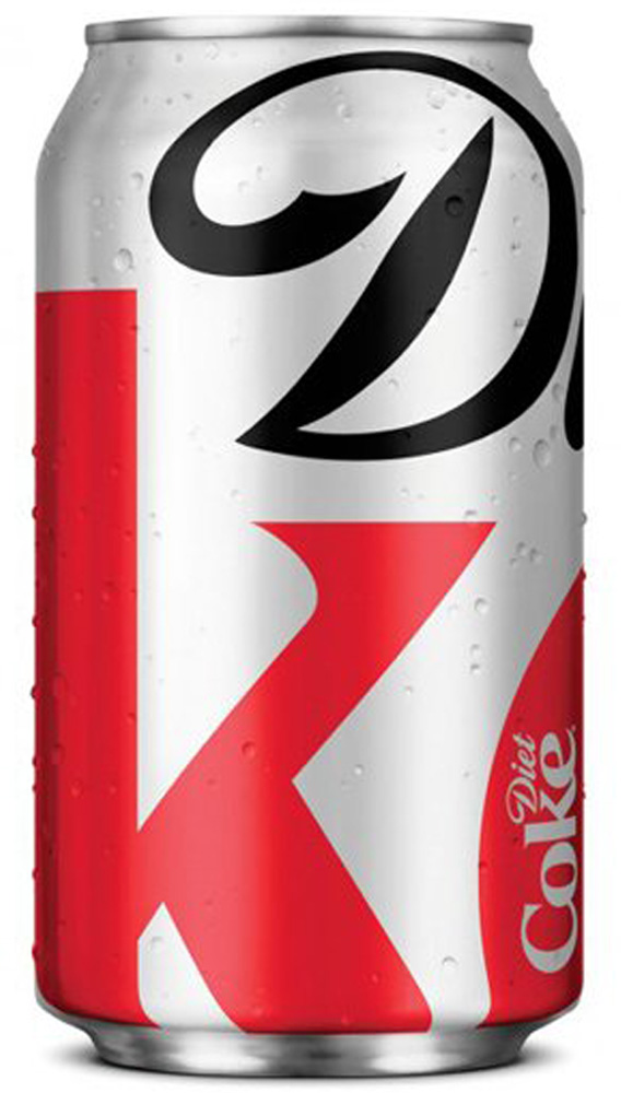
Represent brand of the Pepsico. A competitor would be Coca Cora. A simple test, you found Pepsi and Coke at a convenience store. It’s the same price, same amount and same feature. Which one do you buy? That’s the power of the brand.
Conclusion: Reason why a company rebranding
How do you reply to this question?
– Globalization
– Repositioning
– M&A
You may think of other reasons. All answers are not wrong. Branding is not only the company’s thought, but also how the company want a consumer to think/feel.
The designer’s work is to visualize the corporate message/philosophy and deliver it to the consumer. It’s meaningful work.
