Story: Sketch → XD → Figma
In 2018–2019, I used Adobe Illustrator for website prototyping. At the time, I assumed many web designers were still relying on Adobe Photoshop. For me, Illustrator was much faster than Photoshop, though it had its inconveniences.
Eventually, I discovered Sketch, a prototyping design tool, which proved to be extremely useful.
- Tailored for UI/UX Design: Built specifically for web and app design, with features like artboards, grids, and responsive layouts.
- Lightweight and Fast: Smaller file sizes and optimized performance compared to tools like Photoshop.
- Reusable Components: Symbols allow for consistent design and easy updates across projects.
- Easy Collaboration: Early support for shared libraries and plugins made teamwork seamless.
- Extensive Plugin Ecosystem: Offers powerful integrations for extended functionality.
- Vector-Based Design: Ensures high-quality, scalable graphics ideal for digital projects.
- User-Friendly Interface: Simple and intuitive, reducing the learning curve for designers.
- Affordable Pricing: More cost-effective than Adobe’s subscription model at the time.
- Export Optimization: Streamlined exporting for multiple screen sizes and formats.
- Prototyping Tools: Built-in prototyping features for creating interactive designs.
As time passed, Adobe released Adobe XD. UI was similar to Sketch, and since it was part of the Adobe ecosystem, I decided to switch to XD. It was free initially, and having an Adobe account made the transition easy.
Later, Adobe introduced a requirement for the relatively latest macOS to use XD. I wasn’t a fan of this restriction, so I switched from XD to Figma.
Currently, I use Figma and have no complaints. It’s an excellent tool. I believe Adobe’s acquisition of Figma failed, which, in hindsight, might be a good thing for designers. Adobe tends to monetize everything, and even though Figma planned to operate independently, it could have turned into a different company. It was just a possibility, but there’s no way to know right now.
In the digital-first and AI era of 2025, I’m uncertain if designers will still have a place in the future, but I’m doing what I like. My focus for 2025 is to improve productivity with Figma.
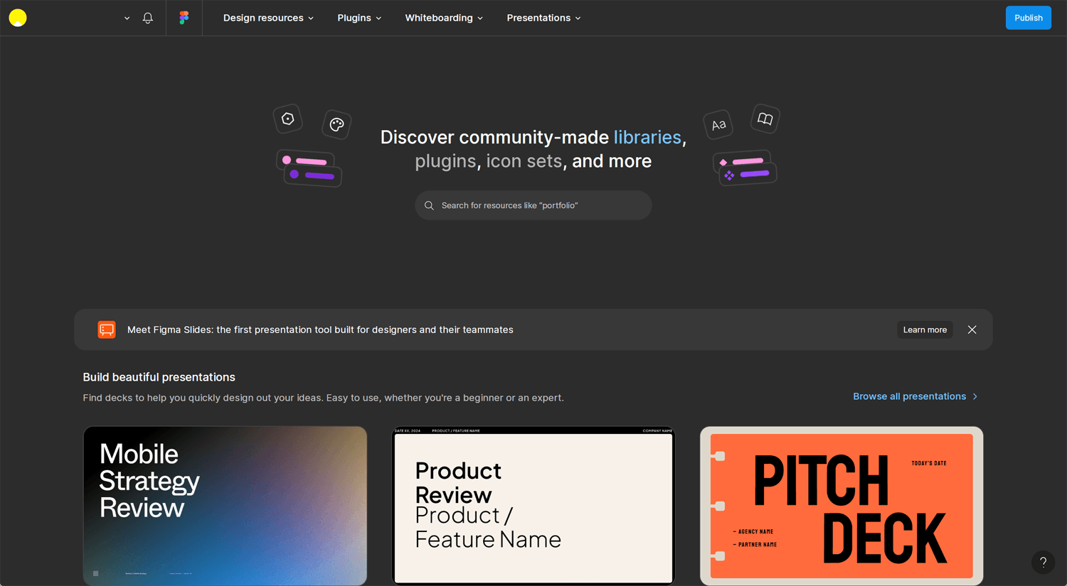
Figma Community
©Figma
The Figma Community is a platform within Figma where designers, developers, and creators can share their design files, plugins, and widgets with others. It serves as a hub for collaboration, learning, and inspiration in the design community. Here’s a breakdown of what you can find and do in the Figma Community:
Key Features:
- Design Files: Access a wide range of shared design templates, UI kits, prototypes, and assets created by other users. These files can be duplicated and customized for your own projects.
- Plugins: Explore plugins created by the community to extend Figma’s functionality. Plugins can automate tasks, add features, or integrate with other tools (e.g., accessibility checks, icon libraries, or design-to-code solutions).
- Widgets: Add interactive elements to your files, like calendars, voting tools, or sticky notes, to enhance collaboration and productivity during design processes.
- Creators: Follow creators whose work you admire to stay updated on their latest contributions and learn from their design approaches.
- Learning and Inspiration: Discover how other professionals approach design challenges by exploring shared work. It’s a great resource for learning new techniques, trends, and workflows.
Whatever you’re working on—user flow, design system, wireframe, or prototype—you’ll find plenty of resources, including paid templates. To simplify your search, you can filter out paid options. It’s important to select a few templates before starting a client project, as randomly choosing templates can lead to inconsistency. Preparing some work in advance and studying professional examples is an excellent way to improve and stay organized.
Building a Design System Fast Tip
©Figma
A Design System on Figma is a centralized library of reusable design components, styles, and guidelines that help teams maintain consistency and efficiency when creating user interfaces. It’s a framework that ensures all design and development elements align across a project or brand. Here’s a breakdown of what it typically includes and its benefits:
Key Components of a Design System in Figma:
- UI Components:
Pre-built elements like buttons, input fields, dropdowns, cards, and navigation bars.
These are designed to be reusable and can be customized for specific needs. - Styles:
Color Styles: Brand colors (e.g., primary, secondary, background, text colors).
Text Styles: Typography settings, such as fonts, sizes, line heights, and weights.
Effects: Shadows, blurs, and other visual effects.
Grid & Layouts: Spacing, grid systems, and alignment guides. - Icons & Assets:
A library of commonly used icons and illustrations, ensuring consistency in visuals. - Design Tokens:
Values like colors, fonts, and spacing rules stored as tokens to make scaling designs easier. - Documentation:
Usage guidelines for components and styles to help designers and developers use the system correctly.
Explains best practices, do’s and don’ts, and accessibility considerations.
She explains things very quickly and also mentions plugins. Yes, plugins can improve productivity. If you search for the best Figma plugins on YouTube, you’ll easily find helpful recommendations.
Finding a Design System on Figma
©DesignerUp
The purpose of this blog is to highlight this. Design materials are already shared in the Figma Community, but if we’re unaware of them, we can’t use them. That’s why I searched for it.
Build a complete Figma design system
©Arnau Ros
You can duplicate the Figma file from the community, but it’s important to understand what the creator is doing. Using existing files is sometimes hard to use. It seems like he offers a Figma design course and is a master of Figma, which is beyond my current level. I’m at an intermediate level, so I can follow along. However, if you’re a total beginner, it might be tough to keep up. Purchasing the course could be a good idea.
Extra: Tokens, variables, and styles – Update: Introduction to design systems
©Figma
I don’t think every freelancer needs to fully understand tokens or vailabes. What’s important is knowing that Figma is a very organized tool and understanding how corporate design teams use it. This topic is quite advanced, and as an auditory learner, I find it hard to remember unless I actively use it.
Figma tutorial: Intro to variables
©Figma
In Figma, variables are reusable design tokens for colors, text styles, spacing, and more. They ensure consistency, save time, and simplify updates across designs. Create them in the Variables Panel, group them into sets (e.g., “Light Theme”), and apply them to your designs for streamlined workflows.
Conclusion: Figma is much deeper
I don’t create high-fidelity prototypes during projects. My prototypes are typically rough representations of the final product or website, giving the client an idea of how it will look. Once the client approves, I move on to development—whether it’s WordPress, Webflow, or another platform they prefer. While I’m aware of tips for optimizing the Figma-to-Webflow workflow, I haven’t mastered them yet.
My goal is to streamline the research-to-prototype process as much as possible, achieving more in less time. In the near future, prompts may address this challenge. However, I’m unsure how accurately they can generate results or how to refine them using prompts effectively. We must not underestimate the power of AI.
